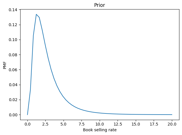
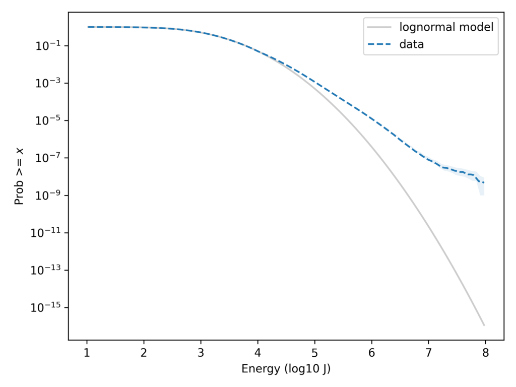
Is the Ideology Gap Growing?
This tweet from John Burn-Murdoch links to an article in the Financial Times (FT), “A new global gender divide is emerging”, which includes this figure:

The article claims:
In the US, Gallup data shows that after decades where the sexes were each spread roughly equally across liberal and conservative world views, women aged 18 to 30 are now 30 percentage points more liberal than their male contemporaries. That gap took just six years to open up.
The figure says it is based on General Social Survey data and the text says it’s based on Gallup data, so I’m not sure which it is. UPDATE: In this tweet Burn-Murdoch explains that the figure shows Gallup data, backfilled with GSS data from before the Gallup series began.
And I don’t know what it means that “All figures are adjusted for time trend in the overall population”. UPDATE: In this tweet, Burn-Murdoch explains that the adjustment mentioned in the figure is to subtract off the overall trend. In the notebook for this article, I apply the same adjustment, but it does not change my conclusions.
Anyway, since I used GSS data in several places in Probably Overthinking It, this analysis did not sound right to me. So I tried to replicate the analysis with GSS data.
I conclude:
- The GSS data does not look like the figure in the FT.
- Women are a more likely to say that they are liberal, by 5-10 percentage points.
- The only evidence that the gap is growing depends entirely on a data point from 2022 that is probably an error.
- If we drop the 2022 data and apply moderate smoothing, we see no evidence that the gap is growing.
Most of the functions in this notebook are the ones I used to write Probably Overthinking It. All of the notebooks for that book are available in this repository.
Click here to run this notebook on Colab
GSS Data
I’m using data from the General Social Survey (GSS), which I previous cleaned in this notebook. The primary variable we’ll use is polviews, which asks:
We hear a lot of talk these days about liberals and conservatives. I’m going to show you a seven-point scale on which the political views that people might hold are arranged from extremely liberal–point 1–to extremely conservative–point 7. Where would you place yourself on this scale?
The points on the scale are Extremely liberal, Liberal, and Slightly liberal; Moderate; Slightly conservative, Conservative, and Extremely conservative.
I’ll lump the first three points into “Liberal” and the last three into “Conservative”
All respondents
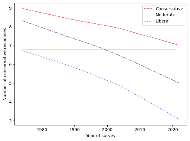
The following figure shows the percentage who says they are liberal minus the percentage who say they are conservative, grouped by sex.
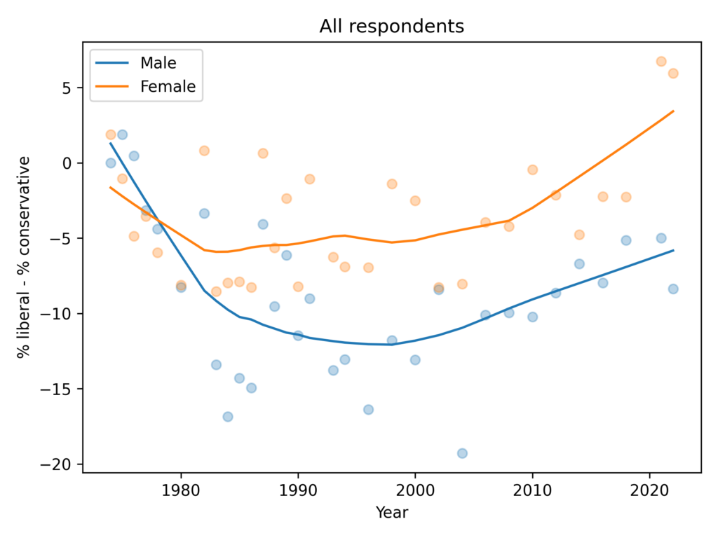
In the general population, women are more likely to say they are liberal by 5-10 percentage points. The gap might have increased in the most recent data, depending on how seriously we take the last two points in a noisy series.
Just young people
Now let’s select people under 30.
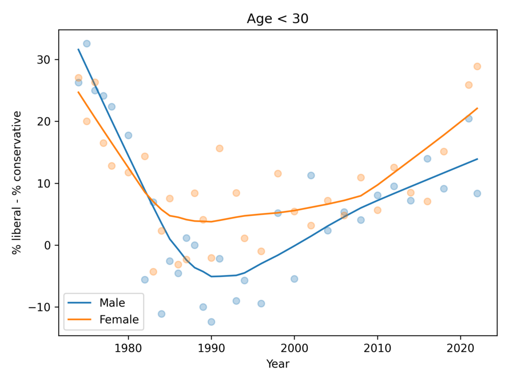
The trends here are pretty much the same as in the general population. Women are more likely to say they are liberal by 5-10 percentage points.
It’s possible that the gap has grown in the most recent data, but the evidence is weak and depends on how we draw a smooth curve through noisy data.
Anyway, there is no evidence the trend for men is going down — as in the FT graph — and the gap in the most recent data is nowhere near 30 percentage points.
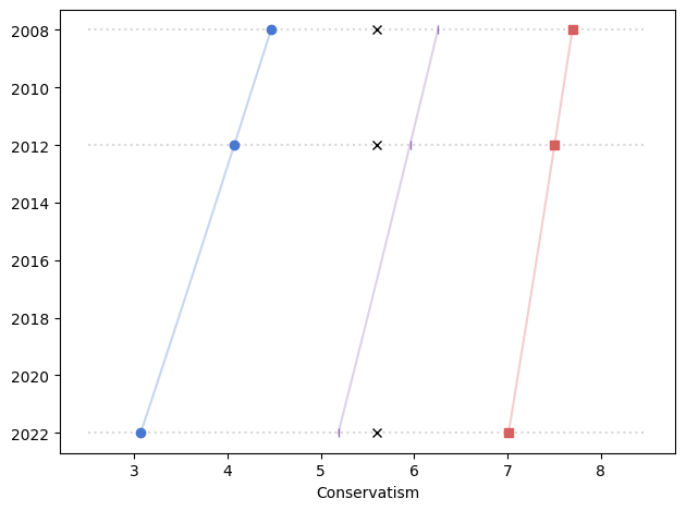
With Sampling Weights
In the previous figures, I did not take into account the sampling weights, partly to keep the analysis simple and partly because I didn’t expect them to make much difference.
And I was mostly right, except for men in 2022 – and as we’ll see, there is almost certainly something wrong with that data point.
In this figure, the shaded area is the 90% CI of 101 weighted resamplings, the line is the median of the resamplings, and the points show the unweighted data. We only have weighted data since 1988, since that’s how far back the wtssps variable goes.
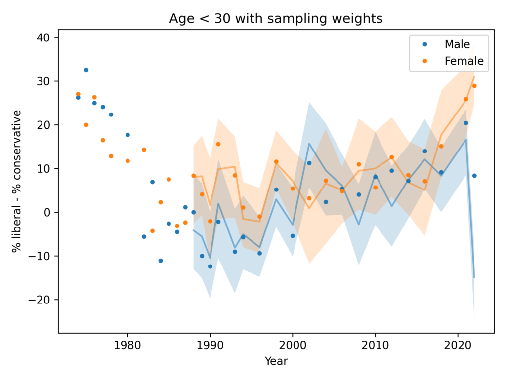
In most cases, the unweighted data falls in the CI of the weighted data, but for male respondents in 2022, the weighting moves the needle by almost 30 percentage points.
So something is not right there. I think the best option is to drop the 2022 data, but just for completeness, let’s see what happens if we apply some smoothing.
Resampling and smoothing
Here’s a version of the same plot with moderate smoothing, dropping the unweighted data.
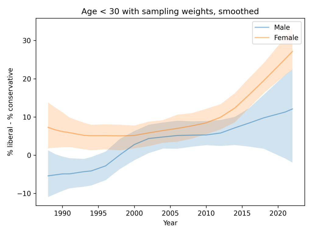
You could argue that this figure shows evidence for an increasing gap, but the error bounds are very wide, and as we’ll see in the next figure, the entire effect is due to the likely error in the 2022 data.
Resampling and smoothing without 2022
Finally, here’s the analysis I think is the best choice, dropping the 2022 data for both men and women.
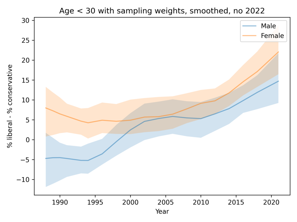
In summary:
- Since the 1990s, both men and women have become more likely to identify as liberal.
- Women are more likely to identify as liberal by 5-10 percentage points.
- There is no evidence that the ideology gap is growing.