Millennials are not getting married
In 2015 I wrote a paper called “Will Millennials Ever Get Married?” where I used data from the National Survey of Family Growth (NSFG) to estimate the age at first marriage for women in the U.S, broken down by decade of birth.
I found that women born in the 1980s and 90s were getting married later than previous cohorts, and I generated projections that suggest they are on track to stay unmarried at substantially higher rates.
Here are the results from that paper, based on 58 488 women surveyed between 1983 to 2015:
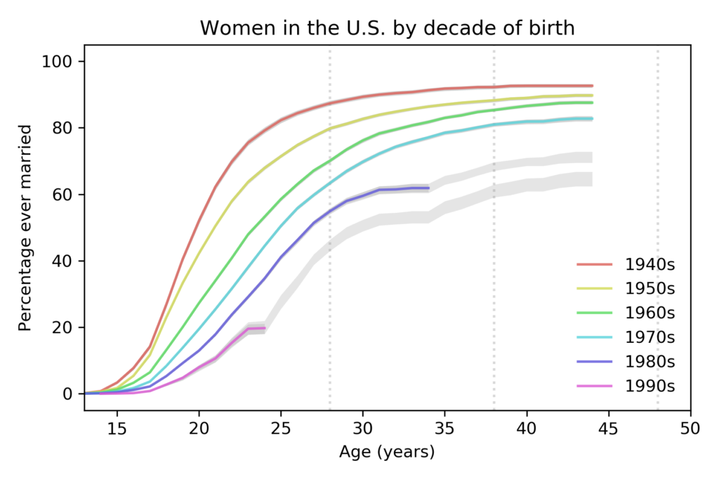
Each line represents a cohort grouped by decade of birth. For example, the top line represents women born in the 1940s.
The colored segments show the fraction of women who had ever been married as a function of age. For example, among women born in the 1940s, 82% had been married by age 25. Among women born in the 1980s, only 41% had been married by the same age.
The gray lines show projections I generated by assuming that going forward each cohort would be subject to the hazard function of the previous cohort. This method is likely to overestimate marriage rates.
These results show two trends:
- Each cohort is getting married later than the previous cohort.
- The fraction of women who never marry is increasing from one cohort to the next.
New data
Yesterday the National Center for Health Statistics (NCHS) released a new batch of data from surveys conducted in 2017-2019. So we can compare the predictions from 2015 with the new data, and generate updated predictions.
The following figure shows the predictions from the previous figure, which are based on data up to 2015, compared to the new curves based on data up to 2019, which includes 70 183 respondents.
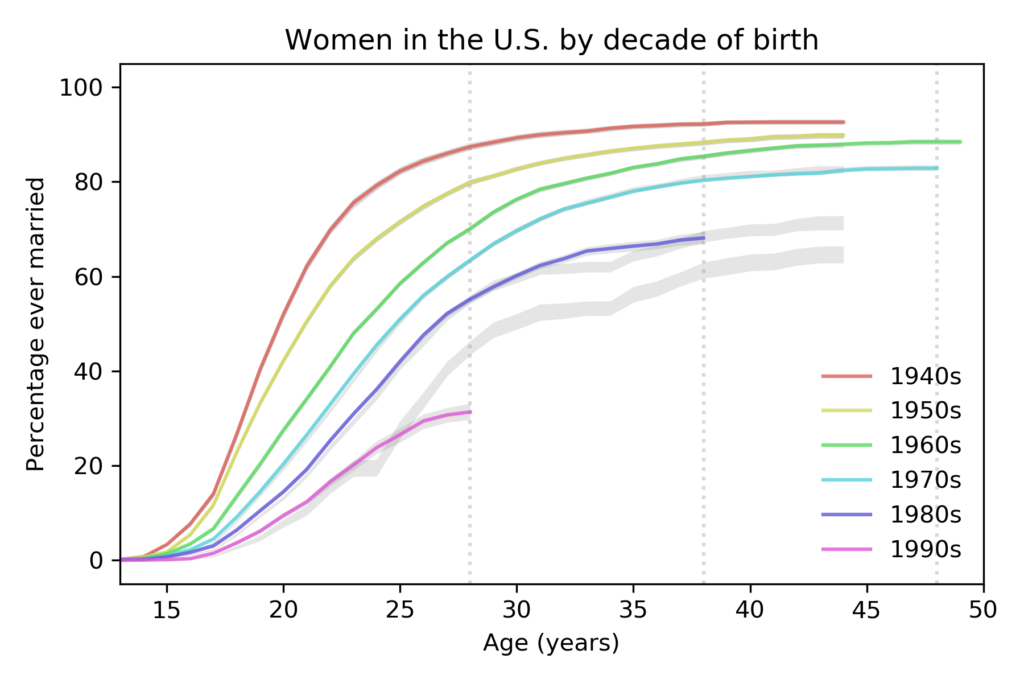
compared to predictions based on data up to 2015.
For women born in the 1980s, the fraction who have married is almost exactly as predicted. For women born in the 1990s, it is substantially lower.
New projections
The following figure shows projections based on data up to 2019.
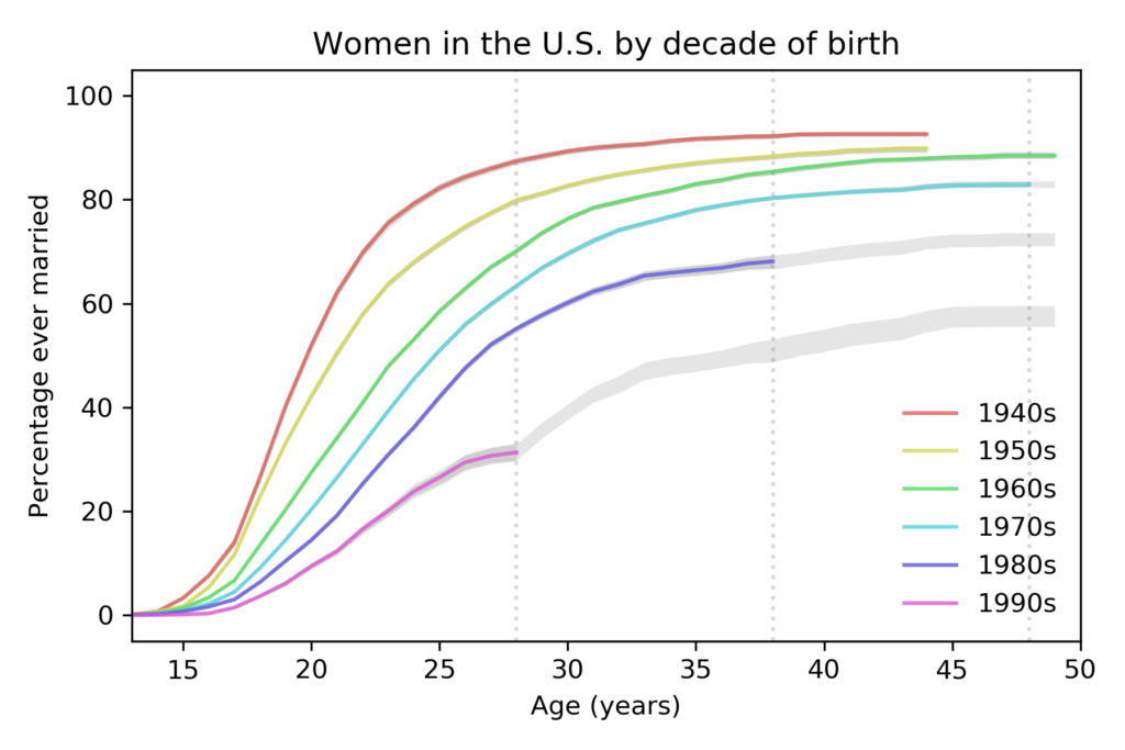
with predictions based on data up to 2019.
The vertical dashed lines show the ages where we have the last reliable estimate for each cohort. The following table summarizes the results at age 28:
| Decade of birth | 1940s | 1950s | 1960s | 1970s | 1980s | 1990s |
|---|---|---|---|---|---|---|
| % married before age 28 | 87% | 80% | 70% | 63% | 55% | 31% |
The percentage of women married by age 28 has dropped quickly from each cohort to the next, by about 11 percentage points per decade.
The following table shows the same percentage at age 38; the last value, for women born in the 1990s, is a projection based on the data we have so far.
| Decade of birth | 1940s | 1950s | 1960s | 1970s | 1980s | 1990s |
|---|---|---|---|---|---|---|
| % married before age 38 | 92% | 88% | 85% | 80% | 68% | 51% |
Based on current trends, we expect barely half of women born in the 1990s to be married before age 38.
Finally, here are the percentages of women married by age 48; the last two values are projections.
| Decade of birth | 1940s | 1950s | 1960s | 1970s | 1980s | 1990s |
|---|---|---|---|---|---|---|
| % married before age 48 | >93% | >90% | 88% | 83% | 72% | 58% |
Based on current trends, we expect women born in the 1980s and 1990s to remain unmarried at rates substantially higher than previous generations.
Projections like these are based on the assumption that the future will be like the past, but of course, things change. In particular:
- These data were collected before the COVID-19 pandemic. Marriage rates in 2020 will probably be lower than predicted, and the effect could continue into 2021 or beyond.
- However, as economic conditions improve in the future, marriage rates might increase.
We’ll find out when we get the next batch of data in October 2022.
The code I used for this analysis is in this GitHub repository.
