Browsed by
Month: July 2024

Where’s My Train?

Where’s My Train?

Yesterday I presented a webinar for PyMC Labs where I solved one of the exercises from Think Bayes, called “The Red Line Problem”. Here’s the scenario:

The Red Line is a subway that connects Cambridge and Boston, Massachusetts. When I was working in Cambridge I took the Red Line from Kendall Square to South Station and caught the commuter rail to Needham. During rush hour Red Line trains run every 7-8 minutes, on average.

When I arrived at the subway stop, I could estimate the time until the next train based on the number of passengers on the platform. If there were only a few people, I inferred that I just missed a train and expected to wait about 7 minutes. If there were more passengers, I expected the train to arrive sooner. But if there were a large number of passengers, I suspected that trains were not running on schedule, so I expected to wait a long time.

While I was waiting, I thought about how Bayesian inference could help predict my wait time and decide when I should give up and take a taxi.

I used this exercise to demonstrate a process for developing and testing Bayesian models in PyMC. The solution uses some common PyMC features, like the Normal, Gamma, and Poisson distributions, and some less common features, like the Interpolated and StudentT distributions.

The video is on YouTube now:

The slides are here.

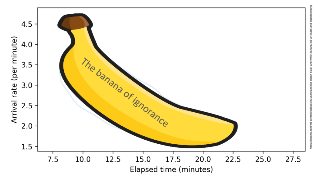
This talk will be remembered for the first public appearance of the soon-to-be-famous “Banana of Ignorance”. In general, when the data we have are unable to distinguish between competing explanations, that uncertainty is reflected in the joint distribution of the parameters. In this example, if we see more people waiting than expected, there are two explanation: a higher-than-average arrival rate or a longer-than-average elapsed time since the last train. If we make a contour plot of the joint posterior distribution of these parameters, it looks like this:

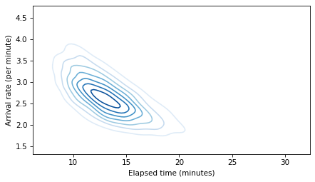
The elongated shape of the contour indicates that either explanation is sufficient: if the arrival rate is high, elapsed time can be normal, and if the elapsed time is high, the arrival rate can be normal. Because this shape indicates that we don’t know which explanation is correct, I have dubbed it “The Banana of Ignorance”:

For all of the details, you can read the Jupyter notebook or run it on Colab.

The original Red Line Problem is based on a student project from my Bayesian Statistics class at Olin College, way back in Spring 2013.

Elements of Data Science

Elements of Data Science

I’m excited to announce the launch of my newest book, Elements of Data Science. As the subtitle suggests, it is about “Getting started with Data Science and Python”.

Order now from Lulu.com and get 20% off!

I am publishing this book myself, which has one big advantage: I can print it with a full color interior without increasing the cover price. In my opinion, the code is more readable with syntax highlighting, and the data visualizations look great!

In addition to the printed edition, all chapters are available to read online, and they are in Jupyter notebooks, where you can read the text, run the code, and work on the exercises.

Description

Elements of Data Science is an introduction to data science for people with no programming experience. My goal is to present a small, powerful subset of Python that allows you to do real work with data as quickly as possible.

Part 1 includes six chapters that introduce basic Python with a focus on working with data.

Part 2 presents exploratory data analysis using Pandas and empiricaldist — it includes a revised and updated version of the material from my popular DataCamp course, “Exploratory Data Analysis in Python.”

Part 3 takes a computational approach to statistical inference, introducing resampling method, bootstrapping, and randomization tests.

Part 4 is the first of two case studies. It uses data from the General Social Survey to explore changes in political beliefs and attitudes in the U.S. in the last 50 years. The data points on the cover are from one of the graphs in this section.

Part 5 is the second case study, which introduces classification algorithms and the metrics used to evaluate them — and discusses the challenges of algorithmic decision-making in the context of criminal justice.

This project started in 2019, when I collaborated with a group at Harvard to create a data science class for people with no programming experience. We discussed some of the design decisions that went into the course and the book in this article.

Density and Likelihood: What’s the Difference?

Density and Likelihood: What’s the Difference?

It’s another installment in Data Q&A: Answering the real questions with Python. Previous installments are available from the Data Q&A landing page.

If you get this post by email, the formatting might be broken — if so, you might want to read it on the site.

likelihood
PMFs and PDFs

PMFs and PDFs

It’s another installment in Data Q&A: Answering the real questions with Python. Previous installments are available from the Data Q&A landing page.

If you get this post by email, the formatting is not good — you might want to read it on the site.

pmf_and_pdf
Regrets and Regression

Regrets and Regression

It’s another installment in Data Q&A: Answering the real questions with Python. Previous installments are available from the Data Q&A landing page.

standardize