Two questions crossed my desktop this week, and I think I can answer both of them with a single example.
On Twitter, Kareem Carr asked, “If Alice believes an event has a 90% probability of occurring and Bob also believes it has a 90% chance of occurring, what does it mean to say they have the same degree of belief? What would we expect to observe about both Alice’s and Bob’s behavior?”
And on Reddit, a reader of /r/statistics asked, “I have three coefficients from three different studies that measure the same effect, along with their 95% CIs. Is there an easy way to combine them into a single estimate of the effect?”
So let me tell you a story:
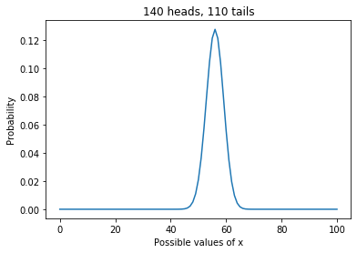
One day Alice tells her friend, Bob, “I bought a random decision-making box. Every time you press this button, it says ‘yes’ or ‘no’. I’ve tried it a few times, and I think it says ‘yes’ 90% of the time.”
Bob says he has some important decisions to make and asks if he can borrow the box. The next day, he returns the box to Alice and says, “I used the box several times, and I also think it says ‘yes’ 90% of the time.”
Alice says, “It sounds like we agree, but just to make sure, we should compare our predictions. Suppose I press the button twice; what do you think is the probability it says ‘yes’ both times?”
Bob does some calculations and reports the predictive probability 81.56%.
Alice says, “That’s interesting. I got a slightly different result, 81.79%. So maybe we don’t agree after all.”
Bob says, “Well let’s see what happens if we combine our data. I can tell you how many times I pressed the button and how many times it said ‘yes’.”
Alice says, “That’s ok, I don’t actually need your data; it’s enough if you tell me what prior distribution you used.”
Bob tells her he used a Jeffreys prior.
Alice does some calculations and says, “Ok, I’ve updated my beliefs to take into account your data as well as mine. Now I think the probability of ‘yes’ is 91.67%.”
Bob says, “That’s interesting. Based on your data, you thought the probability was 90%, and based on my data, I thought it was 90%, but when we combine the data, we get a different result. Tell me what data you saw, and let me see what I get.”
Alice tells him she pressed the button 8 times and it always said ‘yes’.
“So,” says Bob, “I guess you used a uniform prior.”
Bob does some calculations and reports, “Taking into account all of the data, I think the probability of ‘yes’ is 93.45%.”
Alice says, “So when we started, we had seen different data, but we came to the same conclusion.”
“Sort of,” says Bob, “we had the same posterior mean, but our posterior distributions were different; that’s why we made different predictions for pressing the button twice.”
Alice says, “And now we’re using the same data, but we have different posterior means. Which makes sense, because we started with different priors.”
“That’s true,” says Bob, “but if we collect enough data, eventually our posterior distributions will converge, at least approximately.”
“Well that’s good,” says Alice. “Anyway, how did those decisions work out yesterday?”
“Mostly bad,” says Bob. “It turns out that saying ‘yes’ 93% of the time is a terrible way to make decisions.”
If you would like to know how any of those calculations work, you can see the details in a Jupyter notebook:
And if you don’t want the details, here is the summary:
- If two people have different priors OR they see different data, they will generally have different posterior distributions.
- If two posterior distributions have the same mean, some of their predictions will be the same, but many others will not.
- If you are given summary statistics from a posterior distribution, you might be able to figure out the rest of the distribution, depending on what other information you have. For example, if you know the posterior is a two-parameter beta distribution (or is well-modeled by one) you can recover it from the mean and second moment, or the mean and a credible interval, or almost any other pair of statistics.
- If someone has done a Bayesian update using data you don’t have access to, you might be able to “back out” their likelihood function by dividing their posterior distribution by the prior.
- If you are given a posterior distribution and the data used to compute it, you can back out the prior by dividing the posterior by the likelihood of the data (unless the prior contains values with zero likelihood).
- If you are given summary statistics from two posterior distributions, you might be able to combine them. In general, you need enough information to recover both posterior distributions and at least one prior.