In Chapter 9 of Probably Overthinking It I wrote about Drug Recognition Experts (DREs), who are law enforcement officers trained to recognize impaired drivers.
I reviewed the research papers that were supposed to evaluate the accuracy of DREs and I summarized my impressions like this:
What I found was a collection of studies that are, across the board, deeply flawed. Every one of them features at least one methodological error so blatant it would be embarrassing at a middle school science fair.
Recently the related topic of Field Sobriety Tests (FSTs) came up in this Reddit discussion, which links to this TV news report about sober drivers who were arrested based on FST results.
The TV report refers to this 2023 paper in JAMA Psychiatry. Because it’s recent, published in a good quality journal, and called “Evaluation of Field Sobriety Tests for Identifying Drivers Under the Influence of Cannabis: A Randomized Clinical Trial”, I thought it might address the problems I found in previous research.
Unfortunately, it has the same problems:
Selection bias: It excludes as subjects people with conditions that might cause them to fail an FST while sober – but these are exactly the people most vulnerable to false positive results.
Wrong metrics: The paper focuses on the true positive and false positive rates, and neglects the predictive value of the test – which is more relevant to the policy question.
Unrealistic base rate: In the test conditions, two thirds of the participants were impaired, which is almost certainly higher than the relevant fraction in the real world.
Despite all that, the false positive rate they reported is 49%, which means that nearly half of the sober participants were wrongly classified as impaired.
Let’s look at each of these problems more closely.
False Positives
The study tested 184 participants, 121 randomly assigned to the THC group and 63 to the placebo group. The THC group smoked cannabis cigarettes containing THC; the placebo group smoked cigarettes with almost none. Each participant was evaluated by one officer, who was “blinded to treatment assignment”. The paper reports
Officers classified 98 participants (81.0%) in the THC group and 31 (49.2%) in the placebo group as FST impaired.
The following table summarizes these results as a confusion matrix:
FST Positive
FST Negative
Total
THC Group
98
23
121
Placebo Group
31
32
63
Total
129
55
184
Let’s start with the most obvious problem: of 63 people in the placebo group, 31 were wrongly classified as impaired, so the false positive rate was 49%.
Although the tests “were administered by certified DRE instructors, the highest training level for impaired driving detection”, the results for sober participants were no better than a coin toss. That’s pretty bad, but in reality it’s probably worse, because of selection bias.
Selection Bias
The study recruited 261 people who met these requirements: “age 21 to 55 years, cannabis use 4 or more times in the past month, holding a valid driver’s license, and driving at least 1000 miles in the past year.”
But it excluded 62 recruits for reasons including “history of traumatic brain injury [and] significant medical conditions or psychiatric conditions”. They also excluded people with a positive urine test for nonprescription drugs or substance use disorder in the past year.
That’s a problem because people with these kinds of medical conditions are more likely to fail an FST – even if they are not actually impaired. By excluding them, the study excludes exactly the people most vulnerable to a false positive result.
A better experiment would recruit a representative sample of drivers, including people older than 55 and people with conditions that make it hard to pass a field sobriety test. The TV report highlights an example: an autistic man who was arrested for DUI because his autism-related differences were mistaken for impairment. I assume he would have been excluded from the study.
To see how much difference the selection criteria could make, suppose 20 of the excluded participants (about one third) had been assigned to the placebo group. And suppose that because of their conditions 16 of them were wrongly classified as impaired – that’s 80%, somewhat higher than the rate among included participants.
That would increase the number of false positives by 16 and the number of true negatives by 4, so the unbiased false positive rate might be 57%.
This is just a guess: it’s not clear how many were excluded specifically for medical conditions or how many of the excluded would have failed the FST. But this calculation gives us a sense of how big the bias could be.
As I wrote in Probably Overthinking It:
How can you estimate the number of false positives if you exclude from the study everyone likely to yield a false positive? You can’t.
And that brings us to the next problem.
Predictive Value
The paper reports:
Officers classified 98 participants (81.0%) in the THC group and 31 (49.2%) in the placebo group as FST impaired at the first evaluation
They quantify this difference as 31.8 percentage points, with 95% CI, 16.4-47.2 percentage points, and report a p-value < .001. Based on this analysis, they conclude:
FSTs administered by highly trained law enforcement officers differentiated between individuals receiving THC vs placebo
This conclusion is true in the sense that the difference in percentages is statistically significant, but the policy question is not whether THC exposure changes FST performance under laboratory conditions. The question is whether an FST result provides sufficiently strong evidence to justify detention or arrest.
For that, the false positive rate is relevant, and as we have discussed, it is probably more than 50%.
But even more important is the positive predictive value (PPV), which is the probability that a positive test is correct. In the confusion matrix, there are 129 positive tests, of which 98 are correct and 31 incorrect, so the PPV is 98 out of 129, about 76%.
Of the people who failed the FST, 76% were actually impaired. That might sound good enough for probable cause, but that conclusion is misleading because there is still another problem – the base rate.
Base Rate
In the study, two thirds of the participants were impaired. In the real world, it is unlikely that two thirds of drivers are impaired – or even two thirds of drivers who take an FST. So the base rate in the study is too high.
To see why that matters, we have to do a little math. First we’ll use the confusion matrix to compute one more metric, sensitivity, which is the percentage of impaired participants who were classified correctly.
We can use sensitivity, along with the false positive rate we already computed, to figure out the positive predictive value of a test with a more realistic base rate.
Of all people pulled over and given a field sobriety test, how many do you think are impaired by THC? That’s a hard question to answer, so we’ll try a couple of values.
First, suppose the base rate is one third, rather than the two thirds in the study. If we imagine 100 drivers:
If 33 are impaired, and sensitivity is 81%, we expect 27 true positive results.
If 67 are not impaired, and the false positive rate is 49%, we expect 33 false positive results.
In that case the positive predictive value is 27 / (27 + 33), which means that only 45% of positive tests are correct. If we put those numbers in a table, the calculation might be clearer.
Tests
Prob pos
Pos tests
Percent
Impaired
33
0.810
26.727
44.773
Not impaired
67
0.492
32.968
55.227
With a lower base rate, PPV is lower, which means that a positive test is weaker evidence of impairment. But even 45% might be too high.
If we suppose that 15% of drivers who take an FST are impaired, we can run the numbers again.
Tests
Prob pos
Pos tests
Percent
Impaired
15
0.810
12.149
22.508
Not impaired
85
0.492
41.825
77.492
With 15% base rate, the predictive value of the test is only 23% – which means 77% of drivers identified as impaired would actually be sober.
In reality, the base rate depends on the context. At a checkpoint where every driver is stopped, the base rate might be lower than 15%. If a driver is stopped for driving erratically, the base rate might be relatively high. But even then, it is unlikely to be as high as 66%, as in the study.
Discussion
The JAMA Psychiatry study provides valuable data, but it suffers from the same methodological problems as previous DRE validation studies:
High false positive rate: Nearly half of sober participants were incorrectly classified as impaired.
Selection bias: The study excluded exactly the people most likely to be falsely accused, making it impossible to assess the true false positive rate in the general population.
Unrealistic base rate: The base rate in the study is higher than what we expect in real-world use, which inflates the predictive value of the test.
Although I have been critical of the study, I agree with their interpretation of the results:
…the substantial overlap of FST impairment between groups and the high frequency at which FST impairment was suspected to be due to THC suggest that absent other indicators, FSTs alone may be insufficient to identify THC-specific driving impairment.
Emphasis mine.
Notes
In my interpretation of the results, I follow the methodology of the study, which treats assignment to the THC group as ground truth – that is, we assume that participants in the THC group were actually impaired and participants in the placebo group were not. And the paper reports:
Median self-reported highness (scale of 0 to 100, with higher scores indicating more impairment) at 30 minutes was 64 (IQR, 32-76) for the THC group and 13 (IQR, 1-28) for the placebo group (P < .001).
The THC group felt that they were more impaired, but based on the IQRs, it looks like there might be overlap. That complicates the interpretation of “impaired”, but for this analysis I use the study’s operational definition.
If you have studied probability, you might be familiar with fractional odds, which represent the ratio of the probability something happens to the probability it doesn’t. For example, if the Seahawks have a 75% chance of winning the Super Bowl, they have a 25% chance of losing, so the ratio is 75 to 25, sometimes written 3:1 and pronounced “three to one”.
But if you search for “the odds that the Seahawks win”, you will probably get moneyline odds, also known as American odds. Right now, the moneyline odds are -240 for the Seahawks and +195 for the Patriots. If you are not familiar with this format, that means:
If you bet $100 on the Patriots and they win, you gain $195 – otherwise you lose $100.
If you bet $240 on the Seahawks and they win, you gain $100 – otherwise you lose $240.
If you are used to fractional odds, this format might make your head hurt. So let’s unpack it.
Suppose you think the Patriots have a 25% chance of winning. Under that assumption, we can compute the expected value of the first wager like this:
If the Patriots actually have a 25% chance of winning, the first wager has negative expected value – so you probably don’t want to make it.
Now let’s compute the expected value of the second wager – assuming the Seahawks have a 75% chance of winning:
expected_value(p=0.75, wager=240, payout=100)
15.0
The expected value of this wager is positive, so you might want to make it – but only if you have good reason to think the Seahawks have a 75% chance of winning.
Implied Probability
More generally, we can compute the expected value of each wager for a range of probabilities from 0 to 1.
plt.plot(ps, ev_patriots, label='Bet on Patriots')
plt.plot(ps, ev_seahawks, label='Bet on Seahawks')
plt.axhline(0, color='gray', alpha=0.4)

decorate(xlabel='Actual probability Patriots win',
        ylabel='Expected value of wager')
To find the crossover point, we can set the expected value to 0 and solve for p. This function computes the result:
Here’s crossover for a bet on the Patriots at the offered odds.
p1 = crossover(100, 195)
p1
0.3389830508474576
If you think the Patriots have a probability higher than the crossover, the first bet has positive expected value.
And here’s the crossover for a bet on the Seahawks.
p2 = crossover(240, 100)
p2
0.7058823529411765
If you think the Seahawks have a probability higher than this crossover, the second bet has positive expected value.
So the offered odds imply that the consensus view of the betting market is that the Patriots have a 33.9% chance of winning and the Seahawks have a 70.6% chance. But you might notice that the sum of those probabilities exceeds 1.
p1 + p2
1.0448654037886342
What does that mean?
The Take
The sum of the crossover probabilities determines “the take”, which is the share of the betting pool taken by “the house” – that is, the entity that takes the bets.
For example, suppose 1000 people take the first wager and bet $100 each on the Patriots. And 1000 people take the second wager and bet $240 on the Seahawks.
Here’s the total expected value of all of those wagers.
total = expected_value(ps, 100_000, 195_000) + expected_value(1-ps, 240_000, 100_000)
plt.plot(ps, total, label='Total')
plt.axhline(0, color='gray', alpha=0.4)

decorate(xlabel='Actual probability Patriots win',
        ylabel='Total expected value of all wagers')
The total expected value is negative for all probabilities (or zero if the Patriots have no chance at all) – which means the house wins.
How much the house wins depends on the actual probability. As an example, suppose the actual probability is the midpoint of the probabilities implied by the odds:
p = (p1 + (1-p2)) / 2
p
0.31655034895314055
In that case, here’s the expected take, assuming that the implied probability is correct.
take = -expected_value(p, 100_000, 195_000) - expected_value(1-p, 240_000, 100_000)
take
14244.765702891316
As a percentage of the total betting pool, it’s a little more than 4%.
take / (100_000 + 240_000)
0.04189636971438623
Which we could have approximated by computing the “overround”, which is the amount that the sum of the implied probabilities exceeds 1.
(p1 + p2) - 1
0.04486540378863424
Don’t Bet
In summary, here are the reasons you should not bet on the Super Bowl:
If the implied probabilities are right (within a few percent) all wagers have negative expected value.
If you think the implied probabilities are wrong, you might be able to make a good bet – but only if you are right. The odds represent the aggregated knowledge of everyone who places a bet, which probably includes a lot of people who know more than you.
If you spend a lot of time and effort, you might find instances where the implied probabilities are wrong, and you might even make money in the long run. But there are better things you could do with your time.
Betting is a zero-sum game if you include the house and a negative-sum game for people who bet. If you make money, someone else loses – there is no net creation of economic value.
So, if you have the skills to beat the odds, find something more productive to do.
Some people have strong opinions about this question:
In a family with two children, if at least one of the children is a girl born on Tuesday, what are the chances that both children are girls?
In this article, I hope to offer
A solution to one interpretation of this question,
An explanation of why the solution seems so counterintuitive,
A discussion of other interpretations, and
An implication of this problem for teaching and learning probability.
Let’s get started.
One interpretation
One reason this problem is contentious is that it is open to multiple interpretations. I’ll start by presenting just one – then we’ll get back to the ambiguity.
First, to avoid real-world complications, let’s assume an imaginary world where:
Every family has two children.
50% of children are boys and 50% are girls.
All days of the week are equally likely birth days.
Genders and birth days are independent.
Second, we will interpret the question in terms of conditional probability; that is, we’ll compute P(B|A), where
A is “at least one of the children is a girl born on Tuesday”, and
B is “both children are girls”.
Under these assumptions and this interpretation, the answer is unambiguous – and it turns out to be 13/27 (about 48.1%).
But why?
This problem is counterintuitive because it elicits confusion between causation and evidence.
If a family has a girl born on a Tuesday, that does not cause the other child to be a girl.
But the fact that a family has a girl born on Tuesday is evidence that the other child is a girl.
To see why, imagine two families: the first has one girl and the other has ten girls. Suppose I choose one of the families at random, check to see whether they have a girl born on Tuesday, and find that they do.
Which family do you think I chose?
If I chose the family with one girl, the chance is only 1/7 (about 14%) that she was born on Tuesday.
If I chose the family with ten girls, the chance is about 79% that at least one of them was born on a Tuesday.
And that’s the key to understanding the problem:
A family with more than one girl is more likely to have one born on Tuesday. Therefore, if a family has a girl born on a Tuesday, it is more likely that they have more than one girl.
That’s the qualitative argument. Now we’ll make it quantitative – with Bayes’s Theorem.
Bayes’s Theorem
Let’s start with four kinds of two-child families.
The posterior probability of two girls is 13/27. As always, Bayes’s Theorem is the chainsaw that cuts through the knottiest problems in probability.
Other versions
Everything so far is based on the interpretation of the question as a conditional probability. But many people have pointed out that the question is ambiguous because it does not specify how we learn that the family has a girl born on a Tuesday.
This objection is valid:
The answer depends on how we get the information, and
The statement of the problem does not say how.
There are many versions of this problem that specify different ways you might learn that a family has a girl born on a Tuesday, and you might enjoy the challenge of solving them.
In general, if we specify the process that generates the data, we can use simulation, enumeration, or Bayes’s Theorem to compute the conditional probability given the data.
But what should we do if the data-generating process is not uniquely specified?
One option is to say that the question has no answer because it is ambiguous.
Another option is to specify a prior distribution of possible data-generating processes, compute the answer under each process, and apply the law of total probability.
Some of the people who choose the second option also choose a prior distribution so that the answer turns out to be 1/2. In my view, that is a correct answer to one interpretation, but that interpretation seems arbitrary – by choosing different priors, we can make the answer almost anything.
I prefer the interpretation I presented, because
I believe it is what was intended by the people who posed the problem,
It is consistent with the conventional interpretation of conditional probability,
It yields an answer that seems paradoxical at first, so it is an interesting problem,
The apparent paradox can be resolved in a way that sheds light on conditional probability and the idea of independent events.
So I think it’s a perfectly good problem – it’s just hard to express it unambiguously in natural language (as opposed to math notation).
But you don’t have to agree with me. If you prefer a different interpretation of the question, and it leads to a different answer, feel free to write a blog post about it.
What about independence?
I think the girl born on Tuesday carries a lesson about how we teach. In introductory probability, students often learn two ways to compute the probability of a conjunction. First they learn the easy way:
P(A and B) = P(A) P(B)
But they are warned that this only applies if A and B are independent. Otherwise, they have to do it the hard way:
P(A and B) = P(A) P(B|A)
But how to we know whether A and B are independent? Formally, they are independent if
P(B|A) = P(B)
So, in order to know which formula to use, you have to know P(B|A). But if you know P(B|A), you might as well use the second formula.
Rather than check independence by conditional probability, it is more common to assert independence by intuition. For example, if we flip two coins, we have a strong intuition that the outcomes are independent. And if the coins are known to fair, this intuition is correct. But if there is any uncertainty about the probability of heads, it is not.
The coin example – and Monty Hall, and Bertrand’s Boxes, and many more – demonstrate the real lesson of the girl born on Tuesday – our intuition for independence is wildly unreliable.
Which means we might want to rethink the way we teach it.
In general
Previously I wrote about a version of this problem where the girl is named Florida. In general, if we are given that a family has at least one girl with a particular property, and the prevalence of the property is p, we can use Bayes’s Theorem to compute the probability of two girls.
I’ll use SymPy to represent the priors and the probability p.
The following figure shows the probability of two girls as a function of the prevalence of the property.
xs = np.linspace(0, 1)
ys = (xs-2) / (xs-4)

plt.plot(xs, ys)
plt.xlabel('Prevalence of the property')
plt.ylabel('Conditional probability of two girls')
If the property is rare – like the name Florida – the conditional probability is close to 1/2. If the property is common – like having a name – the conditional probability is close to 1/3.
Objections
Here are some objections to the “girl born on Tuesday” problem along with my responses.
You have to model the message, not just the event
Objection. The statement “at least one child is a girl born on Tuesday” should not be treated as a bare event in a probability space. It should be treated as the outcome of a random process that generates messages or facts we learn. Therefore, the probability space must include not only family composition, but also the mechanism by which that information is produced. Any solution that conditions only on the family outcomes is incomplete.
Response. I agree that if the problem is interpreted as conditioning on a message (something that is said, reported, or chosen from among several true statements), then the reporting mechanism matters and must be modeled explicitly. However, I don’t think such a mechanism is required in all cases. It is standard and meaningful to interpret a question as conditioning on an event – an extensional property of outcomes – without introducing an additional random variable for how the information was obtained. That is the interpretation I adopt here.
Without a specified selection rule, symmetry forces the answer to 1/2
Objection. If the problem does not specify how the information was obtained, then we must assume a symmetric rule for selecting which true statement is revealed. Under that assumption, conditioning on “at least one boy” or “at least one girl” must give the same answer, and applying the law of total probability forces the posterior probability to equal the prior. Therefore, the correct answer must be 1/2.
Response. This conclusion follows only if we assume that the conditioning is on a message chosen from a symmetric set of alternatives. Under that interpretation, the result does depend on the selection rule, and 1/2 is a valid answer for one particular choice of rule. But if the conditioning is on an event rather than a message, there is no requirement that different events form a symmetric partition or that the law of total probability be applied across them in this way. Under the event-based interpretation, the argument forcing 1/2 does not apply.
The problem is ambiguous and therefore has no answer
Objection. Because the problem does not specify how we learn that there is a girl born on Tuesday, it is fundamentally ambiguous. Since different interpretations lead to different answers, the question has no single correct solution.
Response. It’s true that the problem is ambiguous as stated in natural language. One option is to declare it unanswerable. Another is to resolve the ambiguity by adopting a conventional default interpretation. I choose the latter: I interpret the question as a conditional probability defined on an explicit probability model and make that interpretation clear by enumerating the sample space. Under that interpretation, the answer is unambiguous and, in my view, interesting and instructive – even if other interpretations lead to different answers.
You are changing the sampling procedure
Objection. Some people object that the 13/27 result comes from changing how families are selected. Conditioning on “at least one child is a girl born on Tuesday” oversamples families with more girls, so the conditional distribution no longer represents the original population of two-child families. From this perspective, the result feels like an artifact of biased sampling rather than a genuine probability update.
Response. That description is accurate, but it is not a flaw. Conditioning is biased sampling: evidence changes the distribution of outcomes. Families with more girls really are more likely to satisfy the condition, and the conditional probability reflects that fact.
The day of the week seems irrelevant
Objection. Tuesday has nothing to do with gender, so it feels wrong that adding this detail should change the probability. Since the day of the week does not cause a child to be a girl, it seems irrelevant to the question.
Response. This objection reflects a common confusion between causal independence and evidential relevance. While the day of the week does not cause the other child’s gender, it provides evidence about the number of girls in the family. Evidence can change probabilities even when there is no causal connection.
The result depends on unrealistic independence assumptions
Objection. The solution assumes that genders and days of the week are independent and uniformly distributed, which is not true in the real world. If those assumptions are relaxed, the answer changes.
Response. That is correct, but those assumptions are not the source of the puzzle. Relaxing them changes the numerical value of the answer, but not the underlying logic. The same kind of reasoning applies under more realistic models.
The problem is artificial or pathological
Objection. Some readers reject the problem not because the calculation is wrong, but because the setup feels artificial or unlike how information is learned in real life. From this view, the problem is a trick rather than a meaningful probability question.
Response. Whether this is a flaw or a feature depends on the goal. The problem is artificial, but it is intended to expose how unreliable our intuitions about conditional probability and independence can be. In that sense, its artificiality is what makes it pedagogically useful. The underlying issue – determining how evidence bears on hypotheses – comes up in real-world problems all the time. And getting it wrong has real-world consequences.
At PyData Global 2025 I presented a workshop on Bayesian Decision Analysis with PyMC. The video is available now.
This workshop is based on the first session of the Applied Bayesian Modeling Workshop I teach along with my colleagues at PyMC Labs. If you would like to learn more, it is not too late to sign up for the next offering, starting Monday January 12.
Here’s the abstract and description of the workshop.
Bayesian Decision Analysis with PyMC: Beyond A/B Testing
This hands-on tutorial introduces practical Bayesian inference using PyMC, focusing on A/B testing, decision-making under uncertainty, and hierarchical modeling. With real-world examples, you’ll learn how to build and interpret Bayesian models, evaluate competing hypotheses, and implement adaptive strategies like Thompson sampling. Whether you’re working in marketing, healthcare, public policy, UX design, or data science more broadly, these techniques offer powerful tools for experimentation, decision-making, and evidence-based analysis.
Description
Bayesian methods offer a natural and interpretable framework for updating beliefs with data, and PyMC makes it easy to apply these techniques in practice. In this tutorial, we’ll walk through a series of examples that demonstrate the core concepts:
Bayesian A/B Testing with the Beta-Binomial Model
Represent prior beliefs with the beta distribution
Use binomial likelihoods to model observed outcomes
Understand posterior distributions and credible intervals
Bayesian Bandits and Thompson Sampling
Go beyond hypothesis testing: estimate the probability of one version outperforming another
Use Thompson sampling to guide decision-making
Simulate and visualize an adaptive email campaign
Hierarchical Models for Partial Pooling and Prediction
Learn how to share information across variants
Use posterior predictive distributions to quantify uncertainty
Understand second-order probabilities
Hands-On Learning
Participants will follow along in Jupyter notebooks (hosted on Colab — no installation required). Exercises are embedded throughout, with guided solutions. Code is based on PyMC, ArviZ, and standard scientific Python libraries.
Prerequisites
Intermediate Python: basic familiarity with NumPy, plotting, and Jupyter notebooks
No prior experience with Bayesian statistics or PyMC is assumed
Suppose you are not sure whether all ravens are black. If you see a white raven, that clearly refutes the hypothesis. And if you see a black raven, that supports the hypothesis in the sense that it increases our confidence, maybe slightly. But what if you see a red apple – does that make the hypothesis any more or less likely?
This question is the core of the Raven paradox, a problem in the philosophy of science posed by Carl Gustav Hempel in the 1940s. It highlights a counterintuitive aspect of how we evaluate evidence and confirm hypotheses.
No resolution of the paradox is universally accepted, but the most widely accepted is what I will call the standard Bayesian response. In this article, I’ll present this response, explain why I think it is incomplete, and propose an extension that might resolve the paradox.
Logically, these hypotheses are identical – if A is true, B must be true, and vice versa. So if we have a certain level of confidence in A, we should have exactly the same confidence in B. And if we observe evidence in favor of A, we should also accept it as evidence in favor of B, to the same degree.
Also, if we accept that a black raven is evidence in favor of A, we should also accept that a non-black non-raven is evidence in favor of B.
Finally, if a non-black non-raven is evidence in favor of B, we should also accept that it is evidence in favor of A.
Therefore, a red apple (which is a non-black non-raven) is evidence that all ravens are black.
If you accept this conclusion, it seems like every time you see a red apple (or a blue car, or a green leaf, etc.) you should think, “Now I am slightly more confident that all ravens are black”.
But that seems absurd, so we have two options:
Discover an error in the argument, or
Accept the conclusion.
As you might expect, many versions of (1) and (2) have been proposed.
The standard Bayesian response is to accept the conclusion but, quoth Wikipedia “argue that the amount of confirmation provided is very small, due to the large discrepancy between the number of ravens and the number of non-black objects. According to this resolution, the conclusion appears paradoxical because we intuitively estimate the amount of evidence provided by the observation of a green apple to be zero, when it is in fact non-zero but extremely small.”
It is true that when the number of non-ravens is large, the amount of evidence we get from each non-black non-raven is so small it is negligible. But I don’t think that’s why the conclusion is so acutely counterintuitive.
To clarify my objection, let me present a smaller example I’ll call the Roulette paradox.
The Roulette Paradox
An American roulette wheel has 36 pockets with the numbers 1 to 36, and two pockets labeled 0 and 00. The non-zero pockets are red or black, and the zero pockets are green.
Suppose we work in quality control at the roulette factory and our job is to check that all zero pockets are green. If we observe a green zero, that’s evidence that all zeros are green. But what if we observe a red 19?
In this example, the standard Bayesian response fails:
First, the number of non-zeros is not particularly large, so the weight of the evidence is not negligible.
Also, the Bayesian response doesn’t address what I think is actually the key: The non-green non-zero may or may not be evidence, depending on how it was sampled.
As I will demonstrate,
If we choose a pocket at random and it turns out to be a non-green non-zero, that is not evidence that all zeros are green.
But if we choose a non-green pocket and it turns out to be non-zero, that is evidence that all zeros are green.
In both cases we observe a non-green non-zero, but “observe” is ambiguous. Whether the observation is evidence or not depends on the sampling process that generated the observation. And I think confusion between these two scenarios is the foundation of the paradox.
The Setup
Let’s get into the details. Switching from roulette back to ravens, we will consider four scenarios:
You choose a random thing and it turns out to be a black raven.
You choose a random thing and it turns out to be a non-black non-raven.
You choose a random raven and it turns out to be black.
You choose a random non-black thing and it turns out to be a non-raven.
The key to the raven paradox is the difference between scenarios 2 and 4.
Scenario 2 is what most people imagine when they picture “observing a red apple”. And in this scenario, the red apple is irrelevant, exactly as intuition insists.
In Scenario 4, a red apple is evidence in favor of A, because we’re systematically checking non-black things to ensure they’re not ravens – so finding they aren’t is confirmation. But this sampling process is a more contrived interpretation of “observing a red apple”.
The reason for the paradox is that we imagine Scenario 2 and we are given the conclusion from Scenario 4.
It might not be obvious why the red apple is evidence in Scenario 4, but not Scenario 2. I think it will be clearer if we do the math.
The Math
We’ll start with a small world where there are only N = 9 ravens and M = 19 non-ravens. Then we’ll see what happens as we vary N and M.
I’ll use i to represent the unknown number of black ravens, which could be any value from 0 to N, and j to represent the unknown number of black non-ravens, from 0 to M.
We’ll use a joint distribution to represent beliefs about i and j; then we’ll use Bayes’s Theorem to update these beliefs when we see new data.
Let’s start with a uniform prior over all possible combinations of (i, j). For this prior, the probability of A is 10%. We’ll see later that the prior affects the strength of the evidence, but it doesn’t affect whether an observation is in favor of A or not.
Scenario 1
Now let’s consider the first scenario: we choose a thing at random from the universe of things, and we find that it is a black raven.
The likelihood for this observation is: i / (N + M), because i is the number of black ravens and N + M is the total number of things.
In this scenario the posterior probability of A is 20%. The posterior probability is higher than the prior, so the black raven is evidence in favor of A.
To quantify the strength of the evidence, we’ll use the log odds ratio, which is 0.81. Later we’ll see how the strength of the evidence depends on the prior distribution of i and j.
Before we go on, let’s also look at the marginal distribution of i (number of black ravens) before and after.
As expected, observing a black raven increases our confidence that all ravens are black. The posterior distribution shifts toward higher values of i, and the probability that i = N increases.
In Scenario 1, the likelihood depends only on i, not on j, so the update doesn’t change our beliefs about j (the number of black non-ravens).
Finally, let’s visualize posterior joint distribution of i and j.
Because we started with a uniform distribution and the data has no bearing on j, the joint posterior probabilities don’t depend on j.
In summary, Scenario 1 is consistent with intuition: a black raven is evidence in favor of A.
Scenario 2
In this scenario, we choose a thing at random from the universe of N + M things, and it turns out to be a red apple – which we will treat generally as a non-black non-raven.
The likelihood of this observation is: (M - j) / (N + M), because M - j is the number of non-black non-ravens and N + M is the total number of things.
In this scenario, the posterior probability of A is the same as the prior. In fact, the entire distribution of i is unchanged.
So the red apple is not evidence in favor of A or against it. This is consistent with the intuition that the red apple (or any non-black non-raven) is irrelevant.
However, the red apple is evidence about j, as we can confirm by comparing the marginal distribution of j before and after.
And here’s the posterior joint distribution of i and j.
Because the red apple has no bearing on i, the posterior probabilities in this scenario don’t depend on i.
In summary, Scenario 2 matches our intuition: a red apple (chosen at random) is not evidence about whether all ravens are black.
Scenario 3
In this scenario, we choose a raven first and then observe that it is black.
The likelihood for this observation is: i / N, because i is the number of black ravens and N is the total number of ravens.
In this scenario, the posterior probability of A is 20%, the same as in Scenario 1.So we conclude that the black raven is evidence in favor of A, with the same strength regardless of whether we are in:
Scenario 1: Select a random thing and it turns out to be a black raven or
Scenario 3: Select a random raven and it turns out to be black.
In fact, the entire posterior distribution is the same in both scenarios. That’s because the likelihoods in Scenarios 1 and 3 differ only by a constant factor, which is removed when the posterior distributions are normalized.
In summary, Scenario 3 is consistent with intuition: if we choose a raven and find that it is black, that is evidence in favor of A.
Scenario 4
In the last scenario, we first choose a non-black thing (from all non-black things in the universe), and then observe that it is a non-raven.
The likelihood of this observation is: (M - j) / (N - i + M - j) because M - j is the number of non-black non-ravens and N - i + M - j is the total number of non-black things.
This likelihood depends on bothi and j, unlike Scenario 2. This is the key difference that makes Scenario 4 informative about whether all ravens are black.
The posterior probability of A is about 15%, which is greater than the prior, so the non-black non-raven is evidence in favor of A. The log odds ratio is about 0.47, which is smaller than in Scenarios 1 and 3, because there are more non-ravens than ravens. As we’ll see, the strength of the evidence gets smaller as M gets bigger.
Here is the marginal distribution of i (number of black ravens) before and after.
And here’s the marginal distribution of j (number of black non-ravens) before and after.
Finally, here’s the posterior joint distribution of i and j.
In Scenario 4, the likelihood depends on bothi and j, so the update changes our beliefs about both parameters.
And in Scenario 4 a non-black non-raven (chosen from non-black things) is evidence in favor of A. This might still be surprising, but let me suggest a way to think about it: in this scenario we are checking non-black things to make sure they are not ravens. If we find a non-black raven, that contradicts A. If we don’t, that supports A.
In all four scenarios, the results are consistent with intuition. So as long as you are clear about which scenario you are in, there is no paradox. The paradox is only apparent if you think you are in Scenario 2 and you imagine the result from Scenario 4.
In the context of the original problem:
If you walk out of your house and the first thing you see is a red apple (or a blue car, or a green leaf) that has no bearing on whether raven are black.
But if you deliberately select a non-black thing and check whether it’s a raven, and you find that it is not, that actually is evidence that all ravens are black – but consistent with the standard Bayesian response, it is so weak it is negligible.
Successive updates
In these examples, we started with a uniform prior over all combinations of i and j. Of course that’s not a realistic representation of what we believe about the world. So let’s consider the effect of other priors.
In general, different priors lead to different posterior distributions, and in this case they lead to different conclusions about the strength of the evidence. But they lead to the same conclusion about the direction of the evidence.
To demonstrate, let’s see what happens if we observe a series of black ravens (in Scenario 1 or 3). For simplicity, assume that we sample with replacement.
The following function computes multiple updates, starting with the uniform prior and then using the posterior from each update as the prior for the next.
This table shows the results in Scenario 1 (which is the same as in Scenario 3). For each iteration, the table shows the prior and posterior probability of A, and the log odds ratio.
Iteration
Prior
Posterior
LOR
0
0.100000
0.200000
0.810930
1
0.200000
0.284211
0.462624
2
0.284211
0.360000
0.348307
3
0.360000
0.427901
0.284942
4
0.427901
0.488715
0.245274
5
0.488715
0.543171
0.218261
6
0.543171
0.591920
0.198796
7
0.591920
0.635551
0.184196
8
0.635551
0.674590
0.172914
9
0.674590
0.709512
0.163995
As we see more ravens, the posterior probability of A increases, but the LOR decreases – which means that each raven provides weaker evidence than the previous one. In the long run the LOR converges to a value greater than 0 (about 0.11), which means that each raven provides at least some additional evidence, even when the prior is far from the uniform distribution we started with.
In the worst case, if the prior probability of A is 0 or 1, nothing we observe can change those beliefs, so nothing is evidence for or against A. But there is no prior where a black raven provides evidence againstA.
[Proof: The likelihood of the observation is maximized when all ravens are black (i = N). Therefore, for any prior that gives non-zero probability to both A and its complement, the LOR is positive: these observations can never be evidence against A.]
The following table shows the results in Scenario 4, where we select a non-black thing and check that it is not a raven.
Iteration
Prior
Posterior
LOR
0
0.100000
0.149403
0.457933
1
0.149403
0.201006
0.359272
2
0.201006
0.253991
0.302582
3
0.253991
0.307217
0.264273
4
0.307217
0.359496
0.235611
5
0.359496
0.409837
0.212911
6
0.409837
0.457528
0.194344
7
0.457528
0.502141
0.178860
8
0.502141
0.543477
0.165785
9
0.543477
0.581514
0.154644
The pattern is similar. Each non-black thing that turns out not to be a raven is weaker evidence than the previous one. But it is always in favor of A – in this scenario, there is no prior where a non-black non-raven is evidence against A.
Varying M
Finally, let’s see how the strength of the evidence varies as we increase M, the number of non-ravens. The following function computes results in Scenario 4 for a range of values of M, holding constant the number of ravens, N = 9.
M
Prior
Posterior
LOR
20
0.1
0.147655
0.444110
50
0.1
0.124515
0.246875
100
0.1
0.114530
0.151946
200
0.1
0.108495
0.091022
500
0.1
0.104100
0.044751
1000
0.1
0.102331
0.025640
As M increases (more non-ravens in the universe), the strength of the evidence decreases. This is consistent with the standard Bayesian response, which notes that in a realistic scenario, the evidence is negligible.
Conclusion
The standard Bayesian response to the Raven paradox is correct in the sense that if a non-black non-raven is evidence that all ravens are black, it is so extremely weak. But that doesn’t explain why the roulette example – where the number of non-green non-zero pockets is relatively small – is still so contrary to intuition.
I think a better explanation for the paradox is the ambiguity of the word “observe”. If we are explicit about the sampling process that generates the observation, we find that a non-black non-raven may or may not be evidence that all ravens are black.
Scenario 2: If we choose a random thing and find that it is a non-black non-raven, that is not evidence.
Scenario 4: If we choose a non-black thing and find that it is a non-raven, that is evidence.
The first case is entirely consistent with intuition. The second case is less obvious, but if we consider smaller examples like a roulette wheel, and do the math, it can be reconciled with intuition.
Confusion between these scenarios causes the apparent paradox, and clarity about the scenarios resolves it.
Symmetry and Asymmetry
It might still seem strange that a black raven is always evidence for A and B, but a non-black non-raven may or may not be, depending on the sampling process. If A and B are logically identical, and a black raven supports A, it’s still not clear why a non-black non-raven doesn’t always support B.
After all, if we start with B, we conclude that a non-black non-raven is always evidence for B (and A), and a black raven may or may not be. Where does this asymmetry come from?
We broke the symmetry when we formulated “All ravens are black” as “Out of all ravens, how many are black?” This formulation first divides the world into ravens and non-ravens, then asks how many in each group are black.
Conversely, if we start with “All non-black things are non-ravens”, we formulate it as “Out of all non-black things, how many are ravens?” In this formulation, we divide the world into black and non-black things, then ask how many in each group are ravens.
The asymmetry is apparent when we parameterize the models. If we start with A, we define i to be the number of ravens that are black. And we find that in Scenario 1, the likelihood of a black raven depends on i, and in Scenario 2, the likelihood of a non-black non-raven does not.
If we start with B, we define i to be the number of non-black things that are non-ravens. Then in Scenario 1 we find that a non-black non-raven pertains to i, but a black raven does not.
So the symmetry is broken when we formulate the hypothesis in a way that is testable with data. In propositional logic, A and B are equivalent in the sense that evidence for one must be evidence for the other. In the Bayesian formulation, “How many ravens are black?” and “How many non-black things are non-ravens?” are not equivalent; evidence for one is not necessarily evidence for the other.
A critic might say that the Bayesian formulation is a non-resolution – that is, it doesn’t solve the original problem posed by Hempel; it only solves a related problem by making additional assumptions.
A Bayesian response is that the Raven Paradox is only problematic in the abstract world of propositional logic; as soon as we formulate the question in a way that connects it to the real world through observation, it disappears. So the Raven Paradox is similar to the principle of explosion – it demonstrates a brittleness in propositional logic that makes it unsuitable for reasoning about many real-world hypotheses.
Related Reading
I am not the first to notice that the interpretation of evidence depends on a model of the data-generating process. In the context of the Raven Problem, Richard Royall wrote:
We see that the observation of a red pencil can be evidence that all ravens are black. To make the proper interpretation, we must have an additional piece of information. Whether the observation is or is not evidence supporting the hypothesis (A) that all ravens are black versus the hypothesis (B) that only a fraction … are black is determined by the sampling procedure. A randomly selected pencil that proves to be red is not evidence that all ravens are black, but a randomly selected red object that proves to be a pencil is.
Royall in his commentary on the Raven Paradox … observes that how one got the white shoes is inferentially important. If you grabbed a non-raven object at random, then it does not bear on the question of whether all ravens are black. If on the other hand you grabbed a random non-black object, and it turned out to be a pair of shoes, then it provides a very tiny amount of evidence for the hypothesis that all ravens are black …
Royall is right that the sampling process determines whether a red pencil (or white shoe) is evidence about ravens, and he analyzes a version of what I’m calling Scenario 4. But I don’t think his analysis quite explains why the paradox feels so counterintuitive, and it seems to have had little impact on the discussion of the Raven paradox in the confirmation theory literature.
And as always, you can read Think Bayes in hard copy or free online.
Abstract
Why do male test takers consistently score about 30 points higher than female test takers on the mathematics section of the SAT? Does this reflect an actual difference in math ability, or is it an artifact of selection bias—if young men with low math ability are less likely to take the test than young women with the same ability?
This talk presents a Bayesian model that estimates how much of the observed difference can be explained by selection effects. We’ll walk through a complete Bayesian workflow, including prior elicitation with PreliZ, model building in PyMC, and validation with ArviZ, showing how Bayesian methods disentangle latent traits from observed outcomes and separate the signal from the noise.
I’m happy to report that Probably Overthinking It is available now in paperback. If you would like a copy, you can order from Bookshop.org and Amazon (affiliate links).
To celebrate, I’m publishing The Lost Chapter — that is, the chapter I cut from the published book. It’s about The Girl Named Florida problem, which might be the most counterintuitive problem in probability — even more than the Monty Hall problem.
When I started writing the book, I thought it would include more puzzles and paradoxes like this, but as the project evolved, it shifted toward real world problems where data help us answer questions and make better decisions. As much as The Girl Named Florida is challenging and puzzling, it doesn’t have much application in the real world.
But it got a new life in the internet recently, so I think this is a good time to publish! The following is an excerpt; you can read the complete chapter here.
The Girl Named Florida
The Monty Hall Problem is famously contentious. People have strong feelings about the answer, and it has probably started more fights than any other problem in probability. But there’s another problem that I think it’s even more counterintuitive – and it has started a good number of fights as well. It’s called The Girl Named Florida.
I’ve written about this problem before, and I’ve demonstrated the correct answer, but I don’t think I really explained why the answer is what it is. That’s what I’ll try to do here.
As far as I have found, the source of the problem is Leonard Mlodinow’s book, The Drunkard’s Walk, which pose the question like this:
In a family with two children, what are the chances, if one of the children is a girl named Florida, that both children are girls?
If you have not encountered this problem before, your first thought is probably that the girl’s name is irrelevant – but it’s not. In fact, the answer depends on how common the name is.
If you feel like that can’t possibly be right, you are not alone. Solving this puzzle requires conditional probability, which is one of the most counterintuitive areas of probability. So I suggest we approach it slowly – like we’re defusing a bomb.
We’ll start with two problems involving coins and dice, where the probabilities are relatively simple. These examples demonstrate three principles that will help when things get strange:
It is not always clear when the condition in a conditional probability is relevant, and our intuition can be unreliable.
A reliable way to compute conditional probabilities is to enumerate equally likely possibilities and count.
If someone does something rare, it is likely that they made more than one attempt.
Then, finally, we’ll solve The Girl Named Florida.
Tossing Coins
Let’s warm up with two problems related to coins and dice.
We’ll assume that coins are fair, so the probability of getting heads or tails is 1/2. And the outcome of one coin toss does not affect another, so even if the coin comes up heads ten times, the probability of heads on the next toss is 1/2.
Now, suppose I toss a coin twice where I can see the outcome and you can’t. I tell you that I got heads at least once, and ask you the probability that I got heads both times.
You might think, if the outcome of one coin does not affect the other, it doesn’t matter if one of the coins came up heads – the probability for the other coin is still 1/2.
But that’s not right; the correct answer is 1/3. To see why, consider this:
After I toss the coins, there are four equally likely outcomes: two heads, two tails, heads first and then tails, or tails first and then heads.
When I tell you that I got heads at least once, I rule out one of the possibilities, two tails.
The remaining three possibilities are still equally likely, so the probability of each is 1/3.
In one of the remaining possibilities, the other coin is also heads.
So the conditional probability is 1/3.
If that argument doesn’t entirely convince you, there’s another way to solve problems like this, called enumeration.
Enumeration
A conditional probability has two parts: a statement and a condition. Both are claims about the world that might be true or not, but they play different roles. A conditional probability is the probability that the statement is true, given that the condition is true. In the coin toss example, the statement is “I got heads both times” and the condition is “I tossed a coin twice and got heads at least once”.
We’ve seen that it can be tricky to compute conditional probabilities, so let me suggest what I think is the most reliable way to get the right answer and be confident that it’s correct. Here are the steps:
Make a list of equally likely outcomes,
Select the subset where the condition is true,
Within the subset where the condition is true, compute the fraction where the statement is also true.
This method is called enumerating the sample space, where the “sample space” is the list of outcomes. In the coin toss example, there are four possible outcomes, as shown in the following diagram.
The shaded cells (both light and dark) show the three outcomes where the condition is true; the darker cell shows the one outcome where the statement is true. So the conditional probability is 1/3.
This example demonstrates one of the principles we’ll need to understand the puzzles: you have to count the combinations. If we know that the number of heads is either one or two, it is tempting to think these possibilities are equally likely. But there is only one way to get two heads, and there are two ways to get one heads. So the one-heads possibility is more likely.
In the next section, we’ll use this method to solve a problem involving dice. But I’ll start with a story that sets the scene.
Can We Get Serious Now?
The 2016 film Sully is based on the true story of Captain Chelsea Sullenberger, who famously and improbably landed a large passenger jet in the Hudson River near New York City, saving the lives of all 155 people on board.
In the aftermath of this emergency landing, investigators questioned his decision to ditch the airplane rather than attempt to land at one of two airports nearby. To demonstrate that these alternatives were feasible, they showed simulations of pilots landing successfully at both airports.
In the movie version of the hearing, Tom Hanks, who played Captain Sullenberger, memorably asks, “Can we get serious now?” Having seen the simulations, he says, “I’d like to know how many times the pilot practiced that maneuver before he actually pulled it off. Please ask how many practice runs they had.”
One of the investigators replies, “Seventeen. The pilot […] had seventeen practice attempts before the simulation we just witnessed.” And the audience gasps.
Of course this scene is fictionalized, but the logic of this exchange is consistent with the actual investigation. It is also consistent with the laws of probability.
If someone accomplishes an unlikely feat, you are right to suspect it was not their first try. And the more unlikely the feat, the more attempts you might guess they made.
I will demonstrate this point with coins and dice. Suppose I toss a coin and, based on the outcome, roll a die either once or twice. I don’t let you see the coin or the die, and you don’t know how many times I rolled, but I report that I rolled at least one six. Which do you think is more likely, that I rolled once or twice?
You might suspect that I rolled twice – and this time your intuition is correct. If I get a six, it is more likely that I rolled twice.
To see how much more likely, let’s enumerate the possibilities. The following diagram shows 72 equally likely outcomes.
The left side shows 36 cases where I roll the die once, using a single digit to represent the outcomes. The right side shows 36 cases where I roll the die twice: the first digit represents the first roll; the second digit represents the second roll.
The shaded area indicates the outcomes where at least one die is a six. There are 17 in total, 6 when I roll the die once and 11 when I roll it twice. So if I tell you I rolled at least one six, the probability is 11/17 that I rolled the die twice, which is about 65%.
If you succeed at something difficult, it is likely you had more than one chance.
The Two Child Problems
Next we’ll solve two puzzles made famous by Martin Gardner in his Scientific American column in 1959. He posed the first like this:
Mr. Jones has two children. The older child is a girl. What is the probability that both children are girls?
The real world is complicated, so let’s assume that these problems are set in a world where all children are boys or girls with equal probability. With that simplification, there are four equally likely combinations of two children, shown in the following diagram.
The shaded areas show the families where the condition is true – that is, the first child is a girl. The darker area shows the only family where the statement is true – that is, both children are girls.
There are two possibilities where the condition is true and one of them where the statement is true, so the conditional probability is 1/2. This result confirms what you might have suspected: the sex of the older child is irrelevant. The probability that the second child is a girl is 1/2, regardless.
Now here’s the second problem, which I have revised to make it easier to compare with the first part:
Mr. Smith has two children. At least one of them is a [girl]. What is the probability that both children are [girls]?
Again, there are four equally likely combinations of two children, shown in the following diagram.
Now there are three possibilities where the condition is true – that is, at least one child is a girl. In one of them, the statement is true – that is, both children are girls. So the conditional probability is 1/3.
This problem is identical to the coin example, and it demonstrates the same principle: you have to count the combinations. There is only one way to have two girls, but there are two ways to have a boy and a girl.
More Variations
Now let’s consider a series of related questions where:
One of the children is a girl born on Saturday,
One of the children is a left-handed girl, and finally
One of the children is a girl named Florida.
To avoid real-world complications, let’s assume:
Children are equally likely to be born on any day of the week.
One child in 10 is left-handed.
One child out of 1000 is named Florida.
Children are independent of one other in the sense that the attributes of one (birth day, handedness, and name) don’t affect the attributes of the others.
Let’s also assume that “one of the children” means at least one, so a family could have two girls born on Saturday, or even two girls named Florida.
Saturday’s Child
In a family with two children, what are the chances, if one of the children is a girl born on Saturday, that both children are girls?
To answer this question, we’ll divide each of the four boy-girl combinations into 49 day-of-the-week combinations.
I’ll represent days with the digits 1 through 7, with 1 for Sunday and 7 for Saturday. And I’ll represent families with two digit numbers; for example, the number 17 represents a family where the first child was born on Sunday and the second child was born on Saturday.
The following diagram shows the four possible orders for boys and girls, and within them, the 49 possible orders for days of the week.
The shaded area shows the possibilities where the condition is true – that is, at least one of the children is a girl born on a Saturday. And the darker area shows the possibilities where the statement is true – that is, both children are girls.
There are 27 cases where the condition is true. In 13 of them, the statement is true, so the conditional probability is 13/27, which is about 48%.
So the day of the week is not irrelevant. If at least one child is a girl, the probability of two girls is about 33%. If at least one child is a girl born on Saturday, the probability of two girls is about 48%.
Now let’s see what happens if the girl is left-handed.
Left-handed girl
In a family with two children, what are the chances, if one of the children is a left-handed girl, that both children are girls?
Let’s assume that 1 child in 10 is left-handed, and if one sibling is left-handed, it doesn’t change the probability that the other is.
The following diagram shows the possible combinations, using “R” to represent a right-handed child and “L” to represent a left-handed child. Again, the shaded areas show where the condition is true; the darker area shows where the statement is true.
There are 39 combinations where at least one child is a left-handed girl. Of them, there are 19 combinations where both children are girls. So the conditional probability is 19/39, which is about 49%.
Now we’re starting to see a pattern. If the probability of a particular attribute, like birthday or handedness, is 1 in n, the number of cases where the condition is true is 4n-1 and the number of cases where the statement is true is 2n-1. So the conditional probability is (2n-1) / (4n-1).
Looking at the diagram, we can see where the terms in this expression come from. The multiple of four represents the segments of the L-shaped region where the condition is true; the multiple of two represents the segments where the statement is true. And we subtract one from the numerator and denominator so we don’t count the case in the lower-right corner twice.
In the days-of-the-week example, n is 7 and the conditional probability is 13/27, about 48%. In the handedness example, n is 10 and the conditional probability is 19/39, about 49%. And for the girl named Florida, who is 1 in 1000, the conditional probability is 1999/3999, about 49.99%. As n increases, the conditional probability approaches 1/2.
Going in the other direction, if we choose an attribute that’s more common, like 1 in 2, the conditional probability is 3/7, around 43%. And if we choose an attribute that everyone has, n is 1 and the conditional probability is 1/3.
In general for problems like these, the answer is between 1/3 and 1/2, closer to 1/3 if the attribute is common, and closer to 1/2 if it is rare.
But Why?
At this point I hope you are satisfied that the answers we calculated are correct. Enumerating the sample space, as we did, is a reliable way to compute conditional probabilities. But it might not be clear why additional information, like the name of a child or the day they were born, is relevant to the probability that a family has two girls.
The key is to remember what we learned from Sully: if you succeed at something improbable, you probably made more than one attempt.
If a family has a girl born on Saturday, they have done something moderately improbable, which suggests that they had more than one chance, that is, more than one girl. If they have a girl named Florida, which is more improbable, it is even more likely that they have two girls.
These problems seem paradoxical because we have a strong intuition that the additional information is irrelevant. The resolution of the paradox is that our intuition is wrong. In these examples, names and birthdays are relevant because they make the condition of the conditional probability more strict. And if you meet a strict condition, it is likely that you had more than one chance.
Be Careful What You Ask For
When I first wrote about these problems in 2011, a reader objected that the wording of the questions is ambiguous. For example, here’s Gardner’s version again (with my revision):
Mr. Smith has two children. At least one of them is a [girl]. What is the probability that both children are [girls]?
And here is the objection:
If we pick a family at random, ask if they have a girl, and learn that they do, the probability is 1/3 that the family has two girls.
But if we pick a family at random, choose one of the children at random, and find that she’s a girl, the probability is 1/2 that the family has two girls.
In either case, we know that the family has at least one girl, but the answer depends on how we came to know that.
I am sympathetic to this objection, up to a point. Yes, the question is ambiguous, but natural language is almost always ambiguous. As readers, we have to make assumptions about the author’s intent.
If I tell you that a family has at least one girl, without specifying how I came to know it, it’s reasonable to assume that all families with a girl are equally likely. I think that’s the natural interpretation of the question and, based on the answers Gardner and Mlodinow provide, that’s the interpretation they intended.
I offered this explanation to the reader who objected, but he was not satisfied. He replied at length, writing almost 4000 words about this problem, which is longer than this chapter. Sadly, we were not able to resolve our differences.
But this exchange helped me understand the difficulty of explaining this problem clearly, which helped when I wrote this chapter. So, if you think I succeeded, it’s probably because I had more than one chance.
Once in a while, a few of the Scicloj friends will meet to learn about signal processing, following the Think DSP book by Allen B. Downey, and implementing things in Clojure. Our notes will be published at Clojure Civitas.
The other reason I started the project is that Cursor (the AI-assisted IDE) helped get me unstuck. Here’s the problem: Think DSP was the last book I wrote in LaTeX before I switched to Jupyter notebooks. So I had code in Python modules and the text in LaTeX.
At some point I put the code in notebooks, with exercises and solutions in other notebooks. Some time later I converted the LaTeX to notebooks — but those notebooks only had code snippets, not the complete working code. And they were full of leftover LaTeX bits, like references to the figures, which were in all the wrong places.
Merging the text, code, and exercises into a single notebook was too daunting, so the book was idle for a while. And that’s where Cursor came in.
I drafted a plan to convert the notebooks to Markdown (using Jupytext) and then use AI tools to merge them. After I merged the first chapter, I checked it for issues and revised the prompt. After a few iterations, I had a plan document and a prompt document that worked pretty well. Cursor took a few minutes to merge the notebooks for each chapter, but the results were good.
I made a second pass to make the structure of the notebooks consistent. For example, each notebook starts with five or six cells that import libraries, download files, etc. It’s helpful if these cells are the same, and with the same tags, in every notebook. Revising the Markdown version of the notebooks and then converting to ipynb worked well.
The whole process took about 1.5 work days — and there are probably still some issues I’ll have to fix by hand — but it is nice to get the project unstuck!
A recent Reddit post asks “Amateur athletes of Reddit: what’s your ‘There’s levels to this shit’ experience from your sport?” Responses included:
We have some good runners who can win local races … And then you realise that if you put them in a 5000m race with Olympic-level athletes they’d get lapped at least 3 time and possibly 4 times.
Former NHL player putting in 10% effort was a harder, faster shot than mid-high tier beer league at 110%. The average adult player’s ceiling is buried somewhere deep under the worst NHL player’s basement floor.
And the thread includes more than one reference to Brian Scalabrine, who played in the NBA but was not a star. After he retired, he participated in a “Scallenge” where he played one-on-one against talented amateur players — and beat them by a combined score of 44-6. Explaining the gap in ability between the best amateurs and the worse professionals, he said “I’m way closer to LeBron James than you are to me.”
Brian Scalabrine is probably right, because professionals in many areas — not just athletics — really are on another level. And then there’s another level above that, and a level above that, too.
This phenomenon is surprising because it violates our intuition for the distribution of ability. We expect something like a bell curve — the Gaussian distribution — and what we get is a lognormal distribution with a tail that extends much, much farther.
This is the topic of Chapter 4 of Probably Overthinking It, where I show some examples and propose two explanations. To celebrate the imminent release of the paperback edition, here’s an excerpt (or, if you prefer video, I gave a talk based on this chapter).
Running Speeds
If you are a fan of the Atlanta Braves, a Major League Baseball team, or if you watch enough videos on the internet, you have probably seen one of the most popular forms of between-inning entertainment: a foot race between one of the fans and a spandex-suit-wearing mascot called the Freeze.
The route of the race is the dirt track that runs across the outfield, a distance of about 160 meters, which the Freeze runs in less than 20 seconds. To keep things interesting, the fan gets a head start of about 5 seconds. That might not seem like a lot, but if you watch one of these races, this lead seems insurmountable. However, when the Freeze starts running, you immediately see the difference between a pretty good runner and a very good runner. With few exceptions, the Freeze runs down the fan, overtakes them, and coasts to the finish line with seconds to spare.
But as fast as he is, the Freeze is not even a professional runner; he is a member of the Braves’ ground crew named Nigel Talton. In college, he ran 200 meters in 21.66 seconds, which is very good. But the 200 meter collegiate record is 20.1 seconds, set by Wallace Spearmon in 2005, and the current world record is 19.19 seconds, set by Usain Bolt in 2009.
To put all that in perspective, let’s start with me. For a middle-aged man, I am a decent runner. When I was 42 years old, I ran my best-ever 10 kilometer race in 42:44, which was faster than 94% of the other runners who showed up for a local 10K. Around that time, I could run 200 meters in about 30 seconds (with wind assistance).
But a good high school runner is faster than me. At a recent meet, the fastest girl at a nearby high school ran 200 meters in about 27 seconds, and the fastest boy ran under 24 seconds.
So, in terms of speed, a fast high school girl is 11% faster than me, a fast high school boy is 12% faster than her; Nigel Talton, in his prime, was 11% faster than him, Wallace Spearmon was about 8% faster than Talton, and Usain Bolt is about 5% faster than Spearmon.
Unless you are Usain Bolt, there is always someone faster than you, and not just a little bit faster; they are much faster. The reason, as you might suspect by now, is that the distribution of running speed is not Gaussian. It is more like lognormal.
To demonstrate, I’ll use data from the James Joyce Ramble, which is the 10 kilometer race where I ran my previously-mentioned personal record time. I downloaded the times for the 1,592 finishers and converted them to speeds in kilometers per hour. The following figure shows the distribution of these speeds on a logarithmic scale, along with a Gaussian model I fit to the data.
The logarithms follow a Gaussian distribution, which means the speeds themselves are lognormal. You might wonder why. Well, I have a theory, based on the following assumptions:
First, everyone has a maximum speed they are capable of running, assuming that they train effectively.
Second, these speed limits can depend on many factors, including height and weight, fast- and slow-twitch muscle mass, cardiovascular conditioning, flexibility and elasticity, and probably more.
Finally, the way these factors interact tends to be multiplicative; that is, each person’s speed limit depends on the product of multiple factors.
Here’s why I think speed depends on a product rather than a sum of factors. If all of your factors are good, you are fast; if any of them are bad, you are slow. Mathematically, the operation that has this property is multiplication.
For example, suppose there are only two factors, measured on a scale from 0 to 1, and each person’s speed limit is determined by their product. Let’s consider three hypothetical people:
The first person scores high on both factors, let’s say 0.9. The product of these factors is 0.81, so they would be fast.
The second person scores relatively low on both factors, let’s say 0.3. The product is 0.09, so they would be quite slow.
So far, this is not surprising: if you are good in every way, you are fast; if you are bad in every way, you are slow. But what if you are good in some ways and bad in others?
The third person scores 0.9 on one factor and 0.3 on the other. The product is 0.27, so they are a little bit faster than someone who scores low on both factors, but much slower than someone who scores high on both.
That’s a property of multiplication: the product depends most strongly on the smallest factor. And as the number of factors increases, the effect becomes more dramatic.
To simulate this mechanism, I generated five random factors from a Gaussian distribution and multiplied them together. I adjusted the mean and standard deviation of the Gaussians so that the resulting distribution fit the data; the following figure shows the results.
The simulation results fit the data well. So this example demonstrates a second mechanism that can produce lognormal distributions: the limiting power of the weakest link. If there are at least five factors that affect running speed, and each person’s limit depends on their worst factor, that would explain why the distribution of running speed is lognormal.
I suspect that distributions of many other skills are also lognormal, for similar reasons. Unfortunately, most abilities are not as easy to measure as running speed, but some are. For example, chess-playing skill can be quantified using the Elo rating system, which we’ll explore in the next section.
Chess Rankings
In the Elo chess rating system, every player is assigned a score that reflects their ability. These scores are updated after every game. If you win, your score goes up; if you lose, it goes down. The size of the increase or decrease depends on your opponent’s score. If you beat a player with a higher score, your score might go up a lot; if you beat a player with a lower score, it might barely change. Most scores are in the range from 100 to about 3000, although in theory there is no lower or upper bound.
By themselves, the scores don’t mean very much; what matters is the difference in scores between two players, which can be used to compute the probability that one beats the other. For example, if the difference in scores is 400, we expect the higher-rated player to win about 90% of the time.
If the distribution of chess skill is lognormal, and if Elo scores quantify this skill, we expect the distribution of Elo scores to be lognormal. To find out, I collected data from Chess.com, which is a popular internet chess server that hosts individual games and tournaments for players from all over the world. Their leader board shows the distribution of Elo ratings for almost six million players who have used their service. The following figure shows the distribution of these scores on a log scale, along with a lognormal model.
The lognormal model does not fit the data particularly well. But that might be misleading, because unlike running speeds, Elo scores have no natural zero point. The conventional zero point was chosen arbitrarily, which means we can shift it up or down without changing what the scores mean relative to each other.
With that in mind, suppose we shift the entire scale so that the lowest point is 550 rather than 100. The following figure shows the distribution of these shifted scores on a log scale, along with a lognormal model.
With this adjustment, the lognormal model fits the data well.
Now, we’ve seen two explanations for lognormal distributions: proportional growth and weakest links. Which one determines the distribution of abilities like chess? I think both mechanisms are plausible.
As you get better at chess, you have opportunities to play against better opponents and learn from the experience. You also gain the ability to learn from others; books and articles that are inscrutable to beginners become invaluable to experts. As you understand more, you are able to learn faster, so the growth rate of your skill might be proportional to your current level.
At the same time, lifetime achievement in chess can be limited by many factors. Success requires some combination of natural abilities, opportunity, passion, and discipline. If you are good at all of them, you might become a world-class player. If you lack any of them, you will not. The way these factors interact is like multiplication, where the outcome is most strongly affected by the weakest link.
These mechanisms shape the distribution of ability in other fields, even the ones that are harder to measure, like musical ability. As you gain musical experience, you play with better musicians and work with better teachers. As in chess, you can benefit from more advanced resources. And, as in almost any endeavor, you learn how to learn.
At the same time, there are many factors that can limit musical achievement. One person might have a bad ear or poor dexterity. Another might find that they don’t love music enough, or they love something else more. One might not have the resources and opportunity to pursue music; another might lack the discipline and tenacity to stick with it. If you have the necessary aptitude, opportunity, and personal attributes, you could be a world-class musician; if you lack any of them, you probably can’t.
Outliers
If you have read Malcolm Gladwell’s book, Outliers, this conclusion might be disappointing. Based on examples and research on expert performance, Gladwell suggests that it takes 10,000 hours of effective practice to achieve world-class mastery in almost any field.
Referring to a study of violinists led by the psychologist K. Anders Ericsson, Gladwell writes:
The striking thing […] is that he and his colleagues couldn’t find any ‘naturals,’ musicians who floated effortlessly to the top while practicing a fraction of the time their peers did. Nor could they find any ‘grinds,’ people who worked harder than everyone else, yet just didn’t have what it takes to break the top ranks.”
The key to success, Gladwell concludes, is many hours of practice. The source of the number 10,000 seems to be neurologist Daniel Levitin, quoted by Gladwell:
“In study after study, of composers, basketball players, fiction writers, ice skaters, concert pianists, chess players, master criminals, and what have you, this number comes up again and again. […] No one has yet found a case in which true world-class expertise was accomplished in less time.”
The core claim of the rule is that 10,000 hours of practice is necessary to achieve expertise. Of course, as Ericsson wrote in a commentary, “There is nothing magical about exactly 10,000 hours”. But it is probably true that no world-class musician has practiced substantially less.
However, some people have taken the rule to mean that 10,000 hours is sufficient to achieve expertise. In this interpretation, anyone can master any field; all they have to do is practice! Well, in running and many other athletic areas, that is obviously not true. And I doubt it is true in chess, music, or many other fields.
Natural talent is not enough to achieve world-level performance without practice, but that doesn’t mean it is irrelevant. For most people in most fields, natural attributes and circumstances impose an upper limit on performance.
In his commentary, Ericsson summarizes research showing the importance of “motivation and the original enjoyment of the activities in the domain and, even more important, […] inevitable differences in the capacity to engage in hard work (deliberate practice).” In other words, the thing that distinguishes a world-class violinist from everyone else is not 10,000 hours of practice, but the passion, opportunity, and discipline it takes to spend 10,000 hours doing anything.
The Greatest of All Time
Lognormal distributions of ability might explain an otherwise surprising phenomenon: in many fields of endeavor, there is one person widely regarded as the Greatest of All Time or the G.O.A.T.
For example, in hockey, Wayne Gretzky is the G.O.A.T. and it would be hard to find someone who knows hockey and disagrees. In basketball, it’s Michael Jordan; in women’s tennis, Serena Williams, and so on for most sports. Some cases are more controversial than others, but even when there are a few contenders for the title, there are only a few.
And more often than not, these top performers are not just a little better than the rest, they are a lot better. For example, in his career in the National Hockey League, Wayne Gretzky scored 2,857 points (the total of goals and assists). The player in second place scored 1,921. The magnitude of this difference is surprising, in part, because it is not what we would get from a Gaussian distribution.
To demonstrate this point, I generated a random sample of 100,000 people from a lognormal distribution loosely based on chess ratings. Then I generated a sample from a Gaussian distribution with the same mean and variance. The following figure shows the results.
The mean and variance of these distributions is about the same, but the shapes are different: the Gaussian distribution extends a little farther to the left, and the lognormal distribution extends much farther to the right.
The crosses indicate the top three scorers in each sample. In the Gaussian distribution, the top three scores are 1123, 1146, and 1161. They are barely distinguishable in the figure, and and if we think of them as Elo scores, there is not much difference between them. According to the Elo formula, we expect the top player to beat the #3 player about 55% of the time.
In the lognormal distribution, the top three scores are 2913, 3066, and 3155. They are clearly distinct in the figure and substantially different in practice. In this example, we expect the top player to beat #3 about 80% of the time.
In reality, the top-rated chess players in the world are more tightly clustered than my simulated players, so this example is not entirely realistic. Even so, Garry Kasparov is widely considered to be the greatest chess player of all time. The current world champion, Magnus Carlsen, might overtake him in another decade, but even he acknowledges that he is not there yet.
Less well known, but more dominant, is Marion Tinsley, who was the checkers (aka draughts) world champion from 1955 to 1958, withdrew from competition for almost 20 years – partly for lack of competition – and then reigned uninterrupted from 1975 to 1991. Between 1950 and his death in 1995, he lost only seven games, two of them to a computer. The man who programmed the computer thought Tinsley was “an aberration of nature”.
Marion Tinsley might have been the greatest G.O.A.T. of all time, but I’m not sure that makes him an aberration. Rather, he is an example of the natural behavior of lognormal distributions:
In a lognormal distribution, the outliers are farther from average than in a Gaussian distribution, which is why ordinary runners can’t beat the Freeze, even with a head start.
And the margin between the top performer and the runner-up is wider than it would be in a Gaussian distribution, which is why the greatest of all time is, in many fields, an outlier among outliers.
UPDATE: I submitted a more formal version of this article to the UMAP Journal (Undergraduate Mathematics and Its Applications), which publishes articles that use mathematical modeling for real-world problems, often with a pedagogical or expository angle. A preprint is available on arXiv at: https://arxiv.org/abs/2603.19945
Five-year survival might be the most misleading statistic in medicine. For example, suppose 5-year survival for a hypothetical cancer is
91% among patients diagnosed early, while the tumor is localized at the primary site,
74% among patients diagnosed later, when the tumor has spread regionally to nearby lymph nodes or adjacent organs, and
16% among patients diagnosed late, when the tumor has spread to distant organs or lymph nodes.
What can we infer from these statistics?
If a patient is diagnosed early, it is tempting to think the probability is 91% that they will survive five years after diagnosis.
Looking at the difference in survival between early and late detection, it is tempting to conclude that more screening would save lives.
In a case where a patient is diagnosed late and dies of cancer, it is tempting to say that they would have survived if their cancer had been caught early.
And if 5-year survival increases over time, it is tempting to conclude that treatment has improved.
In fact, none of these inferences are correct.
Let’s take them one at a time.
Particularization
Here’s the first incorrect inference:
If a patient is diagnosed early, and 5-year survival is 91%, it is tempting to think the probability is 91% that they will survive five years after diagnosis.
This is almost correct in the sense that it applies to the past cases that were used to estimate the survival rate – of all patients in the dataset who were diagnosed early, 91% of them survived at least five years.
But it is misleading for two reasons:
Because it is based on past cases, it doesn’t apply to present cases if (1) the effectiveness of treatment has changed or – often more importantly – (2) diagnostic practices have changed.
Also, before interpreting a probability like this, which applies in general, it is important to particularize it for a specific case.
Factors that should be taken into account include the general health of the patient, their age, and the mode of detection. Some factors are causal – for example, general health directly improves the chance of survival. Other factors are less obvious because they are informational – for example, the mode of detection can make a big difference:
If a tumor is discovered because it is causing symptoms, it is more likely to be larger, more aggressive, and relatively late for a given stage – and all of those implications decrease the chance of survival.
If a tumor is not symptomatic, but discovered during a physical exam, it is probably larger, later, and more likely to cause mortality, compared to one discovered by high resolution imaging or a sensitive chemical test.
Conversely, tumors detected by screening are more likely to be slow-growing because of length-biased sampling – the probability of detection depends on the time between when a tumor is detectable and when it causes symptoms.
Taking age into account is complicated because it might be both causal and informational, with opposite implications. A young patient might be more robust and able to tolerate treatment, but a tumor detectable in a younger person is likely to have progressed more quickly than one that could only be discovered after more years of life. So the implication of age might be negative among the youngest and oldest patients, and positive in the middle-aged.
For some cancers, the magnitude of these implications is large, so the probability of 5-year survival for a particular patient might be higher than 91% or much lower.
Is More Screening Better?
Now let’s consider the second incorrect inference.
If 5-year survival is high when a cancer is detected early and much lower when it is detected late, it is tempting to conclude that more screening would save lives.
For example, in a recent video, Nassim Taleb and Emi Gal discuss the pros and cons of cancer screening, especially full-body MRIs for people who have no symptoms. At one point they consider this table of survival rates based on stage at diagnosis:
They note that survival is highest if a tumor is detected while localized at the primary site, lower if it has spread regionally, and often much lower if it has spread distantly.
They take this as evidence that screening for these cancers is beneficial. For example, at one point Taleb says, “Look at the payoff for pancreatic cancer – 10 times the survival rate.”
And Gal adds, “Colon cancer, it’s like seven times… The overarching insight is that you want to find cancer early… This table makes the case for the importance of finding cancer early.”
Taleb agrees, but this inference is incorrect: This table does not make the case that it is better to catch cancer early.
Catching cancer early is beneficial only if (1) the cancers we catch would otherwise cause disease and death, and (2) we have treatments that prevent those outcomes, and (3) these benefits outweigh the costs of additional screening. This table does not show that any of those things is true.
In fact, it is possible for a cancer to reproduce any row in this table, even if we have no treatment and detection has no effect on outcomes. To demonstrate, I’ll use a model of tumor progression to show that a hypothetical cancer could have the same survival rates as colon cancer – even if there is no effective treatment at all.
To be clear, I’m not saying that cancer treatment is not effective – in many cases we know that it is. I’m saying that we can’t tell, just looking at a survival rates, whether early detection has any benefit at all.
We’ll model tumor progression using a Markov chain with these states:
U1, U2, and U3 represent tumors that are undetected at each stage: local, regional, and distant.
D1, D2, D3 represent tumors that were detected/diagnosed at each stage.
And M represents mortality.
The following figure shows the states and transition rates of the model.
The transition probabilities are:
lams, two values that represent transition rates between stages,
kappas, three values that represent detection rates at each state,
mu the mortality rate from D3,
gamma the effectiveness of treatment.
If gamma > 0, the treatment is effective by decreasing the probability of progression to the next stage. In the models we’ll run for this example, gamma=0, which means that detection has no effect on progression.
Overall, these values are within the range we observe in real cancers.
The transition rates are close to 1/6, which means the average time at each stage is 6 simulated years.
The detection rate is low at the first stage, higher at the second, and much higher at the third.
The mortality rate is close to 1/3, so the average survival after diagnosis at the third stage is about 3 years.
In this model, death occurs only after a cancer has progressed to the third stage and been detected. That’s not realistic – in reality deaths can occur at any stage, due to cancer or other causes.
But adding more transitions would not make make the model better. The purpose of the model is to show that we can reproduce the survival rates we see in reality, even if there are no effective treatments. Making the model more realistic would increase the number of parameters, which would make it easier to reproduce the data, but that would not make the conclusion stronger. More realistic models are not necessarily better.
Results
We can simulate this model to compute survival rates and the distribution of stage at diagnosis
In the model, survival rates are 95% if localized, 72% if spread regionally, and 17% if spread distantly. For colon cancer, the rates from the SEER data are are 91%, 74%, and 16%. So the simulation results are not exactly the same, but they are close.
In the model, 38% of tumors are localized when diagnosed, 33% have spread regionally, and 29% have spread distantly. The actual distribution for colon cancer is 38%, 38%, and 24%. Again, the simulation results are not exactly the same, but close.
With more trial and error, I could probably find parameters that reproduce the results exactly. That would not be surprising, because even though the model is meant to be parsimonious, it has seven parameters and we are matching observations with only five degrees of freedom.
That might seem unfair, but it makes the point that there is not enough information in the survival table – even if we also consider the distribution of stages – to estimate the parameters of the model precisely. The data don’t exclude the possibility that treatment is ineffective, so they don’t prove that early detection is beneficial.
Again, it might be better to find cancer early, if the benefit of treatment outweighs the costs of false discovery and overdiagnosis – but that’s a different analysis, and 5-year survival rates aren’t part of it.
That’s why this editorial concludes, “Only reduced mortality rates can prove that screening saves lives… journal editors should no longer allow misleading statistics such as five year survival to be reported as evidence for screening.”
Counterfactuals
Now let’s consider the third incorrect inference.
In a case where a patient is diagnosed late and dies of cancer, it is tempting to say that they would have survived if their cancer had been caught early.
For example, later in the previous video, Taleb says, “Your mother, had she had a colonoscopy, she would be alive today… she’s no longer with us because it was detected when it was stage IV, right?” And Gal agrees.
That might be true, if treatment would have prevented the cancer from progressing. But this conclusion is not supported by the data in the survival table.
If someone is diagnosed late and dies, it is tempting to look at the survival table and think there’s a 91% chance they would have survived if they had been diagnosed earlier. But that’s not accurate – and it might not even be close.
First, remember what 91% survival means: among people diagnosed early, 91% survived five years after diagnosis. But among those survivors, an unknown proportion had tumors that would not have been fatal, even without treatment. Some might be non-progressive, or progress so slowly that they never cause disease or death. But in a case where the patient dies of cancer, we know their tumor was not one of those.
As a simplified example, suppose that of all tumors that are caught early, 50% would cause death within five years, if untreated, and 50% would not. Now imagine 100 people, all detected early and all treated: 50 would survive with or without treatment; out of the other 50, 41 survive with treatment – so overall survival is 91%. But if we know someone is in the second group, their chance of survival is 41/50, which is 82%.
And if the percentage of non-progressive cancers is higher than 50%, the survival rate for progressive cancers is even lower, holding overall survival constant. So that’s one reason the inference is incorrect.
To see the other reason, let’s be precise about the counterfactual scenario. Suppose someone was diagnosed in 2020 with a tumor that had spread distantly, and they died in 2022. Would they be alive in 2025 if they had been diagnosed earlier?
That depends on when the hypothetical diagnosis happens – if we imagine they were diagnosed in 2020, five year survival might apply (except for the previous point). But if it had spread distantly in 2020, we have to go farther back in time to catch it early. For example, if it took 10 years to progress, catching it early means catching it in 2010. In that case, being “alive today” would depend on 15-year survival, not 5-year.
It’s a Different Question
The five-year survival rate answers the question, “Of all people diagnosed early, how many survive five years?” That is a straightforward statistic to compute.
But the hypothetical asks a different question: “Of all people who died [during a particular interval] after being diagnosed late, how many would be alive [at some later point] if the tumor had been detected early?” That is a much harder question to answer – and five-year survival provides little or no help.
In general, we don’t know the probability that someone would be alive today, if they had been diagnosed earlier. Among other things, it depends on progression rates with and without treatment.
If many of the tumors caught early would not have progressed or caused death, even without treatment, the counterfactual probability would be low.
In any case, if treatment is ineffective, as in the hypothetical cancer we simulated, the counterfactual probability is zero.
At the other extreme, if treatment is perfectly effective, the probability is 100%.
It might be frustrating that we can’t be more specific about the probability of the counterfactual, but if someone you know was diagnosed late and died, and it bothers you to think they would have lived if they had been diagnosed earlier, it might be some comfort to realize that we don’t know that – and it could be unlikely.
Comparing Survival Rates
Now let’s consider the last incorrect inference.
If 5-year survival increases over time, it is tempting to conclude that treatment has improved.
This conclusion is appealing because if cancer treatment improves, survival rates improve, other things being equal. But if we do more screening and catch more cancers early, survival rates improve even if treatment is no more effective. And if screening becomes more sensitive, and detects smaller tumors, survival rates also improve.
For many cancers, all three factors have changed over time: improved treatment, more screening, and more sensitive screening. Looking only at survival rates, we can’t tell how much change in survival we should attribute to each.
And the answer is different for different sites. For example, this paper concludes:
In some cases, increased survival was accompanied by decreased burden of disease, reflecting true progress. For example, from 1975 to 2010, five-year survival for colon cancer patients improved … while cancer burden fell: Fewer cases … and fewer deaths …, a pattern explained by both increased early detection (with removal of cancer precursors) and more effective treatment. In other cases, however, increased survival did not reflect true progress. In melanoma, kidney, and thyroid cancer, five-year survival increased but incidence increased with no change in mortality. This pattern suggests overdiagnosis from increased early detection, an increase in cancer burden.
Screening detects abnormalities that meet the pathological definition of cancer but that will never progress to cause symptoms or death (non-progressive or slow growing cancers). The higher the number of overdiagnosed patients, the higher the survival rate.
It concludes that “Although 5-year survival is a valid measure for comparing cancer therapies in a randomized trial, our analysis shows that changes in 5-year survival over time bear little relationship to changes in cancer mortality. Instead, they appear primarily related to changing patterns of diagnosis.”
That conclusion might be stated too strongly. This response paper concludes “While the change in the 5-year survival rate is not a perfect measure of progress against cancer […] it does contain useful information; its critics may have been unduly harsh. Part of the long-run increase in 5-year cancer survival rates is due to improved […] therapy.”
But they acknowledge that with survival rates alone, we can’t say what part – and in some cases we have evidence that it is small.
Summary
Survival statistics are misleading because they suggest inferences they do not actually support.
Survival rates from the past might not apply to the present, and for a particular patient, the probability of survival depends on (1) causal factors like general health, and (2) informational factors like the mode of discovery (screening vs symptomatic presentation).
If survival rates are higher when tumors are discovered early, that doesn’t mean that more screening would be better.
And if a cancer is diagnosed late, and the patient dies, that doesn’t mean that if it had been diagnosed early, they would have lived.
Finally, if survival rates improve over time (or they are different in different places) that doesn’t mean treatment is more effective.
To be clear, all of these conclusions can be true, and in some cases we know they are true, at least in part. For some cancers, treatments have improved, and for some, additional screening would save lives. But to support these conclusions, we need other methods and metrics – notably randomized controlled trials that compare mortality. Survival rates alone provide little or no information, and they are more likely to mislead than inform.
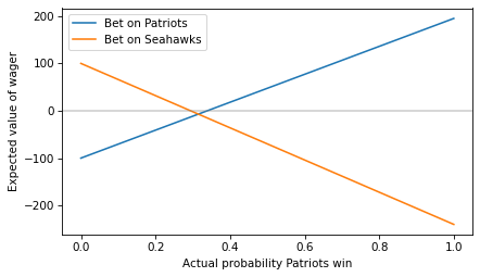
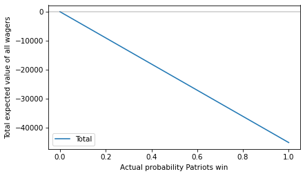
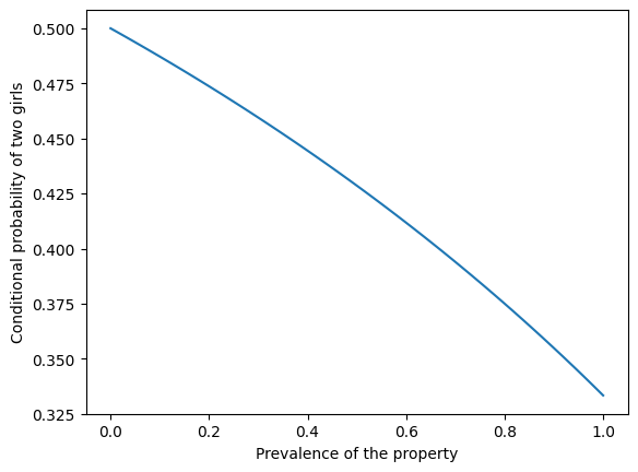
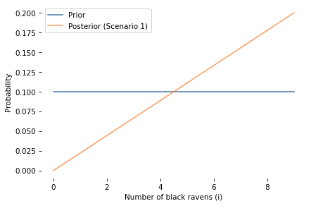
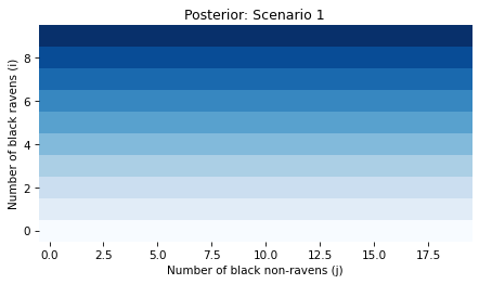
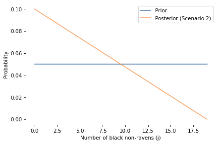
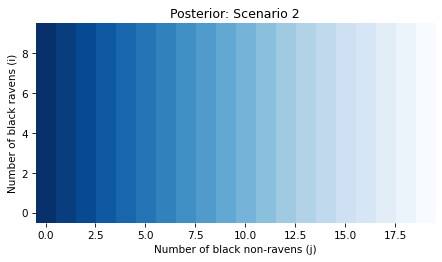
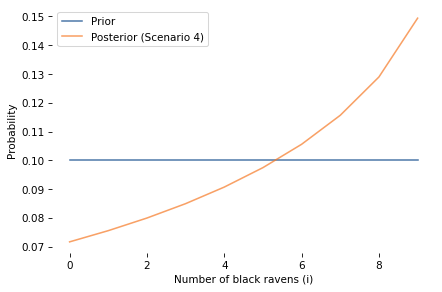
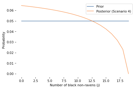
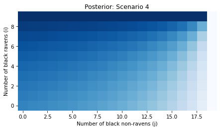
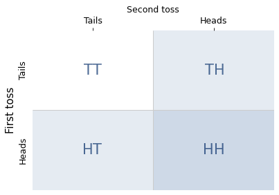
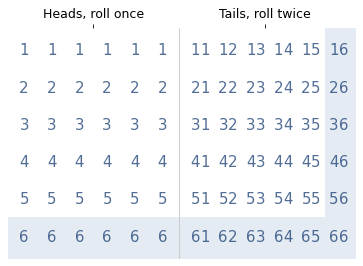
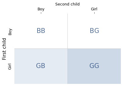
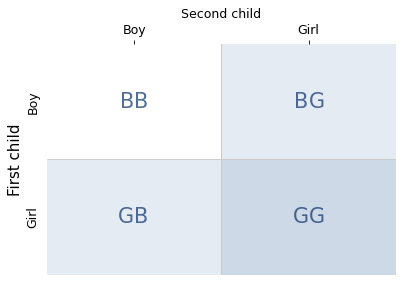
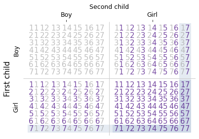
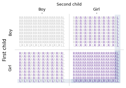
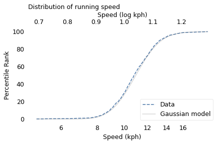
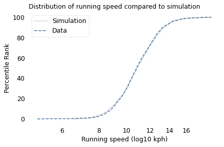
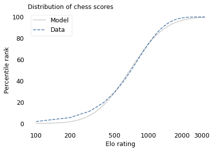
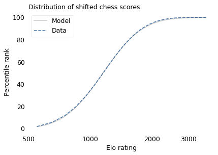
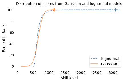
