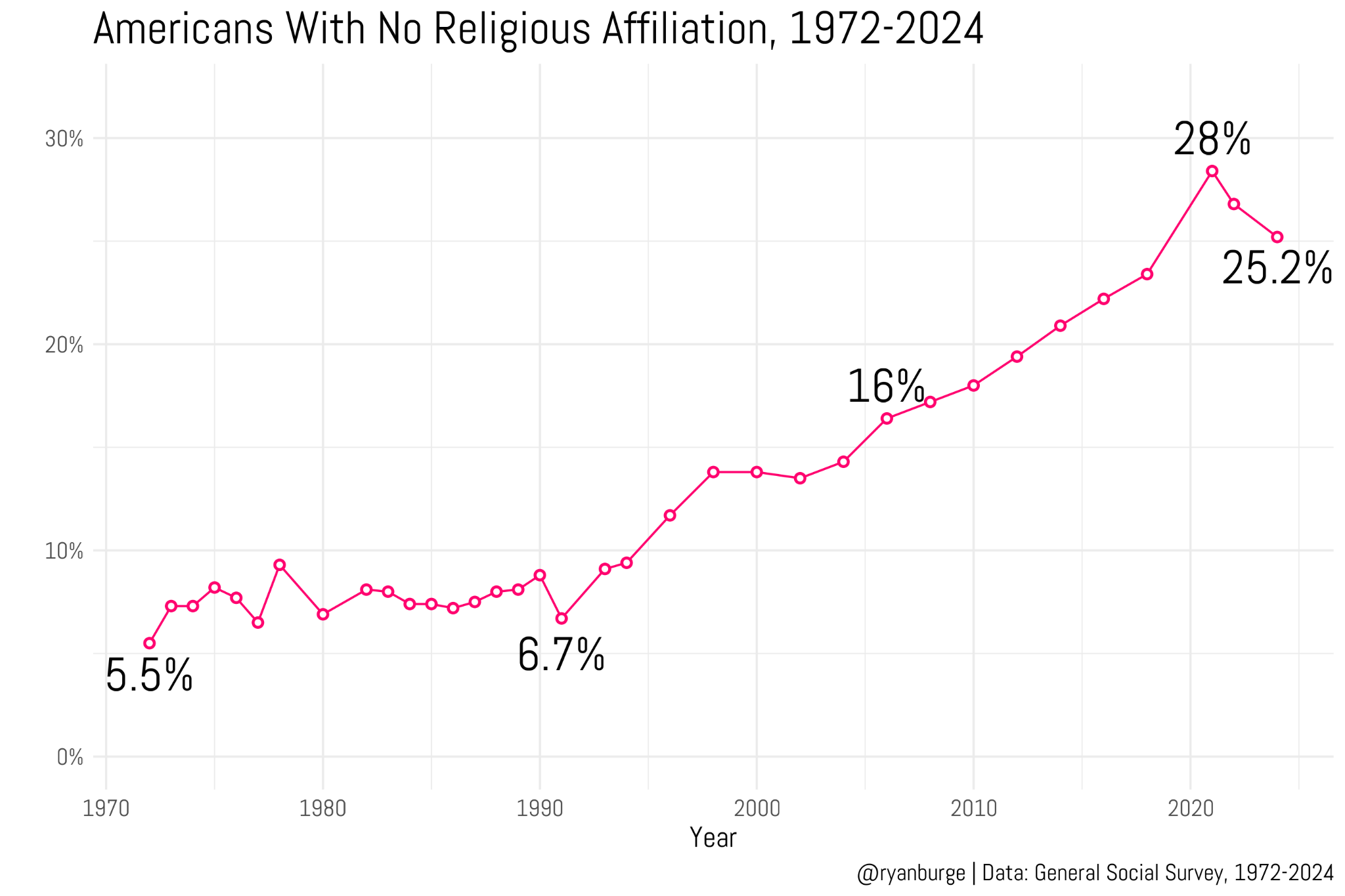
presents evidence that the Nones have hit a ceiling — that is, that the percentage of people in the U.S. with no religious affiliation, which has consistently increased for several decades, has either leveled off or started to reverse.
He reports on new data from the Cooperative Election Study and the 2024 General Social Survey, including this figure based on the GSS.
The observed percentage of Nones peaked in the 2021 survey and has dropped in the last two cycles. The CES data show a similar pattern, with a much larger sample size. So I’m not going to disagree with Ryan: it sure looks like the rise of the Nones has stalled or even reversed.
However, since I am developing a model that decomposes trends like this into cohort and period effects, we can use it to check whether the turnaround is a cohort or a period effect. It turns out to be both.
The Model
The model assumes that each cohort in each year has an unobserved (latent) propensity to report a religious affiliation or none.
The cohort and period effects are modeled as second-order Gaussian random walks, which means the model assumes these effects evolve smoothly over time, unless the data provide strong evidence otherwise. The amount of smoothing is estimated from the data.
An additional random year effect captures variation from one survey to the next that is not explained by long-term trends, like current events and topics of discussion.
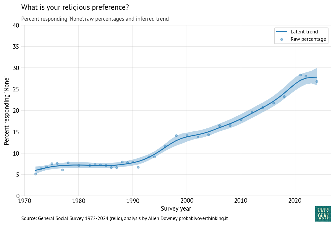
The “time only” version of the model estimates a latent propensity for each cycle of the survey, so the result is a smooth curve through the raw proportions.
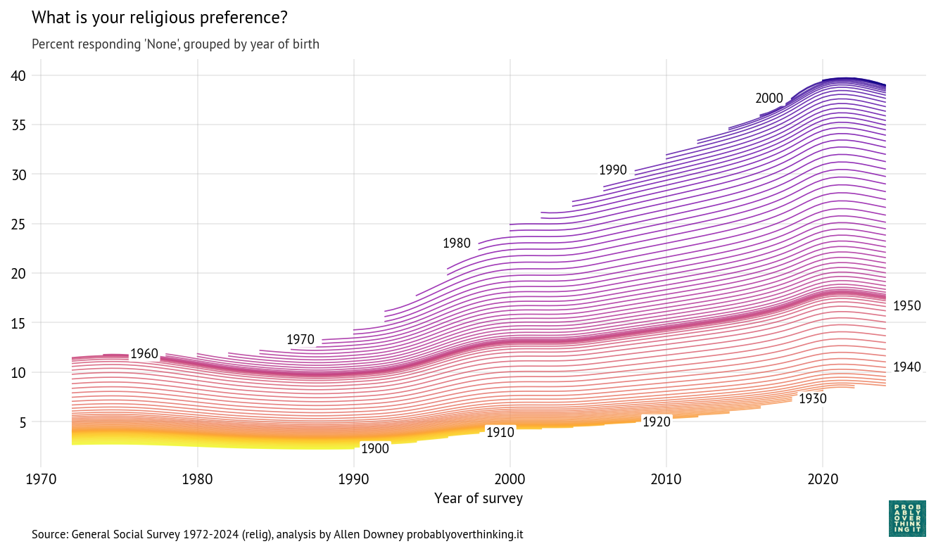
The “time-cohort” version estimates a latent propensity for each cohort during each cycle, so the result is a trajectory over time for each birth year.
Results
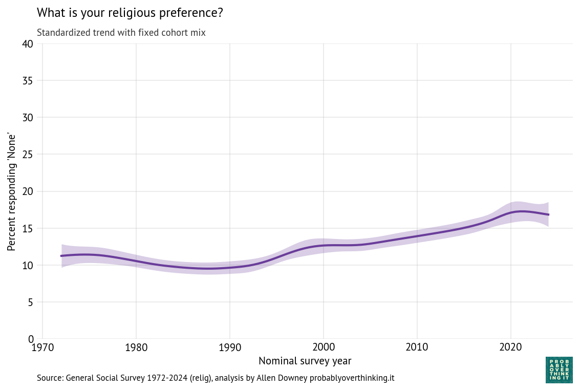
Here are the results for the time-only model, showing the posterior mean and a 94% credible interval.
Time-only model, percent with no religious preference
The posterior mean indicates that the trend in the latent factor has probably slowed; the credible interval indicates that it might have leveled off or reversed.
And here are the trajectories for each cohort:
Cohort trajectories, percent with no religious preference
Starting at the bottom, we can see that cohorts born between 1900 and 1930 were not very different — fewer than 10% of them were Nones.
People born in the 1940s were increasingly non-religious, but this first wave of secularization stalled in the cohorts born in the 1950s. The second wave got started with people born in the 1960s, and continued until the 2000s cohorts, where it seems to have stalled again.
Decomposition
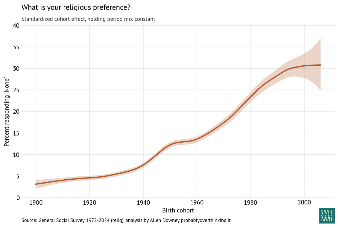
With these trajectories, we can decompose the cohort and period effects. The following figure shows the cohort effect, standardized by holding the period effect constant.
As we saw in the previous figure, there was a period of relatively fast change in the 1940s cohorts that stalled among people born in the 1950s and then resumed among people born in the 1960s through the 1980s (primarily Gen X).
Again, it looks like the most recent cohorts have leveled off, but with the width of the credible interval, it’s possible that the trend has continued or reversed.
The following figure shows the period effect, standardized by holding the cohort mix constant.
The period effect was generally increasing from 1990 to 2020, but seems to have leveled off or rolled over.
So, if the rise of the Nones has stalled, at least temporarily, it seems to be a combination of a cohort effect among people born after 2000 and a period effect starting around 2020. This decomposition suggests we should look for at least two kinds of explanations:
Differences in the childhood of people born after 2000 that might make them more likely to have a religious affiliation as young adults, and
Events since 2020 that have affected all cohorts in ways that might make them more religious.
I’ll hold off on speculating.
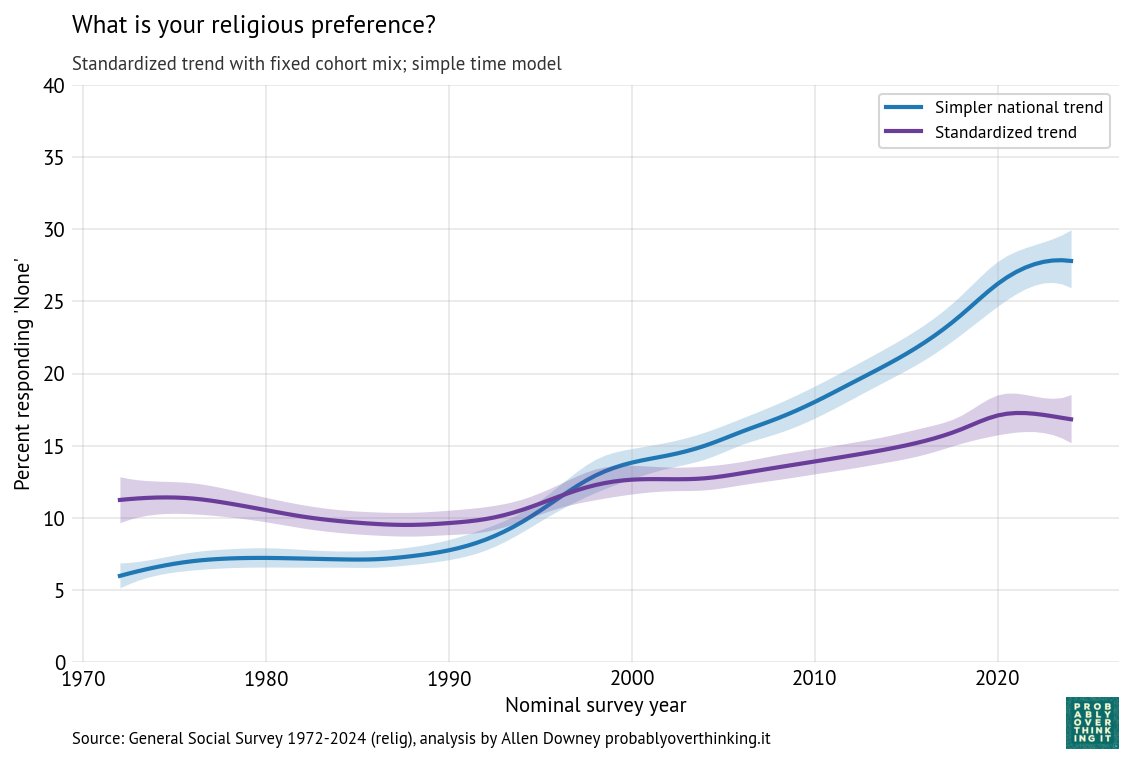
For purposes of comparison, here is the trend from the time-only model (blue) and the standardized time trend from the time-cohort model (purple).
The difference between these lines is the part of the change due to the cohort effect. So we can see that most of the change over this interval is due to generational replacement rather than disaffiliation.
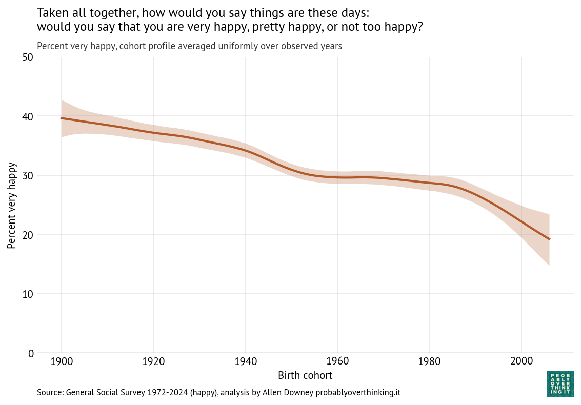
Since 1972, the General Social Survey has asked respondents: “Taken all together, how would you say things are these days—would you say that you are very happy, pretty happy, or not too happy?”
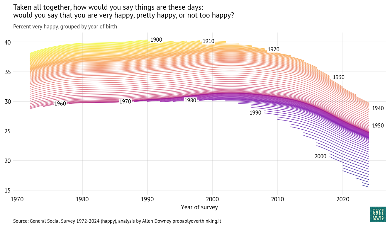
The following figure shows how the responses have changed over time and between birth cohorts. Each line represents one birth year.
People born in 1900 were 72 years old when the survey started; at that point, about 37% said they were very happy. In 1990, the last year they were eligible to participate, a little more than 40% said they were very happy. So it seems like they aged well—or possibly the less happy died earlier.
People born in 1910 were a little less happy when the survey started, but by the time they aged out, they also reached 40%. They were the last generation to reach that mark.
Among people born between 1920 and 1950, each cohort was a little less happy than the one before (or maybe less likely to say they were happy). In these cohorts, we can see a general trend over time: increasing until about 2000, leveling off, and declining after 2010.
The cohorts born in the 1960s and 1970s followed a similar trajectory, with only small differences from one birth year to the next.
And then the bottom fell out. Starting with people born in the 1980s (the earliest Millennials), each successive cohort was substantially less happy than the one before.
When people born in 1990 joined the survey in 2008 (at age 18), only 27% said they were very happy. In the most recent data, from 2024, the number had fallen to 22%.
When people born in 2000 entered in 2018, they set a new record low at 21%, which has now fallen to 18%.
And in the most recent cohort—born in 2006 and interviewed in 2024—only 16% said they were very happy.
These percentages are based on a statistical model that estimates the proportion of “very happy” responses in each group at each point in time. The details of the model and its assumptions are below.
The Time Trend
With an estimated proportion for each cohort and time step, we can compute separate contributions for changes over time and between cohorts.
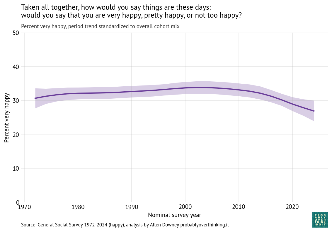
To characterize the contribution of time, we have to hold the cohort effect constant, which we can do by computing the distribution of birth years across the entire dataset and simulating a population where this distribution does not change over time. The following figure shows the result.
The overall level of happiness increased between 1972 and 2000, leveled off, and then declined after 2010.
Of course it is speculation to say why that happened, but we can think about large-scale economic and social patterns and how they line up with these trends.
Economically, 1980 to 2000 was a period of growth and relative stability. That changed after the end of the Dot-com bubble in 2001 and, more importantly, the Global Financial Crisis in 2008, which had broad and persistent effects on employment, wealth, and economic security.
Geopolitically, the 1970s through the 1990s were relatively quiet compared to what followed. The September 11 attacks in 2001, and the wars in Iraq (2003–2011) and Afghanistan (2001–2021) marked a shift toward a more uncertain and conflict-oriented global environment.
Participation in civic organizations and religious institutions declined over the past several decades. These institutions traditionally provided social support, shared identity, and regular face-to-face interaction. Social isolation is strongly associated with lower well-being.
At the same time, the media environment was transformed. The rise of 24-hour news increased exposure to negative and emotionally salient events, and after 2010 the spread of smartphones and social media made that exposure continuous and personalized.
Finally, measures of trust in institutions and other people have generally declined over this period, while political polarization has increased. These trends may reduce people’s sense of stability and shared purpose.
The COVID-19 pandemic likely contributed to the most recent decline, but the downward trend was already underway before 2020.
The Cohort Effect
Just as we isolated the time trend by simulating a survey with a fixed distribution of cohorts, we can isolate the cohort effect by simulating a survey with a fixed distribution of times. The following figure shows the result.
The cohort effect is larger and more consistent than the time trend: the difference between the happiest and least happy cohorts is more than 20 percentage points.
The decline was relatively slow for cohorts born between 1900 and 1950 and nearly zero for cohorts born in the 1950s, 1960s and 1970s (late Baby Boomers and Gen X). The steep decline begins with the Millennials and continues into Gen Z.
Possible explanations for the recent decline include:
Transformation of childhood: Jonathan Haidt has described childhood in recent cohorts as “overprotected in the real world and underprotected in the online world.” Increased parental monitoring, reduced independent play, and greater time spent online may affect the development of autonomy, risk tolerance, and social skills. If these early-life experiences shape long-term outlook, they could contribute to lower self-reported happiness.
Greater and earlier exposure to media: Younger cohorts were exposed to a media landscape characterized by continuous, personalized, and often negative content. Social media platforms amplify social comparison and negative content, while displacing in-person interaction. Increased awareness of global risks—including climate change—may contribute to a more pessimistic worldview.
Differential impact of economic conditions: Recent cohorts entered the labor market during periods of economic disruption, including the aftermath of the Global Financial Crisis and more recent pandemic-related shocks. These cohorts also face higher housing costs and greater student debt. Economic insecurity during the transition to adulthood may have lasting effects on well-being.
Extension of “liminal” adulthood: Young adults are taking longer to complete education, establish careers, form long-term partnerships, and have children. This extended unsettled period may be associated with lower life satisfaction.
Norms around self-reported well-being. Younger cohorts may also be less likely to say they are “very happy,” either because of changing norms around self-presentation or greater awareness of mental health.
It’s hard to say how much of the recent decline we can attribute to these causes. But the decline is steep, and seems to be ongoing.
How the Model Works
One of the challenges with this kind of survey data is that the sample size is small for each birth year in each iteration of the survey. If we plot raw percentages over time, the result is noisy.
In Probably Overthinking It, I addressed this problem by grouping respondents into decade-of-birth cohorts and smoothing the resulting time series. That approach works, but it has drawbacks: aggregation removes detail, introduces edge effects for the earliest and latest cohorts, and requires an arbitrary choice about the level of smoothing.
The new model takes a more principled approach. Instead of smoothing the observed data, it models an unobserved (latent) propensity to report being “very happy” for each cohort in each year.
We assume that the number of “very happy” responses in each group follows a binomial distribution, where the probability of a “very happy” response depends on this latent propensity. The observed responses provide noisy information about the latent factor; the model combines information across cohorts and years to estimate it.
The latent propensity is modeled as the sum of an intercept, representing the overall level of happiness, a smooth effect of birth cohort, a smooth effect of survey year, and a year-specific random effect that captures short-term fluctuations (overdispersion).
The cohort and period effects are modeled as second-order Gaussian random walks (RW2), which means the model assumes these effects evolve smoothly over time, with a preference for gradual changes in slope rather than abrupt jumps, unless the data provide strong evidence otherwise. The amount of smoothing is not fixed in advance; it is estimated from the data.
The random year effect captures variation from one survey to the next that is not explained by long-term trends, like current events and topics of discussion.
Where we have a lot of data, the estimates track the observed proportions closely. Where data are sparse, the model borrows strength from neighboring cohorts and years, providing principled smoothing and interpolation without arbitrary grouping.
At PyData Global 2025 I presented a workshop on Bayesian Decision Analysis with PyMC. The video is available now.
This workshop is based on the first session of the Applied Bayesian Modeling Workshop I teach along with my colleagues at PyMC Labs. If you would like to learn more, it is not too late to sign up for the next offering, starting Monday January 12.
Here’s the abstract and description of the workshop.
Bayesian Decision Analysis with PyMC: Beyond A/B Testing
This hands-on tutorial introduces practical Bayesian inference using PyMC, focusing on A/B testing, decision-making under uncertainty, and hierarchical modeling. With real-world examples, you’ll learn how to build and interpret Bayesian models, evaluate competing hypotheses, and implement adaptive strategies like Thompson sampling. Whether you’re working in marketing, healthcare, public policy, UX design, or data science more broadly, these techniques offer powerful tools for experimentation, decision-making, and evidence-based analysis.
Description
Bayesian methods offer a natural and interpretable framework for updating beliefs with data, and PyMC makes it easy to apply these techniques in practice. In this tutorial, we’ll walk through a series of examples that demonstrate the core concepts:
Bayesian A/B Testing with the Beta-Binomial Model
Represent prior beliefs with the beta distribution
Use binomial likelihoods to model observed outcomes
Understand posterior distributions and credible intervals
Bayesian Bandits and Thompson Sampling
Go beyond hypothesis testing: estimate the probability of one version outperforming another
Use Thompson sampling to guide decision-making
Simulate and visualize an adaptive email campaign
Hierarchical Models for Partial Pooling and Prediction
Learn how to share information across variants
Use posterior predictive distributions to quantify uncertainty
Understand second-order probabilities
Hands-On Learning
Participants will follow along in Jupyter notebooks (hosted on Colab — no installation required). Exercises are embedded throughout, with guided solutions. Code is based on PyMC, ArviZ, and standard scientific Python libraries.
Prerequisites
Intermediate Python: basic familiarity with NumPy, plotting, and Jupyter notebooks
No prior experience with Bayesian statistics or PyMC is assumed
All materials run on Colab (no setup required)
SAT math scores: gender difference or selection bias?
And as always, you can read Think Bayes in hard copy or free online.
Abstract
Why do male test takers consistently score about 30 points higher than female test takers on the mathematics section of the SAT? Does this reflect an actual difference in math ability, or is it an artifact of selection bias—if young men with low math ability are less likely to take the test than young women with the same ability?
This talk presents a Bayesian model that estimates how much of the observed difference can be explained by selection effects. We’ll walk through a complete Bayesian workflow, including prior elicitation with PreliZ, model building in PyMC, and validation with ArviZ, showing how Bayesian methods disentangle latent traits from observed outcomes and separate the signal from the noise.
Selection bias is the hardest problem in statistics because it’s almost unavoidable in practice, and once the data have been collected, it’s usually not possible to quantify the effect of selection or recover an unbiased estimate of what you are trying to measure.
And because the effect is systematic, not random, it doesn’t help to collect more data. In fact, larger sample sizes make the problem worse, because they give the false impression of precision.
But sometimes, if we are willing to make assumptions about the data generating process, we can use Bayesian methods to infer the effect of selection bias and produce an unbiased estimate.
As an example, let’s solve an exercise from Chapter 7 of Think Bayes. It’s based on a fictional anecdote about the mathematician Henri Poincaré:
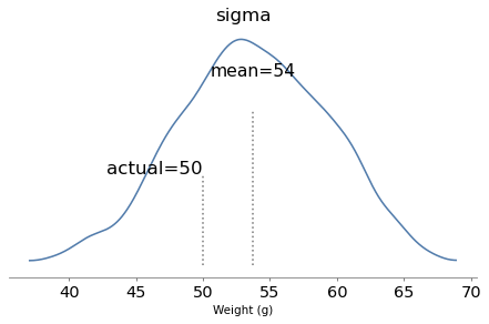
Supposedly Poincaré suspected that his local bakery was selling loaves of bread that were lighter than the advertised weight of 1 kg, so every day for a year he bought a loaf of bread, brought it home and weighed it. At the end of the year, he plotted the distribution of his measurements and showed that it fit a normal distribution with mean 950 g and standard deviation 50 g. He brought this evidence to the bread police, who gave the baker a warning.
For the next year, Poincaré continued to weigh his bread every day. At the end of the year, he found that the average weight was 1000 g, just as it should be, but again he complained to the bread police, and this time they fined the baker.
Why? Because the shape of the new distribution was asymmetric. Unlike the normal distribution, it was skewed to the right, which is consistent with the hypothesis that the baker was still making 950 g loaves, but deliberately giving Poincaré the heavier ones.
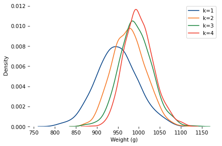
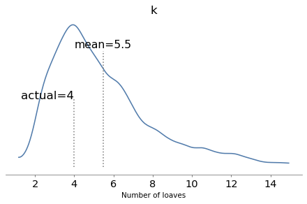
To see whether this anecdote is plausible, let’s suppose that when the baker sees Poincaré coming, he hefts k loaves of bread and gives Poincaré the heaviest one. How many loaves would the baker have to heft to make the average of the maximum 1000 g?
How Many Loaves?
Here are distributions with the same underlying normal distribution and different values of k.
mu_true, sigma_true = 950, 50
As k increases, the mean increases and the standard deviation decreases.
When k=4, the mean is close to 1000. So let’s assume the baker hefted four loaves and gave the heaviest to Poincaré.
At the end of one year, can we tell the difference between the following possibilities?
Innocent: The baker actually increased the mean to 1000, and k=1.
Shenanigans: The mean was still 950, but the baker selected with k=4.
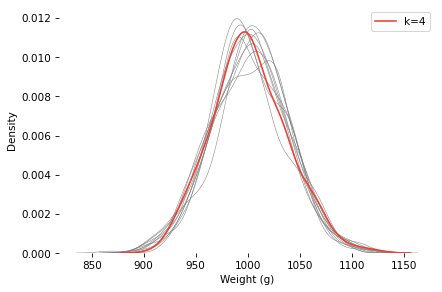
Here’s a sample under the k=4 scenario, compared to 10 samples with the same mean and standard deviation, and k=1.
The k=4 distribution falls mostly within the range of variation we’d expect from the k=1 distribution (with the same mean and standard deviation). If you were on the jury and saw this evidence, would you convict the baker?
Ask a Bayesian
As a Bayesian approach to this problem, let’s see if we can use this data to estimate k and the parameters of the underlying distribution. Here’s a PyMC model that
Defines prior distributions for mu, sigma, and k, and
Uses a custom distribution that computes the likelihood of the data for a hypothetical set of parameters (see the notebook for details).
def make_model(sample):
    with pm.Model() as model:
        mu = pm.Normal("mu", mu=950, sigma=30)
        sigma = pm.HalfNormal("sigma", sigma=30)
        k = pm.Uniform("k", lower=0.5, upper=15)

        obs = pm.CustomDist(
            "obs",
            mu, sigma, k,
            logp=max_normal_logp,
            observed=sample,
        )
    return model
Notice that we treat k as continuous. That’s because continuous parameters are much easier to sample (and the log PDF function allows non-integer values of k). But it also make sense in the context of the problem – for example, if the baker sometimes hefts three loaves and sometimes four, we can approximate the distribution of the maximum with k=3.5.
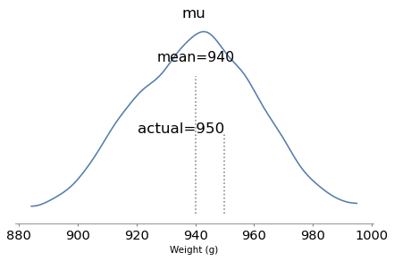
The model runs quickly and the diagnostics look good. Here are the posterior distributions of the parameters compared to their known values.
With one year of data, we can recover the parameters pretty well. The true values fall comfortably inside the posterior distributions, and the posterior mode of k is close to the true value, 4.
But the posterior distributions are still quite wide. There is even some possibility that the baker is innocent, although it is small.
Conclusion
This example shows that we can use the shape of an observed distribution to estimate the effect of selection bias and recover the unbiased latent distribution. But we might need a lot of data, and the inference depends on strong assumptions about the data generating process.
Credits: I don’t remember where I got this example from (maybe here?), but it appears in Leonard Mlodinov, The Drunkard’s Walk (2008). Mlodinov credits Bart Holland, What Are the Chances? (2002). The ultimate source seems to be George Gamow and Marvin Stern, Puzzle Math (1958) – but their version is about a German professor, not Poincaré.
You can order print and ebook versions of Think Bayes 2e from Bookshop.org and Amazon.
I’m not sure who scheduled ODSC and PyConUS during the same week, but I am unhappy with their decisions. Last Tuesday I presented a talk and co-presented a workshop at ODSC, and on Thursday I presented a tutorial at PyCon.
If you would like to follow along with my very busy week, here are the resources:
In this tutorial, we explore Bayesian regression using PyMC – the primary library for Bayesian sampling in Python – focusing on survey data and other datasets with categorical outcomes. Starting with logistic regression, we’ll build up to categorical and ordered logistic regression, showcasing how Bayesian approaches provide versatile tools for developing and evaluating complex models. Participants will leave with practical skills for implementing Bayesian regression models in PyMC, along with a deeper appreciation for the power of Bayesian inference in real-world data analysis. Participants should be familiar with Python, the SciPy ecosystem, and basic statistics, but no experience with Bayesian methods is required.
Mastering Time Series Analysis with StatsModels: From Decomposition to ARIMA
Time series analysis provides essential tools for modeling and predicting time-dependent data, especially data exhibiting seasonal patterns or serial correlation. This tutorial covers tools in the StatsModels library including seasonal decomposition and ARIMA. As examples, we’ll look at weather data and electricity generation from renewable sources in the United States since 2004 — but the methods we’ll cover apply to many kinds of real-world time series data. Outline Introduction to time series Overview of the data Seasonal decomposition, additive model Seasonal decomposition, multiplicative model Serial correlation and autoregression ARIMA Seasonal ARIMA
On Wednesday I flew to Pittsburgh, and on Thursday I presented…
Analyzing Survey Data with Pandas and StatsModels
PyConUS 2025 tutorial
Whether you are working with customer data or tracking election polls, Pandas and StatsModels provide powerful tools for getting insights from survey data. In this tutorial, we’ll start with the basics and work up to age-period-cohort analysis and logistic regression. As examples, we’ll use data from the General Social Survey to see how political beliefs have changed over the last 50 years in the United States. We’ll follow the essential steps of a data science project, from loading and validating data, exploring and visualizing, modeling and predicting, and communicating results.
In the first edition of Think Bayes, I presented what I called the Geiger counter problem, which is based on an example in Jaynes, Probability Theory. But I was not satisfied with my solution or the way I explained it, so I cut it from the second edition.
I am re-reading Jaynes now, following the excellent series of videos by Aubrey Clayton, and this problem came back to haunt me. On my second attempt, I have a solution that is much clearer, and I think I can explain it better.
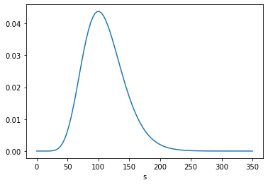
We have a radioactive source … which is emitting particles of some sort … There is a rate p, in particles per second, at which a radioactive nucleus sends particles through our counter; and each particle passing through produces counts at the rate θ. From measuring the number {c1 , c2 , …} of counts in different seconds, what can we say about the numbers {n1 , n2 , …} actually passing through the counter in each second, and what can we say about the strength of the source?
As a model of the source, Jaynes suggests we imagine “N nuclei, each of which has independently the probability r of sending a particle through our counter in any one second”. If N is large and r is small, the number of particles emitted in a given second is well modeled by a Poisson distribution with parameter s=Nr, where s is the strength of the source.
As a model of the sensor, we’ll assume that “each particle passing through the counter has independently the probability ϕ of making a count”. So if we know the actual number of particles, n, and the efficiency of the sensor, ϕ, the distribution of the count is Binomial(n,ϕ).
With that, we are ready to solve the problem. Following Jaynes, I’ll start with a uniform prior for s, over a range of values wide enough to cover the region where the likelihood of the data is non-negligible. To represent distributions, I’ll use the Pmf class from empiricaldist.
ss = np.linspace(0, 350, 101)
prior_s = Pmf(1, ss)
For each value of s, the distribution of n is Poisson, so we can form the joint prior of s and n using the poisson function from SciPy. The following function creates a Pandas DataFrame that represents the joint prior.
The result is a DataFrame with one row for each value of n and one column for each value of s.
To update the prior, we need to compute the likelihood of the data for each pair of parameters. However, in this problem the likelihood of a given count depends only on n, regardless of s, so we only have to compute it once for each value of n. Then we multiply each column in the prior by this array of likelihoods. The following function encapsulates this computation, normalizes the result, and returns the posterior distribution.
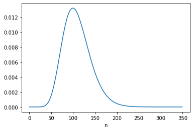
The following figures show the posterior marginal distributions of s and n.
posterior_s = marginal(posterior, 0)
posterior_n = marginal(posterior, 1)
The posterior mean of n is close to 109, which is consistent with Equation 6.116. The MAP is 99, which is one less than the analytic result in Equation 6.113, which is 100. It looks like the posterior probabilities for 99 and 100 are the same, but the floating-point results differ slightly.
Jeffreys prior
Instead of a uniform prior for s, we can use a Jeffreys prior, in which the prior probability for each value of s is proportional to 1/s. This has the advantage of “invariance under certain changes of parameters”, which is “the only correct way to express complete ignorance of a scale parameter.” However, Jaynes suggests that it is not clear “whether s can properly be regarded as a scale parameter in this problem.” Nevertheless, he suggests we try it and see what happens. Here’s the Jeffreys prior for s.
prior_jeff = Pmf(1/ss[1:], ss[1:])
We can use it to compute the joint prior of s and n, and update it with c1.
The posterior mean is close to 100 and the MAP is 91; both are consistent with the results in Equation 6.122.
Robot A
Now we get to what I think is the most interesting part of this example, which is to take into account a second observation under two models of the scenario:
Two robots, [A and B], have different prior information about the source of the particles. The source is hidden in another room which A and B are not allowed to enter. A has no knowledge at all about the source of particles; for all [it] knows, … the other room might be full of little [people] who run back and forth, holding first one radioactive source, then another, up to the exit window. B has one additional qualitative fact: [it] knows that the source is a radioactive sample of long lifetime, in a fixed position.
In other words, B has reason to believe that the source strength s is constant from one interval to the next, while A admits the possibility that s is different for each interval. The following figure, from Jaynes, represents these models graphically.
For A, the “different intervals are logically independent”, so the update with c2 = 16 starts with the same prior.
c2 = 16
posterior2 = update(joint, phi, c2)
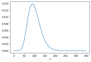
Here’s the posterior marginal distribution of n2.
The posterior mean is close to 169, which is consistent with the result in Equation 6.124. The MAP is 160, which is consistent with Equation 6.123.
Robot B
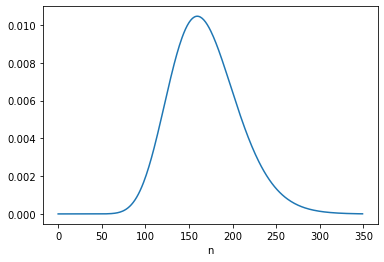
For B, the “logical situation” is different. If we consider s to be constant, we can – and should! – take the information from the first update into account when we perform the second update. We can do that by using the posterior distribution of s from the first update to form the joint prior for the second update, like this:
The posterior mean of n is close to 137.5, which is consistent with Equation 6.134. The MAP is 132, which is one less than the analytic result, 133. But again, there are two values with the same probability except for floating-point errors.
Under B’s model, the data from the first interval updates our belief about s, which influences what we believe about n2.
Going the other way
That might not seem surprising, but there is an additional point Jaynes makes with this example, which is that it also works the other way around: Having seen c2, we have more information about s, which means we can – and should! – go back and reconsider what we concluded about n1.
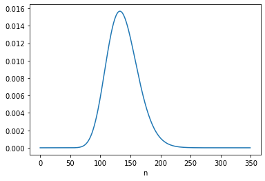
We can do that by imagining we did the experiments in the opposite order, so
We’ll start again with a joint prior based on a uniform distribution for s
Update it based on c2,
Use the posterior distribution of s to form a new joint prior,
The posterior mean is close to 131.5, which is consistent with Equation 6.133. And the MAP is 126, which is one less than the result in Equation 6.132, again due to floating-point error.
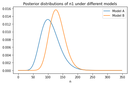
Here’s what the new distribution of n1 looks like compared to the original, which was based on c1 only.
With the additional information from c2:
We give higher probability to large values of s, so we also give higher probability to large values of n1, and
The width of the distribution is narrower, which shows that with more information about s, we have more information about n1.
Discussion
This is one of several examples Jaynes uses to distinguish between “logical and causal dependence.” In this example, causal dependence only goes in the forward direction: “s is the physical cause which partially determines n; and then n in turn is the physical cause which partially determines c”.
Therefore, c1 and c2 are causally independent: if the number of particles counted in one interval is unusually high (or low), that does not cause the number of particles during any other interval to be higher or lower.
But if s is unknown, they are not logically independent. For example, if c1 is lower than expected, that implies that lower values of s are more likely, which implies that lower values of n2 are more likely, which implies that lower values of c2 are more likely.
And, as we’ve seen, it works the other way, too. For example, if c2 is higher than expected, that implies that higher values of s, n1, and c1 are more likely.
If you find the second result more surprising – that is, if you think it’s weird that c2 changes what we believe about n1 – that implies that you are not (yet) distinguishing between logical and causal dependence.
I am not the first person to observe that it sometimes takes several tries to plug in a USB connector (specifically the rectangular Type A connector, which is not reversible). There are memes about it, there are cartoons about it, and on sites like Quora, peoplehaveaskedaboutit more than a few times.
But I might be the first to use Bayesian decision analysis to figure out the optimal strategy for plugging in a USB connector. Specifically, I have worked out how long you should try on the first side before flipping, how long you should try on the second side before flipping again, how long you should try on the third side, and so on.
I added a lot of new examples and exercises, most from classes I taught using the first edition.
I rewrote all of the code using NumPy, SciPy, and Pandas (rather than basic Python types). The new code is shorter, clearer, and faster!
For every chapter, there’s a Jupyter notebook where you can read the text, run the code, and work on exercises. You can run the notebooks on your own computer or, if you don’t want to install anything, you can run them on Colab.
More generally, the second edition reflects everything I’ve learned in the 10 years since I started the first edition, and it benefits from the comments, suggestions, and corrections I’ve received from readers. I think it’s really good!
Abstract: The unusual circumstances of Curtis Flowers’ trials make it possible to estimate the probabilities that white and black jurors would vote to convict him, 98% and 68% respectively, and the probability a jury of his peers would find him guilty, 15%.
Background
Curtis Flowers was tried six times for the same crime. Four trials ended in conviction; two ended in a mistrial due to a hung jury.
Three of the convictions were invalidated by the Mississippi Supreme Court, at least in part because the prosecution had excluded black jurors, depriving Flowers of the right to trial by a jury composed of a “fair cross-section of the community“.
Because of the unusual circumstances of these trials, we can perform a statistical analysis that is normally impossible: we can estimate the probability that black and white jurors would vote to convict, and use those estimates to compute the probability that he would be convicted by a jury that represents the racial makeup of Montgomery County.
Results
According to my analysis, the probability that a white juror in this pool would vote to convict Flowers, given the evidence at trial, is 98%. The same probability for black jurors is 68%. So this difference is substantial.
The probability that Flowers would be convicted by a fair jury is only 15%, and the probability that he would be convicted four times out of six times is less than 1%.
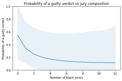
The following figure shows the probability of a guilty verdict as a function of the number of black jurors:
According to the model, the probability of a guilty verdict is 55% with an all-white jury. If the jury includes 5-6 black jurors, which would be representative of Montgomery County, the probability of conviction would be only 14-15%.
The shaded area represents a 90% credible interval. It is quite wide, reflecting uncertainty due to limits of the data. Also, the model is based on the simplifying assumptions that
All six juries saw essentially the same evidence,
The probabilities we’re estimating did not change substantially over the period of the trials,
Interactions between jurors had negligible effects on their votes,
If any juror refuses to convict, the result is a hung jury.