Browsed by
Tag: inspection paradox

COVID-19 and the Inspection Paradox

COVID-19 and the Inspection Paradox

The inspection paradox (aka length-biased sampling) is one of my favorite topics, and it turns out to be useful in the fight against COVID-19.

During the pandemic, you have probably heard about about the effective reproduction number, R, which is the average number of people infected by each infected person. R is important because it determines the large-scale course of the epidemic. As long as R is greater than 1, the number of cases will grow exponentially; if we find ways to drive R below 1, the number of cases will dwindle toward zero.

However, R is an average, and the average is not the whole story. With COVID-19, like many other epidemics, there is a lot of variation around the average.

According to a news feature in Nature, “One study in Hong Kong found that 19% of cases of COVID-19 were responsible for 80% of transmission, and 69% of cases didn’t transmit the virus to anyone.” In other words, most infections are caused by a small number of superspreaders.

This observation suggests a strategy for contact tracing. When an infected patient is discovered, it is common practice to identify people they have been in contact with who might also be infected. “Forward tracing” is intended to find people the patient might have infected; “backward tracing” is intended to find the person who infected the patient.

Now suppose you are a public health officer trying to slow or stop the spread of a communicable disease. Assuming that you have limited resources to trace contacts and test for the disease — and that’s a pretty good assumption — which do you think would be more effective, forward or backward tracing?

The inspection paradox suggests that backward tracing is more likely to discover a superspreader and the people they have infected.

According to the Nature article, “[Backward tracing] is extremely effective for the coronavirus because of its propensity to be passed on in superspreading events […] Any new case is more likely to have emerged from a cluster of infections than from one individual, so there’s value in going backwards to find out who else was linked to that cluster.”

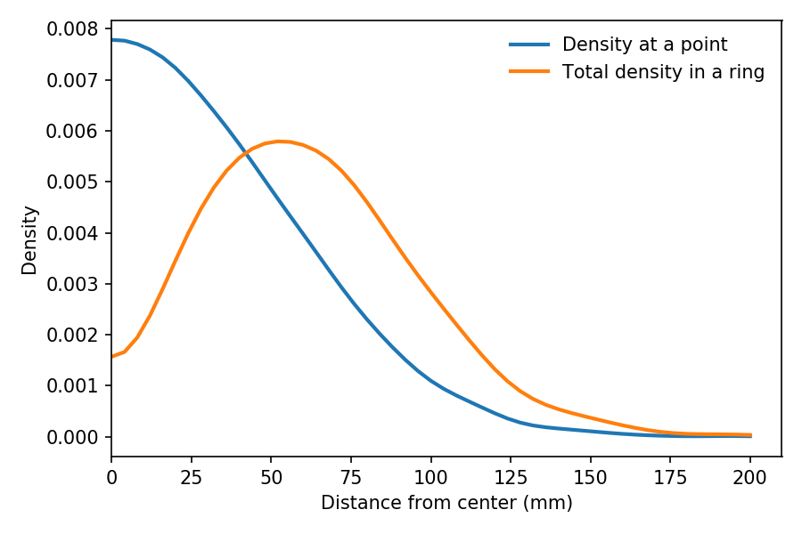
To quantify this effect, let’s suppose that 70% of infected people don’t infect anyone else, as in the Hong Kong study, and the other 30% infect between 1 and 15 other people, uniformly distributed. The average of this distribution is 2.4, which is a plausible value of R.

Now suppose we discover an infected patient, trace forward, and find someone the patient infected. On average, we expect this person to infect 2.4 other people.

But if we trace backward and find the person who infected the patient, we are more likely to find someone who has infected a lot of people, and less likely to find someone who has only infected a few. In fact, the probability that we find any particular spreader is proportional to the number of people they have infected.

By simulating this sampling process, we can compute the distribution we would see by backward tracing. The average of this biased distribution is 10.1, more than four times the average of the unbiased distribution. This result suggests that backward tracing can discover four times more cases than forward tracing, given the same resources.

This example is not just theoretical; Japan adopted this strategy in February 2020. As Michael Lewis describes in The Premonition:

“When the Japanese health authorities found a new case, they did not waste their energy asking the infected person for a list of contacts over the previous few days, to determine whom the person might have infected in turn. […] Instead, they asked for a list of people with whom the infected person had interacted with further back in time. Find the person who had infected the newly infected person and you might have found a superspreader. Find a superspreader and you could track down the next superspreader before [they] really got going.”

So the inspection paradox is not always a nuisance; sometimes we can use it to our advantage.

This article is an excerpt from a new book I am working on, Probably Overthinking It: The puzzles and paradoxes of probability.

The Dartboard Paradox

The Dartboard Paradox

On November 5, 2019, I will be at PyData NYC to give a talk called The Inspection Paradox is Everywhere [UPDATE: The video from the talk is here]. Here’s the abstract:

The inspection paradox is a statistical illusion you’ve probably never heard of. It’s a common source of confusion, an occasional cause of error, and an opportunity for clever experimental design. And once you know about it, you see it everywhere.

The examples in the talk include social networks, transportation, education, incarceration, and more. And now I am happy to report that I’ve stumbled on yet another example, courtesy of John D. Cook.

In a blog post from 2011, John wrote about the following counter-intuitive truth:

For a multivariate normal distribution in high dimensions, nearly all the probability mass is concentrated in a thin shell some distance away from the origin.

John does a nice job of explaining this result, so you should read his article, too. But I’ll try to explain it another way, using a dartboard.

If you are not familiar with the layout of a “clock” dartboard, it looks like this:

File:Dartboard diagram.svg

I got the measurements of the board from the British Darts Organization rules, and drew the following figure with dimensions in mm:

Now, suppose I throw 100 darts at the board, aiming for the center each time, and plot the location of each dart. It might look like this:

Suppose we analyze the results and conclude that my errors in the x and y directions are independent and distributed normally with mean 0 and standard deviation 50 mm.

Assuming that model is correct, then, which do you think is more likely on my next throw, hitting the 25 ring (the innermost red circle), or the triple ring (the middlest red circle)?

It might be tempting to say that the 25 ring is more likely, because the probability density is highest at the center of the board and lower at the triple ring.

We can see that by generating a large sample, generating a 2-D kernel density estimate (KDE), and plotting the result as a contour.

In the contour plot, darker color indicates higher probability density. So it sure looks like the inner ring is more likely than the outer rings.

But that’s not right, because we have not taken into account the area of the rings. The total probability mass in each ring is the product of density and area (or more precisely, the density integrated over the area).

The 25 ring is more dense, but smaller; the triple ring is less dense, but bigger. So which one wins?

In this example, I cooked the numbers so the triple ring wins: the chance of hitting triple ring is about 6%; the chance of hitting the double ring is about 4%.

If I were a better dart player, my standard deviation would be smaller and the 25 ring would be more likely. And if I were even worse, the double ring (the outermost red ring) might be the most likely.

Inspection Paradox?

It might not be obvious that this is an example of the inspection paradox, but you can think of it that way. The defining characteristic of the inspection paradox is length-biased sampling, which means that each member of a population is sampled in proportion to its size, duration, or similar quantity.

In the dartboard example, as we move away from the center, the area of each ring increases in proportion to its radius (at least approximately). So the probability mass of a ring at radius r is proportional to the density at r, weighted by r.

We can see the effect of this weighting in the following figure:

The blue line shows estimated density as a function of r, based on a sample of throws. As expected, it is highest at the center, and drops away like one half of a bell curve.

The orange line shows the estimated density of the same sample weighted by r, which is proportional to the probability of hitting a ring at radius r.

It peaks at about 60 mm. And the total density in the triple ring, which is near 100 mm, is a little higher than in the 25 ring, near 10 mm.

If I get a chance, I will add the dartboard problem to my talk as yet another example of length-biased sampling, also known as the inspection paradox.

You can see my code for this example in this Jupyter notebook.

UPDATE November 6, 2019: This “thin shell” effect has practical consequences. This excerpt from The End of Average talks about designing the cockpit of a plan for the “average” pilot, and discovering that there are no pilots near the average in 10 dimensions.