An Agentic Data Science Story
For a recent collaboration with AIBM, I found myself working with data from the National Survey of Family Growth (NSFG), which I used in several examples in Think Stats. I was reminded of the technical debt I have accumulated while working with this data, and the dread I feel getting back to it. So I decided to make it a case study in agentic data science.
I asked Claude Code to take inventory of the repository, reorganize it, and rebuild the analysis pipeline. Then I asked it to generate a blog post about the process, which is what follows, with my revisions.
The project
Since 2015 I have kept a repository that does one thing: take the National Survey of Family Growth — a large, repeated, nationally representative survey run by the National Center for Health Statistics — and harmonize it across survey cycles so that marriage patterns can be compared over time.
That is more work than it sounds, and it is worth being specific about why, because the difficulty is not where you would expect.
The obvious problem is that the variables move around. A variable that exists in one cycle may be absent from the next, renamed in the one after, or recoded onto a different scale without changing its name. That is tedious but tractable.
The less obvious problem is that the file format and the metadata format both change across cycles, and not in step with each other. Across ten cycles there are two data formats and three ways of describing them:
| cycles | data | metadata | how the code reads it |
|---|---|---|---|
| 1982, 1988, 1995 | fixed-width text | SAS setup file (.sas) | column positions hardcoded by hand |
| 2002–2019 | fixed-width text | Stata dictionary (.dct) | dictionary parsed at run time |
| 2022–2023 | SAS binary (.sas7bdat) | embedded in the file | pyreadstat |
The early cycles are the awkward ones. NCHS distributes a SAS setup file — a program, not a data structure, full of PROC FORMAT blocks — and the repository does not read it. Someone [Allen], years ago, opened that file and transcribed the column positions into a Python list by hand:
colspecs = [
    (976 - 1, 982),
    (1001 - 1, 1002),
    (1268 - 1, 1271),
    ...
]
The - 1 on each start position converts from the one-based columns the SAS file uses to the zero-based ones pandas wants. There are dozens of these, and nothing checks them against the setup file they came from.
Then there are the one-off quirks. The 1988 respondent file, as published, contains no line breaks at all — it is a single unbroken run of 30,022,850 bytes, which is 8,450 records of 3,553 characters each. Reading it requires splitting it into records first. And in the 2022–2023 file every variable name is uppercase except one, agebaby1, which is lowercase for no reason anyone has recorded.
The repository grew one cycle at a time. Each new release meant a new loading function — ReadFemResp2002, ReadFemResp2010, and so on — that knew the quirks of that cycle and mapped them onto a common set of columns. Ten cycles for women, seven for men: seventeen loading functions, each a small archive of things learned the hard way.
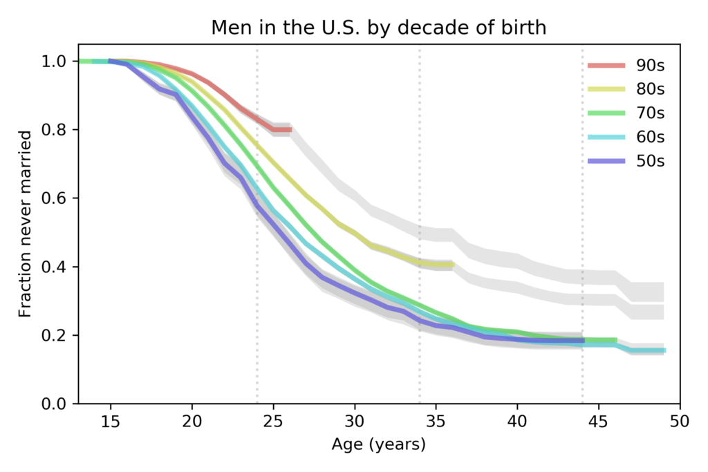
The output is a survival analysis. For each decade-of-birth cohort, it estimates the fraction who have ever married, as a function of age. Those curves are the reason the project exists, and they show something clear:

Each successive cohort marries later than the one before, and the more recent cohorts look likely to end up with a larger share never marrying at all. That figure, and its male counterpart, appeared in a post in December 2024.
How it accumulated
Eighty-five commits over eleven years, in bursts: seventeen in 2015, then a handful a year, then a flurry whenever a new cycle landed. Between bursts the repository sat untouched for months at a time.
This is how a lot of real analysis code lives, and it is worth being honest about what it looked like after a decade:
- About 150 files in a single directory. Raw survey data, derived data, 49 loose figures, notebooks, and the source of a 2015-era statistics library pasted into the repo rather than installed, all side by side.
git statusreported 78 untracked files and 13 modified ones. At that point the tool stops being useful: a real change is invisible in the noise.- Seventeen months of uncommitted work, including a 1.8 MB notebook that produced eleven published figures and had never been committed at all.
- Two parallel codebases. A modern one using
lifelinesandempiricaldist, and a legacy one using the pasted-in library — joined at exactly one function call, which kept 116 KB of 2015 code loaded on every run. - Data committed to version control. Several hundred megabytes of survey microdata in git-LFS — which NSFG’s data user agreement does not permit redistributing.
None of this was the result of carelessness [Thanks, Claude, but that is far too generous]. Each piece was a reasonable local decision: commit the data so the analysis is reproducible; keep a private copy of the library so it does not break; add a loader for the new cycle in the same style as the last one. The problems are emergent. No single commit introduced them.
The audit
I recently worked through the repository with Claude, with a simple standing rule: any change that was supposed to be behavior-preserving had to prove it. Before and after every structural change, the pipeline was re-run and the output compared. That rule turned out to matter more than any of the cleanup.
A one-year error in the headline variable
From cycle 10 (2015–2017) onward, the NSFG public-use files stopped publishing century-month dates of birth and marriage. What they publish instead is the year of first marriage and the integer age at interview. The loading code reconstructed the missing century months by taking midpoints:
cmbirth  = cmintvw - ager * 12 + 6      # female respondent file
cmmarrhx = (mardat01 - 1900) * 12 + 6
The marriage line is right. mardat01 is a year with no month, so mid-year is the best guess, and + 6 moves the date six months later within that year.
The birth line is not, and the sign is easy to misread, so it is worth stepping through in units of age rather than months.
Someone who reports age 30 at interview is somewhere between 30 and 31 — so the best single guess is 30.5 years old — half a year older than the integer they reported. To turn that into a birth date you go back thirty years and six further months from the interview. Going back six extra months is what - 6 does: it makes the person older, not younger.
The published code had + 6, which goes six months the other way. Concretely: for someone interviewed in January 2020 who reports age 30, - 6 gives a birth date of July 1989 and an implied age of 30.5 — the midpoint, as it should be. The + 6 gives July 1990 and an implied age of 29.5, which is younger than the age the respondent reported. Not merely biased: impossible.
Measured against cycle 9, the last cycle that still publishes a real date of birth:
| formula | bias | RMSE |
|---|---|---|
+6 (female respondent file) | +0.998 yr | 1.039 |
0 (male respondent file) | +0.498 yr | 0.576 |
−6 (correct) | −0.002 yr | 0.290 |
The consequence: age at first marriage was a year too low in the three most recent cycles, and correct in all the earlier ones. That distorted the trend in precisely the direction that matters. In the old data, age at first marriage fell between cycle 9 and cycle 10 — from 24.27 to 23.55 for women — a visible dip suggesting people had started marrying younger again. That dip was entirely an artifact. Corrected, the series rises monotonically across all ten cycles.
The error survived for years because it hid well. The code for the female and male respondent files was wrong in different ways that produced the same agemarry, so the two pipelines agreed with each other. And the + 6 cancels between cmbirth and cmmarrhx when you take the difference — so the headline variable looked plausible even though the birth dates underneath it were infeasible.
What found it was not reading the code. It was a sweep comparing every derived variable across every cycle boundary, looking for discontinuities.
Why the tail is hard
Now the more interesting problem, and the one that took the longest to get right.
A survival curve for a birth cohort answers: of people born in this decade, what fraction had married by each age? For the 1950s cohort that is easy — everyone in it has passed age 45, and the survey has observed them doing so.
For the 2000s cohort it is not. In the 2022–2023 survey, the oldest of them are 23. Nobody has been observed at 30. No estimator can say what fraction of them will have married by 30, because no data about it exists. This is right-censoring, and it is unavoidable — it is a property of time, not of the method.
What a Kaplan–Meier estimator does at the end of such a cohort’s range is specific and worth understanding. It tracks a risk set: the people still unmarried and still under observation. As age increases, people leave the risk set by marrying or by running out of observation. Near the end, the risk set becomes very small. When one person remains and that person marries, the estimated survival drops to zero — the curve says 100% married on the strength of a single respondent.
Look closely at the right-hand end of the 2000s curve in the published figure above and you can see the machinery straining: short, steep steps where a smooth curve should be.
The coarse dates made it worse
Here is where the missing century months come back.
In the cycles that publish real dates, age at marriage takes about 300 distinct values and age at interview about 360 — month-level resolution. In cycles 10–12, age at interview takes 36 distinct values, every one a whole number, because the file reports an integer age.
That means every censored respondent in those cycles lands on one of a dozen integer ages. The risk set does not decline smoothly; it falls off a cliff twelve times. For the 1990s cohort, 97 people are censored at age 32.000000 exactly, dropping the risk set from 131 to 34 in a single instant. Every marriage after that point moves the curve by 1.3 percentage points instead of 0.1.
So the visible spikes have two causes stacked on each other: a genuinely exhausted risk set, and an artificial one created by rounding.
What the pipeline was asserting
Step back and the deeper problem is clearer. The midpoint convention produces a number — say, age at marriage of 24.83 — and every downstream step treats that as an exactly observed time. But for cycles 10–12 both endpoints are known only to the year, so age at first marriage is genuinely uncertain by about two years.
The pipeline was reporting to the month a quantity known to within two years. The spiking tails were a symptom of that, not the disease.
What we tried
Option 1: a floor on the risk set
Stop drawing the curve once the risk set falls below some number. This is what the project was effectively doing, and it works in the narrow sense that the spikes disappear.
It has two problems. The threshold is arbitrary — I picked 10 because the figures looked right. And it treats the symptom: the curve still claims month-level precision everywhere it is drawn.
Option 2: Turnbull’s estimator
The textbook answer for interval-censored data is the Turnbull estimator, a non-parametric maximum likelihood fit that takes an interval per observation rather than a point. lifelines implements it. It is, in a real sense, the correct estimator for data of this shape.
We tried it, and rejected it for two reasons.
It does not fix the tail. On the 2000s cohort it reads 12.88% at age 23.2 and then jumps to 100% — the same degeneracy as Kaplan–Meier, for the same reason. When the risk set is exhausted, the likelihood puts all remaining mass in the last interval. Being correct about the censoring structure buys nothing once the data runs out.
And it does not scale. It took 1.1 seconds on a cohort of 2,140 and more than five minutes on one of 16,169 without finishing. Inside a bootstrap, where it would run hundreds of times, that is not viable.
Option 3: multiple imputation
Instead of collapsing each interval to its midpoint, draw a value from inside it. Draw the birth date uniformly within the year it could have been; draw the marriage date uniformly within its year; compute age at marriage from the draws. Repeat.
This is the option we adopted, but the reason is not the one I expected. It does not smooth the curve — individual draws still spike. What it does is make the instability visible. Five draws for the 2000s cohort gave final estimates of 100%, 17%, 13%, 12% and 11%.
That is a ninety-point spread on identical data, because at that age the answer turns on whether one person’s imputed marriage date happens to fall before or after their imputed censoring date. The midpoint convention picks one of those numbers and reports it without a warning. The imputation reports the spread, which is the honest answer: at this age, this data cannot tell you.
The rule we settled on
That spread becomes the stopping rule. Fit the curve to many draws, report the mean, and stop where the draws stop agreeing.
Getting the criterion right took two failures, and both are instructive.
An absolute threshold does not work. Stop where the spread exceeds two percentage points, and a small cohort loses everything: 322 men born in the 1950s have a bootstrap spread near two points at every age, simply because the cohort is small. The rule truncated that curve at age 21 and discarded it.
A purely relative threshold does not work either. Stop where the spread exceeds three times the cohort’s own median, and precision is punished: the 1990s cohort has a median spread of 0.4 points, so it trips at 1.2 points — an entirely reportable estimate.
Neither criterion alone separates “the tail has degenerated” from “this cohort is small”. Together they do. A point is dropped only if it is anomalous for its own cohort and imprecise in absolute terms: drop where sd>max(floor,k×median(sd))
The diagnostic below shows it working. Each line is one cohort’s bootstrap spread divided by its own median — solid for women, dashed for men — and the dotted line is the relative threshold. The 1930s women’s curve peaks at 2.2× around age 20 and is kept, because in absolute terms it is still precise. The 1990s and 2000s curves climb past the threshold and are cut.

The result
Estimation is now a bootstrap that resamples respondents within cycle by sampling weight and then draws from each respondent’s interval, so the spread across iterations carries sampling variability and date coarseness together.
In the figures below, the shaded band around each curve is a 90% bootstrap interval, and the dot marks the age past which the data no longer supports an estimate — the point where the stopping rule cuts the curve off.


The substantive story is unchanged: each cohort still marries later than the last, and the recent cohorts still look likely to end with a larger share never married. An audit that overturned the finding would be a bigger story; this one did not.
But some of the numbers changed. For women in the 1990s cohort the old pipeline reported about 62% ever married by age 33; the new one reports 56.5% by 32. Most of that gap is the censoring correction: retiring people from the risk set half a year too early removes them before marriages they may have had, which inflates the estimate.
What I take from this
The valuable output was not the cleanup. Reorganizing 150 files into directories, purging the data from git history, converting notebooks to markdown, retiring the pasted-in library — all worth doing, none of it interesting. The valuable output was three bugs and a method, and every one of them came from the same discipline: check that the thing you believe is true.
Verification is what made the agentic part work. The rule that every supposedly behavior-preserving change had to produce a byte-identical result is what made it safe to delete 253 lines of unreachable code, retire a library that had been pasted in a decade ago, rename 39 functions, and move every file in the repository. It is also what caught the errors. Only one of them had reached the published figures — the reconstructed date of birth, wrong since 2019 — and it was found by a sweep comparing derived variables across cycle boundaries, not by anybody reading the code. The rest were Claude’s, made and caught within the session, before they could change a number.
Coarsened data deserves explicit handling. When NSFG stopped publishing century-month dates, the pipeline papered over it with a midpoint and carried on. That was the single decision that caused both the year-long bias and the spiking tails. The honest move — say what you know, which is an interval — was available the whole time.
Some questions have no answer, and saying so is the finding. No estimator can tell you what fraction of people born in the 2000s will have married by 30. The best a method can do is be clear about where its knowledge ends. A curve that stops, with a dot, is more informative than one that continues into a spike.
The code is at AllenDowney/MarriageNSFG. The estimation lives in nsfg/intervals.py and scripts/estimate_marriage.py; the figures come from scripts/plot_marriage.py.
Note for AI text detectors: Yes, most of this post was generated by Claude, as acknowledged in the introduction.