“The Christian right is coming for divorce next,” according to this recent Vox article, and “Some conservatives want to make it a lot harder to dissolve a marriage.”
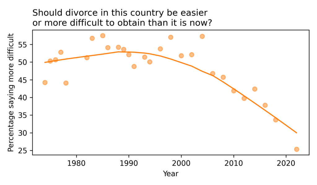
As always when I read an article like this, I want to see data — and the General Social Survey has just the data I need. Since 1974, they have asked a representative sample of the U.S. population, “Should divorce in this country be easier or more difficult to obtain than it is now?” with the options to respond “Easier”, “More difficult”, or “Stay as is”.
Here’s how the responses have changed over time:
Since the 1990s, the percentage saying divorce should be more difficult has dropped from about 50% to about 30%. [The last data point, in 2022, may not be reliable. Due to disruptions during the COVID pandemic, the GSS changed some elements of their survey process — in the 2021 and 2022 data, responses to several questions have deviated from long-term trends in ways that might not reflect real changes in opinion.]
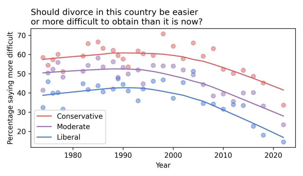
If we break down the results by political alignment, we can see whether these changes are driven by liberals, conservatives, or both.
Not surprisingly, conservatives are more likely than liberals to believe that divorce should be more difficult, by a margin of about 20 percentage points. But the percentages have declined in all groups — and fallen below 50% even among self-described conservatives.
As the Vox article documents, conservatives in several states have proposed legislation to make divorce more difficult. Based on the data, these proposals are likely to be unpopular.
When do we use N and when N-1 for computation of sd and cov?
So I was doing a task, where I had a portfolio of shares and I was given their yields. Then I had to calculate [covariance], [standard deviation] etc. But I simply do not know when to use N and when N-1. I only know that it has to do something with degrees of freedom. Can someone explain it to me like to a 10 year old? Thanks!
If you look up the formula for standard deviation, you are likely to find two versions. One has the sample size, N, in the denominator; the other has N-1.
Sometimes the explanation of when you should use each of them is not clear. And to make it more confusing, some software packages compute the N version by default, and some the N-1 version.
Next we compute the sum of the squared deviations.
In [6]:
ssd=np.sum(deviations**2)ssd
Out[6]:
82.5
Then we compute the variance — we’ll start with the version that has N in the denominator.
In [7]:
var=ssd/N
Finally, the standard deviation is the square root of variance.
In [8]:
std=np.sqrt(var)std
Out[8]:
2.8722813232690143
And here’s the version with N-1 in the denominator.
In [9]:
var=ssd/(N-1)std=np.sqrt(var)std
Out[9]:
3.0276503540974917
With N=10, the difference between the version is non-negligible, but this is pretty much the worst case. With larger sample sizes, the difference in smaller — and with smaller sample sizes, you probably shouldn’t compute a standard deviation at all.
By default, NumPy computes the N version.
In [10]:
np.std(data)
Out[10]:
2.8722813232690143
But with the optional argument ddof=1, it computes the N-1 version.
In [11]:
np.std(data,ddof=1)
Out[11]:
3.0276503540974917
By default, Pandas computes the N-1 version.
In [12]:
pd.Series(data).std()
Out[12]:
3.0276503540974917
But with the optional argument ddof=0, it computes the N version.
In [13]:
pd.Series(data).std(ddof=0)
Out[13]:
2.8722813232690143
It is not ideal that the two libraries have different default behavior.
And it might not be obvious why the parameter that controls this behavior is called ddof.
The answer is related to OP’s question about “degrees of freedom”.
To understand that term, suppose I ask you to think of three numbers.
You are free to choose any first number, any second number, and any third number.
In that case, you have three degrees of freedom.
Now suppose I ask you to think of three numbers, but they are required to add up to 10.
You are free to choose the first and second numbers, but then the third number is determined by the requirement. So you have only two degrees of freedom.
If we are given a dataset with N elements, we generally assume that it has N degrees of freedom unless we are told otherwise.
That’s what the ddof parameter does.
It stands for “delta degrees of freedom”, where “delta” indicates a change or a difference.
In this case, it is the difference between the presumed degrees of freedom, N, and the degrees of freedom that should be used for the computation, N - ddof.
So, with ddof=0, the denominator is N. With ddof=1, the denominator is N-1.
So when should you use one or the other? It depends on whether you are describing data or making a statistical inference.
The N version is a descriptive statistic — it is quantifies the variability of the data.
The N-1 version is an estimator — if data is a sample from a population, we can use it to infer the standard deviation of the population.
To be more specific, the N-1 version is an almost unbiased estimator, which means that it gets the answer almost right, on average, in the long run.
Let’s see how that works.
Consider a uniform distribution from 0 to 10.
In [14]:
fromscipy.statsimportuniformdist=uniform(0,10)
Here are the actual mean and standard deviation of this distribution, computed analytically.
In [15]:
dist.mean(),dist.std()
Out[15]:
(5.0, 2.8867513459481287)
If we generate a large random sample from this distribution, we expect its standard deviation to be close to 2.9.
Yes! The N-1 version is a much less biased estimator of the standard deviation.
That’s why the N-1 version is called the “sample standard deviation”, because it is appropriate when we are using a sample to estimate the standard deviation of a population.
If, instead, we are able to measure an entire population, we can use the N version — which is why it is called the “population standard deviation”.
On one hand, it is impressive that such a simple correction yields a much better estimator. On the other hand, it almost never matters in practice.
If you have a large sample, the difference between the two versions is negligible.
If you have a small sample, you can’t make a precise estimate of the standard deviation anyway.
To demonstrate the second point, let’s look at the distributions of the estimates using the two versions.
In [20]:
sns.kdeplot(standard_deviations_N,label='N version')sns.kdeplot(standard_deviations_Nminus1,label='N-1 version')decorate(xlabel='Estimated standard deviation')
Compared to the variation in the estimates, the difference between the versions is small.
In summary, if your sample size is small and it is really important to avoid underestimating the standard deviation, use the N-1 correction.
Otherwise it doesn’t matter.
To me, the last [column], the “cumulative frequency” expressed in percentages is a percentile: it’s the percentage of scores lower then or the same as the score it’s calculated for.
However, in my class it’s explained that the percentile for score 14 would be 46, and that the percentile for score 17 would be 90, not 94.
The way they arrive at this is that upper and lower limits for the percentile calculation have to be set, in the case of score 14 that would be 14 and 13, and then the percentile would be calculated as (upper limit+lower limit)/2.
In the case of 14: (38+54)/2 = 46
This makes absolutely no sense to me: why are we introducing arbitrary limits to average out when the cumulative frequency in percentages, to me, seems to meet the definition of a percentile perfectly?
What’s at issue here is the definition of percentile and percentile rank.
As an example, let’s consider the distribution of height, and suppose the median is 168 cm.
In that case, 168 cm is the 50th percentile, and if someone is 168 cm tall, their percentile rank is 50%.
By this definition, the percentile rank for a particular quantity is its cumulative frequency expressed as a percentage, exactly as OP suggests.
If you are taller than, or the same height as, 50% of the population, your percentile rank is 50%.
However, some classes teach the alternative definition OP presents.
So, let me explain the two definitions, and we can discuss the pros and cons.
At the risk of giving away the ending, here is my conclusion:
Percentiles and percentile ranks are perfectly well defined, and I don’t think we should encourage variations on the definitions.
In a dataset with many repeated values, percentile ranks might not measure what we want — in that case we might want to compute a different statistic, but then we should give it a different name.
Now suppose we want to compute the median score and the interquartile range (IQR).
We can use the NumPy function percentile to compute the 25th, 50th, and 75th percentiles.
In [6]:
np.percentile(sample,[25,50,75])
Out[6]:
array([13., 14., 16.])
So the median score is 14 and the IQR is 16 - 13 = 3.
Going in the other direction, if we are given a score, q, we can compute its percentile rank by computing the fraction of scores less than or equal to q, expressed as a percentage.
In [7]:
q=14np.mean(sample<=q)*100
Out[7]:
54.166666666666664
If someone gets the median score of 14, their percentile rank is about 54%.
Here we see the first thing that bothers people about percentiles and percentile ranks: with a finite dataset, they are not invertible.
If you compute the percentile rank of the 50th percentile, the answer is not always 50%.
To see why, let’s consider the CDF.
Percentiles and percentile ranks are closely related to the the cumulative distribution function (CDF).
To demonstrate, we can use empiricaldist to make a Cdf object from the reconstituted sample.
A Cdf object is a Pandas Series that contains the observed quantities as an index and their cumulative probabilities as values.
We can use square brackets to look up a quantity and get a cumulative probability.
In [9]:
cdf[14]
Out[9]:
0.5416666666666666
If we multiply by 100, we get the percentile rank.
But square brackets only work with quantities in the dataset.
If we look up any other quantity, that’s an error.
However, we can use parentheses to call the Cdf object like a function.
In [10]:
cdf(14)
Out[10]:
array(0.54166667)
And that works with any numerical quantity.
In [11]:
cdf(13.5)
Out[11]:
array(0.375)
Cdf provides a step method that plots the CDF as a step function, which is what it technically is.
In [12]:
cdf.step(label='')decorate(ylabel='CDF')
To be more explicit, we can put markers at the top of each vertical segment to indicate how the function is evaluated at one of the observed quantities.
The Cdf object provides a method called inverse that computes the inverse CDF — that is, if you give it a cumulative probability, it computes the corresponding quantity.
In [14]:
p1=0.375cdf.inverse(p1)
Out[14]:
array(13.)
The result from an inverse lookup is sometimes called a “quantile”, which is the name of a Pandas method that computes quantiles.
If we put the sample into a Series, we can use quantile to compute the quantity to look up the cumulative probability p1.
By default, quantile uses interpolates linearly between the observed values.
If we want this function to behave according to the definition of the CDF, we have to specify a different kind of interpolation.
In [16]:
sample_series.quantile(p1,interpolation='lower')
Out[16]:
13
If the result from the inverse CDF is called a quantile, you might wonder what we call the result from the CDF.
By analogy with percentile and percentile rank, I think it should be called a quantile rank, but no one calls it that.
As far as I can tell, it’s just called a cumulative probability.
Percentiles and percentile ranks have a perfectly good definition, which follows from the definition of the CDF.
So what’s the problem?
Well, I have to admit — the definition is a little arbitrary.
In the example, suppose your score is 14.
Your score is strictly better than 37.5% of the other scores.
In [17]:
less=np.mean(sample<14)less
Out[17]:
0.375
It’s strictly worse than 45.8%
In [18]:
more=np.mean(sample>14)more
Out[18]:
0.4583333333333333
And equal to 16.7%.
In [19]:
same=np.mean(sample==14)same
Out[19]:
0.16666666666666666
So if we want a single number that quantifies your performance relative to the rest of the class, which number should we use?
The definition of the CDF suggests we should report the fraction of the class whose score is less than or equal to yours.
But that is an arbitrary choice.
We could just as easily report the fraction whose score is strictly less — or the midpoint of these extremes.
For a score of 14, here’s the midpoint:
I prefer the CDF-based definition of percentile rank because it’s consistent with the way most computational tools work.
The midpoint-based definition feels like a holdover from the days of working with small datasets by hand.
That’s just my preference — if people want to compute midpoints, I won’t stop them.
But for the sake of clarity, we should give different names to different statistics.
Historically, I think the CDF-based definition has the stronger claim on the term “percentile rank”.
For the midpoint-based definition, ChatGPT suggests “midpoint percentile rank” or “average percentile rank”.
Those seem fine to me, but it doesn’t look like they are widely used.
Is it correct to use logarithmic transformation in order to mitigate heteroskedasticity?
For my studies I gathered data on certain preferences across a group of people. I am trying to figure out if I can pinpoint preferences to factors such as gender in this case.
I used mixed ANOVA analysis with good success however one of my hypothesis came up with heteroskedasticity when doing Levene’s test. [I’ve been] breaking my head all day on how to solve this. I’ve now used logarithmic transformation to all 3 test results and run another Levene’s. When using the media value the test now results [in] homoskedasticity, however interaction is no longer significant?
Is this the correct way to deal with this problem or is there something I am missing? Thanks in advance to everyone taking their time to help.
Although the question is about ANOVA, I’m going to reframe it in terms of regression, for two reasons:
Discussion of heteroskedasticity is clearer in the context of regression.
For many problems, a regression model is better than ANOVA anyway.
Linear regression is based on a model of the data-generating process where the independent variable y is the sum of
A linear function of x with an unknown slope and intercept, and
Random values drawn from a Gaussian distribution with mean 0 and unknown standard deviation, sigma, that does not depend on x.
If, contrary to the second assumption, sigma depends on x, the data-generating process is heteroskedastic.
Some amount of heteroskedasticity is common in real data, but most of the time it’s not a problem, because:
Heteroskedasticity doesn’t bias the estimated parameters of the model, only the standard errors,
Even very strong heteroskedasticity doesn’t affect the standard errors by much, and
For practical purposes we don’t need standard errors to be particularly precise.
To demonstrate, let’s generate some data.
First, we’ll draw xs from a normal distribution.
OP mentions using the Levene test for heteroskedasticity, which is used to test whether sigma is different between groups.
For continuous values of x and y, we can use the Breusch-Pagan Lagrange Multiplier test:
Both tests produce small p-values, which means that if we generate a dataset by a homoskedastic process, there is almost no chance it would have as much heteroskedasticity as the dataset we generated.
If you have never heard of either of these tests, don’t panic — neither had I under I looked them up for this example.
And don’t worry about remembering them, because you should never use them again.
Like testing for normality, testing for heteroskedasticity is never useful.
Why? Because in almost any real dataset, you will find some heteroskedasticity.
So if you test for it, there are only two possible results:
If the heteroskedasticity is small and you don’t have much data, you will fail to reject the null hypothesis.
If the heteroskedasticity is large or you have a lot of data, you will reject the null hypothesis.
Either way, you learn nothing — and in particular, you don’t learn the answer to the question you actually care about, which is whether the heteroskedasticity is so large that the effect on the standard errors is large enough that you should care.
And the answer to that question is almost always no.
The dataset we generated has very large heteroskedasticity.
Let’s see how much effect that has on the results.
Here are the standard errors from simple linear regression:
In [14]:
ols_results.bse
Out[14]:
array([6.06159018, 0.20152957])
Now, there are several ways to generate standard errors that are robust in the presence of heteroskedasticity.
One is the Huber-White estimator, which we can compute like this:
And one more option is a wild bootstrap, which resamples the residuals by multiplying them by a random sequence of 1 and -1.
This way of resampling preserves heteroskedasticity, because it only changes the sign of the residuals, not the magnitude, and it maintains the relationship between those magnitudes and x.
The standard errors we get from different methods are notably different, but the differences probably don’t matter.
First, I am skeptical of the results from Huber regression.
With this kind of heteroskedasticity, the standard errors should be larger than what we get from OLS.
I’m not sure what’s the problem is, and I haven’t bothered to find out, because I don’t think Huber regression is necessary in the first place.
The results from bootstrapping and the Huber-White estimator are the most reliable — which suggests that the standard errors from quantile regression are too big.
In my opinion, we don’t need esoteric methods to deal with heteroskedasticity.
If heteroskedasticity is extreme, consider using wild bootstrap.
Otherwise, just use ordinary least squares.
Now let’s address OP’s headline question, “Is it correct to use logarithmic transformation in order to mitigate heteroskedasticity?”
In some cases, a log transform can reduce or eliminate heteroskedasticity.
However, there are several reasons this is not a good idea in general:
As we’ve seen, heteroskedasticity is not a big problem, so it usually doesn’t require any mitigation.
Taking a log transform of one or more variables in a regression model changes the meaning of the model — it hypothesizes a relationship between the variables that might not make sense in context.
Anyway, taking a log transform doesn’t always help.
To demonstrate the last point, let’s see what happens if we apply a log transform to the dependent variable:
In [22]:
log_ys=np.log10(ys)
Here’s what the scatter plot looks like after the transform.
The p-values are bigger, which suggests that the log transform mitigated the heteroskedasticity a little.
But if the goal was to eliminate heteroskedasticity, the log transform didn’t do it.
Heteroskedasticity is common in real datasets — if you test for it, you will often find it, provided you have enough data.
Either way, testing does not answer the question you really care about, which is whether the heteroskedasticity is extreme enough to be a problem.
Plain old linear regression is robust to heteroskedasticity, so unless it is really extreme, it is probably not a problem.
Even in the worst case, heteroskedasticity does not bias the estimated parameters — it only affects the standard errors — and we don’t need standard errors to be particularly precise anyway.
Although a log transform can sometimes mitigate heteroskedasticity, it doesn’t always succeed, and even if it does, it’s usually not necessary.
A log transform changes the meaning of the regression model in ways that might not make sense in context.
So, use a log transform if it makes sense in context, not to mitigate a problem that’s not much of a problem in the first place.
Bit of a weird one but I’m hoping you’re the community to help. I work in children’s residential care and I’m trying to find a way of better matching potential young people together.
The way we calculate individual risk for a child is
risk = likelihood + impact (R=L+I), so
L4 + I5 = R9
That works well for individuals but I need to work out a good way of calculating a combined risk to place children [in] the home together. I’m currently using the [arithmetic] average but I don’t feel that it works properly as the average is always lower then the highest risk.
I’ll use a fairly light risk as an example, running away from the home. (We call this MFC missing from care) It’s fairly common that one of the kids will run away from the home at some point or another either out of boredom or frustration. If young person A has a risk of 9 and young person B has a risk of 12 the the average risk of MFC in the home would be 10.5
HOWEVER more often then not having two young people that go MFC will often result in more episodes as they will run off together, so having a lower risk rating doesn’t really make sense. Adding the two together to 21 doesn’t really work either though as the likelihood is the thing that increases not necessarily the impact.
I’m a lot better at chasing after run away kids then I am mathematics so please help π.
Here’s one way to think about this question: based on background knowledge and experience, OP has qualitative ideas about what happens when we put children at different risks together, and he is looking for a statistical summary that is consistent with these ideas.
The arithmetic mean probably makes sense as a starting point, but it clashes with the observation that if you put two children together who are high risk, they interact in ways that increase the risk.
For example, if we put together children with risks 9 and 12, the average is 10.5, and OP’s domain knowledge says that’s too low — it should be more than 12.
At the other extreme, I’ll guess that putting together two low risk children might be beneficial to both — so the combined risk might be lower than either.
And that implies that there is a neutral point somewhere in the middle, where the combined risk is equal to the individual risks.
To construct a summary statistic like that, I suggest a weighted sum of the arithmetic and geometric means.
That might sound strange, but I’ll show that it has the properties we want.
And it might not be as strange as it sounds — there’s a reason it might make sense.
The following function computes the arithmetic mean of a sequence of values, which is the sum divided by n.
In [20]:
defamean(xs):n=len(xs)returnnp.sum(xs)/n
The following function computes the geometric mean of a sequence, which is the product raised to the power 1/n.
In [21]:
defgmean(xs):n=len(xs)returnnp.prod(xs)**(1/n)
And the following function computes the weighted sum of the arithmetic and geometric means.
The constant k determines how much weight we give the geometric mean.
The value 4 determines the neutral point. So if we put together two people with risk 4, the combined average is 4.
In [23]:
mean_plus_gmean(4,4)
Out[23]:
4.0
Above the neutral point, there is a penalty if we put together two children with higher risks.
In [24]:
mean_plus_gmean(5,5)
Out[24]:
6.0
In that case, the combined risk is higher than the individual risks.
Below the neutral point, there is a bonus if we put together two children with low risks.
In [25]:
mean_plus_gmean(3,3)
Out[25]:
2.0
In that case, the combined risk is less than the individual risks.
If we combine low and high risks, the discrepancy brings the average down a little.
In [26]:
mean_plus_gmean(3,5)
Out[26]:
3.872983346207417
In the example OP presented, where we put together two people with high risk, the penalty is substantial.
In [27]:
mean_plus_gmean(9,12)
Out[27]:
16.892304845413264
If that penalty seems too high, we can adjust the weight, k, and the neutral point accordingly.
This behavior extends to more than two people.
If everyone is neutral, the result is neutral.
In [28]:
mean_plus_gmean(4,4,4)
Out[28]:
3.9999999999999996
If you add one person with higher risk, there’s a moderate penalty, compared to the arithmetic mean.
In [29]:
mean_plus_gmean(4,4,5),amean([4,4,5])
Out[29]:
(4.6422027133971, 4.333333333333333)
With two higher risk people, the penalty is bigger.
The idea behind this suggestion is logistic regression with an interaction term.
Let me explain where that comes from.
OP explained:
The way we calculate individual risk for a child is
risk = likelihood + impact (R=L+I), so
L4 + I5 = R9
At first I thought it was strange to add a likelihood and an impact score,
Thinking about expected value, I thought it should be the product of a probability and a cost.
But if both are on a log scale, adding these logarithms is like multiplying probability by impact on a linear scale, so that makes more sense.
And if the scores are consistent with something like a log-odds scale, we can see a connection with logistic regression.
If r1 and r2 are risk scores, we can imagine a regression equation that looks like this, where p is the probability of an outcome like “missing from care”:
logit(p) = a r1 + b r2 + c r1 r2
In this equation, logit(p) is the combined risk score, a, b, and c are unknown parameters, and the product r1 r2 is an interaction term that captures the tendency of high risks to amplify each other.
With enough data, we could estimate the unknown parameters.
Without data, the best we can do is chose values that make the results consistent with expectations.
Since r1 and r2 are interchangeable, they have to have the same parameter.
And since the whole risk scale has an unspecified zero point, we can set it a and b to 1/2.
Which means there is only one parameter left, the weight of the interaction term.
logit(p) = (r_1 + r2) / 2 + k r1 r2
Now we can see that the first term is the arithmetic mean and the second term is close to the geometric mean, but without the square root.
So the function I suggested — the weighted sum of arithmetic and weighted means — is not identical to the logistic model, but it is motivated by it.
With this rationale in mind, we might consider a revision: rather than add the likelihood and impact scores, and then compute the weighted sum of means, it might make more sense to separate likelihood and impact, compute the weighted sum of the means of the likelihoods, and then add back the impact.
This question got my attention because OP is working on a challenging and important problem — and they provided useful context.
It’s an intriguing idea to define something that is intuitively like an average, but is not always bounded between the minimum and maximum of the data.
If we think strictly about generalized means, that’s not possible. But if we think in terms of logarithms, regression, and interaction terms, we find a way.
An early draft of Probably Overthinking It included two chapters about probability. I still think they are interesting, but the other chapters are really about data, and the examples in these chapters are more like brain teasers — so I’ve saved them for another book. Here’s an excerpt from the chapter on Bayes theorem.
In 1889 Joseph Bertrand posed and solved one of the oldest paradoxes in probability. But his solution is not quite correct β it is right for the wrong reason.
Three boxes are identical in appearance. Each has two drawers, each drawer contains a medal. The medals in the first box are gold; those in the second box, silver; the third box contains a gold medal and a silver medal.
We choose a box; what is the probability of finding, in its drawers, a gold coin and a silver coin?
Three cases are possible and they are equally likely because the three chests are identical in appearance. Only one case is favorable. The probability is 1/3.
Having chosen a box, we open a drawer. Whatever medal one finds there, only two cases are possible. The drawer that remains closed may contain a medal whose metal may or may not differ from that of the first. Of these two cases, only one is in favor of the box whose parts are different. The probability of having got hold of this set is therefore 1/2.
How can it be, however, that it will be enough to open a drawer to change the probability and raise it from 1/3 to 1/2? The reasoning cannot be correct. Indeed, it is not.
After opening the first drawer, two cases remain possible. Of these two cases, only one is favorable, this is true, but the two cases do not have the same likelihood.
If the coin we saw is gold, the other may be silver, but we would be better off betting that it is gold.
Suppose, to show the obvious, that instead of three boxes we have three hundred. One hundred contain two gold medals, one hundred and two silver medals and one hundred one gold and one silver. In each box we open a drawer, we see therefore three hundred medals. A hundred of them are in gold and a hundred in silver, that is certain; the hundred others are doubtful, they belong to boxes whose parts are not alike: chance will regulate the number.
We must expect, when opening the three hundred drawers, to see less than two hundred gold coins the probability that the first that appears belongs to one of the hundred boxes of which the other coin is in gold is therefore greater than 1/2.
Now let me translate the paradox one more time to make the apparent contradiction clearer, and then we will resolve it.
Suppose we choose a random box, open a random drawer, and find a gold medal. What is the probability that the other drawer contains a silver medal? Bertrand offers two answers, and an argument for each:
Only one of the three boxes is mixed, so the probability that we chose it is 1/3.
When we see the gold coin, we can rule out the two-silver box. There are only two boxes left, and one of them is mixed, so the probability we chose it is 1/2.
As with so many questions in probability, we can use Bayes theorem to resolve the confusion. Initially the boxes are equally likely, so the prior probability for the mixed box is 1/3.
When we open the drawer and see a gold medal, we get some information about which box we chose. So letβs think about the likelihood of this outcome in each case:
If we chose the box with two gold medals, the likelihood of finding a gold medal is 100%.
If we chose the box with two silver medals, the likelihood is 0%.
And if we chose the box with one of each, the likelihood is 50%.
Putting these numbers into a Bayes table, here is the result:
Prior
Likelihood
Product
Posterior
Two gold
1/3
1
1/3
2/3
Two silver
1/3
0
0
0
Mixed
1/3
1/2
1/6
1/3
The posterior probability of the mixed box is 1/3. So the first argument is correct. Initially, the probability of choosing the mixed box is 1/3 β opening a drawer and seeing a gold coin does not change it. And the Bayesian update tells us why: if there are two gold coins, rather than one, we are twice as likely to see a gold coin.
The second argument is wrong because it fails to take into account this difference in likelihood. Itβs true that there are only two boxes left, but it is not true that they are equally likely. This error is analogous to the base rate fallacy, which is the error we make if we only consider the likelihoods and ignore the prior probabilities. Here, the second argument is wrong because it commits the a βlikelihood fallacyβ β considering only the prior probabilities and ignoring the likelihoods.
Right for the wrong reason
Bertrandβs resolution of the paradox is correct in the sense that he gets the right answer in this case. But his argument is not valid in general. He asks, βHow can it be, however, that it will be enough to open a drawer to change the probabilityβ¦β, implying that it is impossible in principle.
But opening the drawer does change the probabilities of the other two boxes. Having seen a gold coin, we rule out the two-silver box and increase the probability of the two-gold box. So I donβt think we can dismiss the possibility that opening the drawer could change the probability of the mixed box. It just happens, in this case, that it does not.
Letβs consider a variation of the problem where there are three drawers in each box: the first box contains three gold medals, the second contains three silver, and the third contains two gold and one silver.
In that case the likelihood of seeing a gold coin is each case is 1, 0, and 2/3, respectively. And hereβs what the update looks like:
Prior
Likelihood
Product
Posterior
Three gold
1/3
1
1/3
3/5
Three silver
1/3
0
0
0
Two gold, one silver
1/3
2/3
2/9
2/5
Now the posterior probability of the mixed box is 2/5, which is higher than the prior probability, which was 1/3. In this example, opening the drawer provides evidence that changes the probabilities of all three boxes.
I think there are two lessons we can learn from this example. The first is, donβt be too quick to assume that all cases are equally likely. The second is that new information can change probabilities in ways that are not obvious. The key is to think about the likelihoods.
Here’s a question from the Reddit statistics forum.
Hey, so imagine I only have 6 samples from a value that has a normal distribution. Can I estimate the range of likely distributions from those 6?
Let’s be more specific. I’m considering the accuracy of a blood testing device. I took 6 samples of my blood at the same time from the same vein and gave them to the machine. The results are not all the same (as expected), indicating the device’s inherent level of imprecision.
So, I’m wondering if there’s a way to estimate the range of possibilities of what I would see if I could give 100 or 1000 samples?
I’m comfortable assuming a normal distribution around the “true” value. Is there any stats method to guesstimate the range of likely values for sigma? Or would I just need to drain my blood dry to get 1000 samples to figure that out?
Fyi, not a statistician.
Because the sample size is so small, this question cries out for a Bayesian approach.
Why?
Bayesian methods do a good job of taking advantage of background information and extracting as much information as possible from the data,
With a small sample size, the uncertainty of the result is large, so it is important to quantify it, and
The motivating question is explicitly about making probabilistic predictions, which is what Bayesian methods do and classical methods don’t.
As an example, OP suggested looking at blood potassium (K+) levels, with the following data:
4.0, 3.9, 4.0, 4.0, 4.7, 4.2 (mmol/L)
OP also explained that the blood samples were collected “continuously from a single puncture … within seconds, not minutes,” so we don’t expect the true level to change much between samples.
In that case, the variation in the measurements would largely reflect the precision of the testing device.
Now we need prior distributions for mu and sigma.
For the prior distribution of mu we can use the distribution in the general population.
The “normal range” for potassium — which is usually the 5th and 95th percentiles of the population — is 3.5 to 5.4 mmol/L.
So we can construct a normal distribution with these percentiles.
For the prior distribution of sigma, we could use some background information about the device.
For example, based on similar devices, what values of sigma would be expected?
I’ll use a gamma distribution to construct a prior PMF, but it could be anything.
This distribution represents the background knowledge that we expect the standard deviation to be less than 2, and we’d be surprised by anything much higher than that.
I’ll use this function to make a Pandas DataFrame to represent the joint prior.
In [11]:
defmake_joint(s1,s2):"""Compute the outer product of two Series. First Series goes across the columns; second goes down the rows. s1: Series s2: Series return: DataFrame """X,Y=np.meshgrid(s1,s2,indexing='ij')returnpd.DataFrame(X*Y,index=s1.index,columns=s2.index)
In [12]:
prior=make_joint(prior_mu,prior_sigma)prior.shape
Out[12]:
(51, 101)
I’ll use the following function to make a contour plot of the prior.
In [13]:
defplot_contour(joint):"""Plot a joint distribution. joint: DataFrame representing a joint PMF """low=joint.to_numpy().min()high=joint.to_numpy().max()levels=np.linspace(low,high,6)levels=levels[1:]cs=plt.contour(joint.columns,joint.index,joint,levels=levels,linewidths=1)decorate(xlabel=joint.columns.name,ylabel=joint.index.name)returncs
To use the data to update the prior, we have to compute the likelihood of the data for each possible pair of mu and sigma.
Can can do that by creating a 3-D mesh with the possible values of mu and sigma, and the observed values of the data.
Now we can evaluate the normal distribution for each data point and each pair of mu and sigma.
In [16]:
densities=norm(MU,SIGMA).pdf(DATA)densities.shape
Out[16]:
(51, 101, 6)
The likelihood of each pair is the product of the densities for the data points.
In [17]:
likelihood=densities.prod(axis=2)likelihood.shape
Out[17]:
(51, 101)
The unnormalized posterior is the product of the prior and the likelihood.
In [18]:
posterior=prior*likelihood
We can normalize it like this.
In [19]:
defnormalize(joint):"""Normalize a joint distribution. joint: DataFrame """prob_data=joint.to_numpy().sum()joint/=prob_datareturnprob_data
In [20]:
normalize(posterior)posterior.shape
Out[20]:
(51, 101)
And here’s what the result looks like.
In [21]:
plot_contour(posterior)decorate()
Here’s the posterior distribution of sigma compared to the prior.
In [22]:
defmarginal(joint,axis):"""Compute a marginal distribution. axis=0 returns the marginal distribution of the first variable axis=1 returns the marginal distribution of the second variable joint: DataFrame representing a joint distribution axis: int axis to sum along returns: Pmf """returnPmf(joint.sum(axis=axis))
The last part of OP’s question is “So, I’m wondering if there’s a way to estimate the range of possibilities of what I would see if I could give 100 or 1000 samples?”
We can simulate a future experiment with larger sample size by drawing random pairs from the joint posterior distribution and generating simulated measurements.
That’s easier to do if we stack the posterior PMF.
Now we can use NumPy’s choice function to choose a random pair of mu and sigma.
For each random pair, we can generate 1000 simulated measurements from a normal distribution, and plot the distribution of the results.
Each line shows the distribution of a possible sample of 1000 measurements. You can see that they vary in both location and spread, due to the uncertainty represented by the posterior distribution of mu and sigma.
The normal distribution is probably a good enough model for this data, but for some pairs of mu and sigma in the prior, the normal distribution extends into negative values with non-negligible probability — and for measurements like these, negative values are nonsensical.
An alternative would be to run the whole calculation with the logarithms of the measurements.
In effect, this would model the distribution of the data as lognormal, which is generally a good choice for measurements like these.
In this example, the sample size is small, so the choice of the prior is important.
I suspect there is more background information we could use to make a better choice for the prior distribution of sigma.
This example demonstrates the use of grid methods for Bayesian statistics.
For many common statistical questions, grid methods like this are simple and fast to compute, especially with libraries like NumPy and SciPy.
And they make it possible to answer many useful probabilistic questions.
Hi Redditors, I am a civil engineer trying to solve a statistical problem for a current project I have. I have a pavement parking lot 125,000 sf in size. I performed nondestructive testing to render an opinion about the areas experiencing internal delimitation not observable from the surface. Based on preliminary testing, it was determined that 9% of the area is bad, and 11% of the total area I am unsure about (nonconclusive results if bad or good), and 80% of the area is good. I need to verify all areas using destructive testing, I will take out slabs 2 sf in size. my question is how many samples do I need to take from each area to confirm the results with 95% confidence interval?
There are elements of this question that are not clear, and OP did not respond to follow-up questions.
But the question is generally about sample size selection, so let’s talk about that.
If the parking lot is 125,000 sf and each sample is 2 sf, we can imagine dividing the total area into 62,500 test patches.
Of those, some unknown proportion are good and the rest are bad.
In reality, there is probably some spatial correlation — if a patch is bad, the nearby patches are more likely to be bad.
But if we choose a sample of patches entirely at random, we can assume that they are independent.
In that case, we can estimate the proportion of patches that are good and quantify the precision of that estimate by computing a confidence interval.
Then we can choose a sample size that meets some requirement.
For example, we might want the 95% confidence interval needs to be smaller than a given threshold, or we might want to bound the probability that the proportion falls below some threshold.
But let’s start by estimating proportions and computing confidence intervals.
Based on preliminary testing, it is likely that the proportion of good patches is between 80% and 90%.
We can take advantage of that information by using a beta distribution as a prior and updating it with the data.
Here’s a prior distribution that seems like a reasonable choice, given the background information.
This prior leaves open the possibility of values below 80% and greater than 90%, but it assigns them lower probabilities.
Now let’s generate a hypothetical dataset to see what the update looks like.
Suppose the actual percentage of good patches is 90%, and we sample n=10 of them.
With a larger sample size, the posterior mean is closer to the proportion observed in the data.
And the posterior distribution is narrower, which indicates greater precision.
If we need more precision than that, we can increase the sample size more.
If we don’t need that much precision, we can decrease it.
With some math, we could compute the sample size algorithmically, but a simple alternative is to run this analysis with different sample sizes until we get the results we need.
Some people don’t like using Bayesian methods because they think it is more objective to ignore perfectly good background information, even in cases like this where they come from preliminary testing that is clearly applicable.
To satisfy them, we can run the analysis again with a uniform prior, which is not actually more objective, but it seems to make people happy.
In [16]:
uniform_prior=beta_dist(1,1)uniform_prior.mean()
Out[16]:
0.5
The mean of the uniform prior is 50%, so it is more pessimistic.
Here’s the update with n=10.
Sample size analysis is a good thing to do when you are designing experiments, because it requires you to
Make a model of the data-generating process,
Generate hypothetical data, and
Specify ahead of time what analysis you plan to do.
It also gives you a preview of what the results might look like, so you can think about the requirements.
If you do these things before running an experiment, you are likely to clarify your thinking, communicate better, and improve the data collection process and analysis.
Sample size analysis can also help you choose a sample size, but most of the time that’s determined by practical considerations, anyway.
I mean, how many holes do you think they’ll let you put in that parking lot?
I have collected data regarding how individuals feel about a particular program. They reported their feelings on a scale of 1-5, with 1 being Strongly Disagree, 2 being Disagree, 3 being Neutral, 4 being Agree, and 5 being Strongly Agree.
I am looking to analyze the data for averages responses, but I see that a basic mean will not do the trick. I am looking for very simple statistical analysis on the data. Could someone help out regarding what I would do?
It sounds like OP has heard the advice that you should not compute the mean of values on a Likert scale.
The Likert scale is ordinal, which means that the values are ordered, but it is not an interval scale, because the distances between successive points are not necessarily equal.
For example, if we imagine that “Neutral” maps to 0 on a number line and “Agree” maps to 1, it’s not clear where we should place “Strongly agree”.
And an appropriate mapping might not be symmetric — for example, maybe the people who choose “Strongly agree” are content, but the people who choose “Strongly disagree” are angry.
In an arithmetic mean, they would cancel each other out — but that might erase an important distinction.
Nevertheless, I think an absolute prohibition on computing means is too strong.
I’ll show some examples where I think it’s a reasonable thing to do — but I’ll also suggest alternatives that might be better.
The variable we’ll start with is polviews, which contains responses to this question:
We hear a lot of talk these days about liberals and conservatives. I’m going to show you a seven-point scale on which the political views that people might hold are arranged from extremely liberal–point 1–to extremely conservative–point 7. Where would you place yourself on this scale?
This is not a Likert scale, specifically, but it is ordinal.
Here is the distribution of responses:
As always, it’s a good idea to visualize the distribution before we compute any summary statistics.
I’ll use Pmf from empiricaldist to compute the PMF of the values.
The modal value is “Moderate” and the distribution is roughly symmetric, so I think it’s reasonable to compute a mean.
For example, suppose we want to know how self-reported political alignment has changed over time.
We can compute the mean in each year like this:
fromutilsimportplot_series_lowessplot_series_lowess(mean_series,'C2')decorate(xlabel='Year',title='Mean political alignment')
I used LOWESS to plot a local regression line, which makes long-term trends easier to see.
It looks like the center of mass trended toward conservative from the 1970s into the 1990s and trended toward liberal since then.
When you compute any summary statistic, you lose information.
To see what we might be missing, we can use a normalized cross-tabulation to compute the distribution of responses in each year.
Based on the heat map, it seems like the general shape of the distribution has not changed much — so the mean is probably a good way to make comparisons over time.
However, it is hard to interpret the mean in absolute terms.
For example, in the most recent data, the mean is about 4.1.
In [13]:
gss.query('year == 2022')['polviews'].mean()
Out[13]:
4.099445902595509
Since 4.0 maps to “Moderate”, we can say that the center of mass is slightly on the conservative side of moderate, but it’s hard to say what a difference of 0.1 means on this scale.
As an alternative, we could add up the percentage who identify as conservative or liberal, with or without an adverb.
plot_series_lowess(con,'C3',label='Conservative')plot_series_lowess(lib,'C0',label='Liberal')decorate(xlabel='Year',ylabel='Percent',title='Percent identifying as conservative or liberal')
Or we could plot the difference in percentage points.
This figure shows the same trends we saw by plotting the mean, but the y-axis is more interpretable — for example, we could report that, at the peak of the Reagan era, conservatives outnumbered liberals by 10-15 percentage points.
Suppose we are interested in polarization, so we want to see if the spread of the distribution has changed over time.
Would it be OK to compute the standard deviation of the responses?
As with the mean, my answer is yes and no.
The standard deviation is easy to compute, and it makes it easy to see the long-term trend.
If we interpret the spread of the distribution as a measure of polarization, it looks like it has increased in the last 30 years.
But it is not easy to interpret this result in context.
If it increased from about 1.35 to 1.5, is that a lot?
It’s hard to say.
As an alternative, let’s compute the mean absolute deviation (MAD), which we can think of like this: if we choose two people at random, how much will they differ on this scale, on average?
A quick way to estimate MAD is to draw two samples from the responses and compute the mean pairwise distance.
The result is about 1.5 points, which is bigger than the distance from moderate to slightly conservative, and smaller than the distance from moderate to conservative.
Rather than sampling, we can compute MAD deterministically by forming the joint distribution of response pairs and computing the expected value of the distances.
For this computation, it is convenient to use NumPy functions for outer product and outer difference.
The two figures tell the same story — polarization is increasing.
But the MAD is easier to interpret.
In the 1970s, if you chose two people at random, they would differ by less than 1.5 points on average.
Now the difference would be almost 1.7 points.
Considering that the difference between a moderate and a conservative is 2 points, it seems like we should still be able to get along.
I think MAD is more interpretable than standard deviation, but it is based on the same assumption that the points on the scale are equally spaced.
In most cases, that’s not an assumption we can easily check, but in this example, maybe we can.
For another project, I selected 15 questions in the GSS where conservatives and liberals are most likely to disagree, and used them to estimate the number of conservative responses from each respondent.
The following figure shows the average number of conservative responses to the 15 questions for each point on the self-reported scale.
In the examples so far, computing the mean and standard deviation of a scale variable is not necessarily the best choice, but it could be a reasonable choice.
Now we’ll see an example where it is probably a bad choice.
The variable homosex contains responses to this question:
What about sexual relations between two adults of the same sex–do you think it is always wrong, almost always wrong, wrong only sometimes, or not wrong at all?
If the wording of the question seems loaded, remember that many of the core questions in the GSS were written in the 1970s.
Here is the encoding of the responses.
In [26]:
homosex_dict={1:"Always wrong",2:"Almost always wrong",3:"Sometimes wrong",4:"Not wrong at all",5:"Other",}
There are several reasons it’s a bad idea to summarize this distribution by computing the mean.
First, one of the responses is not ordered.
If we include “Other” in the mean, the result is meaningless.
In [30]:
gss['homosex'].mean()# total nonsense
Out[30]:
2.099526621672291
If we exclude “Other”, the remaining responses are ordered, but arguably not evenly spaced on a spectrum of opinion.
In [31]:
gss['homosex'].replace(5,np.nan).mean()# still nonsense
Out[31]:
2.0931232091690544
If we compute a mean and report that the average response is somewhere between “Sometimes wrong” and “Almost always wrong”, that is not an effective summary of the distribution.
The distribution of results is strongly bimodal — most people are either accepting of homosexuality or not.
And that suggests a better way to summarize the distribution: we can simply report the fraction of respondents who choose one extreme or the other.
I’ll start by creating a binary variable that is 1 for respondents who chose “Not wrong at all”, 0 for the other responses, and NaN for people who were not asked the question, did not respond, or chose “Other”.
plot_series_lowess(percent_series,'C4')decorate(xlabel='Year',ylabel='Percent',title='Percent responding "Not wrong at all"')
The percentage of people who accept homosexuality was almost unchanged in the 1970s and 1980s, and began to increase quickly around 1990.
For a discussion of this trend, and similar trends related to racism and sexism, you might be interested in Chapter 11 of Probably Overthinking It.
Computing the mean of an ordinal variable can be a quick way to make comparisons between groups or show trends over time.
The computation implicitly assumes that the points on the scale are equally spaced, which is not true in general, but in many cases it is close enough.
However, even when the mean (or standard deviation) is a reasonable choice, there is often an alternative that is easier to interpret in context.
It’s always good to look at the distribution before choosing a summary statistic.
If it’s bimodal, the mean is probably not the best choice.
Data Q&A: Answering the real questions with Python
We’ve seen that mean absolute deviation (MAD) can quantify the average level of disagreement between two people in a population.
As a generalization, it can also quantify the discord between two groups.
I have two different samples (about 100 observations per sample) drawn from the same population (or that’s what I hypothesize; the populations may in fact be different). The samples and population are approximately normal in distribution.
I want to estimate the 85th percentile value for both samples, and then see if there is a statistically significant difference between these two values. I cannot use a normal z- or t-test for this, can I? It’s my current understanding that those tests would only work if I were comparing the means of the samples.
As an extension of this, say I wanted to compare one of these 85th percentile values to a fixed value; again, if I was looking at the mean, I would just construct a confidence interval and see if the fixed value fell within it…but the percentile stuff is throwing me for a loop.
This is […] related to a research project I’m working on (in my job).
There are two questions here.
The first is about testing a difference in percentiles between two groups.
The second is about the difference between a percentile from an observed sample and an expected value.
We’ll answer the first question with a permutation test, and we’ll answer the second in two ways: bootstrap resampling and a Gaussian model.
Since OP didn’t provide a dataset, we have to generate one.
I’ll draw two samples from Gaussian distributions with the same standard deviation and different means.
When we test a difference between two groups, the usual model of the null hypothesis is that the groups are actually identical.
If that’s true, the two samples came from the same distribution, so we can combine them into a single sample.
Now we can simulate the null hypothesis by permutation — that is, by shuffling the pooled data and splitting it into two groups with the same sizes as the originals.
The following function generates two samples under this assumption, and returns the difference in their 85th percentiles.
Here’s what it looks like, with a vertical line at the observed difference.
I’m plotting it with cut=0 so the estimated density doesn’t extend past the minimum and maximum of the data.
In [10]:
sns.kdeplot(sample_diff,label='',cut=0)plt.axvline(actual_diff,ls=':',color='gray')decorate(xlabel='Difference',ylabel='Density',title='Distribution of differences under H0')
The distribution is multimodal, which is the result of selecting a moderately high percentile from a moderately small dataset — the diversity of the results is limited.
However, in this example we are interested in the tails of the distribution, so multimodality is not a problem.
To estimate a one-sided p-value, we can compute the fraction of the sample that exceeds the actual difference.
In this example, the result of the one-sided test would be considered significant at the 5% significance level, but the two-sided test would not.
So which is it?
I think it’s not worth worrying about.
My interpretation of the results is the same either way: they are inconclusive.
Under the null hypothesis, a difference as big as the one we saw would be unlikely, but we can’t rule out the possibility that the groups are identical — or nearly so — and the apparent difference is due to random variation.
Now let’s turn to the second question.
Suppose we have reason to think that the actual value of the 85th percentile is 12.3, and we would like to know whether the data contradict this hypothesis.
In [13]:
expected=12.3
We’ll test group1 first.
Here’s the 85th percentile of group1 and its difference from the expected value.
Let’s see if a difference of this magnitude is likely to happen under the null hypothesis.
One way to model the null hypothesis is to create a dataset that is similar to the observed data, but where the 85th percentile is exactly as expected.
We can do that by shifting the observed data by the observed difference.
The 85th percentile of the shifted data is the expected value, exactly.
Now, to generate samples under the null hypothesis, we can use the following function, which takes a sample, shifts it to have the expected value of the 85th percentile, generates a bootstrap resample of the shifted values, and returns the difference between the 85th percentile of the sample and the expected value.
The following function shows the distribution of the sample with a vertical line at the observed value.
In [18]:
sns.kdeplot(sample1,label='Sampling distribution')plt.axvline(actual_diff1,ls=':',color='gray')decorate(xlabel='Deviation',ylabel='Density',title='Distribution of deviations from expected under H0')
Without computing a p-value, we can see that a difference as big as actual_diff1 is entirely plausible under the null hypothesis.
We can confirm that by computing a one-sided p-value.
Here’s what the distribution of differences looks like under the null hypothesis, with a vertical line at the observed value.
In [22]:
sns.kdeplot(sample2,label='Group 2',cut=0)plt.axvline(actual_diff2,ls=':',color='gray')decorate(xlabel='Deviation',ylabel='Density',title='Distribution of deviations from expected under H0')
There are no differences in the sample that exceed the observed value.
In [23]:
np.max(sample2),actual_diff2
Out[23]:
(0.6391539586773582, 0.7570036406220559)
We can conclude that a difference as big as that is very unlikely under the null hypothesis.
There’s not much point in computing a p-value more precisely than that, but if it’s required, we can estimate it if we assume that the tail of the sampling distribution is roughly Gaussian.
In that case, we can fit a KDE to the sampling distribution like this.
The bootstrap method in the previous section is a good choice if we are unsure about the distribution of the data, or if there are outliers.
But multiple modes in the sampling distribution suggest that there might not be enough diversity in the data for bootstrapping to be reliable.
Fortunately, there is another way we might model the null hypothesis: using a Gaussian distribution.
If we generate data from a continuous distribution, we expect the sampling distribution to be unimodal.
But there is a problem we have to solve first — we have to make an assumption about the standard deviation of the hypothetical Gaussian distribution.
One option is to use the standard deviation of the data.
In [27]:
s=np.std(group1)
Now we need to find a Gaussian distribution with a given standard deviation that has the expected 85th percentile.
We can do that by starting with a distribution centered at 0, computing it’s 85th percentile and then shifting it.
ppf stands for “percentile point function”, which is another name for the quantile function, which is the inverse of the CDF — it takes a cumulative probability and returns the corresponding quantity.
The following function takes one of the groups, fits a hypothetical model to it, generates a sample from the model, and returns the difference between the 85th percentile of the sample and the expected value.
Here’s what the distribution looks like, compared to the corresponding distribution from the bootstrapped model.
In [32]:
sns.kdeplot(sample1,label='Bootstrap model',cut=0)sns.kdeplot(sample3,label='Gaussian model',cut=0)plt.axvline(actual_diff1,ls=':',color='gray')decorate(xlabel='Quantity',ylabel='Density',title='Distribution of deviations from expected under H0, Group 1')
The shapes of the distributions are different, but their ranges are comparable.
And the conclusion is the same: a difference as big as actual_diff1 is entirely plausible under the null hypothesis.
Here’s the result, along with the result from the bootstrap model.
In [35]:
sns.kdeplot(sample2,label='Bootstrap model',cut=0)sns.kdeplot(sample4,label='Gaussian model',cut=0)plt.axvline(actual_diff2,ls=':',color='gray')decorate(xlabel='Quantity',ylabel='Density',title='Distribution of deviations from expected under H0, Group 2')
Again, the shapes of the distributions are different, but the conclusion is the same.
A difference as big as actual_diff2 is unlikely under the null hypothesis.
This example demonstrates a kind of inconsistency in hypothesis testing.
We found that Group 1 is not significantly different from the expected value — in the technical sense of significantly — but Group 2 is.
So that suggests that Group 1 and Group 2 are different from each other, but when we test that hypothesis, the difference is not statistically significant.
People who are new to hypothesis testing find results like this surprising, but they are not rare.
Generally, they are a consequence of the logic of null hypothesis testing and the arbitrariness of the significance threshold.
I think it helps to interpret p-values qualitatively.
A p-value greater than 10% means that the observed effect is plausible under the null hypothesis, and could happen by chance.
A p-value less than 1% means that an observed effect is unlikely under the null hypothesis — so it is unlikely to have happened by chance.
Anything in between is inconclusive.
There is nothing special about 5%.
Data Q&A: Answering the real questions with Python