If there is a quiz of x questions with varying results between teams of different sizes, how could you logically handicap the larger teams to bring some sort of equivalence in performance measure?
[Suppose there are] 25 questions and a team of two scores 11/25. A team of 4 scores 17/25. Who did better […]?
One respondent suggested a binomial model, in which every player has the same probability of answering any question correctly.
I suggested a model based on item response theory, in which each question has a level of difficulty, d, each player has a level of efficacy e, and the probability that a player answers a question is
expit(e-d+c)
where c is a constant offset for all players and questions and expit is the inverse of the logit function.
Another respondent pointed out that group dynamics will come into play. On a given team, it is not enough if one player knows the answer; they also have to persuade their teammates.
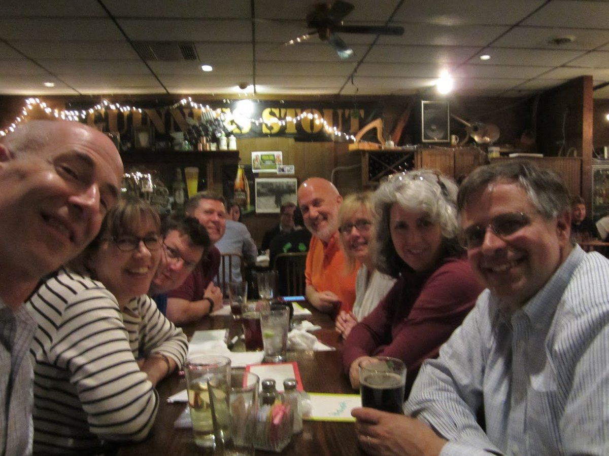
Me (left) at pub trivia with friends in Richmond, VA. Despite our numbers, we did not win.
I implement a binomial model and a model based on item response theory. Interestingly, for the scenario in the question they yield opposite results: under the binomial model, we would judge that the team of two performed better; under the other model, the team of four was better.
In both cases I use a simple model of group dynamics: if anyone on the team gets a question, that means the whole team gets the question. So one way to think of this model is that “getting” a question means something like “knowing the answer and successfully convincing your team”.
Anyway, I’m not sure I really answered the question, other than to show that the answer depends on the model.
Political alignment and beliefs about homosexuality
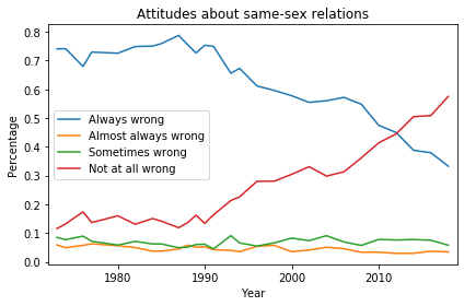
In the United States, beliefs and attitudes about homosexuality have changed drastically over the last 50 years. In 1972, 74% of U.S. residents thought sexual relations between two adults of the same sex were “always wrong”, according to results from the General Social Survey (GSS). In 2018, that fraction was down to 33%, and another 58% thought same-sex relations were “not wrong at all”.
Here’s what the distribution of responses looks like over the duration of the survey:
Distribution of responses to the question “What about sexual relations between two adults of the same sex—do you think it is always wrong, almost always wrong, wrong only sometimes, or not wrong at all?”
In the late 1980s, the fraction of “always wrong” responses started dropping, being replaced almost entirely with “not at all wrong”. Respondents who chose “almost always wrong” or “sometimes wrong” have always been a small minority.
Political alignment
As you might expect, these responses are related to political alignment, that is, to whether respondents describe themselves as liberal, conservative, or moderate.
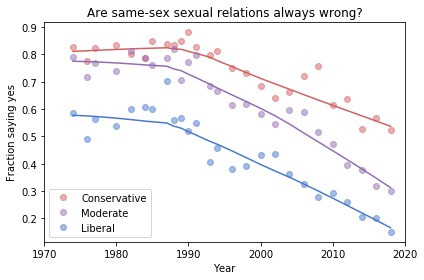
The following figure shows the fraction of “always wrong” responses over time, grouped by political alignment:
Fraction of respondents who think sexual relations between two adults of the same sex are “always wrong”, grouped by self-described political affiliation.
The circles in this figure show the observed percentages in each group during each year. The lines show a smooth curve computed by local regression.
Unsurprisingly, people who consider themselves conservative are consistently more likely than liberals to believe homosexuality is wrong. And moderates fall somewhere between liberals and conservatives.
What might be more surprising is how conservative self-described liberals were in 1972: almost 60% of them thought homosexuality was always wrong.
You might also be surprised at how liberal self-described conservatives are now: the fraction who think homosexuality is wrong is down to 60%. In other words, conservatives now are as liberal as liberals were in 1972.
The more things change…
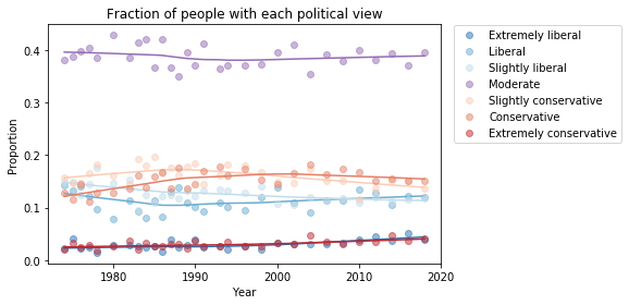
As we saw in a previous article, the fractions of liberals and conservatives do not change much over time. The following figure shows the proportions for GSS respondents:
Self-described political alignment over time.
I conjecture that people describe themselves relative to a perceived center of mass of public opinion. If they are more conservative than what they think is the mean, they are more likely to say they are “conservative”.
But what that means, in terms of beliefs and attitudes, changes over time. And with some issues, it changes quite fast.
The inspection paradox is a statistical illusion you’ve probably never heard of. It’s a common source of confusion, an occasional cause of error, and an opportunity for clever experimental design. And once you know about it, you see it everywhere.
The examples in the talk include social networks, transportation, education, incarceration, and more. And now I am happy to report that I’ve stumbled on yet another example, courtesy of John D. Cook.
For a multivariate normal distribution in high dimensions, nearly all the probability mass is concentrated in a thin shell some distance away from the origin.
John does a nice job of explaining this result, so you should read his article, too. But I’ll try to explain it another way, using a dartboard.
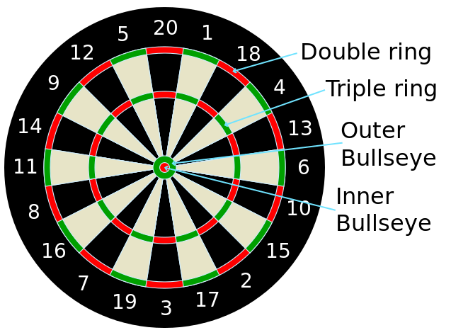
If you are not familiar with the layout of a “clock” dartboard, it looks like this:
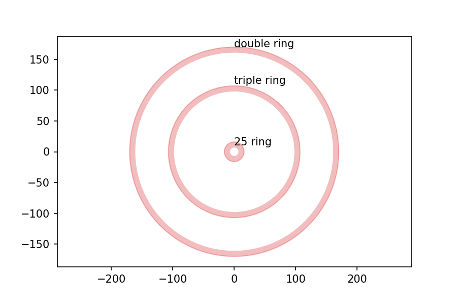
I got the measurements of the board from the British Darts Organization rules, and drew the following figure with dimensions in mm:
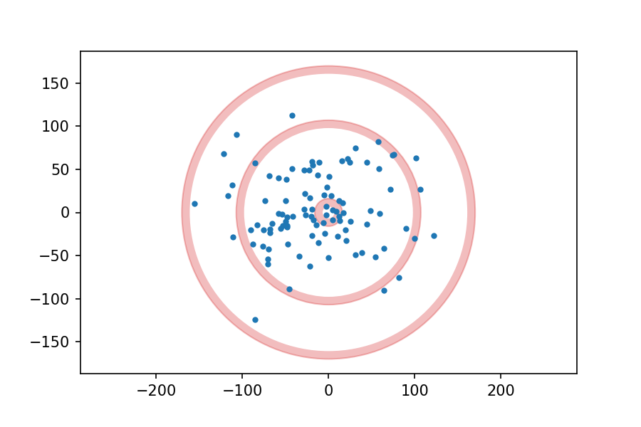
Now, suppose I throw 100 darts at the board, aiming for the center each time, and plot the location of each dart. It might look like this:
Suppose we analyze the results and conclude that my errors in the x and y directions are independent and distributed normally with mean 0 and standard deviation 50 mm.
Assuming that model is correct, then, which do you think is more likely on my next throw, hitting the 25 ring (the innermost red circle), or the triple ring (the middlest red circle)?
It might be tempting to say that the 25 ring is more likely, because the probability density is highest at the center of the board and lower at the triple ring.
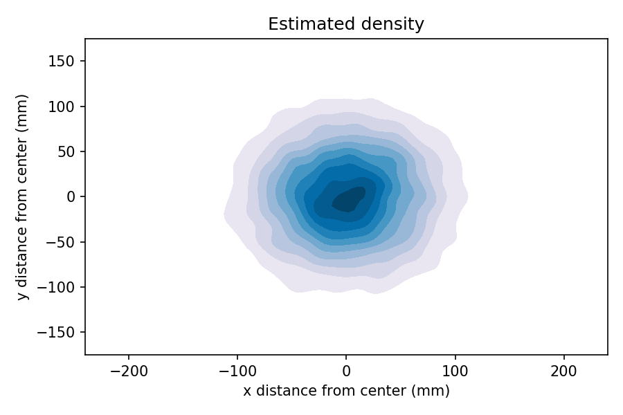
We can see that by generating a large sample, generating a 2-D kernel density estimate (KDE), and plotting the result as a contour.
In the contour plot, darker color indicates higher probability density. So it sure looks like the inner ring is more likely than the outer rings.
But that’s not right, because we have not taken into account the area of the rings. The total probability mass in each ring is the product of density and area (or more precisely, the density integrated over the area).
The 25 ring is more dense, but smaller; the triple ring is less dense, but bigger. So which one wins?
In this example, I cooked the numbers so the triple ring wins: the chance of hitting triple ring is about 6%; the chance of hitting the double ring is about 4%.
If I were a better dart player, my standard deviation would be smaller and the 25 ring would be more likely. And if I were even worse, the double ring (the outermost red ring) might be the most likely.
Inspection Paradox?
It might not be obvious that this is an example of the inspection paradox, but you can think of it that way. The defining characteristic of the inspection paradox is length-biased sampling, which means that each member of a population is sampled in proportion to its size, duration, or similar quantity.
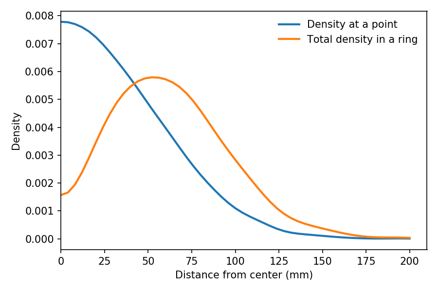
In the dartboard example, as we move away from the center, the area of each ring increases in proportion to its radius (at least approximately). So the probability mass of a ring at radius r is proportional to the density at r, weighted by r.
We can see the effect of this weighting in the following figure:
The blue line shows estimated density as a function of r, based on a sample of throws. As expected, it is highest at the center, and drops away like one half of a bell curve.
The orange line shows the estimated density of the same sample weighted by r, which is proportional to the probability of hitting a ring at radius r.
It peaks at about 60 mm. And the total density in the triple ring, which is near 100 mm, is a little higher than in the 25 ring, near 10 mm.
If I get a chance, I will add the dartboard problem to my talk as yet another example of length-biased sampling, also known as the inspection paradox.
UPDATE November 6, 2019: This “thin shell” effect has practical consequences. This excerpt from The End of Average talks about designing the cockpit of a plan for the “average” pilot, and discovering that there are no pilots near the average in 10 dimensions.
In my previous post I asked “What should I do?“. Now I want to share a letter I wrote recently for students at Olin, which appeared in our school newspaper, Frankly Speaking.
It is addressed to engineering students, but it might also be relevant to people who are not students or not engineers.
Dear Students,
As engineers, you have a greater ability to affect the future of the planet than almost anyone else. In particular, the decisions you make as you start your careers will have a disproportionate impact on what the world is like in 2100.
Here are the things you should work on for the next 80 years that I think will make the biggest difference:
Nuclear energy
Desalination
Transportation without fossil fuels
CO₂ sequestration
Alternatives to meat
Global education
Global child welfare
Infrastructure for migration
Geoengineering
Let me explain where that list comes from.
First and most importantly, we need carbon-free energy, a lot of it, and soon. With abundant energy, almost every other problem is solvable, including food and desalinated water. Without it, almost every other problem is impossible.
Solar, wind, and hydropower will help, but nuclear energy is the only technology that can scale up enough, soon enough, to substantially reduce carbon emissions while meeting growing global demand.
With large scale deployment of nuclear power, it is feasible for global electricity production to be carbon neutral by 2050 or sooner. And most energy use, including heat, agriculture, industry, and transportation, could be electrified by that time. Long-range shipping and air transport will probably still require fossil fuels, which is why we also need to develop carbon capture and sequestration.
Global production of meat is a major consumer of energy, food, and water, and a major emitter of greenhouse gasses. Developing alternatives to meat can have a huge impact on climate, especially if they are widely available before meat consumption increases in large developing countries.
World population is expected to peak in 2100 at 9 to 11 billion people. If the peak is closer to 9 than 11, all of our problems will be 20% easier. Fortunately, there are things we can do to help that happen, and even more fortunately, they are good things.
The difference between 9 and 11 depends mostly on what happens in Africa during the next 30 years. Most of the rest of the world has already made the “demographic transition“, that is, the transition from high fertility (5 or more children per woman) to low fertility (at or below replacement rate).
The primary factor that drives the demographic transition is child welfare; increasing childhood survival leads to lower fertility. So it happens that the best way to limit global population is to protect children from malnutrition, disease, and violence. Other factors that contribute to lower fertility are education and economic opportunity, especially for women.
Regardless of what we do in the next 50 years, we will have to deal with the effects of climate change, and a substantial part of that work will be good old fashioned civil engineering. In particular, we need infrastructure like sea walls to protect people and property from natural disasters. And we need a new infrastructure of migration, including the ability to relocate large numbers of people in the short term, after an emergency, and in the long term, when current population centers are no longer viable.
Finally, and maybe most controversially, I think we will need geoengineering. This is a terrible and dangerous idea for a lot of reasons, but I think it is unavoidable, not least because many countries will have the capability to act unilaterally. It is wise to start experiments now to learn as much as we can, as long as possible before any single actor takes the initiative.
Think locally, act globally
When we think about climate change, we gravitate to individual behavior and political activism. These activities are appealing because they provide opportunities for immediate action and a feeling of control. But they are not the best tools you have.
Reducing your carbon footprint is a great idea, but if that’s all you do, it will have a negligible effect.
And political activism is great: you should vote, make sure your representatives know what you think, and take to the streets if you have to. But these activities have diminishing returns. Writing 100 letters to your representative is not much better than one, and you can’t be on strike all the time.
If you focus on activism and your personal footprint, you are neglecting what I think is your greatest tool for impact: choosing how you spend 40 hours a week for the next 80 years of your life.
As an early-career engineer, you have more ability than almost anyone else to change the world. If you use that power well, you will help us get through the 21st Century with a habitable planet and a high quality of life for the people on it.
I am planning to be on sabbatical from June 2020 to August 2021, so I am thinking about how to spend it. Let me tell you what I can do, and you can tell me what I should do.
Data Science
I consider myself a data scientist, but that means different things to different people. More specifically, I can contribute in the following areas:
Data exploration, modeling, and prediction,
Bayesian statistics and machine learning,
Scientific computing and optimization,
Software engineering and reproducible science,
Technical communication, including data visualization.
I have written a series of books related to data science and scientific computing, including Think Stats, Think Bayes, Physical Modeling in MATLAB, and Modeling and Simulation in Python.
And I practice what I teach. During a previous sabbatical, I was a Visiting Scientist at Google, working in their Make the Web Faster initiative. I worked on measurement and modeling of network performance, related to my previous research.
As a way of developing, demonstrating, and teaching data science skills, I write a blog called Probably Overthinking It.
Software Engineering
I’ve been programming since before you (the median-age reader of this article) were born, mostly in C for the first 20 years, and mostly in Python for the last 20. But I’ve also worked in Java, MATLAB, and a bunch of functional languages.
Most of my code has been for research or education, but in my time at Google I learned to write industrial-grade code with professional software engineering tools.
I work on teams: I have co-taught classes, co-authored books, consulted with companies and colleges, and collaborated on software projects. I’ve done Scrum training, and I use agile methods and tools on most of my projects (with varying degrees of fidelity).
Curriculum design
If you are creating a new college from scratch, I am one of a small number of people with that experience. When I joined Olin College in 2003, the first year curriculum had run once. I was in for the creation of Years 2, 3, and 4, as well as the reinvention of Year 1.
My projects focus on the role of computing and data science in education, especially engineering education.
I was part of a team that developed a novel introduction to computational modeling and simulation, and I wrote a book about it, now available for MATLAB and Python.
I developed an introductory data science course for Olin, a book, and an online class. Currently I am working with a team at Harvard to develop a data science class for their GenEd program.
Bayesian statistics is not just for grad students. I developed an undergraduate class that teaches Bayesian methods first, and wrote a book about it.
Data structures is a problematic class in the Computer Science curriculum. I developed a class on Complexity Science as an alternative approach to the topic, and wrote a book about it. And for people coming to the topic later, I developed an online class and a book.
I have also written a series of books to help people learn to program in Python, Java, and C++. Other authors have adapted my books for Julia, Perl, OCaml, and other languages.
My books and curricular materials are used in universities, colleges, and high schools all over the world.
I have taught webcasts and workshops on these topics at conferences like PyCon and SciPy, and for companies developing in-house expertise.
If you are creating a new training program, department, or college, maybe I can help.
What I am looking for
I want to work on interesting projects with potential for impact. I am especially interested in projects related to the following areas, which are the keys we need to get through the 21st Century with a habitable planet and a high quality of life for the people on it:
Nuclear energy
Desalination
CO₂ sequestration
Geoengineering
Alternatives to meat
Transportation without fossil fuels
Global education
Global child welfare
Infrastructure for natural disaster and rising sea level
I live in Needham MA, and probably will not relocate for this sabbatical, but I could work almost anywhere in eastern Massachusetts. I would consider remote work, but I would rather work with people face to face, at least sometimes.
I have temperatures reading over times (2 secs interval) in a computer that is control by an automatic fan. The temperature fluctuate between 55 to 65 in approximately sine wave fashion. I wish to find out the average time between each cycle of the wave (time between 55 to 65 then 55 again the average over the entire data sets which includes many of those cycles) . What sort of statistical analysis do I use?
[The following] is one of my data set represents one of the system configuration. Temperature reading are taken every 2 seconds. Please show me how you guys do it and which software. I would hope for something low tech like libreoffice or excel. Hopefully nothing too fancy is needed.
A few people recommended using FFT, and I agreed, but I also suggested two other options:
And then another person suggested autocorrelation.
I ran some experiments to see what each of these solutions looks like and what works best. If you are too busy for the details, I think the best option is computing the distance between zero crossings using a spline fitted to the smoothed data.
For a long time I have recommended using CDFs to compare distributions. If you are comparing an empirical distribution to a model, the CDF gives you the best view of any differences between the data and the model.
Now I want to amend my advice. CDFs give you a good view of the distribution between the 5th and 95th percentiles, but they are not as good for the tails.
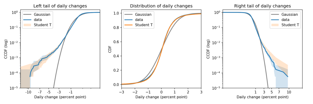
To compare both tails, as well as the “bulk” of the distribution, I recommend a triptych that looks like this:
There’s a lot of information in that figure. So let me explain.
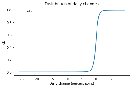
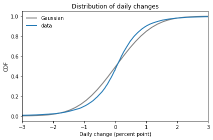
Suppose you observe a random process, like daily changes in the S&P 500. And suppose you have collected historical data in the form of percent changes from one day to the next. The distribution of those changes might look like this:
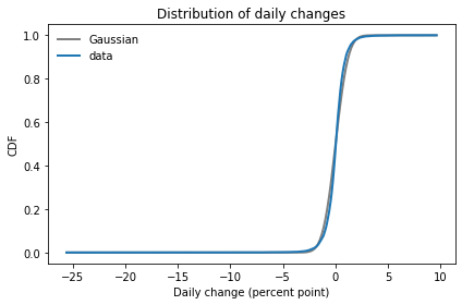
If you fit a Gaussian model to this data, it looks like this:
It looks like there are small discrepancies between the model and the data, but if you follow my previous advice, you might look at these CDFs and conclude that the Gaussian model is pretty good.
If we zoom in on the middle of the distribution, we can see the discrepancies more clearly:
In this figure it is clearer that the Gaussian model does not fit the data particularly well. And, as we’ll see, the tails are even worse.
Survival on a log-log scale
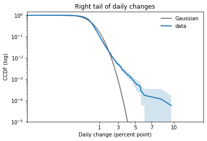
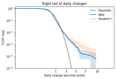
In my opinion, the best way to compare tails is to plot the survival curve (which is the complementary CDF) on a log-log scale.
In this case, because the dataset includes positive and negative values, I shift them right to view the right tail, and left to view the left tail.
Here’s what the right tail looks like:
This view is like a microscope for looking at tail behavior; it compresses the bulk of the distribution and expands the tail. In this case we can see a small discrepancy between the data and the model around 1 percentage point. And we can see a substantial discrepancy above 3 percentage points.
The Gaussian distribution has “thin tails”; that is, the probabilities it assigns to extreme events drop off very quickly. In the dataset, extreme values are much more common than the model predicts.
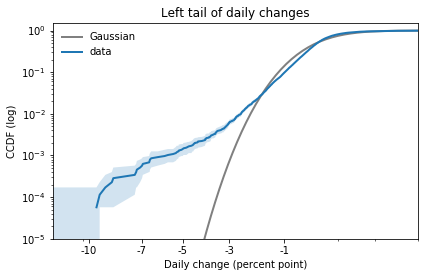
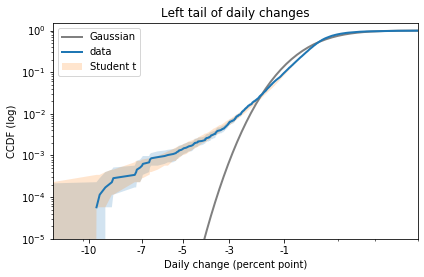
The results for the left tail are similar:
Again, there is a small discrepancy near -1 percentage points, as we saw when we zoomed in on the CDF. And there is a substantial discrepancy in the leftmost tail.
Student’s t-distribution
Now let’s try the same exercise with Student’s t-distribution. There are two ways I suggest you think about this distribution:
1) Student’s t is similar to a Gaussian distribution in the middle, but it has heavier tails. The heaviness of the tails is controlled by a third parameter, ν.
2) Also, Student’s t is a mixture of Gaussian distributions with different variances. The tail parameter, ν, is related to the variance of the variances.
I used PyMC to estimate the parameters of a Student’s t model and generate a posterior predictive distribution. You can see the details in this Jupyter notebook.
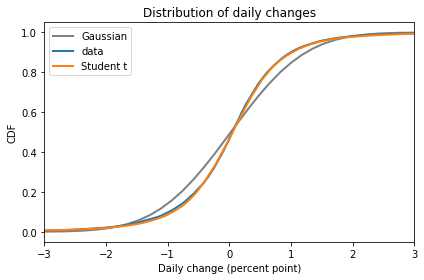
Here is the CDF of the Student t model compared to the data and the Gaussian model:
In the bulk of the distribution, Student’s t-distribution is clearly a better fit.
Now here’s the right tail, again comparing survival curves on a log-log scale:
Student’s t-distribution is a better fit than the Gaussian model, but it overestimates the probability of extreme values. The problem is that the left tail of the empirical distribution is heavier than the right. But the model is symmetric, so it can only match one tail or the other, not both.
Here is the left tail:
The model fits the left tail about as well as possible.
If you are primarily worried about predicting extreme losses, this model would be a good choice. But if you need to model both tails well, you could try one of the asymmetric generalizations of Student’s t.
The old six sigma
The tail behavior of the Gaussian distribution is the key to understanding “six sigma events”.
“Six sigma means six standard deviations away from the mean of a probability distribution, sigma (σ) being the common notation for a standard deviation. Moreover, the underlying distribution is implicitly a normal (Gaussian) distribution; people don’t commonly talk about ‘six sigma’ in the context of other distributions.”
This is important. John also explains:
“A six-sigma event isn’t that rare unless your probability distribution is normal… The rarity of six-sigma events comes from the assumption of a normal distribution more than from the number of sigmas per se.”
So, if you see a six-sigma event, you should probably not think, “That was extremely rare, according to my Gaussian model.” Instead, you should think, “Maybe my Gaussian model is not a good choice”.
In the first article in this series, I looked at data from the General Social Survey (GSS) to see how political alignment in the U.S. has changed, on the axis from conservative to liberal, over the last 50 years.
In the second article, I suggested that self-reported political alignment could be misleading.
Do you think most people would try to take advantage of you if they got a chance, or would they try to be fair?
And generated seven “headlines” to describe the results.
In this article, we’ll use resampling to see how much the results depend on random sampling. And we’ll see which headlines hold up and which might be overinterpretation of noise.
Overall trends
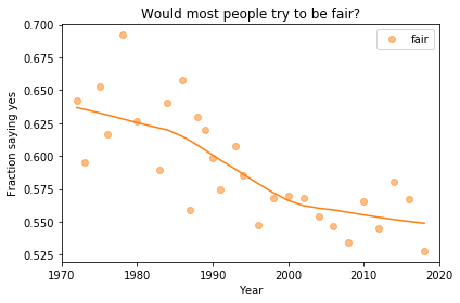
In the previous article we looked at this figure, which was generated by resampling the GSS data and computing a smooth curve through the annual averages.
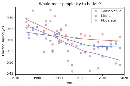
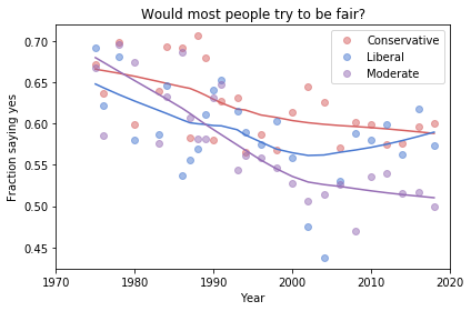
If we run the resampling process two more times, we get somewhat different results:
Now, let’s review the headlines from the previous article. Looking at different versions of the figure, which conclusions do you think are reliable?
Absolute value: “Most respondents think people try to be fair.”
Rate of change: “Belief in fairness is falling.”
Change in rate: “Belief in fairness is falling, but might be leveling off.”
In my opinion, the three figures are qualitatively similar. The shapes of the curves are somewhat different, but the headlines we wrote could apply to any of them.
Even the tentative conclusion, “might be leveling off”, holds up to varying degrees in all three.
Grouped by political alignment
When we group by political alignment, we have fewer samples in each group, so the results are noisier and our headlines are more tentative.
Here’s the figure from the previous article:
And here are two more figures generated by random resampling:
Now we see more qualitative differences between the figures. Let’s review the headlines again:
Absolute value: “Moderates have the bleakest outlook; Conservatives and Liberals are more optimistic.” This seems to be true in all three figures, although the size of the gap varies substantially.
Rate of change: “Belief in fairness is declining in all groups, but Conservatives are declining fastest.” This headline is more questionable. In one version of the figure, belief is increasing among Liberals. And it’s not at all clear the the decline is fastest among Conservatives.
Change in rate: “The Liberal outlook was declining, but it leveled off in 1990.” The Liberal outlook might have leveled off, or even turned around, but we could not say with any confidence that 1990 was a turning point.
Change in rate: “Liberals, who had the bleakest outlook in the 1980s, are now the most optimistic”. It’s not clear whether Liberals have the most optimistic outlook in the most recent data.
As we should expect, conclusions based on smaller sample sizes are less reliable.
Also, conclusions about absolute values are more reliable than conclusions about rates, which are more reliable than conclusions about changes in rates.
In the first article in this series, I looked at data from the General Social Survey (GSS) to see how political alignment in the U.S. has changed, on the axis from conservative to liberal, over the last 50 years.
In the second article, I suggested that self-reported political alignment could be misleading.
In this article we’ll look at results from questions related to “outlook”, that is, how the respondents see the world and people in it.
Specifically, the questions are:
fair: Do you think most people would try to take advantage of you if they got a chance, or would they try to be fair?
trust: Generally speaking, would you say that most people can be trusted or that you can’t be too careful in dealing with people?
helpful: Would you say that most of the time people try to be helpful, or that they are mostly just looking out for themselves?
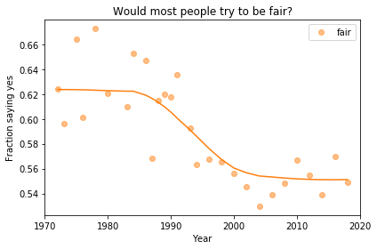
Do people try to be fair?
Let’s start with fair. The responses are coded like this:
1    Take advantage
2    Fair
3    Depends
To put them on a numerical scale, I recoded them like this:
1    Fair
0.5  Depends
0    Take advantage
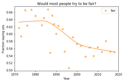
I flipped the axis so the more positive answer is higher, and put “Depends” in the middle. Now we can plot the mean response by year, like this:
Looking at a figure like this, there are three levels we might describe:
Absolute value: “Most respondents think people try to be fair.”
Rate of change: “Belief in fairness is falling.”
Change in rate: “Belief in fairness is falling, but might be leveling off.”
For any of these qualitative descriptions, we could add quantitative estimates. For example, “About 55% of U.S. residents think people try to be fair”, or “Belief in fairness has dropped 10 percentage points since 1970”.
Statistically, the estimates of absolute value are probably reliable, but we should be more cautious estimating rates of change, and substantially more cautious talking about changes in rates. We’ll come back to this issue, but first let’s look at breakdowns by group.
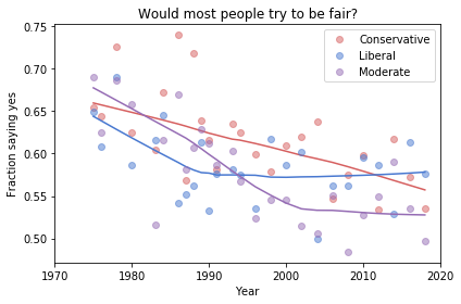
Outlook and political alignment
In the previous article I grouped respondents by self-reported political alignment: Conservative, Moderate, or Liberal.
We can use these groups to see the relationship between outlook and political alignment. For example, the following figure shows the average response to the fairness question, grouped by political alignment and plotted over time:
Results like these invite comparisons between groups, and we can make those comparisons at several levels. Here are some potential headlines for this figure:
Absolute value: “Moderates have the bleakest outlook; Conservatives and Liberals are more optimistic.”
Rate of change: “Belief in fairness is declining in all groups, but Conservatives are declining fastest.”
Change in rate: “The Liberal outlook was declining, but it leveled off in 1990.” or “Liberals, who had the bleakest outlook in the 1980s, are now the most optimistic”.
Because we divided the respondents into three groups, the sample size in each group is smaller. Statistically, we need to be more skeptical about our estimates of absolute level, even more skeptical about rates of change, and extremely skeptical about changes in rates.
In the next article, I’ll use resampling to quantify the uncertainly of these estimates, and we’ll see how many of these headlines hold up.
In the previous article, I looked at data from the General Social Survey (GSS) to see how political alignment in the U.S. has changed, on the axis from conservative to liberal, over the last 50 years.
The GSS asks respondents where they place themselves on a 7-point scale from “extremely liberal” (1) to “extremely conservative” (7), with “moderate” in the middle (4).
In the previous article I computed the mean and standard deviation of the responses as a way of quantifying the center and spread of the distribution. But it can be misleading to treat categorical responses as if they were numerical. So let’s see what we can do with the categories.
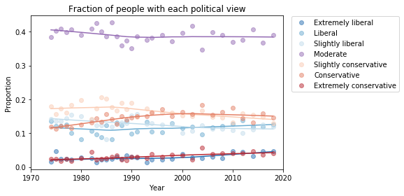
The following plot shows the fraction of respondents who place themselves in each category, plotted over time:
My initial reaction is that these lines are mostly flat. If political alignment is changing in the U.S., it is changing slowly, and the changes might not matter much in practice.
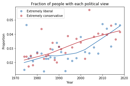
If we look more closely, it seems like the number of people who consider themselves “extreme” is increasing, and the number of moderates might be decreasing. The following plot shows a closer look at the extremes.
There is some evidence of polarization here, but we should not make too much of it. People who consider themselves extreme are still less than 10% of the population, and moderates are still the biggest group, at almost 40%.
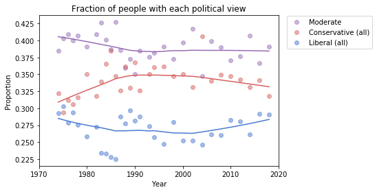
To get a better sense of what’s happening with the other groups, I reduced the number of categories to 3: “Conservative” at any level, “Liberal” at any level, and “Moderate”. Here’s what the plot looks like with these categories:
Moderates make up a plurality; conservatives are the next biggest group, followed by liberals.
From 1974 to 1990, the number of people who call themselves “Conservative” was increasing, but it has decreased ever since. And the number of “Liberals” has been increasing since 2000.
At least, that’s what this plot seems to show. We should be careful about over-interpreting patterns that might be random noise. And we might not want to take these categories too seriously, either.
The hazards of self-reporting
There are several problems with self-reported labels like this.
First, political beliefs are multi-dimensional. “Conservative” and “liberal” are labels for collections of ideas that sometimes go together. But most people hold a mixture of these beliefs.
Also, these labels are relative; that is, when someone says they are conservative, what they often mean is that they are more conservative than the center of the population, or where they think the center is, for the population they have in mind.
Finally, nearly all survey responses are subject to social desirability bias, which is the tendency of people to give answers that make them look better or feel better about themselves.
Over time, the changes we see in these responses depend on actual changes in political beliefs, but they also depend on where the center of the population is, where people think the center is, and the perceived desirability of the labels “liberal”, “conservative”, and “moderate”.
So, in the next article we’ll look more closely at changes in beliefs and attitudes, not just labels.
I am planning to turn these articles into a case study for an upcoming Data Science class, so I welcome comments and questions.