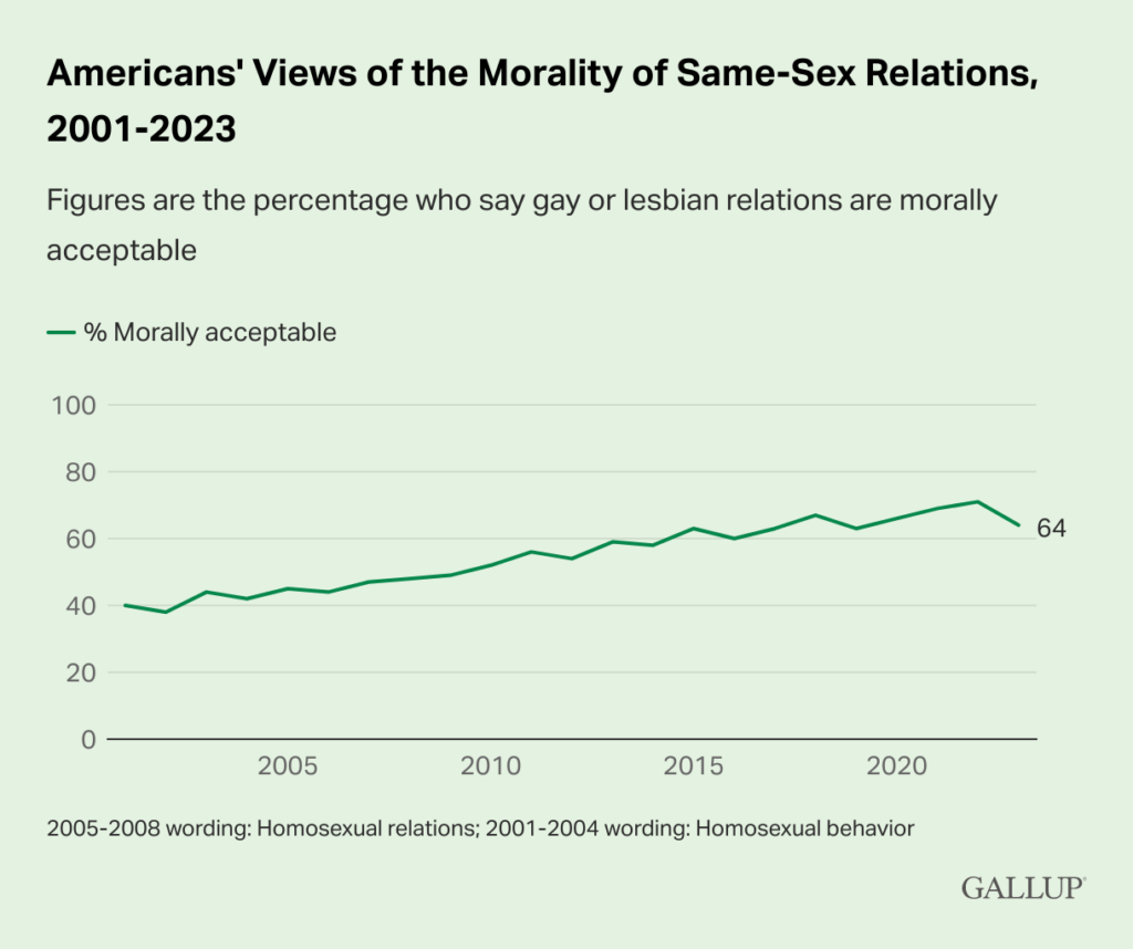
Browsed by
Category: Uncategorized

Driving Under the Influence

Driving Under the Influence

This recent article in the Washington Post reports that “a police department in Maryland is training officers to spot the signs of driving high by watching people toke up in a tent”. The story features Lt. John O’Brien, who is described as a “trained drug recognition expert”. It also quotes a defense attorney who says, “There are real questions about the scientific validity of what they’re doing.”

As it happens, the scientific validity of Drug Recognition Experts is one of the examples in my forthcoming book, Probably Overthinking It. The following is an excerpt from Chapter 9: “Fairness and Fallacy”.

In September 2017 the American Civil Liberties Union (ACLU) filed suit against Cobb County, Georgia on behalf of four drivers who were arrested for driving under the influence of cannabis. All four were evaluated by Officer Tracy Carroll, who had been trained as a “Drug Recognition Expert” (DRE) as part of a program developed by the Los Angeles Police Department in the 1970s.

At the time of their arrest, all four insisted that they had not smoked or ingested any cannabis products, and when their blood was tested, all four results were negative; that is, the blood tests found no evidence of recent cannabis use.

In each case, prosecutors dismissed the charges related to impaired driving. Nevertheless, the arrests were disruptive and costly, and the plaintiffs were left with a permanent and public arrest record.

At issue in the case is the assertion by the ACLU that, “Much of the DRE protocol has never been rigorously and independently validated.”

So I investigated that claim. What I found was a collection of studies that are, across the board, deeply flawed. Every one of them features at least one methodological error so blatant it would be embarrassing at a middle school science fair.

As an example, the lab study most often cited to show that the DRE protocol is valid was conducted at Johns Hopkins University School of Medicine in 1985. It concludes, “Overall, in 98.7% of instances of judged intoxication the subject had received some active drug”. In other words, in the cases where one of the Drug Recognition Experts believed that a subject was under the influence, they were right 98.7% of the time.

That sounds impressive, but there are several problems with this study. The biggest is that the subjects were all “normal, healthy” male volunteers between 18 and 35 years old, who were screened and “trained on the psychomotor tasks and subjective effect questionnaires used in the study”.

By design, the study excluded women, anyone older than 35, and anyone in poor health. Then the screening excluded anyone who had any difficulty passing a sobriety test while they were sober — for example, anyone with shaky hands, poor coordination, or poor balance.

But those are exactly the people most likely to be falsely accused. How can you estimate the number of false positives if you exclude from the study everyone likely to yield a false positive? You can’t.

Another frequently-cited study reports that “When DREs claimed drugs other than alcohol were present, they [the drugs] were almost always detected in the blood (94% of the time)”. Again, that sounds impressive until you look at the methodology.

Subjects in this study had already been arrested because they were suspected of driving while impaired, most often because they had failed a field sobriety test.

Then, while they were in custody, they were evaluated by a DRE, that is, a different officer trained in the drug evaluation procedure. If the DRE thought that the suspect was under the influence of a drug, the suspect was asked to consent to a blood test; otherwise they were released.

Of 219 suspects, 18 were released after a DRE performed a “cursory examination” and concluded that there was no evidence of drug impairment.

The remaining 201 suspects were asked for a blood sample. Of those, 22 refused and 6 provided a urine sample only.

Of the 173 blood samples, 162 were found to contain a drug other than alcohol. That’s about 94%, which is the statistic they reported.

But the base rate in this study is extraordinarily high, because it includes only cases that were suspected by the arresting officer and then confirmed by the DRE. With a few generous assumptions, I estimate that the base rate is 86%; in reality, it was probably higher.

To estimate the base rate, let’s assume:

  • All 18 of the suspects who were released were, in fact, not under the influence of a drug, and
  • The 28 suspects who refused a blood test were impaired at the same rate as the 173 who agreed, 94%.

Both of these assumptions are generous; that is, they probably overestimate the accuracy of the DREs. Even so, they imply that 188 out of 219 blood tests would have been positive, if they had been tested. That’s a base rate of 86%.

Because the suspects who were released were not tested, there is no way to estimate the sensitivity of the test, but let’s assume it’s 99%, so if a suspect is under the influence of a drug, there is a 99% chance a DRE would detect it. In reality, it is probably lower.

With these generous assumptions, we can use the following table to estimate the sensitivity of the DRE protocol.

SuspectsProb PositiveCasesPercent
Impaired860.9985.1493.8
Not impaired140.405.606.2

With 86% base rate, we expect 86 impaired suspects out of 100, and 14 unimpaired. With 99% sensitivity, we expect the DRE to detect about 85 true positives. And with 60% specificity, we expect the DRE to wrongly accuse 5.6 suspects. Out of 91 positive tests, 85 would be correct; that’s about 94%, as reported in the study.

But this accuracy is only possible because the base rate in the study is so high. Remember that most of the subjects had been arrested because they had failed a field sobriety test. Then they were tested by a DRE, who was effectively offering a second opinion.

But that’s not what happened when Officer Tracy Carroll arrested Katelyn Ebner, Princess Mbamara, Ayokunle Oriyomi, and Brittany Penwell. In each of those cases, the driver was stopped for driving erratically, which is evidence of possible impairment. But when Officer Carroll began his evaluation, that was the only evidence of impairment.

So the relevant base rate is not 86%, as in the study; it is the fraction of erratic drivers who are under the influence of drugs. And there are many other reasons for erratic driving, including distraction, sleepiness, and the influence of alcohol. It’s hard to say which explanation is most common. I’m sure it depends on time and location. But as an example, let’s suppose it is 50%; the following table shows the results with this base rate.

SuspectsProb PositiveCasesPercent
Impaired500.9949.571.2
Not impaired500.4020.028.8

With 50% base rate, 99% sensitivity, and 60% specificity, the predictive value of the test is only 71%; under these assumptions, almost 30% of the accused would be innocent. In fact, the base rate, sensitivity, and specificity are probably lower, which means that the value of the test is even worse.

The suit filed by the ACLU was not successful. The court decided that the arrests were valid because the results of the field sobriety tests constituted “probable cause” for an arrest. As a result, the court did not consider the evidence for, or against, the validity of the DRE protocol. The ACLU has appealed the decision.

Sources:

One Queue or Two

One Queue or Two

I’m happy to report that copyediting of Modeling and Simulation in Python is done, and the book is off to the printer! Electronic versions are available now from No Starch Press; print copies will be available in May, but you can pre-order now from No Starch Press, Amazon, and Barnes and Noble.

To celebrate, I just published one of the case studies from the end of Part I, which is about simulating discrete systems. The case study explores a classic question from queueing theory:

Suppose you are designing the checkout area for a new store. There is room for two checkout counters and a waiting area for customers. You can make two lines, one for each counter, or one line that serves both counters.

In theory, you might expect a single line to be better, but it has some practical drawbacks: in order to maintain a single line, you would have to install rope barriers, and customers might be put off by what seems to be a longer line, even if it moves faster.

So you’d like to check whether the single line is really better and by how much.

Simulation can help answer this question. The following figure shows the three scenarios I simulated:

The leftmost diagram shows a single queue (with customers arriving at rate 𝜆) and a single server (with customers completing service at rate 𝜇).

The center diagram shows a single queue with two servers, and the rightmost diagram shows two queue with two servers.

So, which is the best, and by how much? You can read my answer in the online version of the book. Or you can run the Jupyter notebook on Colab.

Here’s what some of the results look like:

This figure shows the time customers are in the system, including wait time and service time, as a function of the arrival rate. The orange line shows the average we expect based on analysis; the blue dots show the result of simulations.

This comparison shows that the simulation and analysis are consistent. It also demonstrates one of the features of simulation: it is easy to quantify not just the average we expect but also the variation around the average.

That capability turns out to be useful for this problem because, as it turns out, the difference between the one-queue and two-queue scenarios is small compared to the variation, which suggests the advantage would be unnoticed in practice.

I conclude:

The two configurations are equally good as long as both servers are busy; the only time two lines is worse is if one queue is empty and the other contains more than one customer. In real life, if we allow customers to change lanes, that disadvantage can be eliminated.

From a theoretical point of view, one line is better. From a practical point of view, the difference is small and can be mitigated. So the best choice depends on practical considerations.

On the other hand, you can do substantially better with an express line for customers with short service times. But that’s a topic for another case study.

Don’t discard that pangolin

Don’t discard that pangolin

Sadly, today is my last day at DrivenData, so it’s a good time to review one of the projects I’ve been working on, using probabilistic predictions from Zamba to find animals in camera trap videos, like this:

Zamba is one of the longest-running projects at DrivenData. You can read about it in this blog post: Computer vision for wildlife monitoring in a changing climate.

And if you want to know more about my part of it, I wrote this series of articles.

Most recently, I’ve been working on calibrating the predictions from convolutional neural networks (CNNs). I haven’t written about it, but at ODSC East 2023, I’m giving a talk about it:

Don’t Discard That Pangolin, Calibrate Your Deep Learning Classifier 

Suppose you are an ecologist studying a rare species like a pangolin. You can use motion-triggered camera traps to collect data about the presence and abundance of species in the wild, but for every video showing a pangolin, you have 100 that show other species, and 100 more that are blank. You might have to watch hours of video to find one pangolin.

Deep learning can help. Project Zamba provides models that classify camera trap videos and identify the species that appear in them. Of course, the results are not perfect, but we can often remove 80% of the videos we don’t want while losing only 10-20% of the videos we want.

But there’s a problem. The output from deep learning classifiers is generally a “confidence score”, not a probability. If a classifier assigns a label with 80% confidence, that doesn’t mean there is an 80% chance it is correct. However, with a modest number of human-generated labels, we can often calibrate the output to produce more accurate probabilities, and make better predictions.

In this talk, I’ll present use cases based on data from Africa, Guam, and New Zealand, and show how we can use deep learning and calibration to save the pangolin… or at least the pangolin videos. This real-world problem shows how users of ML models can tune the results to improve performance on their applications.  

The ODSC schedule isn’t posted yet, but I’ll fill in the details later.

Never Test for Normality

Never Test for Normality

Way back in 2013, I wrote this blog post explaining why you should never use a statistical test to check whether a sample came from a Gaussian distribution. I argued that data from the real world never come from a Gaussian distribution, or any other simple mathematical model, so the answer to the question is always no. And there are only two possible outcomes from the test:

  • If you have enough data, the test will reject the hypothesis that the data came from a Gaussian distribution, or
  • If you don’t have enough data, the test will fail to reject the hypothesis.

Either way, the result doesn’t tell you anything useful.

In this article, I will explore a particular example and demonstrate this relationship between the sample size and the outcome of the test. And I will conclude, again, that

Choosing a distribution is not a statistical question; it is a modeling decision. No statistical test can tell you whether a particular distribution is a good model for your data.

For the technical details, you can read the extended version of this article or run this notebook on Colab.

I’ll start by generating a sample that is actually from a lognormal distribution, then use the sample mean and standard deviation to make a Gaussian model. Here’s what the empirical distribution of the sample looks like compared to the CDF of the Gaussian distribution.

It looks like the Gaussian distribution is a pretty good model for the data, and probably good enough for most purposes.

According to the Anderson-Darling test, the test statistic is 1.7, which exceeds the critical value, 0.77, so at the 5% significance level, we can reject the hypothesis that this sample came from a Gaussian distribution. That’s the right answer, so it might seem like we’ve done something useful. But we haven’t.

Sample size

The result from the A-D test depends on the sample size. The following figure shows the probability of rejecting the null hypothesis as a function of sample size, using the lognormal distribution from the previous section.

When the sample size is more than 200, the probability of rejection is high. When the sample size is less than 100, the probability of rejection is low. But notice that it doesn’t go all the way to zero, because there is always a 5% chance of a false positive.

The critical value is about 120; at that sample size, the probability of rejecting the null is close to 50%.

So, again, if you have enough data, you’ll reject the null; otherwise you probably won’t. Either way, you learn nothing about the question you really care about, which is whether the Gaussian model is a good enough model of the data for your purposes.

That’s a modeling decision, and no statistical test can help. In the original article, I suggested some methods that might.

Resampling for Logistic Regression

Resampling for Logistic Regression

A recent question on Reddit asked about using resampling with logistic regression. The responses suggest two ways to do it, one parametric and one non-parametric. I implemented both of them and then invented a third, which is hybrid of the two.

You can read the details of the implementation in the extended version of this article.

Or you can click here to run the Jupyter notebook on Colab

Different ways of computing sampling distributions – and the statistics derived from them, like standard errors and confidence intervals – yield different results. None of them are right or wrong; rather, they are based on different modeling assumptions.

In this example, it is easy to implement multiple models and compare the results. If they were substantially different, we would need to think more carefully about the modeling assumptions they are based on and choose the one we think is the best description of the data-generating process.

But in this example, the differences are small enough that they probably don’t matter in practice. So we are free to choose whichever is easiest to implement, or fastest to compute, or convenient in some other way.

It is a common error to presume that the result of an analytic method is uniquely correct, and that results from computational methods like resampling are approximations to it. Analytic methods are often fast to compute, but they are always based on modeling assumptions and often based on approximations, so they are no more correct than computational methods.

Smoking causes cancer

Smoking causes cancer

Here’s a question posted on Reddit’s statistics forum:

The Centers for Disease Control and Prevention states on its website that “in the United States, cigarette smoking causes about 90% of lung cancers.” If S is the event “smokes cigarettes” and L is the event “has lung cancer,” then the probability 0.90 is expressed in probability notation as

  1. P(S and L).
  2. P(S | L).
  3. P(L | S).

Let’s consider a scenario that’s not exactly what the question asks about, but will help us understand the relationships among these quantities:

Suppose 20% of people smoke, so out of 1000 people, we have 200 smokers and 800 nonsmokers.

Suppose 1% of nonsmokers get lung cancer, so out of 800 nonsmokers, there would be 8 cases of lung cancer, 0 caused by smoking.

And suppose 20% of smokers get lung cancer, 19% caused by smoking and 1% caused by something else (same as the nonsmokers). Out of 200 smokers, there would be 40 cases of lung cancer, 38 caused by smoking.

In this scenario, there are a total of 48 cases of lung cancer, 38 caused by smoking. So smoking caused 38/48 cancers, which is 79%.

P(S and L) is 40 / 1000, which is 4%.

P(S | L) = 40 / 48, which is 83%.

P(L | S) = 40 / 200, which is 20%.

From this scenario we can conclude:

  • The percentage of cases caused by smoking does not correspond to any of the listed probabilities, so the answer to the question is “None of the above”.
  • In order to compute these quantities, we need to know the percentage of smokers and the risk ratio for smokers vs nonsmokers.

In reality, the relationships among these quantities are complicated by time: the percentage of smokers changes over time, and there is a long lag between smoking and cancer diagnosis.

Finding modes and antimodes

Finding modes and antimodes

Here’s a question from Reddit:

How can I find the least frequent value (antimode) between 2 modes in a bimodal distribution?

I’m only mildly self taught in anything in statistics so please be patient with my ignorance. I’ve found so little info on a Google search for “antimode” that I thought it was a word made up by the author of a random article.

Then I found one tiny mention on the Wikipedia page for “Multimodal distribution” but no citation or details beyond that it’s the least frequent value between modes.

What data do I need in order to find this number and what is the formula?

This site had a short mention of it and in their example listed:

Mode A: 33.25836

Mode B: 71.55446

Antimode: 55.06092

But I can’t seem to reverse engineer it with just this data.

Here’s the reply I wrote:

With continuous data, there is no off-the-shelf formula to compute modes or antimodes. You have to make some modeling decisions.

One option is to use kernel density estimation KDE. Adjust the parameters until, in your judgment, the result is a good representation of the distribution, and then you can read off maxima and minima.

And here’s a notebook on Colab that shows what I mean.

If you are not familiar with KDE, here’s a great animated explanation.

Overthinking the question

Overthinking the question

“Tell me if you agree or disagree with this statement:  Most men are better suited emotionally for politics than are most women.”

That’s one of the questions on the General Social Survey. In 1974, when it was first asked, 47% of respondents said they agreed. In 2018, the most recent survey where this question was asked, that percentage was down to 14%.

Last week I posed the same question to an audience at PyData NYC. Of 56 people who responded, none of them agreed with the statement (0%).

However, if we take the question literally, the correct answer is “I don’t know”. In fact, it is almost certain that either

  1. Most men are better suited emotionally for politics than are most women, or
  2. Most women are better suited emotionally for politics than are most men.

The reason is that saying that “most A are better than most B” is equivalent to saying that the median in group A is higher than the median in group B.

Here’s the proof: If one median is higher than the other, we can find a value between them where most members of group A are higher (by the definition of median) and most members of group B are lower. So unless the medians are identical, either “most A are better than most B” or the other way around.

And what does it mean to be “suited emotionally for politics”? I don’t know, but if we had to quantify it, it would be some combination of emotional factors. Men and women differ in many ways, on average; the difference is small for some factors and bigger for others. So it is likely that a combination of factors also differs between the groups. And even if the difference is very small, the medians are unlikely to be identical.

So, if we take the question literally, the best answer is “I don’t know”. But it’s clear that people don’t take the question literally. Instead, they are probably answering something like “Do you think men are so much better suited emotionally for politics that they should hold a large majority of positions of power?”

I think that one’s easier to answer.

Chasing the Overton Window

Chasing the Overton Window

On November 9 I presented a talk at PyData NYC with the title “Chasing the Overton Window“.

The video from this talk is now available:

This talk is based on a chapter of my forthcoming book called Probably Overthinking It that is about using evidence and reason to answer questions and make better decisions. If you would like to get an occasional update about the book, please join my mailing list.

Here are the slides for the talk.

The results I reported are from 16 questions from the General Social Survey (GSS). If you would like to see the text of the questions, and answer them yourself, you can

Fill out this survey.

I summarized the results from the survey in these slides.

If you would like to read more about the topic of the talk, I’ve written two related blog posts:

The Long Tail of Disaster

The Long Tail of Disaster

In honor of NASA’s successful DART mission, here’s a relevant excerpt from my forthcoming book, Probably Overthinking It.

On March 11, 2022, an astronomer near Budapest, Hungary detected a new asteroid, now named 2022 EB5, on a collision course with Earth. Less than two hours later, it exploded in the atmosphere near Greenland. Fortunately, no large fragments reached the surface, and they caused no damage.

We have not always been so lucky. In 1908, a much larger asteroid entered the atmosphere over Siberia, causing an estimated 2 megaton explosion, about the same size as the largest thermonuclear device tested by the United States. The explosion flattened something like 80 million trees in an area covering 2100 square kilometers, almost the size of Rhode Island. Fortunately, the area was almost unpopulated; a similar-sized impact could destroy a large city.

These events suggest that we would be wise to understand the risks we face from large asteroids. To do that, we’ll look at evidence of damage they have done in the past: the impact craters on the Moon.

The largest crater on the near side of the moon, named Bailly, is 303 kilometers in diameter; the largest on the far side, the South Pole-Aitken basin, is roughly 2500 kilometers in diameter.

In addition to large, visible craters like these, there are innumerable smaller craters. The Lunar Crater Database catalogs nearly all of the ones larger than one kilometer, about 1.3 million in total. It is based on images taken by the Lunar Reconnaissance Orbiter, which NASA sent to the Moon in 2009.

The following figures show the distribution of their sizes on a log scale, compared to a lognormal model. The left figure shows the tail distribution on a linear scale; the right figure shows the same curve on a log scale.

Since the dataset does not include craters smaller than one kilometer, I cut off the model at the same threshold. We can assume that there are many smaller craters, but with this dataset we can’t tell what the distribution of their sizes looks like.

Looking at the figure on the left, we can see a discrepancy between the data and the model between 3 and 10 kilometers. Nevertheless, the model fits the logarithms of the diameters well, so we could conclude that the distribution of crater sizes is approximately lognormal.

However, looking at the figure on the right, we can see big differences between the data and the model in the tail. In the dataset, the fraction of craters as big as 100 kilometers is about 250 per million; according to the model, it would be less than 1 per million. The dotted line in the figure shows this difference.

Going farther into the tail, the fraction of craters as big as 1000 kilometers is about 3 per million; according to the model, it would be less than one per trillion. And the probability of a crater as big as the South Pole-Aitken basin is about 50 per sextillion.

If we are only interested in craters less than 10 kilometers in diameter, the lognormal model might be good enough. But for questions related to the biggest craters, it is way off.

The following figure shows the distribution of crater sizes again, compared to a log-t model [which is the abbreviated name I use for a Student-t distribution on a log scale].

The figure on the left shows that the model fits the data well in the middle of the distribution, a little better than the lognormal model. The figure on the right shows that the log-t model fits the tail of the distribution substantially better than the lognormal model.

It’s not perfect: there are more craters near 100 km than the model expects, and fewer craters larger than 1000 km. As usual, the world is under no obligation to follow simple rules, but this model does pretty well.

We might wonder why. To explain the distribution of crater sizes, it helps to think about where they come from. Most of the craters on the Moon were formed during a period in the life of the solar system called the “Late Heavy Bombardment”, about 4 billion years ago. During this period, an unusual number of asteroids were displaced from the asteroid belt – possibly by interactions with large outer planets – and some of them collided with the Moon.

We assume that some of them also collided with the Earth, but none of the craters they made still exist; due to plate tectonics and volcanic activity, the surface of Earth has been recycled several times since the Late Heavy Bombardment.

But the Moon is volcanically inert and it has no air or water to erode craters away, so its craters are visible now in almost the same condition they were 4 billion years ago (with the exception of some that have been disturbed by later impacts and lunar spacecraft).

Asteroids

As you might expect, there is a relationship between the size of an asteroid and the size of the crater it makes: in general, a bigger asteroid makes a bigger crater. So, to understand why the distribution of crater sizes is long-tailed, let’s consider the distribution of asteroid sizes.

The Jet Propulsion Laboratory (JPL) and NASA provide data related to asteroids, comets and other small bodies in our solar system. From their Small-Body Database, I selected asteroids in the “main asteroid belt” between the orbits of Mars and Jupiter.

There are more than one million asteroids in this dataset, about 136,000 with known diameter. The largest are Ceres (940 kilometers in diameter), Vesta (525 km), Pallas (513 km), and Hygeia (407 km). The smallest are less than one kilometer.

The following figure shows the distribution of asteroid sizes compared to a lognormal model.

As you might expect by now, the lognormal model fits the distribution of asteroid sizes in the middle of the range, but it does not fit the tail at all. Rather than belabor the point, let’s get to the log-t model, as shown in the following figure.

On the left, we see that the log-t model fits the data well near the middle of the range, except possibly near 1 kilometer.

On the right, we see that the model does not fit the tail of the distribution particularly well: there are more asteroids near 100 km than the model predicts. So the distribution of asteroid sizes does not strictly follow a log-t distribution. Nevertheless, it is clearly longer-tailed than a lognormal distribution, and we can use it to explain the distribution of crater sizes, as I’ll show in the next section.

Origins of Long-Tailed Distributions

One of the reasons long-tailed distributions are common in natural systems is that they are persistent; for example, if a quantity comes from a long-tailed distribution and you multiply it by a constant or raise it to a power, the result follows a long-tailed distribution.

Long-tailed distributions also persist when they interact with other distributions. When you add together two quantities, if either comes from a long-tailed distribution, the sum follows a long-tailed distribution, regardless of what the other distribution looks like. Similarly, when you multiply two quantities, if either comes from a long-tailed distribution, the product usually follows a long-tailed distribution. This property might explain why the distribution of crater sizes is long-tailed.

Empirically – that is, based on data rather than a physical model – the diameter of an impact crater depends on the diameter of the projectile that created it, raised to the power 0.78, and on the impact velocity raised to the power 0.44. It also depends on the density of the asteroid and the angle of impact.

As a simple model of this relationship, I’ll simulate the crater formation process by drawing asteroid diameters from the distribution in the previous section and drawing the other factors – density, velocity, and angle – from a lognormal distribution with parameters chosen to match the data. The following figure shows the results from this simulation along with the actual distribution of crater sizes.

In the center of the distribution (left) and in the tail (right), the simulation results are a good match for the data. This example suggests that the distribution of crater sizes can be explained by the relationship between the distributions of asteroid sizes and other factors like velocity and density.

In turn, there are physical models that might explain the distribution of asteroid sizes. Our best current understanding is that the asteroids in the asteroid belt were formed by dust particles that collided and stuck together. This process is called “accretion”, and simple models of accretion processes can yield long-tailed distributions.

So it may be that craters are long-tailed because of asteroids, and asteroids are long-tailed because of accretion.

In The Fractal Geometry of Nature, Benoit Mandelbrot proposes what he calls a “heretical” explanation for the prevalence of long-tailed distributions in natural systems: there may be only a few systems that generate long-tailed distributions, but interactions between systems might cause them to propagate.

He suggests that data we observe are often “the joint effect of a fixed underlying true distribution and a highly variable filter”, and “a wide variety of filters leave their asymptotic behavior unchanged”.

The long tail in the distribution of asteroid sizes is an example of “asymptotic behavior”. And the relationship between the size of an asteroid and the size of the crater it makes is an example of a “filter”. In this relationship, the size of the asteroid gets raised to a power and multiplied by a “highly-variable” lognormal distribution. These operations change the location and spread of the distribution, but they don’t change the shape of the tail.

When Mandelbrot wrote in the 1970s, this explanation might have been heretical, but now long-tailed distributions are more widely known and better understood. What was heresy then is orthodoxy now.