Data visualization for academics
One of the reasons I am excited about the rise of data journalism is that journalists are doing amazing things with visualization. At the same time, one of my frustrations with academic research is that the general quality of visualization is so poor.
One of the problems is that most academic papers are published in grayscale, so the figures don’t use color. But most papers are read in electronic formats now; the world is safe for color!
Another problem is the convention of putting figures at the end, which is an extreme form of burying the lede.
Also, many figures are generated by software with bad defaults: lines are too thin,
But I think the biggest problem is the simplest: the figures in most academic papers do a poor job of communicating one point clearly.
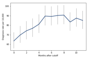
I wrote about one example a few months ago, a paper showing that children who start school relatively young are more likely to be diagnosed with ADHD.
Here’s the figure from the original paper:
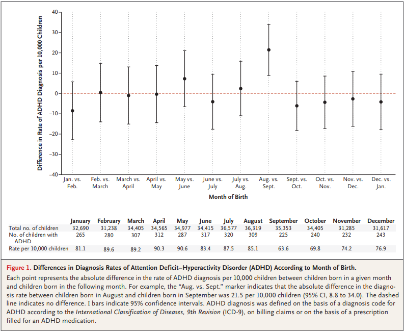
How long does it take you to understand the point of this figure? Now here’s my representation of the same data:
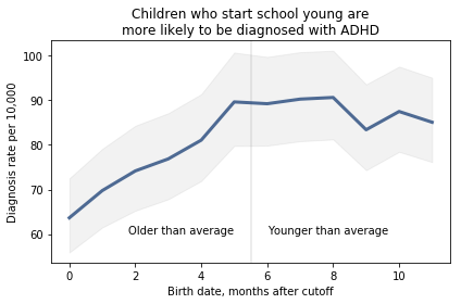
I believe this figure is easier to interpret. Here’s what I changed:
- Instead of plotting the difference between successive months, I plotted the diagnosis rate for each month, which makes it possible to see the pattern (diagnosis rate increases month over month for the first six months, then levels), and the magnitude of the difference (from 60 to 90 diagnoses per 10,000, an increase of about 50%).
- I shifted the horizontal axis to put the cutoff date (September 1) at zero.
- I added a vertical line and text to distinguish and interpret the two halves of the plot.
- I added a title that states the primary conclusion supported by the figure. Alternatively, I could have put this text in a caption.
- I replaced the error bars with a shaded area, which looks better (in my opinion) and appropriately gives less visual weight to less important information.
I came across a similar visualization makeover recently. In this Washington Post article, Catherine Rampell writes, “Colleges have been under pressure to admit needier kids. It’s backfiring.”
Her article is based on this academic paper; here’s the figure from the original paper:
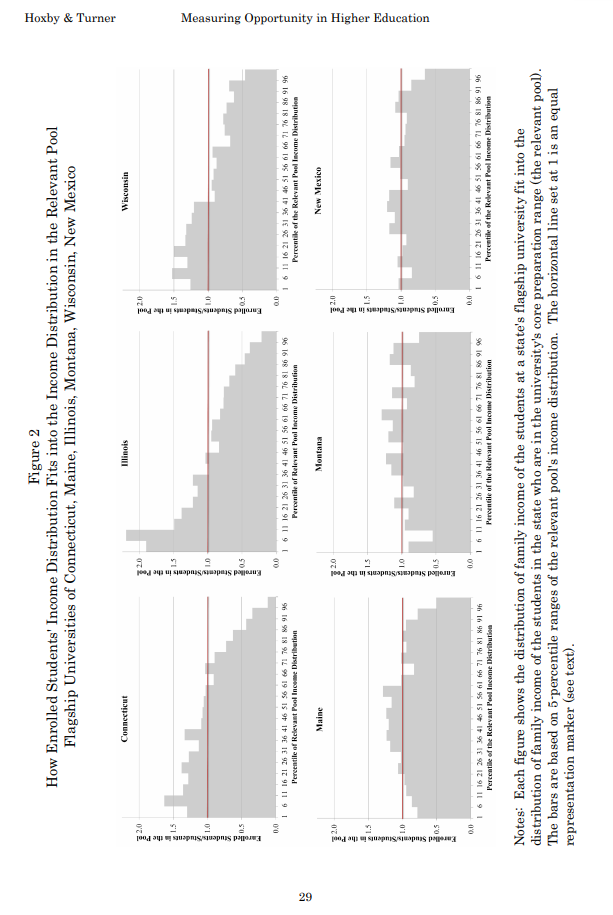
It’s sideways, it’s on page 29, and it fails to make its point. So Rampell designed a better figure. Here’s the figure from her article:

The title explains what the figure shows clearly: enrollment rates are highest for low-income students that qualify for Pell grants and lowest for low-income students who don’t qualify for Pell grants.
To nitpick, I might have plotted this data with a line rather than a bar chart, and I might have used a less saturated color. But more importantly, this figure makes its point clearly and compellingly.
Here’s one last example, and a challenge:
To demonstrate this effect, they show eight histograms on pages 44 and 45. Here’s page 44:
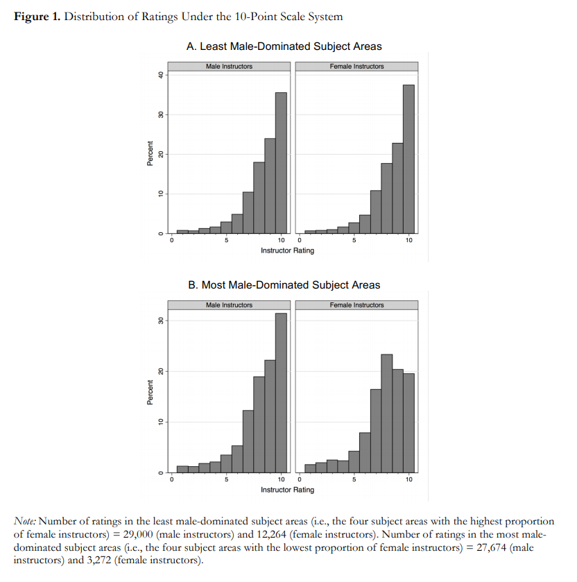
And here’s page 45:
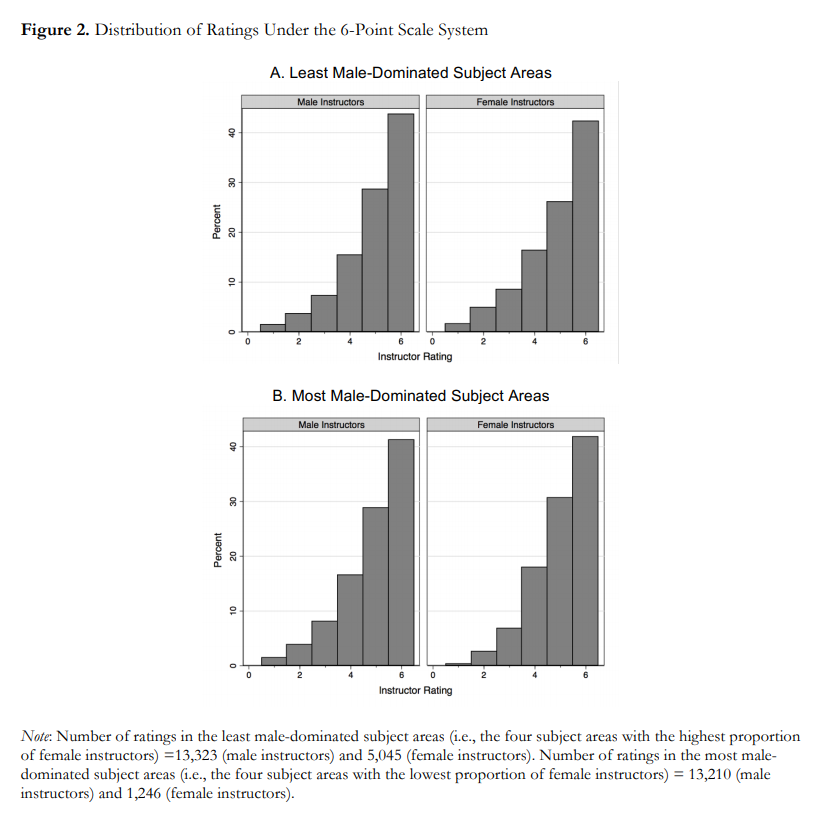
With some guidance from the captions, we can extract the message:
- Under the 6-point system, there is no visible difference between ratings for male and female instructors.
- Under the 10-point system, in the least male-dominated subject areas, there is no visible difference.
- Under the 10-point system, in the most male-dominated subject areas, there is a visibly obvious difference: students are substantially less likely to give female instructors a 9 or 10.
This is an important result — it makes me want to read the previous 43 pages. And the visualizations are not bad — they show the effect clearly, and it is substantial.
But I still think we could do better. So let me pose this challenge to readers: Can you design
- Readers can see the effect quickly and easily, and
- Understand the magnitude of the effect in practical terms?
You can get the data you need from the figures, at least approximately. And your visualization doesn’t have to be fancy; you can send something hand-drawn if you want. The point of the exercise is the design, not the details.
I will post submissions in a few days. If you send me something, let me know how you would like to be acknowledged.
UPDATE: We discussed this example in class today and I presented one way we could summarize and visualize the data:
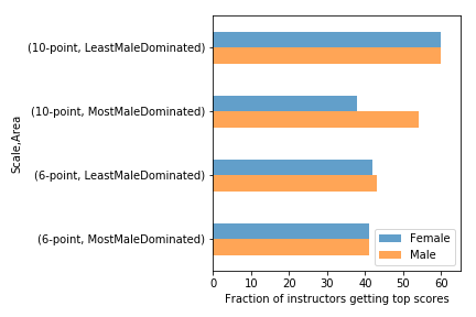
There are definitely things to do to improve this, but I generated it using Pandas with minimal customization. All the code is in this Jupyter notebook.
 Nelis Willers “wrote a 510 page book with LaTeX, using
 For the first 9 months, from September to May, we see what we would expect if at least some of the excess diagnoses are due to age-related behavior differences. For each month of difference in age, we see an increase in the number of diagnoses.
This pattern breaks down for the last three months, June, July, and August. This might be explained by random variation, but it also might be due to parental intervention; if some parents hold back students born near the deadline, the observations for these months include some children who are relatively old for their grade and therefore less likely to be diagnosed.
We could test this hypothesis by checking the actual ages of these students when they started school, rather than just looking at their months of birth. I will see whether that additional data is available; in the meantime, I will proceed taking the data at face value.
I fit the data using a Bayesian logistic regression model, assuming a linear relationship between month of birth and the log-odds of diagnosis. The following figure shows the fitted models superimposed on the data.
For the first 9 months, from September to May, we see what we would expect if at least some of the excess diagnoses are due to age-related behavior differences. For each month of difference in age, we see an increase in the number of diagnoses.
This pattern breaks down for the last three months, June, July, and August. This might be explained by random variation, but it also might be due to parental intervention; if some parents hold back students born near the deadline, the observations for these months include some children who are relatively old for their grade and therefore less likely to be diagnosed.
We could test this hypothesis by checking the actual ages of these students when they started school, rather than just looking at their months of birth. I will see whether that additional data is available; in the meantime, I will proceed taking the data at face value.
I fit the data using a Bayesian logistic regression model, assuming a linear relationship between month of birth and the log-odds of diagnosis. The following figure shows the fitted models superimposed on the data.
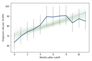 Most of these regression lines fall within the credible intervals of the observed rates, so in that sense this model is not ruled out by the data. But it is clear that the lower rates in the last 3 months bring down the estimated slope, so we should probably consider the estimated effect size to be a lower bound on the true effect size.
To express this effect size in a way that’s easier to interpret, I used the posterior predictive distributions to estimate the difference in diagnosis rate for children born in September and August. The difference is 21 diagnoses per 10,000, with 95% credible interval (13, 30).
As a percentage of the baseline (71 diagnoses per 10,000), that’s an increase of 30%, with credible interval (18%, 42%).
However, if it turns out that the observed rates for June, July, and August are brought down by red-shirting, the effect could be substantially higher. Here’s what the model looks like if we exclude those months:
Most of these regression lines fall within the credible intervals of the observed rates, so in that sense this model is not ruled out by the data. But it is clear that the lower rates in the last 3 months bring down the estimated slope, so we should probably consider the estimated effect size to be a lower bound on the true effect size.
To express this effect size in a way that’s easier to interpret, I used the posterior predictive distributions to estimate the difference in diagnosis rate for children born in September and August. The difference is 21 diagnoses per 10,000, with 95% credible interval (13, 30).
As a percentage of the baseline (71 diagnoses per 10,000), that’s an increase of 30%, with credible interval (18%, 42%).
However, if it turns out that the observed rates for June, July, and August are brought down by red-shirting, the effect could be substantially higher. Here’s what the model looks like if we exclude those months:
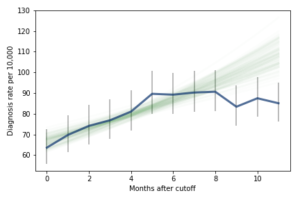 Of course, it is hazardous to exclude data points because they violate expectations, so this result should be treated with caution. But under this assumption, the difference in diagnosis rate would be 42 per 10,000. On a base rate of 67, that’s an increase of 62%.
Here is the notebook with the details of my analysis:
Of course, it is hazardous to exclude data points because they violate expectations, so this result should be treated with caution. But under this assumption, the difference in diagnosis rate would be 42 per 10,000. On a base rate of 67, that’s an increase of 62%.
Here is the notebook with the details of my analysis:
 Here’s another Bayes puzzle: