Browsed by
Tag: data science

Preston’s Paradox

Preston’s Paradox

This article is an excerpt from my book Probably Overthinking It, to be published by the University of Chicago Press in early 2023. This book is intended for a general audience, so I explain some things that might be familiar to readers of this blog – and I leave out the Python code. After the book is published, I will post the Jupyter notebooks with all of the details!

If you would like to receive infrequent notifications about the book (and possibly a discount), please sign up for this mailing list.

Suppose you are the ruler of a small country where the population is growing quickly. Your advisers warn you that unless growth slows down, the population will exceed the capacity of the farms and the peasants will starve.

The Royal Demographer informs you that the average family size is currently 3; that is, each woman in the kingdom bears three children, on average. He explains that the replacement level is close to 2, so if family sizes decrease by one, the population will stabilize at a sustainable size.

One of your advisors asks: “What if we make a new law that says every woman has to have fewer children than her mother?”

It sounds promising. As a benevolent despot, you are reluctant to restrict your subjects’ reproductive freedom, but it seems like such a policy could be effective at reducing family size with minimal imposition.

“Make it so,” you say.

Twenty-five years later, you summon the Royal Demographer to find out how things are going.

“Your Highness,” they say, “I have good news and bad news. The good news is that adherence to the new law has been perfect. Since it was put into effect, every woman in the kingdom has had fewer children than her mother.”

“That’s amazing,” you say. “What’s the bad news?”

“The bad news is that the average family size has increased from 3.0 to 3.3, so the population is growing faster than before, and we are running out of food.”

“How is that possible?” you ask. “If every woman has fewer children than her mother, family sizes have to get smaller, and population growth has to slow down.”

Actually, that’s not true.

In 1976, Samuel Preston, a demographer at the University of Washington, published a description of this apparent paradox: “A major intergenerational change at the individual level is required in order to maintain intergenerational stability at the aggregate level.”

To make sense of this, I’ll use the distribution of fertility in the United States (rather than your imaginary island). Every other year, the Census Bureau surveys a representative sample women in the United States and asks, among other things, how many children they have ever born. To measure completed family sizes, they select women aged 40-44 (of course, some women have children in their forties, so these estimates might be a little low).

I used the data from 1979 to estimate the distribution of family sizes at the time of Preston’s paper. Here’s what it looks like.

The average total fertility was close to 3. Starting from this distribution, what would happen if every woman had the same number of children as her mother? A woman with 1 child would have only one grandchild; a woman with 2 children would have 4 grandchildren; a woman with 3 children would have 9 grandchildren, and so on. In the next generation, there would be more big families and fewer small families.

Here’s what the distribution would look like in this “Same as mother” scenario.

The net effect is to shift the distribution to the right. If this continues, family sizes would increase quickly and population growth would explode.

So what happens in the “One child fewer” scenario? Here’s what the distribution looks like:

Bigger families are still overrepresented, but not as much as in the “Same as mother” scenario. The net effect is an increase is average fertility from 3 to 3.3.

As Preston explained, “under current [1976] patterns a woman would have to bear an average of almost two children fewer than … her mother merely to keep population fertility rates constant from generation to generation”. One child fewer was not enough!

As it turned out, the next generation in the U.S. had 2.3 fewer children than their mothers, on average, which caused a steep decline in average fertility:

Average fertility in the U.S. has been close to 2 since about 1990, although it might have increased in the last few years (keeping in mind that the women interviewed in 2018 had most of their children 10-20 years earlier).

Preston concludes, “Those who exhibit the most traditional behavior with respect to marriage and women’s roles will always be overrepresented as parents of the next generation, and a perpetual disaffiliation from their model by offspring is required in order to avert an increase in traditionalism for the population as a whole.”

So, if you have fewer children than your parents, don’t let anyone say you are selfish; you are doing your part to avert population explosion!

My thanks to Prof. Preston for comments on a previous version of this article.

If you would like to get infrequent email announcements about my book, please sign up below. I’ll let you know about milestones, promotions, and other news, but not more than one email per month. I will not share your email or use this list for any other purpose.

Probably Overthinking It mailing list

* indicates required
Left, right, part 4

Left, right, part 4

In the first article in this series, I looked at data from the General Social Survey (GSS) to see how political alignment in the U.S. has changed, on the axis from conservative to liberal, over the last 50 years.

In the second article, I suggested that self-reported political alignment could be misleading.

In the third article I looked at responses to this question:

Do you think most people would try to take advantage of you if they got a chance, or would they try to be fair?

And generated seven “headlines” to describe the results.

In this article, we’ll use resampling to see how much the results depend on random sampling. And we’ll see which headlines hold up and which might be overinterpretation of noise.

Overall trends

In the previous article we looked at this figure, which was generated by resampling the GSS data and computing a smooth curve through the annual averages.

This image has an empty alt attribute; its file name is image.png

If we run the resampling process two more times, we get somewhat different results:

Now, let’s review the headlines from the previous article. Looking at different versions of the figure, which conclusions do you think are reliable?

  • Absolute value: “Most respondents think people try to be fair.”
  • Rate of change: “Belief in fairness is falling.”
  • Change in rate: “Belief in fairness is falling, but might be leveling off.”

In my opinion, the three figures are qualitatively similar. The shapes of the curves are somewhat different, but the headlines we wrote could apply to any of them.

Even the tentative conclusion, “might be leveling off”, holds up to varying degrees in all three.

Grouped by political alignment

When we group by political alignment, we have fewer samples in each group, so the results are noisier and our headlines are more tentative.

Here’s the figure from the previous article:

This image has an empty alt attribute; its file name is image-1.png

And here are two more figures generated by random resampling:

Now we see more qualitative differences between the figures. Let’s review the headlines again:

  • Absolute value: “Moderates have the bleakest outlook; Conservatives and Liberals are more optimistic.” This seems to be true in all three figures, although the size of the gap varies substantially.
  • Rate of change: “Belief in fairness is declining in all groups, but Conservatives are declining fastest.” This headline is more questionable. In one version of the figure, belief is increasing among Liberals. And it’s not at all clear the the decline is fastest among Conservatives.
  • Change in rate: “The Liberal outlook was declining, but it leveled off in 1990.” The Liberal outlook might have leveled off, or even turned around, but we could not say with any confidence that 1990 was a turning point.
  • Change in rate: “Liberals, who had the bleakest outlook in the 1980s, are now the most optimistic”. It’s not clear whether Liberals have the most optimistic outlook in the most recent data.

As we should expect, conclusions based on smaller sample sizes are less reliable.

Also, conclusions about absolute values are more reliable than conclusions about rates, which are more reliable than conclusions about changes in rates.

Foundations of data science?

Foundations of data science?

“Foundation” is one of several words I would like to ban from all discussion of higher education.  Others include “liberal arts”, “rigor”, and “service class”, but I’ll write about them another time.  Right now, “foundation” is on my mind because of a new book from Microsoft Research, Foundations of Data Science, by Avrim Blum, John Hopcroft, and Ravindran Kannan.

The goal of their book is to “cover the theory we expect to be useful in the next 40 years, just as an understanding of automata theory, algorithms, and related topics gave students an advantage in the last 40 years.”

As an aside, I am puzzled by their use of “advantage” here: who did those hypothetical students have an advantage over?  I don’t think competitive advantage is the primary goal of learning. If a theory is useful, it helps you solve problems and make the world a better place, not just crush your enemies.

I am also puzzled by their use of “foundation”, because it can mean two contradictory things:

  1. The most useful ideas in a field; the things you should learn first.
  2. The most theoretical ideas in a field; the things you should use to write mathematical proofs.

Both kinds of foundation are valuable.  If you identify the right things to learn first, you can give students powerful tools quickly, they can work on real problems and have impact, and they are more likely to be excited about learning more.  And if you find the right abstractions, you can build intuition, develop insight, make connections, and create new tools and ideas.

The problems come when we confuse these meanings, assume that the most abstract ideas are the most useful, and require students to learn them first.  In higher education, confusion about “foundations” is the root of a lot of bad curriculum design.

For example, in the traditional undergraduate engineering curriculum, students take 1-2 years of math and science classes before they learn anything about engineering.  These prerequisites are called the “Math and Science Death March” because so many students don’t get through them; in the U.S., about 40% of students who start an engineering program don’t finish it, largely because of the incorrect assumption that they need two years of theory before they can start engineering.

The introduction to Foundations of Data Science hints at the first meaning of “foundation”.  The authors note that “increasingly researchers of the future will be involved with using computers to understand and extract usable information from massive data arising in applications,” which suggests that this book will help them do those things.

But the rest of the introduction makes it clear that the second meaning is what they have in mind.  

  • “Chapters 2 and 3 lay the foundations of geometry and linear algebra respectively.”
  • “We give a from-first-principles description of the mathematics and algorithms for SVD.”
  • “The underlying mathematical theory of such random walks, as well as connections to electrical networks, forms the core of Chapter 4 on Markov chains.”
  • “Chapter 9 focuses on linear-algebraic problems of making sense from data, in particular topic modeling and non-negative matrix factorization.”

The “fundamentals” in this book are abstract, mathematical, and theoretical.  The authors assert that learning them will give you an “advantage”, but if you are looking for practical tools to solve real problems, you might need to build on a different foundation.

Happiness, Mental Health, Drugs, Politics, and Language

Happiness, Mental Health, Drugs, Politics, and Language

The following are abstracts from 13 projects where students in my Data Science class explore public data sets related to a variety of topics. Each abstract ends with a link to a report where you can see the details.

A Deeper Dive into US Suicides

Diego Berny and Anna Griffin

The world’s suicide rate has been decreasing over the past decade but unfortunately the United States’ rate is doing the exact opposite. Using data from the CDC and Our World in Data organizations, we explored different demographics to see if there are any patterns of vulnerable populations. We found that the group at the most risk is middle aged men. Men’s suicide rate is nearly 4 times higher than women’s and the group of adults between the ages of 45 and 59 has seen 36.5% increase over the past 17 years. When comparing their methods of suicide to their female counterparts we found that men tend to use more lethal means, resulting is less nonfatal suicide attempts. Read more

The Opioid Epidemic and Its Socioeconomic Effects

Daniel Connolly and Bryce Mann

Between 2002 and 2016, heroin use increased by 40%, while the use of other seemingly similar drugs declined in the same period. Using data from the National Survey on Drug Use and Health, we explore how the characteristics of opioid users have changed since the beginning of the epidemic. We find that so-called “late-starters” make up a new population of opioid users, as the average starting age of heroin users has increased by 2.5 years since 2002. We find a major discrepancy between the household incomes of users and nonusers as well, a discovery possibly related to socioeconomic factors like marriage. Read more

What is the Mother Tongue in U.S. Communities?

Allison Busa and Jordan Crawford-O’Banner

By watching the news, a person can assume that diversity is increasing rapidly in the United States. The current generation has been heralded as the most diverse in the history of the country. However, some Americans do not feel very positively about this change, and some even feel that the change is happening too rapidly. We decided to use the data from the U.S. Census to put these claims to the test. Using linguistic Census data, we ask “Is cultural diversity changing over time?” and “How is it spread out?” With PMFs, we analyze the number of people who speak a language other than English at home (SONELAHs). There is a wide range of SONELAHs in the U.S., from only 2 % of West Viriginians to 42% of Californians. Compared inside individual states, however, variations are less extreme. Read More

Heroin and Alcohol: Could there be a relationship?

Daphka Alius

Alcohol abuse is a disease that affects millions in the US. Similarly, opioids have become a national health crisis signaling a substantial increase in opioids use. The question under investigation is whether the same people who abuse heroin, a form of opioid, are also drinking congruously throughout the year. Using data from National Survey of Drug Use and Health, I found that people who infrequently (< 30 days/year) drink alcohol in a year are consuming heroin 1.7 times longer in a year than those who frequently (> 300 days/year) drink alcohol. Additionaly, the two variables are weakly correlated with a Pearson correlation that corresponds to -0.22. Read More

Does Health Insurance Type Lead To Opioid Addiction?

Micah Reid, Filipe Borba

The rate of opioid addiction has escalated into a crisis in recent years. Studies have linked health insurance with prescription painkiller overuse, but little has been done to investigate differences tied to health insurance type. We used data from the National Survey on Drug Use and Health from the year 2017 single out variations in drug use and abuse prevalence and duration across these groups. We found that while those with private health insurance were more likely to have used opioids than those with Medicaid/CHIP or no health insurance (57.3% compared to 45% and 47.4%, respectively), those with Medicaid/CHIP or no health insurance were more likely to have abused opioids when controlling for past opioid use (24.6% and 27.2% versus 17.6%, respectively). Those with private health insurance were also more likely to have used opioids in the past, while those with Medicaid/CHIP or no health insurance were more likely to have continued their use. This suggests that even though those with private health insurance are more likely to use opioids, those without are more likely to continue use and begin misuse once started on opiates. Read more

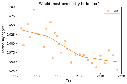
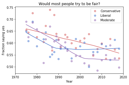
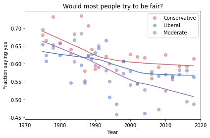
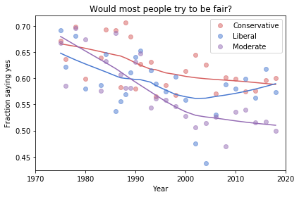
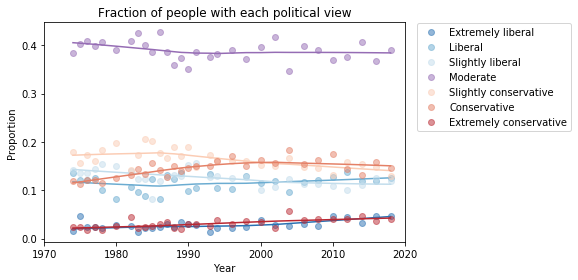
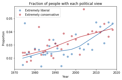
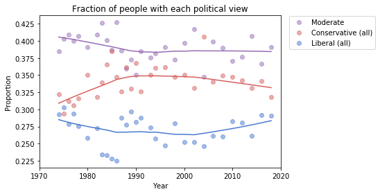
Finding differences between Conservatives and Liberals

Siddharth Garimella

I looked through data from the General Social Survey (GSS) to gain a better understanding about what issues conservatives and liberals differ most on. After making some guesses of my own, I separated conservative and liberal respondents, and sorted their effect sizes for every variable in the dataset segment I had available, ultimately finding three big differences between the two groups. My results suggest conservatives most notably disagree more with same-sex relationships, tend to be slightly older, and attend religious events far more often than liberals do. Read more

Exploring OxyContin Use in the United States

Ariana Olson

According to the CDC, OxyContin is among the most common prescription opioids involved in overdose death. I explored variables related to OxyContin use, both medical and non-medical, from the 2014 National Survey on Drug Use and Health (NSDUH). I found that the median age that respondents tried OxyContin for the first time in a way that wasn’t prescribed for them is around 22, and that almost all respondents who had tried OxyContin non-medically did so before the age of 50. I also found that the overwhelming majority of respondents had never used OxyContin non-medically, but out of those who had, there was an 82% probability that they had used it over 12 months prior to the survey. People who used OxyContin also reported using the drug for fewer days total per year in a way that wasn’t prescribed to them than people who used it at all, prescribed or not. Finally, I found that the median age at which people first used OxyContin in a way that wasn’t directed by a doctor increased with older age groups, and the minimum age of first trying OxyContin non-medically per age group tended to increase as the age of the groups increased. Read more

Subjective Class Compared to Income Class

Cassandra Overney

Back in my hometown, many people consider themselves middle class regardless of their incomes. I grew up confusing income class with subjective class. Now that I am living in a new environment, I am curious to see whether a discrepancy between subjective and income class exists throughout America. The main question I want to answer is: how does subjective class compare to income class?

Income is not the only factor that Americans associate with class since most respondents consider themselves to be either working or middle class. However, there are some discernable differences in subjective class based on income. For example, respondents in the lowest income class are more likely to consider themselves working class than middle class (10.7% vs 6.3%) while respondents in the highest income class are more likely to consider themselves middle class than working class (13.3% vs 4.2%). Read more

The Contribution of the Opioid Epidemic on the Falling Life Expectancy in the United States

Sabrina Pereira

In recent years, a downward trend in the Average Life Expectancy (ALE) in the US has emerged. At the same time, the number of deaths by opioid poisoning has risen dramatically. Using mortality data from the Centers for Disease Control and Prevention, I create a model to quantify the effect of the increase of opioid-related deaths on the ALE in the US. According to the model, the ALE in 2017 would have been about .46 years higher if there had been no opioid-related deaths (79.06 years, compared to the observed 78.6 years). It is only recently that these deaths have created an observable effect this large. Read more

Exploring the Opioid Epidemic

Emma Price

People who use heroin are most likely to do so between the ages of 18 and 40, whereas people who misuse opiate pain relievers are consistently likely to misuse for the first time starting in their early teens. The portion of heroin and prescribed opiate users that stay in school until they complete high school is higher than that of people who do not use opiates; however, the portion of the population of heroin users drop very quickly in their likelihood to survive through college. The rate at which people who misuse opiate pain relievers drop out of school generally follows that of non-users once the high school tipping point is past. Read more

Drug use patterns and correlations

Sreekanth Reddy Sajjala

For users of various regulated substances, their exposure to and use of them varies greatly substance to substance. The National Survey on Drug Use and Health dataset has extensive data which can allow us to view patterns and correlations in their usage. Only 40% of the people who have ever tried cocaine have used it in the past year, but almost 60% of those who have tried heroin use it atleast once a week. People who have tried cannabis tend to try alcohol at an age 15% lower than users who haven’t tried cannabis do so. Unless drug use patterns change drastically, if someone has consumed cannabis at any point in their life they are over 20 times more likely to try heroin at some point in their life. Read more

Age and Generation Affect Happiness Levels in Marriage… A Little

Ashley Swanson

Among age, time, and cohort analysis, happiness levels in marriage are most drastically affected by the age of an individual up until their early 40’s. Between age 20 and age 40, the reported percentage of happy marriages drops by -0.45% percent a year, nearly 10% over the course of those two decades. The following 4 decades see a rebound of about 8%, meaning that 90-year-olds are nearly as happy as 20-year-olds, with those in their early 40’s experiencing the lowest levels of marital happiness. However, cohort effects have the highest explanatory value with an r-value of 0.44. Those born in 1950 experience 13.3% fewer happy marriages than those born in 1900, and those born in 2000 experience an average of 10.5% more happy marriages than those born in 1950. Each of these variables has a small effect size per year, a fraction of a percentage point, but the sustained trends over the decades are significant enough to have real effects. Read more

Associations between screen time and kids’ mental health

MinhKhang Vu

Previous research on children and adolescents has suggested strong associations between screen time and their mental health, contributing to growing concerns among parents, teachers, counselors and doctors about digital technology’s negative effects on children. Using the Census Bureau’s 2017 National Survey of Children’s Health (NSCH), I investigated a large (n=21,599) national random sample of 0- to 17-year-old children in the U.S. in 2017. The NSCH collects data on the physical and emotional health of American children every year, which includes information about their screen time usage and other comprehensive well-being measures. Children who spend 3 hours or more daily using computers are twice more likely to have an anxiety problem (CI 2.06 2.38) and four times more likely to experience depression (CI 3.97 5.11) than those who spend less than 3 hours. For kids spending 4 hours or more with computers, about 16% of them have some anxiety problems (CI 14.98 17.07), and 11% of them experience depression recently (CI 9.73 11.61). Along with the associations between screen time and diagnoses of anxiety and depression, how frequently a family has meals together also has strong linear relationships with both their children’s screen time and mental health. Children who do not have any meal with their family during the past week are twice more likely to have anxiety and three times more likely to experience depression than children who have meals with their family every day. However, in this study, I could not find any strong associations between the severity of kids’ mental illness and screen time, which leaves the open question, whether screen time directly affects children’s mental health. Read more

Data visualization for academics

Data visualization for academics

One of the reasons I am excited about the rise of data journalism is that journalists are doing amazing things with visualization. At the same time, one of my frustrations with academic research is that the general quality of visualization is so poor.

One of the problems is that most academic papers are published in grayscale, so the figures don’t use color. But most papers are read in electronic formats now; the world is safe for color!

Another problem is the convention of putting figures at the end, which is an extreme form of burying the lede.

Also, many figures are generated by software with bad defaults: lines are too thin, text is too small, axis and grids lines are obtrusive, and when colors are used, they tend to be saturated colors that clash. And I won’t even mention the gratuitous use of 3-D.

But I think the biggest problem is the simplest: the figures in most academic papers do a poor job of communicating one point clearly.

I wrote about one example a few months ago, a paper showing that children who start school relatively young are more likely to be diagnosed with ADHD.

Here’s the figure from the original paper:

How long does it take you to understand the point of this figure? Now here’s my representation of the same data:

I believe this figure is easier to interpret. Here’s what I changed:

  1. Instead of plotting the difference between successive months, I plotted the diagnosis rate for each month, which makes it possible to see the pattern (diagnosis rate increases month over month for the first six months, then levels), and the magnitude of the difference (from 60 to 90 diagnoses per 10,000, an increase of about 50%).
  2. I shifted the horizontal axis to put the cutoff date (September 1) at zero.
  3. I added a vertical line and text to distinguish and interpret the two halves of the plot.
  4. I added a title that states the primary conclusion supported by the figure. Alternatively, I could have put this text in a caption.
  5. I replaced the error bars with a shaded area, which looks better (in my opinion) and appropriately gives less visual weight to less important information.

I came across a similar visualization makeover recently. In this Washington Post article, Catherine Rampell writes, “Colleges have been under pressure to admit needier kids. It’s backfiring.”

Her article is based on this academic paper; here’s the figure from the original paper:

It’s sideways, it’s on page 29, and it fails to make its point. So Rampell designed a better figure. Here’s the figure from her article:


The title explains what the figure shows clearly: enrollment rates are highest for low-income students that qualify for Pell grants and lowest for low-income students who don’t qualify for Pell grants.

To nitpick, I might have plotted this data with a line rather than a bar chart, and I might have used a less saturated color. But more importantly, this figure makes its point clearly and compellingly.

Here’s one last example, and a challenge: this recent paper reports, “the number of scale points used in faculty teaching evaluations (e.g., whether instructors are rated on a scale of 6 vs. a scale of 10) substantially affects the size of the gender gap in evaluations.”

To demonstrate this effect, they show eight histograms on pages 44 and 45. Here’s page 44:

And here’s page 45:

With some guidance from the captions, we can extract the message:

  1. Under the 6-point system, there is no visible difference between ratings for male and female instructors.
  2. Under the 10-point system, in the least male-dominated subject areas, there is no visible difference.
  3. Under the 10-point system, in the most male-dominated subject areas, there is a visibly obvious difference: students are substantially less likely to give female instructors a 9 or 10.

This is an important result — it makes me want to read the previous 43 pages. And the visualizations are not bad — they show the effect clearly, and it is substantial.

But I still think we could do better. So let me pose this challenge to readers: Can you design a visualization of this data that communicates the results so that

  1. Readers can see the effect quickly and easily, and
  2. Understand the magnitude of the effect in practical terms?

You can get the data you need from the figures, at least approximately. And your visualization doesn’t have to be fancy; you can send something hand-drawn if you want. The point of the exercise is the design, not the details.

I will post submissions in a few days. If you send me something, let me know how you would like to be acknowledged.

UPDATE: We discussed this example in class today and I presented one way we could summarize and visualize the data:

Students in the most male-dominated fields are less likely to give female instructors top scores, but only on a 10-point scale. The effect does not appear on a 6-point scale.

There are definitely things to do to improve this, but I generated it using Pandas with minimal customization. All the code is in this Jupyter notebook.