Left, right, part 4
In the first article in this series, I looked at data from the General Social Survey (GSS) to see how political alignment in the U.S. has changed, on the axis from conservative to liberal, over the last 50 years.
In the second article, I suggested that self-reported political alignment could be misleading.
In the third article I looked at responses to this question:
Do you think most people would try to take advantage of you if they got a chance, or would they try to be fair?
And generated seven “headlines” to describe the results.
In this article, we’ll use resampling to see how much the results depend on random sampling. And we’ll see which headlines hold up and which might be overinterpretation of noise.
Overall trends
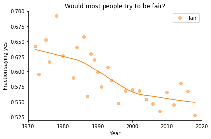
In the previous article we looked at this figure, which was generated by resampling the GSS data and computing a smooth curve through the annual averages.
If we run the resampling process two more times, we get somewhat different results:
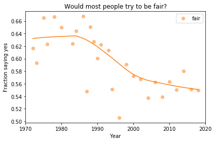
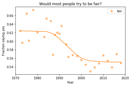
Now, let’s review the headlines from the previous article. Looking at different versions of the figure, which conclusions do you think are reliable?
- Absolute value: “Most respondents think people try to be fair.”
- Rate of change: “Belief in fairness is falling.”
- Change in rate: “Belief in fairness is falling, but might be leveling off.”
In my opinion, the three figures are qualitatively similar. The shapes of the curves are somewhat different, but the headlines we wrote could apply to any of them.
Even the tentative conclusion, “might be leveling off”, holds up to varying degrees in all three.
Grouped by political alignment
When we group by political alignment, we have fewer samples in each group, so the results are noisier and our headlines are more tentative.
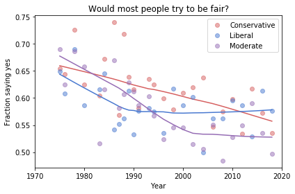
Here’s the figure from the previous article:
And here are two more figures generated by random resampling:
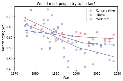
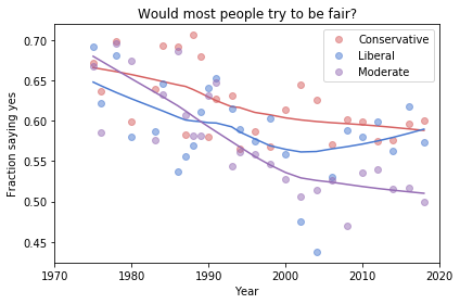
Now we see more qualitative differences between the figures. Let’s review the headlines again:
- Absolute value: “Moderates have the bleakest outlook; Conservatives and Liberals are more optimistic.” This seems to be true in all three figures, although the size of the gap varies substantially.
- Rate of change: “Belief in fairness is declining in all groups, but Conservatives are declining fastest.” This headline is more questionable. In one version of the figure, belief is increasing among Liberals. And it’s not at all clear the the decline is fastest among Conservatives.
- Change in rate: “The Liberal outlook was declining, but it leveled off in 1990.” The Liberal outlook might have leveled off, or even turned around, but we could not say with any confidence that 1990 was a turning point.
- Change in rate: “Liberals, who had the bleakest outlook in the 1980s, are now the most optimistic”. It’s not clear whether Liberals have the most optimistic outlook in the most recent data.
As we should expect, conclusions based on smaller sample sizes are less reliable.
Also, conclusions about absolute values are more reliable than conclusions about rates, which are more reliable than conclusions about changes in rates.