Once in a while, a few of the Scicloj friends will meet to learn about signal processing, following the Think DSP book by Allen B. Downey, and implementing things in Clojure. Our notes will be published at Clojure Civitas.
The other reason I started the project is that Cursor (the AI-assisted IDE) helped get me unstuck. Here’s the problem: Think DSP was the last book I wrote in LaTeX before I switched to Jupyter notebooks. So I had code in Python modules and the text in LaTeX.
At some point I put the code in notebooks, with exercises and solutions in other notebooks. Some time later I converted the LaTeX to notebooks — but those notebooks only had code snippets, not the complete working code. And they were full of leftover LaTeX bits, like references to the figures, which were in all the wrong places.
Merging the text, code, and exercises into a single notebook was too daunting, so the book was idle for a while. And that’s where Cursor came in.
I drafted a plan to convert the notebooks to Markdown (using Jupytext) and then use AI tools to merge them. After I merged the first chapter, I checked it for issues and revised the prompt. After a few iterations, I had a plan document and a prompt document that worked pretty well. Cursor took a few minutes to merge the notebooks for each chapter, but the results were good.
I made a second pass to make the structure of the notebooks consistent. For example, each notebook starts with five or six cells that import libraries, download files, etc. It’s helpful if these cells are the same, and with the same tags, in every notebook. Revising the Markdown version of the notebooks and then converting to ipynb worked well.
The whole process took about 1.5 work days — and there are probably still some issues I’ll have to fix by hand — but it is nice to get the project unstuck!
I have published the first five chapters of Think Linear Algebra! You can read them here or follow these links to run the notebooks on Colab. Here are the chapters I have so far:
Chapter 1: The Power of Linear Algebra Introduces matrix multiplication and eigenvectors through a network-based model of museum traffic, and implements the PageRank algorithm for quantifying the quality of web pages.
Chapter 5: To Boldly Go Uses matrices scale, rotate, shear, and translate vectors. Applies these methods to 2D compute graphics, including a reimplementation of the classic video game Asteroids.
Chapter 7: Systems of Equations Applies LU decomposition and matrix equations to analyze electrical circuits. Shows how linear algebra solves real engineering problems.
Chapter 8: Null Space Investigates chemical stoichiometry as a system with multiple valid solutions. Introduces concepts of rank and nullspace to describe the solution space.
Chapter 9: Truss the System Models structural systems where the unknowns are vector forces. Uses block matrices and rank analysis to compute internal stresses in trusses.
As you can tell by the chapter numbers, there is more to come — although the sequence of topics might change.
If you are curious about this project, here’s more about why I’m writing this book.
Math is not real
In this previous article, I wrote about “math supremacy”, which is the idea that math notation is the real thing, and everything else — including and especially code — is an inferior imitation.
I am confronted with math supremacy more often than most people, because I write books that use code to present ideas that are usually expressed in math notation. I think code can be simpler and clearer, but not everyone agrees, and some of them disagree loudly.
With Think Linear Algebra, I am taking my “code first” approach deep into the domain of math supremacy. Today I was using block matrices to analyze a truss, an example I remember seeing in my college linear algebra class. I remember that I did not find the example particularly compelling, because after setting up the problem — and it takes a lot of setting up — we never really finished it. That is, we talked about how to analyze a truss, hypothetically, but we never actually did it.
This is a fundamental problem with the way math is taught in engineering and the sciences. We send students off to the math department to take calculus and linear algebra, we hope they will be able to apply it to classes in their major, and we are disappointed — and endlessly surprised — when they can’t.
Part of the problem is that transfer of learning is much harder than many people realize, and does not happen automatically, as many teachers expect.
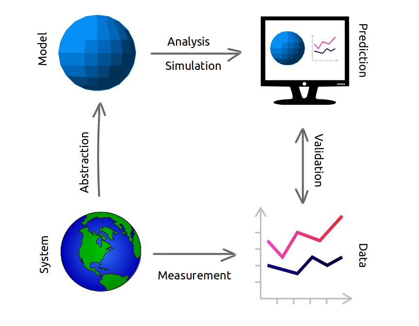
Another part of the problem is what I wrote about in Modeling and Simulation in Python: a complete modeling process involves abstraction, analysis, and validation. In most classes we only teach analysis, neglecting the other steps, and in some math classes we don’t even do that — we set up the tools to do analysis and never actually do it.
This is the power of the computational approach — we can demonstrate all of the steps, and actually solve the problem. So I find it ironic when people dismiss computation and ask for the “math behind it”, as if theory is reality and reality is a pale imitation. Math is a powerful tool for analysis, but to solve real problems, it is not the only tool we need. And it is not, contrary to Plato, more real than reality.
Data Structures and Information Retrieval in Python
I am happy to announce the first release of a new book, Data Structures and Information Retrieval in Python, which is an introduction to data structures organized around a motivating example: building a search engine.
The elements of the search engine are the Crawler, which downloads web pages and follows links to other pages, the Indexer, which builds a map from each word to the pages where it appears, and the Retriever, which looks up search terms and finds pages that maximize relevance and quality.
The index is stored in Redis, which is a NoSQL database that provides data structures like sets, lists, and hashmaps. The book presents each data structure first in Python, then in Redis, which should help readers see which features are essential and which are implementation details.
The book is loosely based on Think Data Structures, which uses Java. When I started, I thought it would be a translation, but the changes were so pervasive, I ended up writing it from scratch.
As I did with Think Bayes, I wrote this book entirely in Jupyter notebooks, and used JupyterBook to translate them to HTML. The notebooks run on Colab, which is a service provided by Google that runs notebooks in a browser. So you can read the book, run the code, and work on exercises without installing anything.
Why?
I have mixed feelings about data structures. In the computer science curriculum, it is often used as a weed-out class, and in the technical interview process, it is used as a gatekeeper. In both cases, it plays a disproportionate role in determining who studies computer science and who gets jobs in the field.
And it tends to be a bad class. The material is presented theoretically, without context or application, organized in a way that seems designed to maximize tedium, and often taught badly. The goals of the course are ambiguous — is it about theoretical foundations or programming proficiency? — and the result is often a hybrid that does nothing well.
Also, it has not kept up with changes in the software landscape. When people were learning to program in C, it might have been appropriate to focus on the implementation of data structures. But for people learning Python, it’s probably better to learn how to use them first, and see how they are implemented when (and if) necessary.
Despite my misgivings about the material, in 2016 I found myself designing a data structures curriculum for the Flatiron School, on behalf of a large software company. In 2017 I updated the curriculum and published Think Data Structures. But the software curriculum at Olin uses more Python than Java, so I have not used the Java version in a class.
Since I was scheduled to teach Data Structures this fall, I decided to write a Python version. I started last August with an outline and about 10 notebooks in various stages of completion. I developed the rest of the material during the semester, staying about a week ahead of the students.
Now there are 29 notebooks including 22 that present the material and 7 quizzes that include practice questions. I hope people will find it useful!
A unique feature of the game is the dice, which yield three possible outcomes, 0, 1, or 2, with equal probability. When you add them up, you get some unusual probability distributions.
There are two phases of the game: During the first phase, players explore a haunted house, drawing cards and collecting items they will need during the second phase, called “The Haunt”, which is when the players battle monsters and (usually) each other.
So when does the haunt begin? It depends on the dice. Each time a player draws an “omen” card, they have to make a “haunt roll”: they roll six dice and add them up; if the total is less than the number of omen cards that have been drawn, the haunt begins.
For example, suppose four omen cards have been drawn. A player draws a fifth omen card and then rolls six dice. If the total is less than 5, the haunt begins. Otherwise the first phase continues.
Last time I played this game, I was thinking about the probabilities involved in this process. For example:
What is the probability of starting the haunt after the first omen card?
What is the probability of drawing at least 4 omen cards before the haunt?
What is the average number of omen cards before the haunt?
Abstract: The unusual circumstances of Curtis Flowers’ trials make it possible to estimate the probabilities that white and black jurors would vote to convict him, 98% and 68% respectively, and the probability a jury of his peers would find him guilty, 15%.
Background
Curtis Flowers was tried six times for the same crime. Four trials ended in conviction; two ended in a mistrial due to a hung jury.
Three of the convictions were invalidated by the Mississippi Supreme Court, at least in part because the prosecution had excluded black jurors, depriving Flowers of the right to trial by a jury composed of a “fair cross-section of the community“.
Because of the unusual circumstances of these trials, we can perform a statistical analysis that is normally impossible: we can estimate the probability that black and white jurors would vote to convict, and use those estimates to compute the probability that he would be convicted by a jury that represents the racial makeup of Montgomery County.
Results
According to my analysis, the probability that a white juror in this pool would vote to convict Flowers, given the evidence at trial, is 98%. The same probability for black jurors is 68%. So this difference is substantial.
The probability that Flowers would be convicted by a fair jury is only 15%, and the probability that he would be convicted four times out of six times is less than 1%.
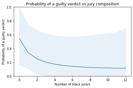
The following figure shows the probability of a guilty verdict as a function of the number of black jurors:
According to the model, the probability of a guilty verdict is 55% with an all-white jury. If the jury includes 5-6 black jurors, which would be representative of Montgomery County, the probability of conviction would be only 14-15%.
The shaded area represents a 90% credible interval. It is quite wide, reflecting uncertainty due to limits of the data. Also, the model is based on the simplifying assumptions that
All six juries saw essentially the same evidence,
The probabilities we’re estimating did not change substantially over the period of the trials,
Interactions between jurors had negligible effects on their votes,
If any juror refuses to convict, the result is a hung jury.
Two questions crossed my desktop this week, and I think I can answer both of them with a single example.
On Twitter, Kareem Carr asked, “If Alice believes an event has a 90% probability of occurring and Bob also believes it has a 90% chance of occurring, what does it mean to say they have the same degree of belief? What would we expect to observe about both Alice’s and Bob’s behavior?”
And on Reddit, a reader of /r/statistics asked, “I have three coefficients from three different studies that measure the same effect, along with their 95% CIs. Is there an easy way to combine them into a single estimate of the effect?”
So let me tell you a story:
One day Alice tells her friend, Bob, “I bought a random decision-making box. Every time you press this button, it says ‘yes’ or ‘no’. I’ve tried it a few times, and I think it says ‘yes’ 90% of the time.”
Bob says he has some important decisions to make and asks if he can borrow the box. The next day, he returns the box to Alice and says, “I used the box several times, and I also think it says ‘yes’ 90% of the time.”
Alice says, “It sounds like we agree, but just to make sure, we should compare our predictions. Suppose I press the button twice; what do you think is the probability it says ‘yes’ both times?”
Bob does some calculations and reports the predictive probability 81.56%.
Alice says, “That’s interesting. I got a slightly different result, 81.79%. So maybe we don’t agree after all.”
Bob says, “Well let’s see what happens if we combine our data. I can tell you how many times I pressed the button and how many times it said ‘yes’.”
Alice says, “That’s ok, I don’t actually need your data; it’s enough if you tell me what prior distribution you used.”
Bob tells her he used a Jeffreys prior.
Alice does some calculations and says, “Ok, I’ve updated my beliefs to take into account your data as well as mine. Now I think the probability of ‘yes’ is 91.67%.”
Bob says, “That’s interesting. Based on your data, you thought the probability was 90%, and based on my data, I thought it was 90%, but when we combine the data, we get a different result. Tell me what data you saw, and let me see what I get.”
Alice tells him she pressed the button 8 times and it always said ‘yes’.
“So,” says Bob, “I guess you used a uniform prior.”
Bob does some calculations and reports, “Taking into account all of the data, I think the probability of ‘yes’ is 93.45%.”
Alice says, “So when we started, we had seen different data, but we came to the same conclusion.”
“Sort of,” says Bob, “we had the same posterior mean, but our posterior distributions were different; that’s why we made different predictions for pressing the button twice.”
Alice says, “And now we’re using the same data, but we have different posterior means. Which makes sense, because we started with different priors.”
“That’s true,” says Bob, “but if we collect enough data, eventually our posterior distributions will converge, at least approximately.”
“Well that’s good,” says Alice. “Anyway, how did those decisions work out yesterday?”
“Mostly bad,” says Bob. “It turns out that saying ‘yes’ 93% of the time is a terrible way to make decisions.”
If you would like to know how any of those calculations work, you can see the details in a Jupyter notebook:
And if you don’t want the details, here is the summary:
If two people have different priors OR they see different data, they will generally have different posterior distributions.
If two posterior distributions have the same mean, some of their predictions will be the same, but many others will not.
If you are given summary statistics from a posterior distribution, you might be able to figure out the rest of the distribution, depending on what other information you have. For example, if you know the posterior is a two-parameter beta distribution (or is well-modeled by one) you can recover it from the mean and second moment, or the mean and a credible interval, or almost any other pair of statistics.
If someone has done a Bayesian update using data you don’t have access to, you might be able to “back out” their likelihood function by dividing their posterior distribution by the prior.
If you are given a posterior distribution and the data used to compute it, you can back out the prior by dividing the posterior by the likelihood of the data (unless the prior contains values with zero likelihood).
If you are given summary statistics from two posterior distributions, you might be able to combine them. In general, you need enough information to recover both posterior distributions and at least one prior.
I am hard at work on the second edition of Think Bayes, currently working on Chapter 6, which is about computing distributions of minima, maxima and mixtures of other distributions.
Of all the changes in the second edition, I am particularly proud of the exercises. I present three new exercises from Chapter 6 below. If you want to work on them, you can use this notebook, which contains the material you will need from the chapter and some code to get you started.
Exercise 1
Henri Poincaré was a French mathematician who taught at the Sorbonne around 1900. The following anecdote about him is probably fabricated, but it makes an interesting probability problem.
Supposedly Poincaré suspected that his local bakery was selling loaves of bread that were lighter than the advertised weight of 1 kg, so every day for a year he bought a loaf of bread, brought it home and weighed it. At the end of the year, he plotted the distribution of his measurements and showed that it fit a normal distribution with mean 950 g and standard deviation 50 g. He brought this evidence to the bread police, who gave the baker a warning.
For the next year, Poincaré continued the practice of weighing his bread every day. At the end of the year, he found that the average weight was 1000 g, just as it should be, but again he complained to the bread police, and this time they fined the baker.
Why? Because the shape of the distribution was asymmetric. Unlike the normal distribution, it was skewed to the right, which is consistent with the hypothesis that the baker was still making 950 g loaves, but deliberately giving Poincaré the heavier ones.
To see whether this anecdote is plausible, let’s suppose that when the baker sees Poincaré coming, he hefts n loaves of bread and gives Poincaré the heaviest one. How many loaves would the baker have to heft to make the average of the maximum 1000 g?
Exercise 2
Two doctors fresh out of medical school are arguing about whose hospital delivers more babies. The first doctor says, “I’ve been at Hospital A for two weeks, and already we’ve had a day when we delivered 20 babies.”
The second doctor says, “I’ve only been at Hospital B for one week, but already there’s been a 19-baby day.”
Which hospital do you think delivers more babies on average? You can assume that the number of babies born in a day is well modeled by a Poisson distribution.
Exercise 3
Suppose I drive the same route three times and the fastest of the three attempts takes 8 minutes.
There are two traffic lights on the route. As I approach each light, there is a 40% chance that it is green; in that case, it causes no delay. And there is a 60% chance it is red; in that case it causes a delay that is uniformly distributed from 0 to 60 seconds.
What is the posterior distribution of the time it would take to drive the route with no delays?
The solution to this exercise is very similar to a method I developed for estimating the minimum time for a packet of data to travel through a path in the internet.
For the first edition, I used a module called thinkplot that provides functions that make it easier to use Matplotlib. It also overrides some of the default options.
But since I wrote the first edition, Matplotlib has improved substantially. I found I was able to eliminate thinkplot with minimal changes. As a result, the code is simpler and the figures look better.
Still using thinkdsp
I provide a module called thinkdsp that contains classes and functions used throughout the book. I think this module is good for learners. It lets me hide details that would otherwise be distracting. It lets me present some topics “top-down”, meaning that we learn how to use some features before we know how they work.
And when you learn the API provided by thinkdsp, you are also learning about DSP. For example, thinkdsp provides classes called Signal, Wave, and Spectrum.
A Signal represents a continuous function; a Wave represents a sequence of discrete samples. So Signal provides make_wave, but Wave does not provide make_signal. When you use this API, you understand implicitly that this is a one-way operation: you can sample a Signal to get a Wave, but you cannot recover a Signal from a Wave.
On the other hand, you can convert from Wave to Spectrum and from Spectrum to Wave, which implies (correctly) that they are equivalent representations of the same information. Given one, you can compute the other.
I realize that not everyone loves it when a book uses a custom library like thinkdsp. When people don’t likeThink DSP, this is the most common reason. But looking at thinkdsp with fresh eyes, I am doubling down; I still think it’s a good way to learn.
Less object-oriented
Nevertheless, I found a few opportunities to simplify the code, and in particular to make it less object-oriented. I generally like OOP, but I acknowledge that there are drawbacks. One of the biggest is that it can be hard to keep an inheritance hierarchy in your head and easy to lose track of what classes provide which methods.
I still think the template pattern is a good way to present a framework: the parent class provides the framework and child classes fill in the details.
However, based on feedback from readers, I have come to realize that object-oriented programming is not as universally known and loved as I assumed.
In several places I found that I could eliminate object-oriented features and simplify the code without losing explanatory power.
Pretty, pretty good
Coming back to this book after some time, I think it’s pretty good. If you are interested in digital signal processing, I think the computation-first approach is a good way to get started. And if you are not interested in digital signal processing, maybe I can change your mind!
The inspection paradox is a statistical illusion you’ve probably never heard of. It’s a common source of confusion, an occasional cause of error, and an opportunity for clever experimental design. And once you know about it, you see it everywhere.
The examples in the talk include social networks, transportation, education, incarceration, and more. And now I am happy to report that I’ve stumbled on yet another example, courtesy of John D. Cook.
For a multivariate normal distribution in high dimensions, nearly all the probability mass is concentrated in a thin shell some distance away from the origin.
John does a nice job of explaining this result, so you should read his article, too. But I’ll try to explain it another way, using a dartboard.
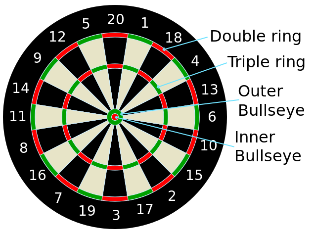
If you are not familiar with the layout of a “clock” dartboard, it looks like this:
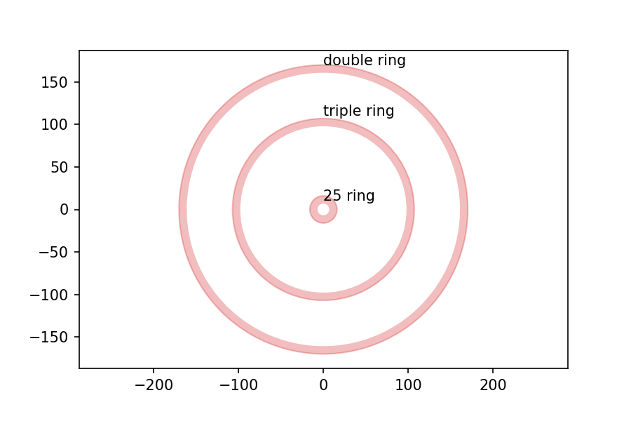
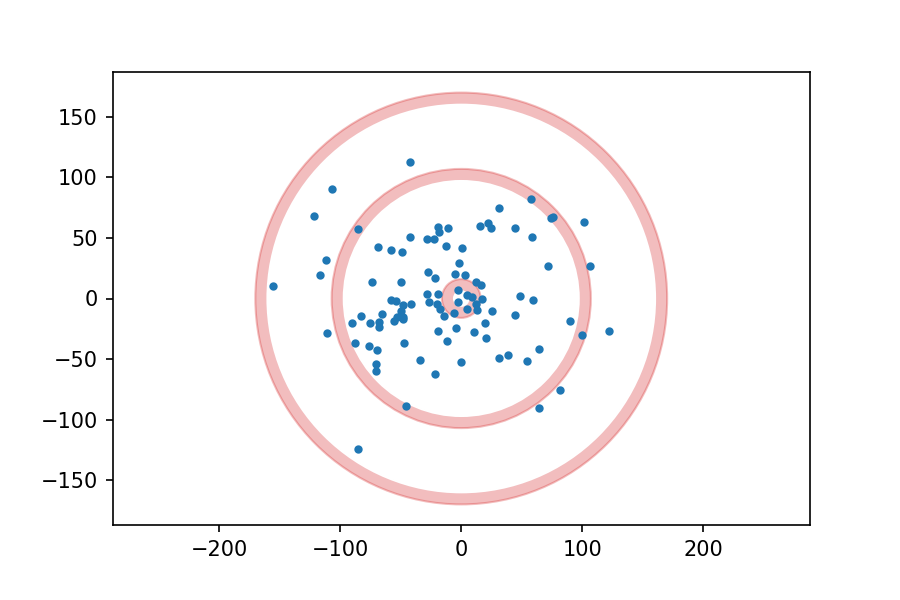
I got the measurements of the board from the British Darts Organization rules, and drew the following figure with dimensions in mm:
Now, suppose I throw 100 darts at the board, aiming for the center each time, and plot the location of each dart. It might look like this:
Suppose we analyze the results and conclude that my errors in the x and y directions are independent and distributed normally with mean 0 and standard deviation 50 mm.
Assuming that model is correct, then, which do you think is more likely on my next throw, hitting the 25 ring (the innermost red circle), or the triple ring (the middlest red circle)?
It might be tempting to say that the 25 ring is more likely, because the probability density is highest at the center of the board and lower at the triple ring.
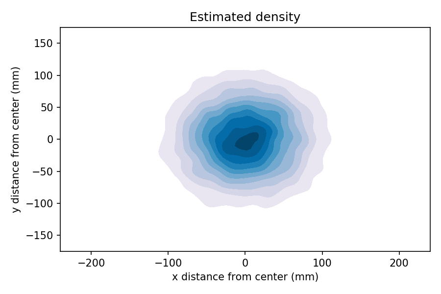
We can see that by generating a large sample, generating a 2-D kernel density estimate (KDE), and plotting the result as a contour.
In the contour plot, darker color indicates higher probability density. So it sure looks like the inner ring is more likely than the outer rings.
But that’s not right, because we have not taken into account the area of the rings. The total probability mass in each ring is the product of density and area (or more precisely, the density integrated over the area).
The 25 ring is more dense, but smaller; the triple ring is less dense, but bigger. So which one wins?
In this example, I cooked the numbers so the triple ring wins: the chance of hitting triple ring is about 6%; the chance of hitting the double ring is about 4%.
If I were a better dart player, my standard deviation would be smaller and the 25 ring would be more likely. And if I were even worse, the double ring (the outermost red ring) might be the most likely.
Inspection Paradox?
It might not be obvious that this is an example of the inspection paradox, but you can think of it that way. The defining characteristic of the inspection paradox is length-biased sampling, which means that each member of a population is sampled in proportion to its size, duration, or similar quantity.
In the dartboard example, as we move away from the center, the area of each ring increases in proportion to its radius (at least approximately). So the probability mass of a ring at radius r is proportional to the density at r, weighted by r.
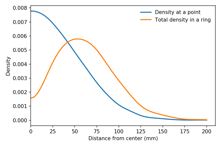
We can see the effect of this weighting in the following figure:
The blue line shows estimated density as a function of r, based on a sample of throws. As expected, it is highest at the center, and drops away like one half of a bell curve.
The orange line shows the estimated density of the same sample weighted by r, which is proportional to the probability of hitting a ring at radius r.
It peaks at about 60 mm. And the total density in the triple ring, which is near 100 mm, is a little higher than in the 25 ring, near 10 mm.
If I get a chance, I will add the dartboard problem to my talk as yet another example of length-biased sampling, also known as the inspection paradox.
UPDATE November 6, 2019: This “thin shell” effect has practical consequences. This excerpt from The End of Average talks about designing the cockpit of a plan for the “average” pilot, and discovering that there are no pilots near the average in 10 dimensions.
In the first article in this series, I looked at data from the General Social Survey (GSS) to see how political alignment in the U.S. has changed, on the axis from conservative to liberal, over the last 50 years.
In the second article, I suggested that self-reported political alignment could be misleading.
Do you think most people would try to take advantage of you if they got a chance, or would they try to be fair?
And generated seven “headlines” to describe the results.
In this article, we’ll use resampling to see how much the results depend on random sampling. And we’ll see which headlines hold up and which might be overinterpretation of noise.
Overall trends
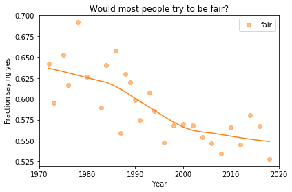
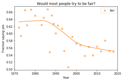
In the previous article we looked at this figure, which was generated by resampling the GSS data and computing a smooth curve through the annual averages.
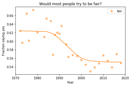
If we run the resampling process two more times, we get somewhat different results:
Now, let’s review the headlines from the previous article. Looking at different versions of the figure, which conclusions do you think are reliable?
Absolute value: “Most respondents think people try to be fair.”
Rate of change: “Belief in fairness is falling.”
Change in rate: “Belief in fairness is falling, but might be leveling off.”
In my opinion, the three figures are qualitatively similar. The shapes of the curves are somewhat different, but the headlines we wrote could apply to any of them.
Even the tentative conclusion, “might be leveling off”, holds up to varying degrees in all three.
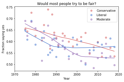
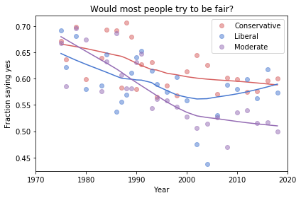
Grouped by political alignment
When we group by political alignment, we have fewer samples in each group, so the results are noisier and our headlines are more tentative.
Here’s the figure from the previous article:
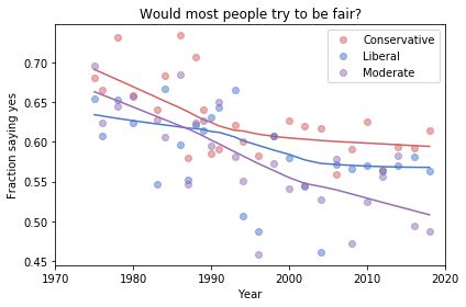
And here are two more figures generated by random resampling:
Now we see more qualitative differences between the figures. Let’s review the headlines again:
Absolute value: “Moderates have the bleakest outlook; Conservatives and Liberals are more optimistic.” This seems to be true in all three figures, although the size of the gap varies substantially.
Rate of change: “Belief in fairness is declining in all groups, but Conservatives are declining fastest.” This headline is more questionable. In one version of the figure, belief is increasing among Liberals. And it’s not at all clear the the decline is fastest among Conservatives.
Change in rate: “The Liberal outlook was declining, but it leveled off in 1990.” The Liberal outlook might have leveled off, or even turned around, but we could not say with any confidence that 1990 was a turning point.
Change in rate: “Liberals, who had the bleakest outlook in the 1980s, are now the most optimistic”. It’s not clear whether Liberals have the most optimistic outlook in the most recent data.
As we should expect, conclusions based on smaller sample sizes are less reliable.
Also, conclusions about absolute values are more reliable than conclusions about rates, which are more reliable than conclusions about changes in rates.