Stop worrying and love the black box
In many engineering classes, computational methods are treated with fear, uncertainty, and doubt. At the same time, analytic methods are presented as if they were magic.
I
They warn me that students have to know how these methods work in order to use them correctly; otherwise they are likely to produce nonsense results and accept them blindly.
And if they let students use computational tools at all, the order of presentation is usually “bottom-up”, that is, a lot of “how it works” before “what it does”, and not much “why you should care”.
In my books and classes, we often got “top-down”, learning to use tools first, and opening the hood only when it’s useful. It’s like learning to drive; knowing about internal combustion engines does not make you a better driver.
But a lot of people don’t like that analogy. Recently one of the good people I follow on Twitter wrote, “No, doing fancy analyses without understanding the basic statistical principles isn’t like driving a car without knowing the mechanics. It’s like driving a car while heavily intoxicated, being in all kinds of accidents without knowing it.”
I replied, “I don’t think there is a general principle here. Sometimes you can use black boxes safely. Sometimes you have to know how they work. Sometimes knowing how they work doesn’t actually help.”
So how do we know which scenario we’re in, and what should we do about it? I suggest the following flow chart:
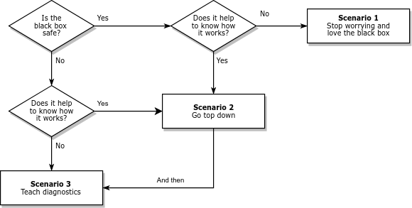
Many black boxes can be used safely; that is, they produce accurate results over the range of relevant problems. In that case, we should ask whether it (really) helps to know how they work. In Scenario 1, the answer is no; we can stop worrying, stop teaching how it works, and use the time we save to teach more useful things.
Of course, some black boxes have sharp edges. They work when they work, but when they don’t, bad things happen. In that case, we should still ask whether it helps to know how they work. In Scenario 3, the answer is no again. In that case, we have to teach diagnosis: What happens when the black box fails? How can we tell? What can we do about it? Often we can answer these questions without knowing much about how the method works.
But sometimes we can’t, and students really need to open the hood. In that case (Scenario 2 in the diagram) I recommend going top down. Show students methods that solve problems they care about. Start with examples where the methods work, then introduce examples where they break. If the examples are authentic, they motivate students to understand the problems and how to fix them.
With this framework, I can explain more concisely my misgivings about how computational methods are taught:
The engineering curriculum is designed on the assumption that we are always in Scenario 2, but Scenarios 1 and 3 are actually more common.

 Nelis Willers “wrote a 510 page book with LaTeX, using
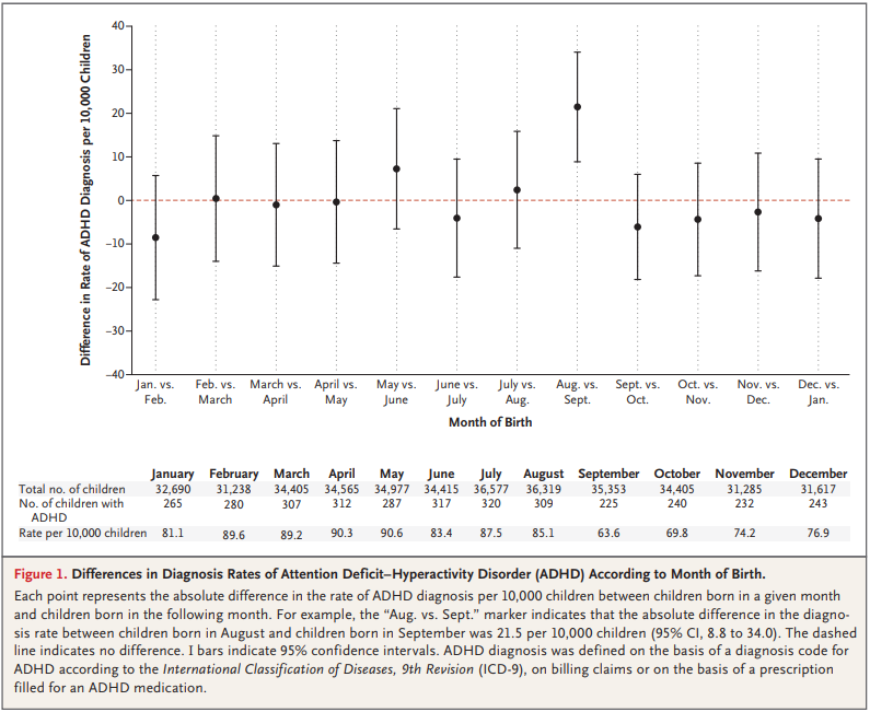
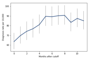 For the first 9 months, from September to May, we see what we would expect if at least some of the excess diagnoses are due to age-related behavior differences. For each month of difference in age, we see an increase in the number of diagnoses.
This pattern breaks down for the last three months, June, July, and August. This might be explained by random variation, but it also might be due to parental intervention; if some parents hold back students born near the deadline, the observations for these months include some children who are relatively old for their grade and therefore less likely to be diagnosed.
We could test this hypothesis by checking the actual ages of these students when they started school, rather than just looking at their months of birth. I will see whether that additional data is available; in the meantime, I will proceed taking the data at face value.
I fit the data using a Bayesian logistic regression model, assuming a linear relationship between month of birth and the log-odds of diagnosis. The following figure shows the fitted models superimposed on the data.
For the first 9 months, from September to May, we see what we would expect if at least some of the excess diagnoses are due to age-related behavior differences. For each month of difference in age, we see an increase in the number of diagnoses.
This pattern breaks down for the last three months, June, July, and August. This might be explained by random variation, but it also might be due to parental intervention; if some parents hold back students born near the deadline, the observations for these months include some children who are relatively old for their grade and therefore less likely to be diagnosed.
We could test this hypothesis by checking the actual ages of these students when they started school, rather than just looking at their months of birth. I will see whether that additional data is available; in the meantime, I will proceed taking the data at face value.
I fit the data using a Bayesian logistic regression model, assuming a linear relationship between month of birth and the log-odds of diagnosis. The following figure shows the fitted models superimposed on the data.
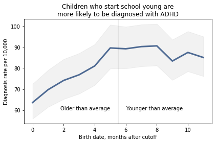
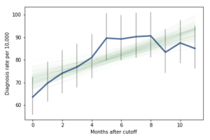 Most of these regression lines fall within the credible intervals of the observed rates, so in that sense this model is not ruled out by the data. But it is clear that the lower rates in the last 3 months bring down the estimated slope, so we should probably consider the estimated effect size to be a lower bound on the true effect size.
To express this effect size in a way that’s easier to interpret, I used the posterior predictive distributions to estimate the difference in diagnosis rate for children born in September and August. The difference is 21 diagnoses per 10,000, with 95% credible interval (13, 30).
As a percentage of the baseline (71 diagnoses per 10,000), that’s an increase of 30%, with credible interval (18%, 42%).
However, if it turns out that the observed rates for June, July, and August are brought down by red-shirting, the effect could be substantially higher. Here’s what the model looks like if we exclude those months:
Most of these regression lines fall within the credible intervals of the observed rates, so in that sense this model is not ruled out by the data. But it is clear that the lower rates in the last 3 months bring down the estimated slope, so we should probably consider the estimated effect size to be a lower bound on the true effect size.
To express this effect size in a way that’s easier to interpret, I used the posterior predictive distributions to estimate the difference in diagnosis rate for children born in September and August. The difference is 21 diagnoses per 10,000, with 95% credible interval (13, 30).
As a percentage of the baseline (71 diagnoses per 10,000), that’s an increase of 30%, with credible interval (18%, 42%).
However, if it turns out that the observed rates for June, July, and August are brought down by red-shirting, the effect could be substantially higher. Here’s what the model looks like if we exclude those months:
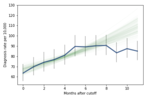 Of course, it is hazardous to exclude data points because they violate expectations, so this result should be treated with caution. But under this assumption, the difference in diagnosis rate would be 42 per 10,000. On a base rate of 67, that’s an increase of 62%.
Here is the notebook with the details of my analysis:
Of course, it is hazardous to exclude data points because they violate expectations, so this result should be treated with caution. But under this assumption, the difference in diagnosis rate would be 42 per 10,000. On a base rate of 67, that’s an increase of 62%.
Here is the notebook with the details of my analysis: