Preston’s Paradox
This article is an excerpt from my book Probably Overthinking It, to be published by the University of Chicago Press in early 2023. This book is intended for a general audience, so I explain some things that might be familiar to readers of this blog – and I leave out the Python code. After the book is published, I will post the Jupyter notebooks with all of the details!
If you would like to receive infrequent notifications about the book (and possibly a discount), please sign up for this mailing list.
Suppose you are the ruler of a small country where the population is growing quickly. Your advisers warn you that unless growth slows down, the population will exceed the capacity of the farms and the peasants will starve.
The Royal Demographer informs you that the average family size is currently 3; that is, each woman in the kingdom bears three children, on average. He explains that the replacement level is close to 2, so if family sizes decrease by one, the population will stabilize at a sustainable size.
One of your advisors asks: “What if we make a new law that says every woman has to have fewer children than her mother?”
It sounds promising. As a benevolent despot, you are reluctant to restrict your subjects’ reproductive freedom, but it seems like such a policy could be effective at reducing family size with minimal imposition.
“Make it so,” you say.
Twenty-five years later, you summon the Royal Demographer to find out how things are going.
“Your Highness,” they say, “I have good news and bad news. The good news is that adherence to the new law has been perfect. Since it was put into effect, every woman in the kingdom has had fewer children than her mother.”
“That’s amazing,” you say. “What’s the bad news?”
“The bad news is that the average family size has increased from 3.0 to 3.3, so the population is growing faster than before, and we are running out of food.”
“How is that possible?” you ask. “If every woman has fewer children than her mother, family sizes have to get smaller, and population growth has to slow down.”
Actually, that’s not true.
In 1976, Samuel Preston, a demographer at the University of Washington, published a description of this apparent paradox: “A major intergenerational change at the individual level is required in order to maintain intergenerational stability at the aggregate level.”
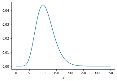
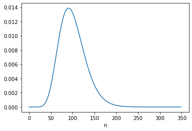
To make sense of this, I’ll use the distribution of fertility in the United States (rather than your imaginary island). Every other year, the Census Bureau surveys a representative sample women in the United States and asks, among other things, how many children they have ever born. To measure completed family sizes, they select women aged 40-44 (of course, some women have children in their forties, so these estimates might be a little low).
I used the data from 1979 to estimate the distribution of family sizes at the time of Preston’s paper. Here’s what it looks like.
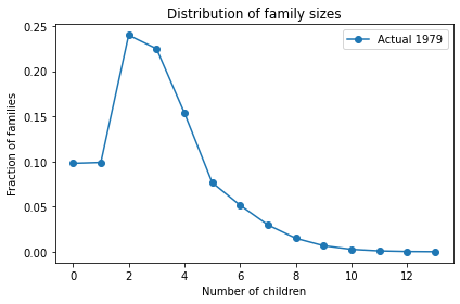
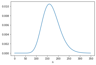
The average total fertility was close to 3. Starting from this distribution, what would happen if every woman had the same number of children as her mother? A woman with 1 child would have only one grandchild; a woman with 2 children would have 4 grandchildren; a woman with 3 children would have 9 grandchildren, and so on. In the next generation, there would be more big families and fewer small families.
Here’s what the distribution would look like in this “Same as mother” scenario.
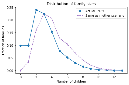
The net effect is to shift the distribution to the right. If this continues, family sizes would increase quickly and population growth would explode.
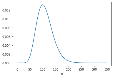
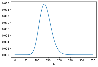
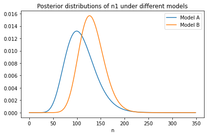
So what happens in the “One child fewer” scenario? Here’s what the distribution looks like:
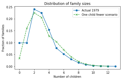
Bigger families are still overrepresented, but not as much as in the “Same as mother” scenario. The net effect is an increase is average fertility from 3 to 3.3.
As Preston explained, “under current [1976] patterns a woman would have to bear an average of almost two children fewer than … her mother merely to keep population fertility rates constant from generation to generation”. One child fewer was not enough!
As it turned out, the next generation in the U.S. had 2.3 fewer children than their mothers, on average, which caused a steep decline in average fertility:
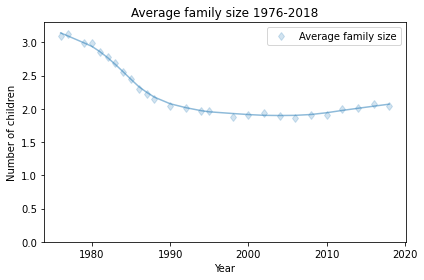
Average fertility in the U.S. has been close to 2 since about 1990, although it might have increased in the last few years (keeping in mind that the women interviewed in 2018 had most of their children 10-20 years earlier).
Preston concludes, “Those who exhibit the most traditional behavior with respect to marriage and women’s roles will always be overrepresented as parents of the next generation, and a perpetual disaffiliation from their model by offspring is required in order to avert an increase in traditionalism for the population as a whole.”
So, if you have fewer children than your parents, don’t let anyone say you are selfish; you are doing your part to avert population explosion!
My thanks to Prof. Preston for comments on a previous version of this article.
If you would like to get infrequent email announcements about my book, please sign up below. I’ll let you know about milestones, promotions, and other news, but not more than one email per month. I will not share your email or use this list for any other purpose.