Simpson’s paradox and real wages
I have good news and bad news. First the good news: after a decade of stagnation, real wages have been rising since 2010. The following figure shows weekly wages for full-time employees (source), which I adjusted for inflation and indexed so the series starts at 100.
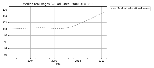
Real wages in 2019 Q3 were about 5% higher than in 2010.
Now here’s the bad news: at every level of education, real wages are lower now than in 2000, or practically the same. The following figure shows real weekly wages grouped by educational attainment:
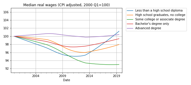
For people with some college or an associate degree, real wages have fallen by about 5% since 2000 Q1. People with a high school diploma or a bachelor’s degree are making less money, too. People with advanced degrees are making about the same, and high school dropouts are doing slightly better.
But the net change for every group is substantially less than the 5% increase we see if we put the groups together. How is that even possible?
The answer is Simpson’s paradox, which is when a trend appears in every subgroup, but “disappears or reverses when these groups are combined”. In this case, real wages are declining or stagnant in every subgroup, but when we put the groups together, wages are increasing.
In general, Simpson’s paradox can happen when there is a confounding variable that interacts with the variables you are looking at. In this example, the variables we’re looking at are real wages, education level, and time. So here’s my question: what is the confounding variable that explains these seemingly impossible results?
Before you read the next section, give yourself time to think about it.
Credit: I got this example from a 2013 article by Floyd Norris, who was the chief financial correspondent of The New York Times at the time. He responded very helpfully to my request for help replicating his analysis.
The answer
The key (as Norris explained) is that the fraction of people in each educational level has changed. I don’t have the number from the BLS, but we can approximate them with data from the General Social Survey (GSS). It’s not exactly the same because:
- The GSS represents the adult residents of the U.S.; the BLS sample includes only people employed full time.
- The GSS data includes number of years of school, so I used that to approximate the educational levels in the BLS dataset. For example, I assume that someone with 12 years of school has a high school diploma, someone with 16 years of school has a bachelor’s degree, etc.
With those caveats, the following figure shows the fraction of GSS respondents in each educational level, from 1973 to 2018:
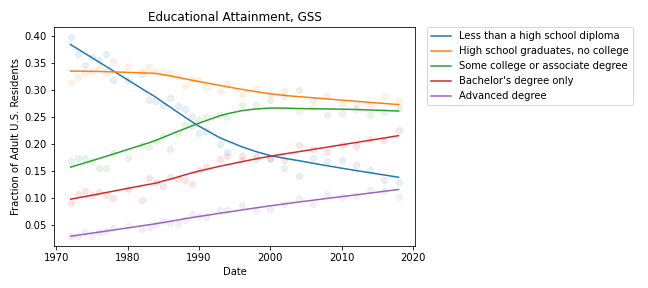
During the relevant period (from 2000 to 2018), the fraction of people with bachelor’s and advanced degrees increased substantially, and the fraction of high school dropouts declined.
These changes are the primary reason for the increase in median real wages when we put all educational levels together. Here’s one way to think about it:
- If you compare two people with the same educational level, one in 2000 and one in 2018, the one in 2018 is probably making less money, in real terms.
- But if you compare two people, chosen at random, one in 2000 and one in 2018, the one in 2018 is probably making more money, because the one in 2018 probably has more education.
These changes in educational attainment might explain the paradox, but the explanation raises another question: The same changes were happening between 2000 and 2010, so why were real wages flat during that interval?
I’m not sure I know the answer, but it looks like wages at each level were falling more steeply between 2000 and 2010; after that, some of them started to recover. So maybe the decreases within educational levels were canceled out by the shifts between levels, with a net change close to zero.
And there’s one more question that nags me: Why are real wages increasing for people with less than a high school diploma? With all the news stories about automation and the gig economy, I expected people in this group to see decreasing wages.
The resolution of this puzzle might be yet another statistical pitfall: survivorship bias. The BLS dataset reports median wages for people who are employed full-time. So if people in the bottom half of the wage distribution lose their jobs, or shift to part-time work, the median of the survivors goes up.
And that raises one final question: Are real wages going up or not?