Browsed by
Tag: statistics

The Foundation Fallacy

The Foundation Fallacy

At Olin College recently, I met with a group from the Kyiv School of Economics who are creating a new engineering program. I am very impressed with the work they are doing, and their persistence despite everything happening in Ukraine.

As preparation for their curriculum design process, they interviewed engineers and engineering students, and they identified two recurring themes: passion and disappointment — that is, passion for engineering and disappointment with the education they got.

One of the professors, reflecting on her work experience, said she thought her education had given her a good theoretical foundation, but when she went to work, she found that it did not apply — she felt like she was starting from scratch.

I suggested that if a “good theoretical foundation” is not actually good preparation for engineering work, maybe it’s not actually a foundation — maybe it’s just a hoop for the ones who can jump through it, and a barrier for the ones who can’t.

The engineering curriculum is based on the assumption that math (especially calculus) and science (especially physics) are (1) the foundations of engineering, and therefore (2) the prerequisites of engineering education. Together, these assumptions are what I call the Foundation Fallacy.

To explain what I mean, I’ll use an example that is not exactly engineering, but it demonstrates the fallacy and some of the rhetoric that sometimes obscures it.

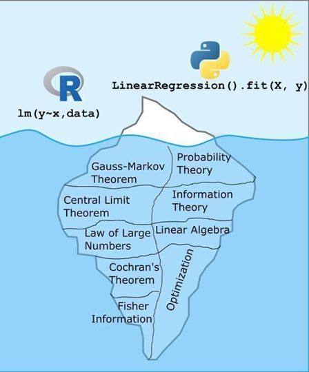
A recent post on LinkedIn includes this image:

And this text:

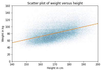
What makes a data scientist a data scientist? Is it their ability to use R or Python to solve data problems? Partially. But just like any tool, I’d rather those making decisions with data truly understand the tools they’re using so that when something breaks, they can diagnose it.

As the image shows, running a linear regression in R or Python is just the tip of the iceberg. What lies beneath, including the theory, assumptions, and reasoning that make those models work, is far more substantial and complex.

ChatGPT can write the code. But it’s the data scientist who decides whether that model is appropriate, interprets the results, and translates them into sound decisions. That’s why I don’t just hand my students an R function and tell them to use it. We dig into why it works, not just that it works. The questions and groans I get along the way are all part of the process, because this deeper understanding is what truly sets a data scientist apart.

Most of the replies to this post, coming from people who jumped through the hoops, agree. The ones who hit a barrier, and the ones groaning in statistics classes, might have a different opinion.

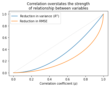
I completely agree that choosing models, interpreting results, and making sound decisions are as important as programming skills. But I’m not sure the things in that iceberg actually develop those skills — in fact, I am confident they don’t.

And maybe for someone who knows these topics, “when something breaks, they can diagnose it.” But I’m not sure about that either — and I am quite sure it’s not necessary. You can understand multiple collinearity without a semester of linear algebra. And you can get what you need to know about AIC without a semester of information theory.

For someone building a regression model, a high-level understanding of causal inference is a lot more useful than the Gauss-Markov theorem. Also more useful: domain knowledge, understanding the context, and communicating the results. Maybe math and science classes could teach these topics, but the ones in this universe really, really don’t.

Everything I just said about linear regression also applies to engineering. Good engineers understand context, not just technology; they understand the people who will interact with, and be affected by, the things they build; and they can communicate effectively with non-engineers.

In their work lives, engineers hardly ever use calculus — more often they use computational tools based on numerical methods. If they know calculus, does that knowledge help them use the tools more effectively, or diagnose problems? Maybe, but I really doubt it.

My reply to the iceberg analogy is the car analogy: you can drive a car without knowing how the engine works. And knowing how the engine works does not make you a better driver. If someone is passionate about driving, the worst thing we can do is make them study thermodynamics. The best thing we can do is let them drive.

When will the haunt begin?

When will the haunt begin?

One of the favorite board games at my house is Betrayal at House on the Hill.

A unique feature of the game is the dice, which yield three possible outcomes, 0, 1, or 2, with equal probability. When you add them up, you get some unusual probability distributions.

There are two phases of the game: During the first phase, players explore a haunted house, drawing cards and collecting items they will need during the second phase, called “The Haunt”, which is when the players battle monsters and (usually) each other.

So when does the haunt begin? It depends on the dice. Each time a player draws an “omen” card, they have to make a “haunt roll”: they roll six dice and add them up; if the total is less than the number of omen cards that have been drawn, the haunt begins.

For example, suppose four omen cards have been drawn. A player draws a fifth omen card and then rolls six dice. If the total is less than 5, the haunt begins. Otherwise the first phase continues.

Last time I played this game, I was thinking about the probabilities involved in this process. For example:

  1. What is the probability of starting the haunt after the first omen card?
  2. What is the probability of drawing at least 4 omen cards before the haunt?
  3. What is the average number of omen cards before the haunt?

My answers to these questions are in this notebook, which you can run on Colab.

Whatever the question was, correlation is not the answer

Whatever the question was, correlation is not the answer

Pearson’s coefficient of correlation, r, is one of the most widely-reported statistics. But in my opinion, it is useless; there is no good reason to report it, ever.

Most of the time, what you really care about is either effect size or predictive value:

  • To quantify effect size, report the slope of a regression line.

If there’s no reason to prefer one measure over another, report reduction in RMSE, because you can compute it directly from R².

If you don’t care about effect size or predictive value, and you just want to show that there’s a (linear) relationship between two variables, use R², which is more interpretable than r, and exaggerates the strength of the relationship less.

In summary, there is no case where r is the best statistic to report. Most of the time, it answers the wrong question and makes the relationship sound more important than it is.

To explain that second point, let me show an example.

Height and weight

I’ll use data from the BRFSS to quantify the relationship between weight and height. Here’s a scatter plot of the data and a regression line:

The slope of the regression line is 0.9 kg / cm, which means that if someone is 1 cm taller, we expect them to be 0.9 kg heavier. If we care about effect size, that’s what we should report.

If we care about predictive value, we should compare predictive error with and without the explanatory variable.

  • Without the model, the estimate that minimizes mean absolute error (MAE) is the median; in that case, the MAE is about 15.9 kg.
  • With the model, MAE is 13.8 kg.

So the model reduces MAE by about 13%.

If you don’t care about effect size or predictive value, you are probably up to no good. But even in that case, you should report R² = 0.22 rather than r = 0.47, because

  • R² can be interpreted as the fraction of variance explained by the model; I don’t love this interpretation because I think the use of “explained” is misleading, but it’s better than r, which has no natural interpretation.
  • R² is generally smaller than r, which means it exaggerates the strength of the relationship less.

[UPDATE: Katie Corker corrected my claim that r has no natural interpretation: it is the standardized slope. In this example, we expect someone who is one standard deviation taller than the mean to be 0.47 standard deviations heavier than the mean. Sebastian Raschka does a nice job explaining this here.]

In general…

This dataset is not unusual.  and r generally overstate the predictive value of the model.

The following figure shows the relationship between r, , and the reduction in RMSE.

Values of r that sound impressive correspond to values of R² that are more modest and to reductions in RMSE which are substantially less impressive.

This inflation is particularly hazardous when r is small. For example, if you see r = 0.25, you might think you’ve found an important relationship. But that only “explains” 6% of the variance, and in terms of predictive value, only decreases RMSE by 3%.

In some contexts, that predictive value might be useful, but it is substantially more modest than r=0.25 might lead you to believe.

The details of this example are in this Jupyter notebook.

And the analysis I used to generate the last figure is in this notebook.

Left, right, part 4

Left, right, part 4

In the first article in this series, I looked at data from the General Social Survey (GSS) to see how political alignment in the U.S. has changed, on the axis from conservative to liberal, over the last 50 years.

In the second article, I suggested that self-reported political alignment could be misleading.

In the third article I looked at responses to this question:

Do you think most people would try to take advantage of you if they got a chance, or would they try to be fair?

And generated seven “headlines” to describe the results.

In this article, we’ll use resampling to see how much the results depend on random sampling. And we’ll see which headlines hold up and which might be overinterpretation of noise.

Overall trends

In the previous article we looked at this figure, which was generated by resampling the GSS data and computing a smooth curve through the annual averages.

This image has an empty alt attribute; its file name is image.png

If we run the resampling process two more times, we get somewhat different results:

Now, let’s review the headlines from the previous article. Looking at different versions of the figure, which conclusions do you think are reliable?

  • Absolute value: “Most respondents think people try to be fair.”
  • Rate of change: “Belief in fairness is falling.”
  • Change in rate: “Belief in fairness is falling, but might be leveling off.”

In my opinion, the three figures are qualitatively similar. The shapes of the curves are somewhat different, but the headlines we wrote could apply to any of them.

Even the tentative conclusion, “might be leveling off”, holds up to varying degrees in all three.

Grouped by political alignment

When we group by political alignment, we have fewer samples in each group, so the results are noisier and our headlines are more tentative.

Here’s the figure from the previous article:

This image has an empty alt attribute; its file name is image-1.png

And here are two more figures generated by random resampling:

Now we see more qualitative differences between the figures. Let’s review the headlines again:

  • Absolute value: “Moderates have the bleakest outlook; Conservatives and Liberals are more optimistic.” This seems to be true in all three figures, although the size of the gap varies substantially.
  • Rate of change: “Belief in fairness is declining in all groups, but Conservatives are declining fastest.” This headline is more questionable. In one version of the figure, belief is increasing among Liberals. And it’s not at all clear the the decline is fastest among Conservatives.
  • Change in rate: “The Liberal outlook was declining, but it leveled off in 1990.” The Liberal outlook might have leveled off, or even turned around, but we could not say with any confidence that 1990 was a turning point.
  • Change in rate: “Liberals, who had the bleakest outlook in the 1980s, are now the most optimistic”. It’s not clear whether Liberals have the most optimistic outlook in the most recent data.

As we should expect, conclusions based on smaller sample sizes are less reliable.

Also, conclusions about absolute values are more reliable than conclusions about rates, which are more reliable than conclusions about changes in rates.