Political Alignment and Outlook
This is the fourth in a series of excerpts from Elements of Data Science, now available from Lulu.com and online booksellers. It’s from Chapter 15, which is part of the political alignment case study. You can read the complete chapter here, or run the Jupyter notebook on Colab.
In the previous chapter, we used data from the General Social Survey (GSS) to plot changes in political alignment over time. In this notebook, we’ll explore the relationship between political alignment and respondents’ beliefs about themselves and other people.
First we’ll use groupby to compare the average response between groups and plot the average as a function of time. Then we’ll use the Pandas function pivot table to compute the average response within each group as a function of time.
Are People Fair?
In the GSS data, the variable fair contains responses to this question:
Do you think most people would try to take advantage of you if they got a chance, or would they try to be fair?
The possible responses are:
| Code | Response |
|---|---|
| 1 | Take advantage |
| 2 | Fair |
| 3 | Depends |
As always, we start by looking at the distribution of responses, that is, how many people give each response:
values(gss["fair"])
1.0    16089
2.0    23417
3.0     2897
Name: fair, dtype: int64
The plurality think people try to be fair (2), but a substantial minority think people would take advantage (1). There are also a number of NaNs, mostly respondents who were not asked this question.
gss["fair"].isna().sum()
29987
To count the number of people who chose option 2, “people try to be fair”, we’ll use a dictionary to recode option 2 as 1 and the other options as 0.
recode_fair = {1: 0, 2: 1, 3: 0}
As an alternative, we could include option 3, “depends”, by replacing it with 1, or give it less weight by replacing it with an intermediate value like 0.5. We can use replace to recode the values and store the result as a new column in the DataFrame.
gss["fair2"] = gss["fair"].replace(recode_fair)
And we’ll use values to make sure it worked.
values(gss["fair2"])
0.0    18986
1.0    23417
Name: fair2, dtype: int64
Now let’s see how the responses have changed over time.
Fairness Over Time
As we saw in the previous chapter, we can use groupby to group responses by year.
gss_by_year = gss.groupby("year")
From the result we can select fair2 and compute the mean.
fair_by_year = gss_by_year["fair2"].mean()
Here’s the result, which shows the fraction of people who say people try to be fair, plotted over time. As in the previous chapter, we plot the data points themselves with circles and a local regression model as a line.
plot_series_lowess(fair_by_year, "C1")

decorate(
    xlabel="Year",
    ylabel="Fraction saying yes",
    title="Would most people try to be fair?",
)
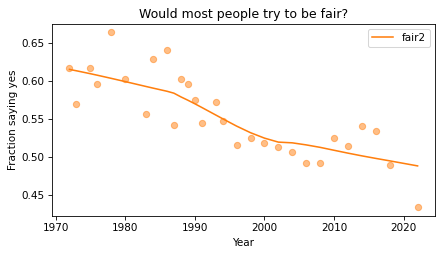
Sadly, it looks like faith in humanity has declined, at least by this measure. Let’s see what this trend looks like if we group the respondents by political alignment.
Political Views on a 3-point Scale
In the previous notebook, we looked at responses to polviews, which asks about political alignment. The valid responses are:
| Code | Response |
|---|---|
| 1 | Extremely liberal |
| 2 | Liberal |
| 3 | Slightly liberal |
| 4 | Moderate |
| 5 | Slightly conservative |
| 6 | Conservative |
| 7 | Extremely conservative |
To make it easier to visualize groups, we’ll lump the 7-point scale into a 3-point scale.
recode_polviews = {
    1: "Liberal",
    2: "Liberal",
    3: "Liberal",
    4: "Moderate",
    5: "Conservative",
    6: "Conservative",
    7: "Conservative",
}
We’ll use replace again, and store the result as a new column in the DataFrame.
gss["polviews3"] = gss["polviews"].replace(recode_polviews)
With this scale, there are roughly the same number of people in each group.
values(gss["polviews3"])
Conservative    21573
Liberal         17203
Moderate        24157
Name: polviews3, dtype: int64
Fairness by Group
Now let’s see who thinks people are more fair, conservatives or liberals. We’ll group the respondents by polviews3.
by_polviews = gss.groupby("polviews3")
And compute the mean of fair2 in each group.
by_polviews["fair2"].mean()
polviews3
Conservative    0.577879
Liberal         0.550849
Moderate        0.537621
Name: fair2, dtype: float64
It looks like conservatives are a little more optimistic, in this sense, than liberals and moderates. But this result is averaged over the last 50 years. Let’s see how things have changed over time.
Fairness over Time by Group
So far, we have grouped by polviews3 and computed the mean of fair2 in each group. Then we grouped by year and computed the mean of fair2 for each year. Now we’ll group by polviews3 and year, and compute the mean of fair2 in each group over time.
We could do that computation “by hand” using the tools we already have, but it is so common and useful that it has a name. It is called a pivot table, and Pandas provides a function called pivot_table that computes it. It takes the following arguments:
values, which is the name of the variable we want to summarize:fair2in this example.index, which is the name of the variable that will provide the row labels:yearin this example.columns, which is the name of the variable that will provide the column labels:polview3in this example.aggfunc, which is the function used to “aggregate”, or summarize, the values:meanin this example.
Here’s how we run it.
table = gss.pivot_table(
    values="fair2", index="year", columns="polviews3", aggfunc="mean"
)
The result is a DataFrame that has years running down the rows and political alignment running across the columns. Each entry in the table is the mean of fair2 for a given group in a given year.
table.head()
| polviews3 | Conservative | Liberal | Moderate |
|---|---|---|---|
| year | |||
| 1975 | 0.625616 | 0.617117 | 0.647280 |
| 1976 | 0.631696 | 0.571782 | 0.612100 |
| 1978 | 0.694915 | 0.659420 | 0.665455 |
| 1980 | 0.600000 | 0.554945 | 0.640264 |
| 1983 | 0.572438 | 0.585366 | 0.463492 |
Reading across the first row, we can see that in 1975, moderates were slightly more optimistic than the other groups. Reading down the first column, we can see that the estimated mean of fair2 among conservatives varies from year to year. It is hard to tell looking at these numbers whether it is trending up or down – we can get a better view by plotting the results.
Plotting the Results
Before we plot the results, I’ll make a dictionary that maps from each group to a color. Seaborn provide a palette called muted that contains the colors we’ll use.
muted = sns.color_palette("muted", 5)
sns.palplot(muted)
And here’s the dictionary.
color_map = {"Conservative": muted[3], "Moderate": muted[4], "Liberal": muted[0]}
Now we can plot the results.
groups = ["Conservative", "Liberal", "Moderate"]
for group in groups:
    series = table[group]
    plot_series_lowess(series, color_map[group])

decorate(
    xlabel="Year",
    ylabel="Fraction saying yes",
    title="Would most people try to be fair?",
)
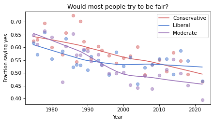
The fraction of respondents who think people try to be fair has dropped in all three groups, although liberals and moderates might have leveled off. In 1975, liberals were the least optimistic group. In 2022, they might be the most optimistic. But the responses are quite noisy, so we should not be too confident about these conclusions.
Discussion
I heard from a reader that they appreciated this explanation of pivot tables because it provides a concrete example of something that can be pretty abstract. I occurred to me that it is hard to define what a pivot table it because the table itself can be almost anything. What the term really refers to is the computation pattern rather than the result. One way to express the computational pattern is “Group by this on one axis, group by that on the other axis, select a variable, and summarize”.
In Pandas, another way to compute a pivot table is like this:
table = gss.groupby(['year', 'polviews3'])['fair2'].mean().unstack()
This way of writing it makes the grouping part of the computation more explicit. And the groupby function is more versatile, so if you only want to learn one thing, you might prefer this version. The unstack at the end is only needed if you want a wide table (with time down the rows and alignment across the columns) — without it, you get the long table (with one row for each pair of time and alignment, and only one column).
So, should we forget about pivot_table (and crosstab while we’re at it) and use groupby for everything? I’m not sure. For people who are already know the terms, it can be helpful to use functions with familiar names. But if you understand the group-by computational pattern, it might not be useful to use different functions for particular instances of the pattern.