The Gender Gap in Political Beliefs Is Small

The Gender Gap in Political Beliefs Is Small

In previous articles (here, here, and here) I’ve looked at evidence of a gender gap in political alignment (liberal or conservative), party affiliation (Democrat or Republican), and policy preferences.

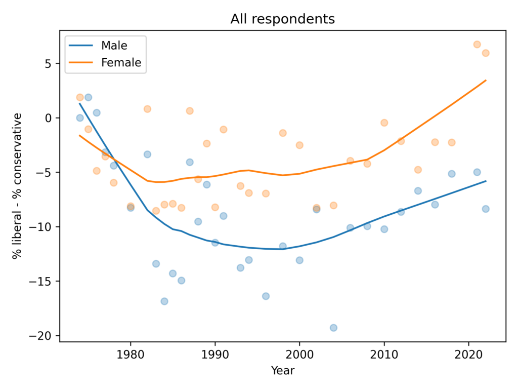
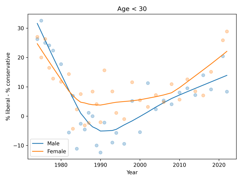
Using data from the GSS, I found that women are more likely to say they are liberal, and more likely to say they are Democrats, by 5-10 percentage points. But in their responses to 15 policy questions that most distinguish conservatives and liberals, men and women give similar answers.

In other words, the political gap is mostly in what people say about themselves, not in what they believe about specific policy questions.

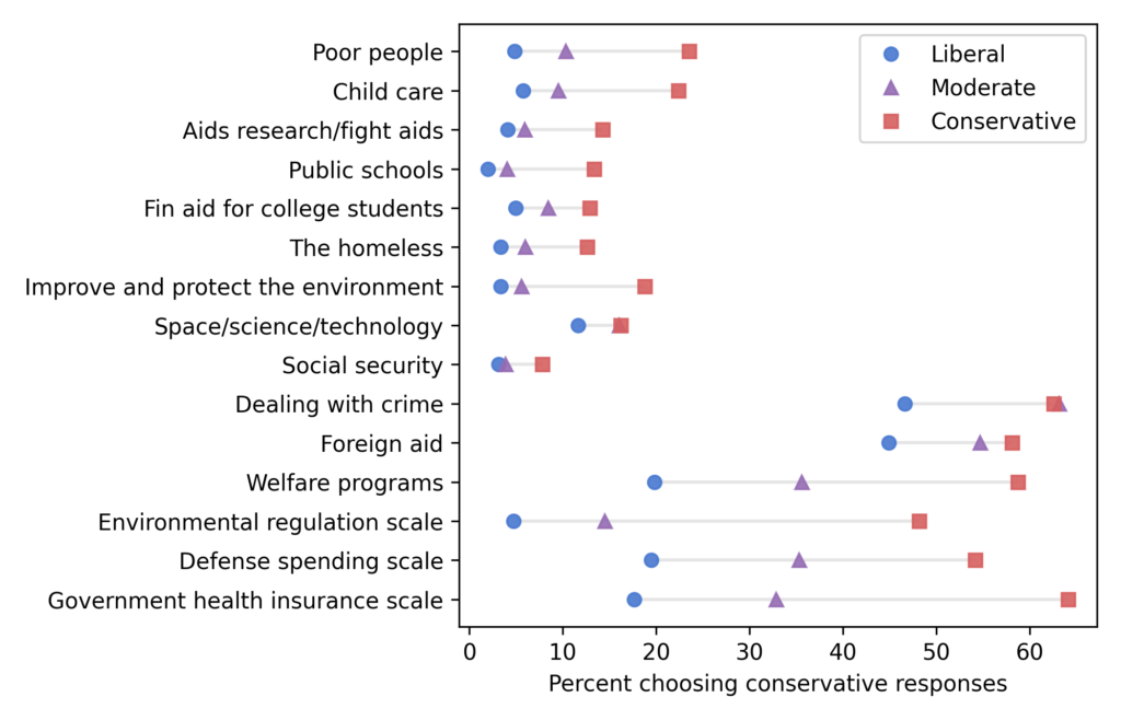
Now let’s see if we get similar results with ANES data. As with the GSS, I looked for questions where liberals and conservatives give different answers. From those, I selected questions about specific policies, plus four questions related to moral foundations, with preference for questions asked over a long period of time. Here are the 16 topics that met these criteria:

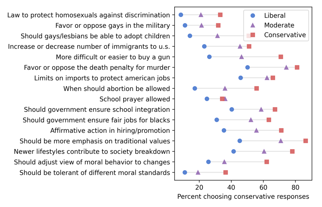
For each question, I identified one or more responses that were more likely to be given by conservatives, which is what I’m calling “conservative responses”.

Not every respondent was asked every question, so I used a Bayesian method based on item response theory to fill missing values. You can get the details of the method here.

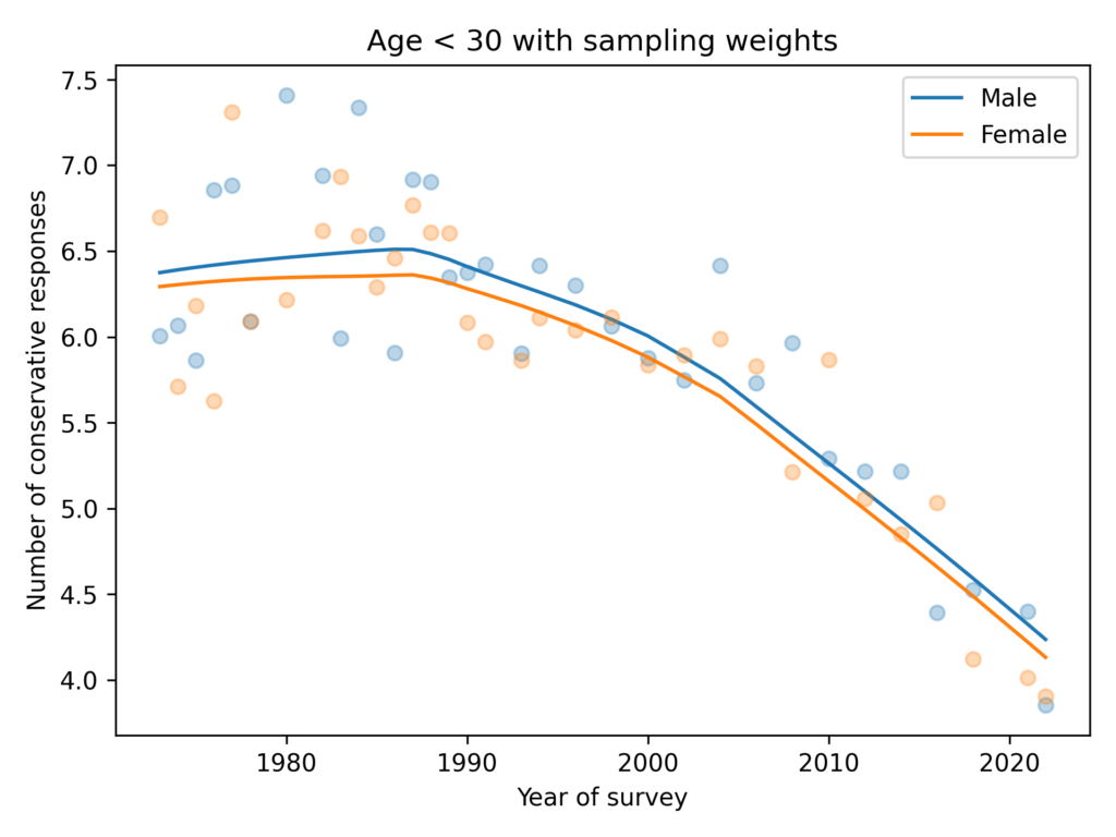
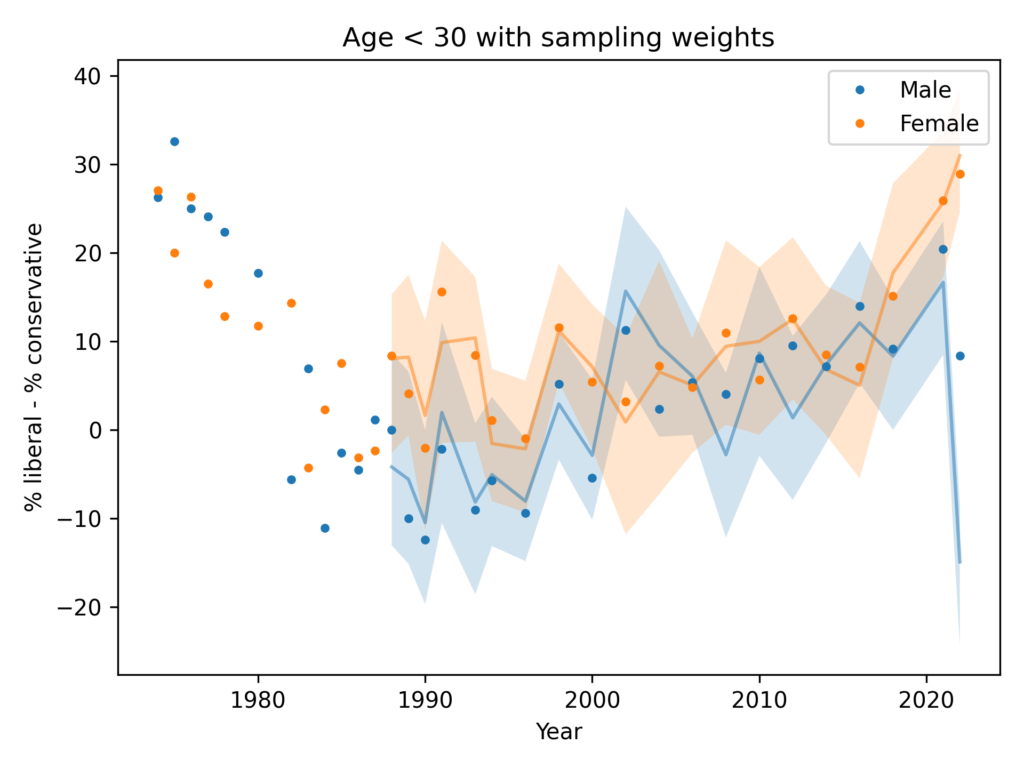
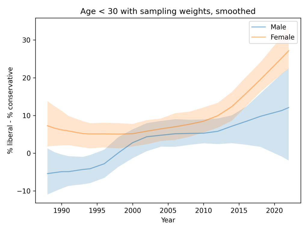
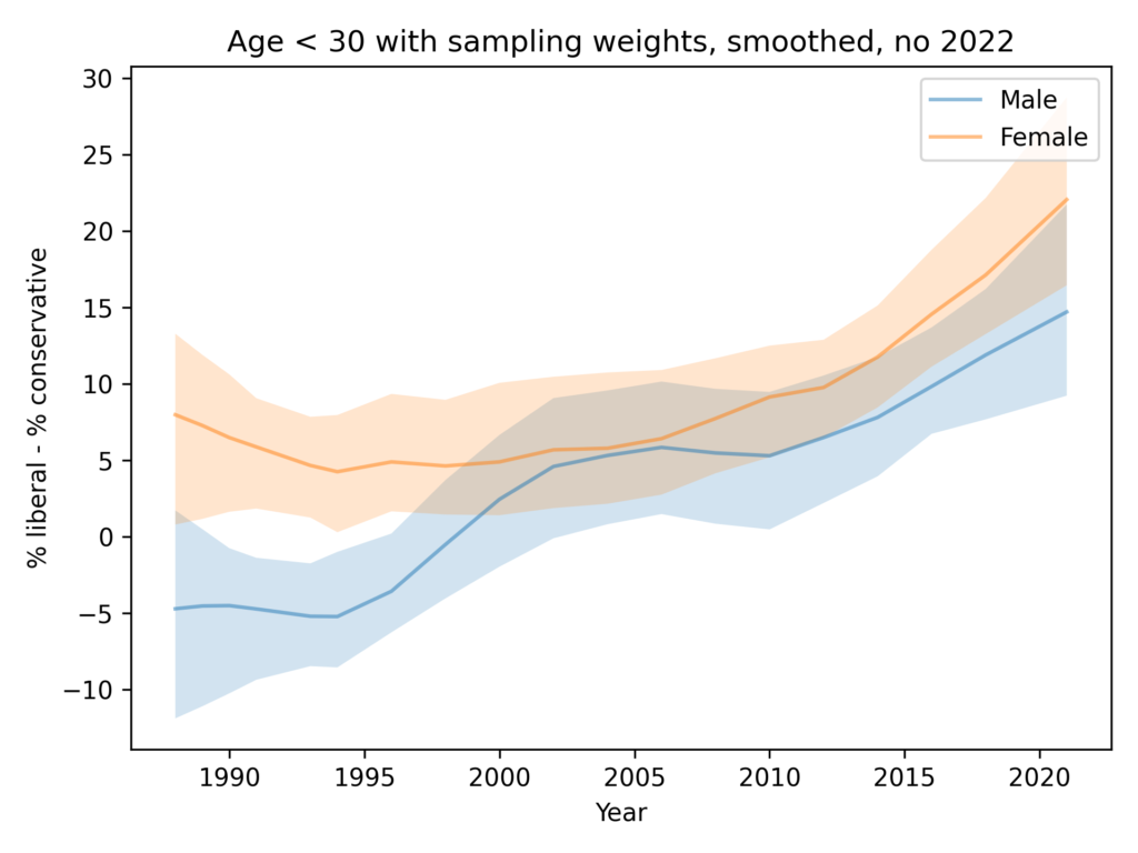
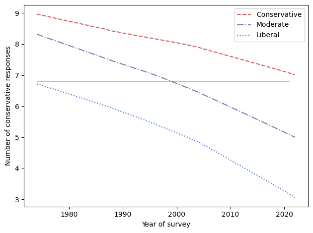
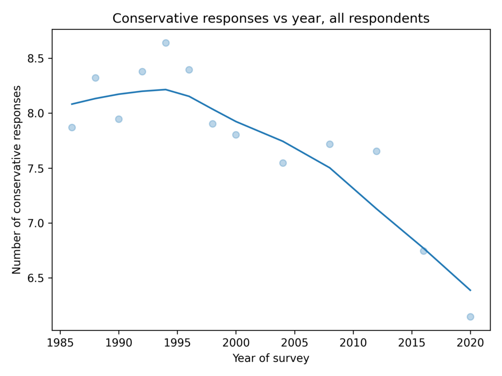
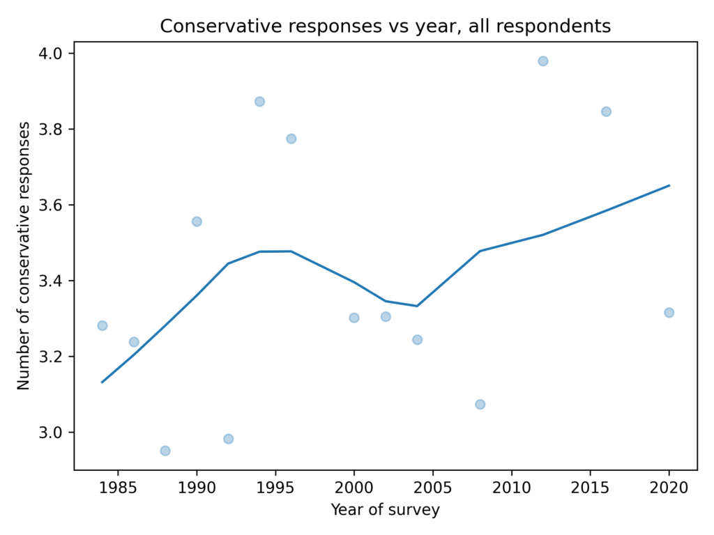
As in the GSS data, the average number of conservative responses has gone down over time.

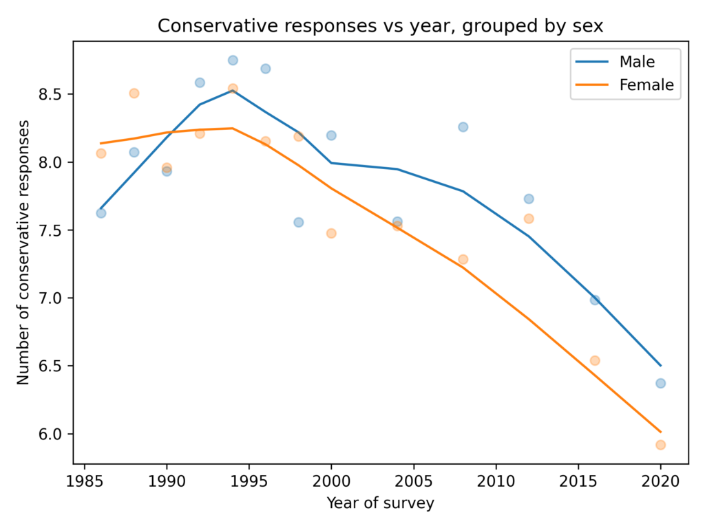
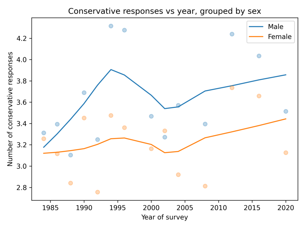
Men give more conservative responses than women, on average, but the differences is only half a question, and the gap is not getting bigger.

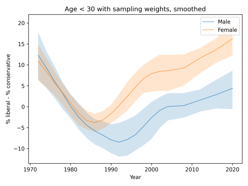
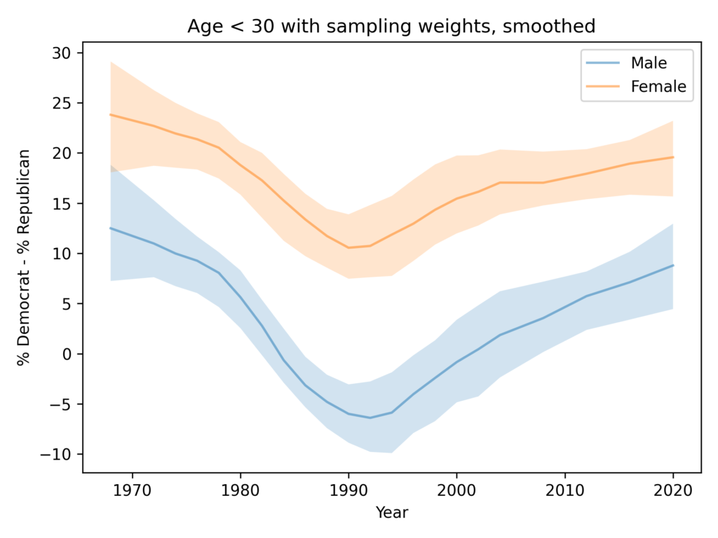
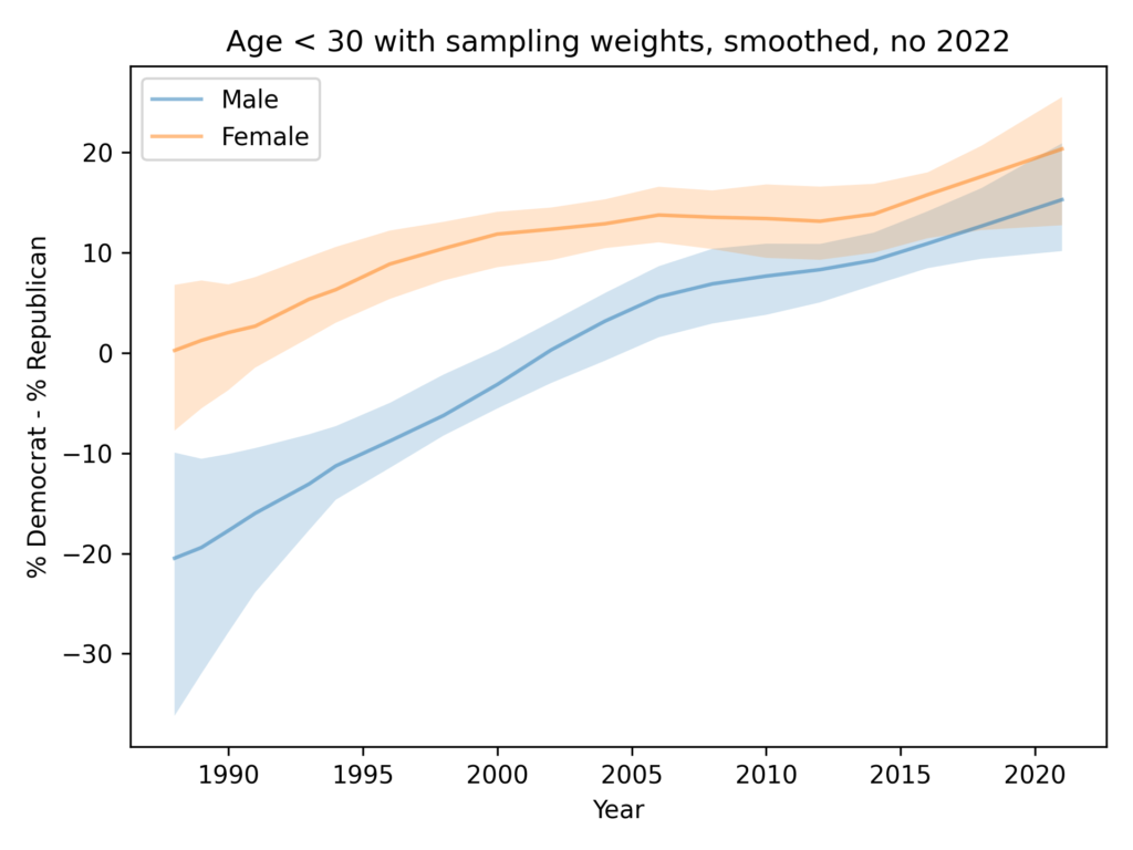
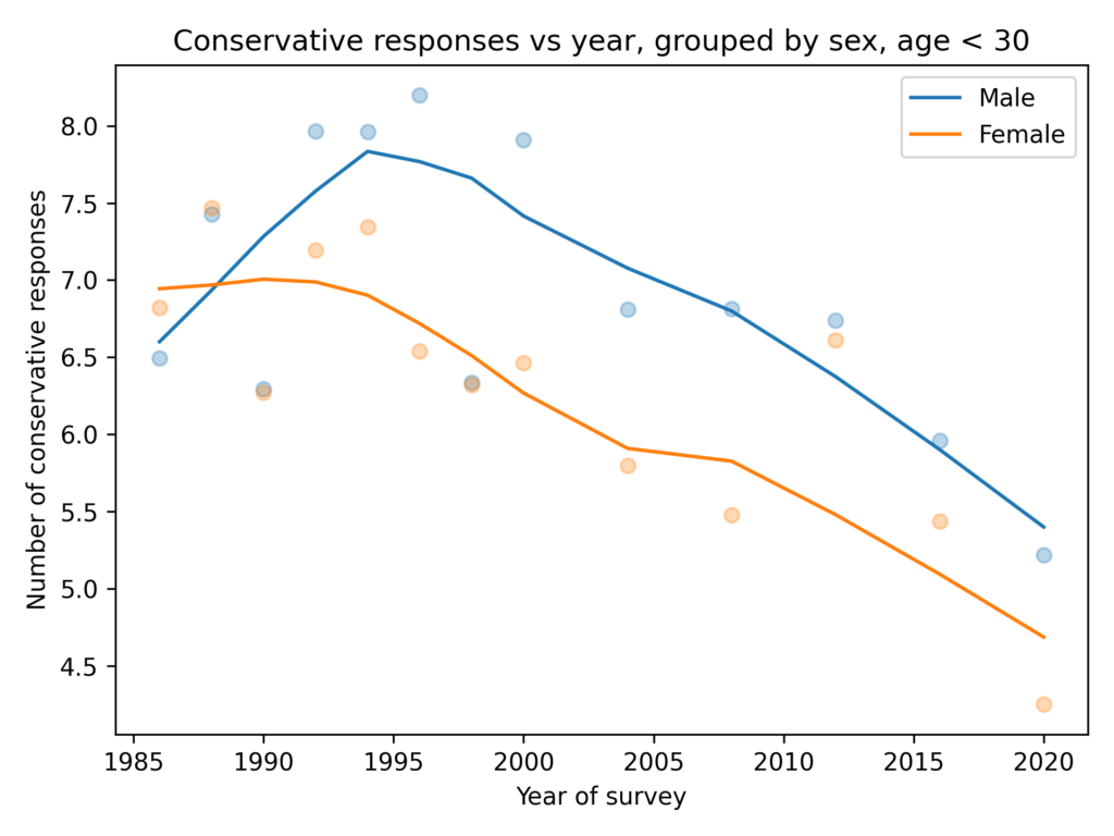
Among people younger than 30, the gap is closer to 1 question, on average. And it is not growing.

In summary:

  • In the ANES, there is no evidence of a growing gender gap in political alignment, party affiliation, or policy preferences.
  • In both the GSS and the ANES the gap in policy preferences is small and not growing.

The details of this analysis are in this Jupyter notebook.

What about economics?

Many of the questions in the previous section are about social issues. On economic issues some of the patterns are different. Here are 15 questions I selected that are mostly about federal spending.

Unlike the social issues, which trend liberal over time, responses to these questions are almost unchanged.

In the general population, the gender gap is about 0.5 questions and not growing.

Among young adults, the gender gap is smaller, and not growing.

On a total of 30 questions where conservatives and liberal disagree, men and women provide similar responses.

Think Python third edition!

Think Python third edition!

I am happy to announce the third edition of Think Python, which will be published by O’Reilly Media later this year.

You can read the online version of the book here. I’ve posted the Preface and the first four chapters — more on the way soon!

You can read the Early Release and pre-order from O’Reilly, or pre-order the third edition on Amazon.

Here is an excerpt from the Preface that explains…

What’s new in the third edition?

The biggest changes in this edition were driven by two new technologies — Jupyter notebooks and virtual assistants.

Each chapter of this book is a Jupyter notebook, which is a document that contains both ordinary text and code. For me, that makes it easier to write the code, test it, and keep it consistent with the text. For readers, it means you can run the code, modify it, and work on the exercises, all in one place.

The other big change is that I’ve added advice for working with virtual assistants like ChatGPT and using them to accelerate your learning. When the previous edition of this book was published in 2016, the predecessors of these tools were far less useful and most people were unaware of them. Now they are a standard tool for software engineering, and I think they will be a transformational tool for learning to program — and learning a lot of other things, too.

The other changes in the book were motivated by my regrets about the second edition.

The first is that I did not emphasize software testing. That was already a regrettable omission in 2016, but with the advent of virtual assistants, automated testing has become even more important. So this edition presents Python’s most widely-used testing tools, doctest and unittest, and includes several exercises where you can practice working with them.

My other regret is that the exercises in the second edition were uneven — some were more interesting than others and some were too hard. Moving to Jupyter notebooks helped me develop and test a more engaging and effective sequence of exercises.

In this revision, the sequence of topics is almost the same, but I rearranged a few of the chapters and compressed two short chapters into one. Also, I expanded the coverage of strings to include regular expressions.

A few chapters use turtle graphics. In previous editions, I used Python’s turtle module, but unfortunately it doesn’t work in Jupyter notebooks. So I replaced it with a new turtle module that should be easier to use. Here’s what it looks like in the notebooks.

Finally, I rewrote a substantial fraction of the text, clarifying places that needed it and cutting back in places where I was not as concise as I could be.

I am very proud of this new edition — I hope you like it!

The Political Gender Gap is Not Growing

The Political Gender Gap is Not Growing

In a previous article, I used data from the General Social Survey (GSS) to see if there is a growing gender gap among young people in political alignment, party affiliation, or political attitudes. So far, the answer is no.

  • Young women are more likely than men to say they are liberal by 5-10 percentage points. But there is little or no evidence that the gap is growing.
  • Young women are more likely to say they are Democrats. In the 1990s, the gap was almost 20 percentage points. Now it is only 5-10 percentage points. So there’s no evidence this gap is growing — if anything, it is shrinking.
  • To 15 questions related to policies and attitudes, young men give slightly more conservative responses than women, on average, but the gap is small and consistent over time — there is no evidence it is growing.

Ryan Burge has done a similar analysis with data from the Cooperative Election Study (CSE). Looking at stated political alignment, he finds that young women are more likely to say they are liberal by 5-10 percentage points. But there is no evidence that the gap is growing.

That leaves one other long-running survey to consider, the American National Election Studies (ANES). I have been meaning to explore this dataset for a long time, so this project is a perfect excuse.

This Jupyter notebook shows my analysis of alignment and party affiliation. I’ll get to beliefs and attitudes next week.

Alignment

This figure shows the percent who say they are liberal minus the percent who say they are conservative, for men and women ages 18-29.

It looks like the gender gap in political alignment appeared in the 1980s, but it has been nearly constant since then.

Affiliation

This figure shows the percent who say they are Democrats minus the percent who say they are Republicans, for men and women ages 18-29.

The gender gap in party affiliation has been mostly constant since the 1970s. It might have been a little wider in the 1990s, and might be shrinking now.

So what’s up with Gallup?

The results from GSS, CES, and ANES are consistent: there is no evidence of a growing gender gap in alignment, affiliation, or attitudes. So why does the Gallup data tell a different story?

Here’s the figure from the Financial Times article again, zooming in on just the US data.

First, I think this figure is misleading. As explained in this tweet, the data here have been adjusted by subtracting off the trend in the general population. As a result, the figure gives the impression that young men now are more likely to identify as conservative than in the past, and that’s not true. They are more likely to identify as liberal, but this trend is moving slightly slower than in the general population.

But misleading or not, this way of showing the data doesn’t change the headline result, which is that the gender gap in this dataset has grown substantially, from about 10 percentage points in 2010 to about 30 percentage points now.

On Twitter, the author of the FT article points out that one difference is that the sample size is bigger for the Gallup data than the datasets I looked at — and that’s true. Sample size explains why the variability from year to year is smaller in the Gallup data, but it does not explain why we see a big trend in the Gallup data that does not exist at in the other datasets.

As a next step, I would ideally like to access the Gallup data so I can replicate the analysis in the FT article and explore reasons for the discrepancy. If anyone with access to the Gallup data can and will share it with me, let me know.

Barring that, we are left with two criteria to consider: plausibility and preponderance of evidence.

Plausibility: The size of the changes in the Gallup data are at least surprising if not implausible. A change of 20 percentage points in 10 years is unlikely, especially in an analysis like this where we follow an age group over time — so the composition of the group changes slowly.

Preponderance of evidence: At this point see a trend in one analysis of one dataset, and no sign of that result in several analyses of three other similar datasets.

Until we see better evidence to support the surprising claim, it seems most likely that the gender gap among young people is not growing, and is currently no larger than it has been in the past.

Political Alignment, Affiliation, and Attitudes

Political Alignment, Affiliation, and Attitudes

Is there a growing gender gap in the U.S?

Alignment

A recent article in the Financial Times suggests that among young people there is a growing gender gap in political alignment on a spectrum from liberal to conservative.

In last week’s post, I tried to replicate this result using data from the General Social Survey. I generated the following figure, which shows the percentage of liberals minus the percentage of conservatives from 1988 to 2021, among people 18 to 29 years old. The analysis is in this Jupyter notebook.

Women are more likely to say they are liberal by 5-10 percentage points. But there is little or no evidence that the gap is growing.

Party Affiliation

This figure shows the percentage of Democrats minus the percentage of Republicans from 1988 to 2021. The analysis is in this Jupyter notebook.

Women are more likely than men to say they are Democrats. In the 1990s, the gap was almost 20 percentage points. Now it is only 5-10 percentage points. So there’s no evidence this gap is growing — if anything, it is shrinking.

Attitudes and beliefs

To quantify political attitudes, I will take advantage of a method I used in Chapter 12 of Probably Overthinking It. In the General Social Survey, I chose 15 questions where there is the biggest difference in the responses of people who identify as liberal or conservative. Then I estimated the number of conservative responses from each respondent.

The following figure shows the average number of conservative responses for young men and women since 1974. The analysis is in this Jupyter notebook.

Men give slightly more conservative responses than women, on average, but the gap is small and consistent over time — there is no evidence it is growing.

In summary, GSS data provides no support for the claim that there is a growing gender gap in political alignment, affiliation, or attitudes.

Extremes, outliers, and GOATS

Extremes, outliers, and GOATS

The video from my PyData Global 2023 talk, Extremes, outliers, and GOATS, is available now:

The slides are here.

There are two Jupyter notebooks that contain the analysis I presented:

Here’s the abstract:

The fastest runners are much faster than we expect from a Gaussian distribution, and the best chess players are much better. In almost every field of human endeavor, there are outliers who stand out even among the most talented people in the world. Where do they come from?

In this talk, I present as possible explanations two data-generating processes that yield lognormal distributions, and show that these models describe many real-world scenarios in natural and social sciences, engineering, and business. And I suggest methods — using SciPy tools — for identifying these distributions, estimating their parameters, and generating predictions.

This talk is based on Chapter 4 of Probably Overthinking It. If you liked the talk, you’ll love the book 🙂

Thanks to the organizers of PyData Global and NumFOCUS!

Is the Ideology Gap Growing?

Is the Ideology Gap Growing?

This tweet from John Burn-Murdoch links to an article in the Financial Times (FT), “A new global gender divide is emerging”, which includes this figure:

The article claims:

In the US, Gallup data shows that after decades where the sexes were each spread roughly equally across liberal and conservative world views, women aged 18 to 30 are now 30 percentage points more liberal than their male contemporaries. That gap took just six years to open up.

The figure says it is based on General Social Survey data and the text says it’s based on Gallup data, so I’m not sure which it is. UPDATE: In this tweet Burn-Murdoch explains that the figure shows Gallup data, backfilled with GSS data from before the Gallup series began.

And I don’t know what it means that “All figures are adjusted for time trend in the overall population”. UPDATE: In this tweet, Burn-Murdoch explains that the adjustment mentioned in the figure is to subtract off the overall trend. In the notebook for this article, I apply the same adjustment, but it does not change my conclusions.

Anyway, since I used GSS data in several places in Probably Overthinking It, this analysis did not sound right to me. So I tried to replicate the analysis with GSS data.

I conclude:

  • The GSS data does not look like the figure in the FT.
  • Women are a more likely to say that they are liberal, by 5-10 percentage points.
  • The only evidence that the gap is growing depends entirely on a data point from 2022 that is probably an error.
  • If we drop the 2022 data and apply moderate smoothing, we see no evidence that the gap is growing.

Most of the functions in this notebook are the ones I used to write Probably Overthinking It. All of the notebooks for that book are available in this repository.

Click here to run this notebook on Colab

GSS Data

I’m using data from the General Social Survey (GSS), which I previous cleaned in this notebook. The primary variable we’ll use is polviews, which asks:

We hear a lot of talk these days about liberals and conservatives. I’m going to show you a seven-point scale on which the political views that people might hold are arranged from extremely liberal–point 1–to extremely conservative–point 7. Where would you place yourself on this scale?

The points on the scale are Extremely liberal, Liberal, and Slightly liberal; Moderate; Slightly conservative, Conservative, and Extremely conservative.

I’ll lump the first three points into “Liberal” and the last three into “Conservative”

All respondents

The following figure shows the percentage who says they are liberal minus the percentage who say they are conservative, grouped by sex.

In the general population, women are more likely to say they are liberal by 5-10 percentage points. The gap might have increased in the most recent data, depending on how seriously we take the last two points in a noisy series.

Just young people

Now let’s select people under 30.

The trends here are pretty much the same as in the general population. Women are more likely to say they are liberal by 5-10 percentage points.

It’s possible that the gap has grown in the most recent data, but the evidence is weak and depends on how we draw a smooth curve through noisy data.

Anyway, there is no evidence the trend for men is going down — as in the FT graph — and the gap in the most recent data is nowhere near 30 percentage points.

With Sampling Weights

In the previous figures, I did not take into account the sampling weights, partly to keep the analysis simple and partly because I didn’t expect them to make much difference.

And I was mostly right, except for men in 2022 – and as we’ll see, there is almost certainly something wrong with that data point.

In this figure, the shaded area is the 90% CI of 101 weighted resamplings, the line is the median of the resamplings, and the points show the unweighted data. We only have weighted data since 1988, since that’s how far back the wtssps variable goes.

In most cases, the unweighted data falls in the CI of the weighted data, but for male respondents in 2022, the weighting moves the needle by almost 30 percentage points.

So something is not right there. I think the best option is to drop the 2022 data, but just for completeness, let’s see what happens if we apply some smoothing.

Resampling and smoothing

Here’s a version of the same plot with moderate smoothing, dropping the unweighted data.

You could argue that this figure shows evidence for an increasing gap, but the error bounds are very wide, and as we’ll see in the next figure, the entire effect is due to the likely error in the 2022 data.

Resampling and smoothing without 2022

Finally, here’s the analysis I think is the best choice, dropping the 2022 data for both men and women.

In summary:

  • Since the 1990s, both men and women have become more likely to identify as liberal.
  • Women are more likely to identify as liberal by 5-10 percentage points.
  • There is no evidence that the ideology gap is growing.

Probably Overthinking It Notebooks

Probably Overthinking It Notebooks

To celebrate one month since the launch of Probably Overthinking It, I’m releasing the Jupyter notebooks I used to create the book. There’s one per chapter, and they contain all of the code I used to do the analysis and generate the figures. So if you are curious about the details of anything in the book, the notebooks are here!

If you — or someone you love — is teaching statistics this semester, please let them know about this resource. I think a lot of the examples in the book are good for teaching.

And if you are enjoying Probably Overthinking It, please help me spread the word:

  • Recommend the book to a friend.
  • Write reviews on Amazon, Goodreads, or your favorite book site.
  • Talk about it on social media.
  • Request it from your local library.
  • Order it from your local bookstore or suggest they carry it.

It turns out that writing a book is the easy part — finding an audience is hard!

The Center Moves Faster Than You

The Center Moves Faster Than You

In May 2022, Elon Musk tweeted this cartoon:

The creator of the cartoon, Colin Wright, explained it like this:

At the outset, I stand happily beside ‘my fellow liberal,’ who is slightly to my left. In 2012 he sprints to the left, dragging out the left end of the political spectrum […] and pulling the political “center” closer to me. By 2021 my fellow liberal is a “woke ‘progressive,’ ” so far to the left that I’m now right of center, even though I haven’t moved.”

The cartoon struck a chord, which suggests that Musk and Wright are not the only ones who feel this way.

As it happens, this phenomenon is the topic of Chapter 12 of Probably Overthinking It and this post from April 2023, where I use data from the General Social Survey to describe changes in political views over the last 50 years.

The chapter includes this figure, which shows how beliefs have changed among people who consider themselves conservative, moderate, and liberal.

All three groups give fewer conservative responses to the survey questions over time. (To see how I identified conservative responses, see the talk I presented at PyData 2022. The technical details are in this Jupyter notebook.)

The gray line represents a hypothetical person whose views don’t change. In 1972, they were as liberal as the average liberal. In 2000, they were near the center. And in 2022, they were almost as conservative as the average conservative.

Using the same methods, I made this data-driven version of the cartoon.

The blue circles show the estimated conservatism of the average self-identified liberal; the red squares show the average conservative, and the purple line shows the overall average.

The data validate Wright’s subjective experience. If you were a little left of center in 2008 and you did not change your views for 14 years, you would find yourself a little right of center in 2022.

However, the cartoon is misleading in one sense: the center did not shift because people on the left moved far to the left. It moved primarily because of generational replacement. On the conveyor belt of demography, when old people die, they are replaced by younger people — and younger people hold more liberal views.

On average people become a little more liberal as they age, but these changes are small and slow compared to generational replacement. That’s why many people have the experience reflected in the cartoon — because the center moves faster than them.

For more on this topic, you can read Chapter 12 of Probably Overthinking It. You can get a 30% discount if you order from the publisher and use the code UCPNEW. You can also order from Amazon or, if you want to support independent bookstores, from Bookshop.org.

Or you might like this talk I presented at PyData NYC, this podcast, and this online article at Brilliant.org.

How Many Books?

How Many Books?

If you like this article, you can read more about this kind of Bayesian analysis in Think Bayes.

Recently I found a copy of Probably Overthinking It at a local bookstore and posted a picture on Twitter. Aubrey Clayton replied with this question:

The author's dilemma: do you want to see many copies of your book at the store or none?

It’s a great question with what turns out to be an interesting answer. I’ll summarize the results here, but if you want to see the calculations, you can run the notebook on Colab.

Assumptions

Suppose you are the author of a book like Probably Overthinking It, and when you visit a local bookstore, like Newtonville Books in Newton, MA, you see that they have two copies of your book on display.

Is it good that they have only a few copies, because it suggests they started with more and sold some? Or is it bad because it suggests they only keep a small number in stock, and they have not sold. More generally, what number of books would you like to see?

To answer these questions, we have to make some modeling decisions. To keep it simple, I’ll assume:

  • The bookstore orders books on some regular cycle of unknown duration.
  • At the beginning of every cycle, they start with k books.
  • People buy the book at a rate of λ books per cycle.
  • When you visit the store, you arrive at a random time t during the cycle.

We’ll start by defining prior distributions for these parameters, and then we’ll update it with the observed data.

Priors

For some books, the store only keeps one copy in stock. For others it might keep as many as ten. If we would be equally unsurprised by any value in this range, the prior distribution of k is uniform between 1 and 10.

If we arrive at a random point in the cycle, the prior distribution of t is uniform between 0 and 1, measured in cycles.

Now let’s figure the book-buying rate is probably between 2 and 3 copies per cycle, but it could be substantially higher – with low probability. We can choose a lognormal distribution that has a mean and shape that seem reasonable. Here’s what it looks like.

From these marginal prior distributions, we can form the joint prior. Now let’s update it.

The update

Now for the update, we have to handle two cases:

  • If we observe at least one book, n, the probability of the data is the probability of selling k-n books at rate λ over period t, which is given by the Poisson PMF.
  • If there are no copies left, we have to add in the probability that the number of books sold in this period could have exceeded k, which is given by the Poisson survival function.

After computing these likelihoods for all possible sets of parameters, we do a Bayesian update in the usual way, multiplying the priors by the likelihoods and normalizing the result.

As an example, we’ll do an update with the hypothetically observed 2 books. Then, from the joint posterior, we can extract the marginal distributions of k and λ, and compute their means.

Seeing two books suggests that the store starts each cycle with 3-4 books and sells 2-3 per cycle. Here’s the posterior distribution of k compared to its prior.

And here’s the posterior distribution of λ.

Seeing two books doesn’t provide much information about the book-selling rate.

Optimization

Now let’s consider the more general question, “What number of books would you most like to see?” There are two ways we might answer:

  • One answer might be the observation that leads to the highest estimate of λ. But if the book-selling rate is high, relative to k, the book will sometimes be out of stock, leading to lost sales.
  • So an alternative is to choose the observation that implies the highest number of books sold per cycle.

Computing the second is a little tricky — you can see the details in the notebook. But with that problem solved, we can loop over possible values of n and compute for each one the posterior mean values of λ and the implied number of books sold per cycle.

Here’s the implied sales rate as a function of the observed number of books. By this metric, the best number of books to see is 0.

And here’s the implied number of books sold per cycle.

This result is a little more interesting. Seeing 0 books is still good, but the optimal value is around 5. The worst possibility is to see just one book.

Now, we should not take these values too literally, as they are based on a very small amount of data and a lot of assumptions – both in the model and in the priors. But it is interesting that the optimal point is neither 0 nor “as many as possible.

Thanks again to Aubrey Clayton for asking such an interesting question. If you are interesting in the history and future of statistical thinking, you might like his book, Bernoulli’s Fallacy.

previous


What are the odds?

What are the odds?

Whenever something unlikely happens, it is tempting to ask, “What are the odds?”

In some very limited cases, we can answer that question. For example, if someone deals you five cards from a well-shuffled deck, and you want to know the odds of getting a royal flush, we can answer that question precisely. At least, we can if you are clearly referring to just this one hand.

But if you’ve been playing poker regularly for a decade and then one night you are dealt a royal flush, it might not be clear, when you ask the question, whether you mean the odds of getting a royal flush on one deal, or one evening of play, or some time in your career, or once in all of the poker hands that have every been dealt. Those are different questions with very different answers — in fact, the first is close to 0 and the last is close to 1 (and known to be 1 in this universe).

So, even in a highly constrained environment like a poker game, answering questions like this can be tricky. It’s even worse in real life. Say you go to college in Massachusetts and then two years later you visit Paris, go for a walk in the Tuileries Garden, and run into a friend from college. What are the odds? Now we have to define both “in how many attempts?” and “odds of what?” Meeting this friend in this particular place? Or any old friend in any unexpected place?

Now let’s put all of this thinking to the test with an example, which is the most surprising thing that has happened to me since the time I ran into a college friend in Paris. Two days ago I was working on a heat vent in my house and wanted to attach this socket

to this screwdriver

But the socket takes a 1/4 inch square drive, and the screwdriver takes 1/4 inch hex bits. I figured there was probably an adapter that could connect them, but I didn’t have one. I thought about getting one, but then I found another way to do the job.

Two days later I went for a walk and about 30 yards from my house, in the middle of the street, I saw a small bit of metal that I picked up just to get it out of the way. And when I looked more closely at what is was — it was a 1/4 inch hex to 1/4 inch square drive adapter.

And here’s how it works.

So, what are the odds of that? I don’t know, but if you have a non-zero prior for the existence of a benevolent deity, you might want to update it.