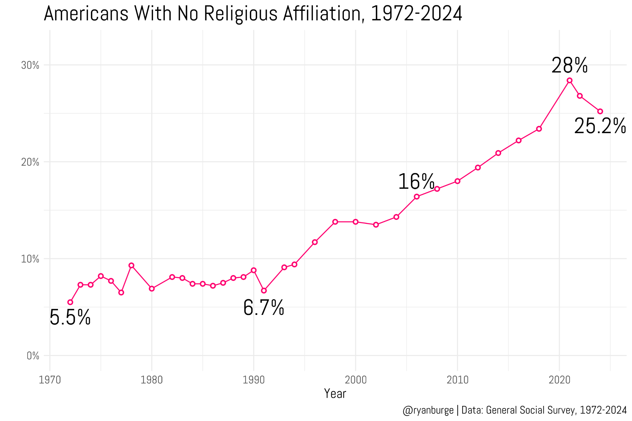
presents evidence that the Nones have hit a ceiling — that is, that the percentage of people in the U.S. with no religious affiliation, which has consistently increased for several decades, has either leveled off or started to reverse.
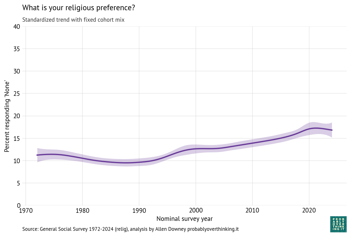
He reports on new data from the Cooperative Election Study and the 2024 General Social Survey, including this figure based on the GSS.
The observed percentage of Nones peaked in the 2021 survey and has dropped in the last two cycles. The CES data show a similar pattern, with a much larger sample size. So I’m not going to disagree with Ryan: it sure looks like the rise of the Nones has stalled or even reversed.
However, since I am developing a model that decomposes trends like this into cohort and period effects, we can use it to check whether the turnaround is a cohort or a period effect. It turns out to be both.
The Model
The model assumes that each cohort in each year has an unobserved (latent) propensity to report a religious affiliation or none.
The cohort and period effects are modeled as second-order Gaussian random walks, which means the model assumes these effects evolve smoothly over time, unless the data provide strong evidence otherwise. The amount of smoothing is estimated from the data.
An additional random year effect captures variation from one survey to the next that is not explained by long-term trends, like current events and topics of discussion.
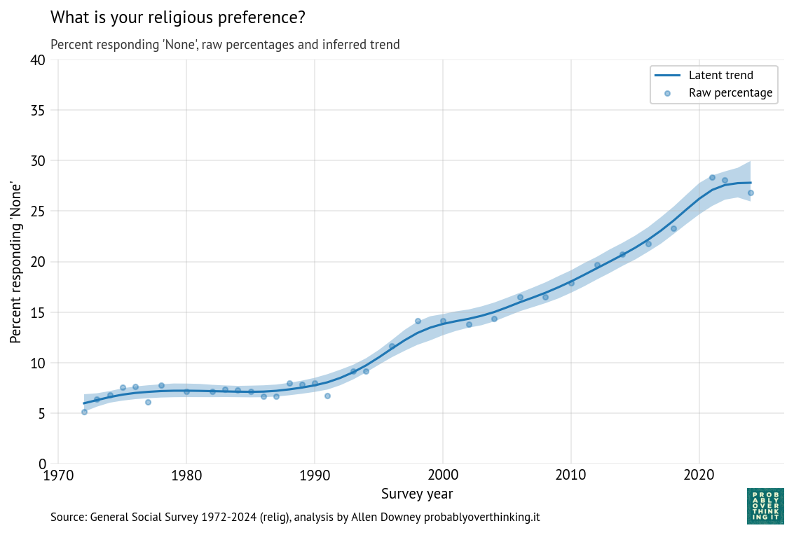
The “time only” version of the model estimates a latent propensity for each cycle of the survey, so the result is a smooth curve through the raw proportions.
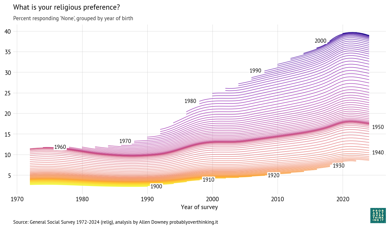
The “time-cohort” version estimates a latent propensity for each cohort during each cycle, so the result is a trajectory over time for each birth year.
Results
Here are the results for the time-only model, showing the posterior mean and a 94% credible interval.
Time-only model, percent with no religious preference
The posterior mean indicates that the trend in the latent factor has probably slowed; the credible interval indicates that it might have leveled off or reversed.
And here are the trajectories for each cohort:
Cohort trajectories, percent with no religious preference
Starting at the bottom, we can see that cohorts born between 1900 and 1930 were not very different — fewer than 10% of them were Nones.
People born in the 1940s were increasingly non-religious, but this first wave of secularization stalled in the cohorts born in the 1950s. The second wave got started with people born in the 1960s, and continued until the 2000s cohorts, where it seems to have stalled again.
Decomposition
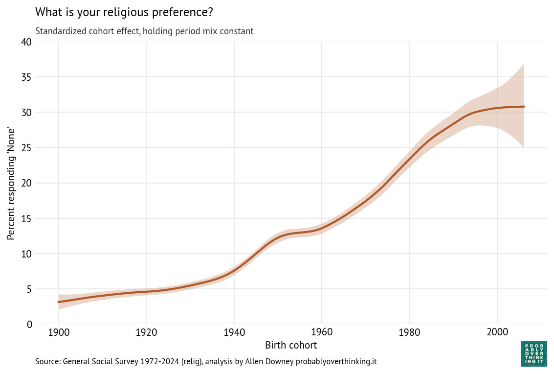
With these trajectories, we can decompose the cohort and period effects. The following figure shows the cohort effect, standardized by holding the period effect constant.
As we saw in the previous figure, there was a period of relatively fast change in the 1940s cohorts that stalled among people born in the 1950s and then resumed among people born in the 1960s through the 1980s (primarily Gen X).
Again, it looks like the most recent cohorts have leveled off, but with the width of the credible interval, it’s possible that the trend has continued or reversed.
The following figure shows the period effect, standardized by holding the cohort mix constant.
The period effect was generally increasing from 1990 to 2020, but seems to have leveled off or rolled over.
So, if the rise of the Nones has stalled, at least temporarily, it seems to be a combination of a cohort effect among people born after 2000 and a period effect starting around 2020. This decomposition suggests we should look for at least two kinds of explanations:
Differences in the childhood of people born after 2000 that might make them more likely to have a religious affiliation as young adults, and
Events since 2020 that have affected all cohorts in ways that might make them more religious.
I’ll hold off on speculating.
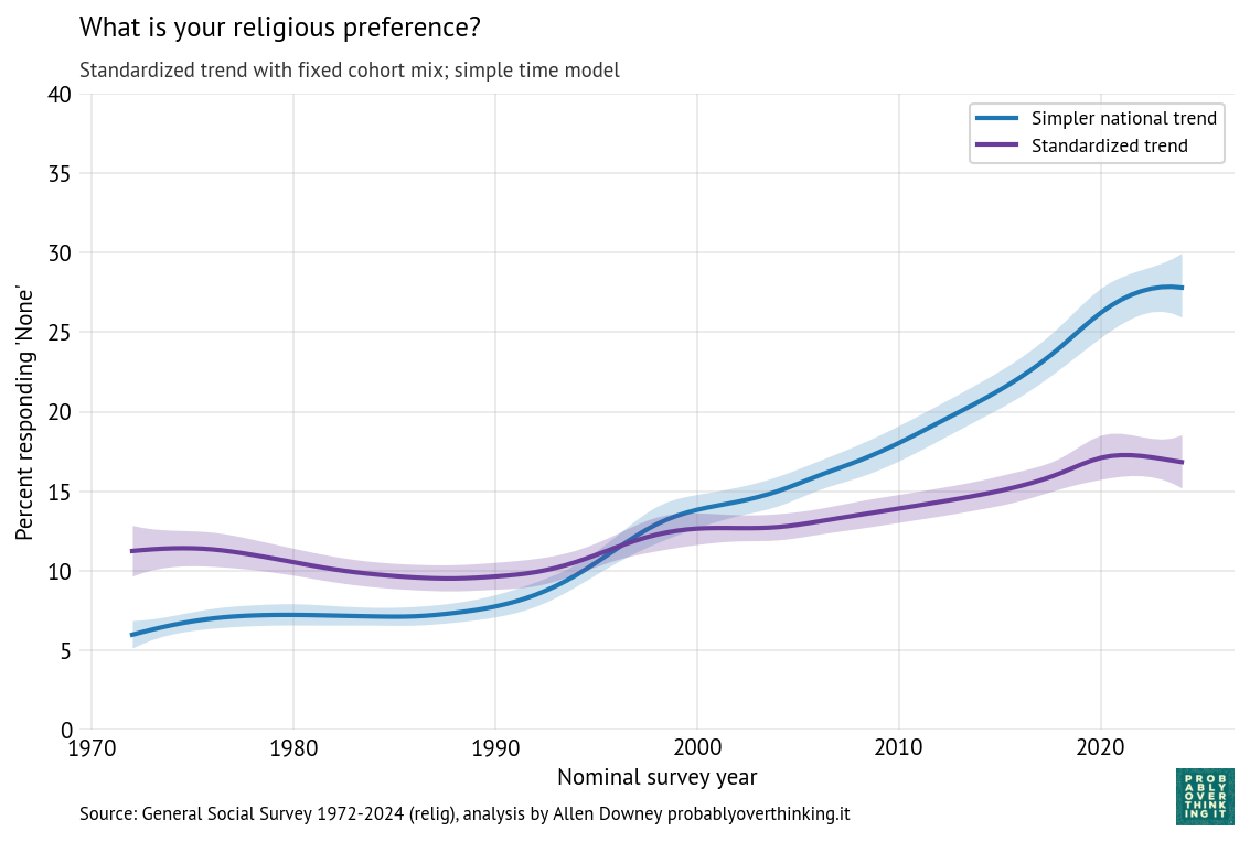
For purposes of comparison, here is the trend from the time-only model (blue) and the standardized time trend from the time-cohort model (purple).
The difference between these lines is the part of the change due to the cohort effect. So we can see that most of the change over this interval is due to generational replacement rather than disaffiliation.
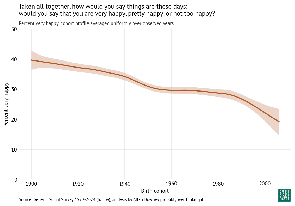
Since 1972, the General Social Survey has asked respondents: “Taken all together, how would you say things are these days—would you say that you are very happy, pretty happy, or not too happy?”
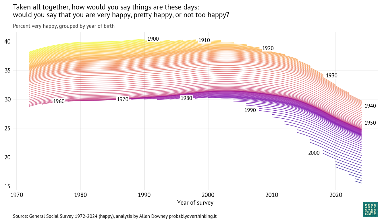
The following figure shows how the responses have changed over time and between birth cohorts. Each line represents one birth year.
People born in 1900 were 72 years old when the survey started; at that point, about 37% said they were very happy. In 1990, the last year they were eligible to participate, a little more than 40% said they were very happy. So it seems like they aged well—or possibly the less happy died earlier.
People born in 1910 were a little less happy when the survey started, but by the time they aged out, they also reached 40%. They were the last generation to reach that mark.
Among people born between 1920 and 1950, each cohort was a little less happy than the one before (or maybe less likely to say they were happy). In these cohorts, we can see a general trend over time: increasing until about 2000, leveling off, and declining after 2010.
The cohorts born in the 1960s and 1970s followed a similar trajectory, with only small differences from one birth year to the next.
And then the bottom fell out. Starting with people born in the 1980s (the earliest Millennials), each successive cohort was substantially less happy than the one before.
When people born in 1990 joined the survey in 2008 (at age 18), only 27% said they were very happy. In the most recent data, from 2024, the number had fallen to 22%.
When people born in 2000 entered in 2018, they set a new record low at 21%, which has now fallen to 18%.
And in the most recent cohort—born in 2006 and interviewed in 2024—only 16% said they were very happy.
These percentages are based on a statistical model that estimates the proportion of “very happy” responses in each group at each point in time. The details of the model and its assumptions are below.
The Time Trend
With an estimated proportion for each cohort and time step, we can compute separate contributions for changes over time and between cohorts.
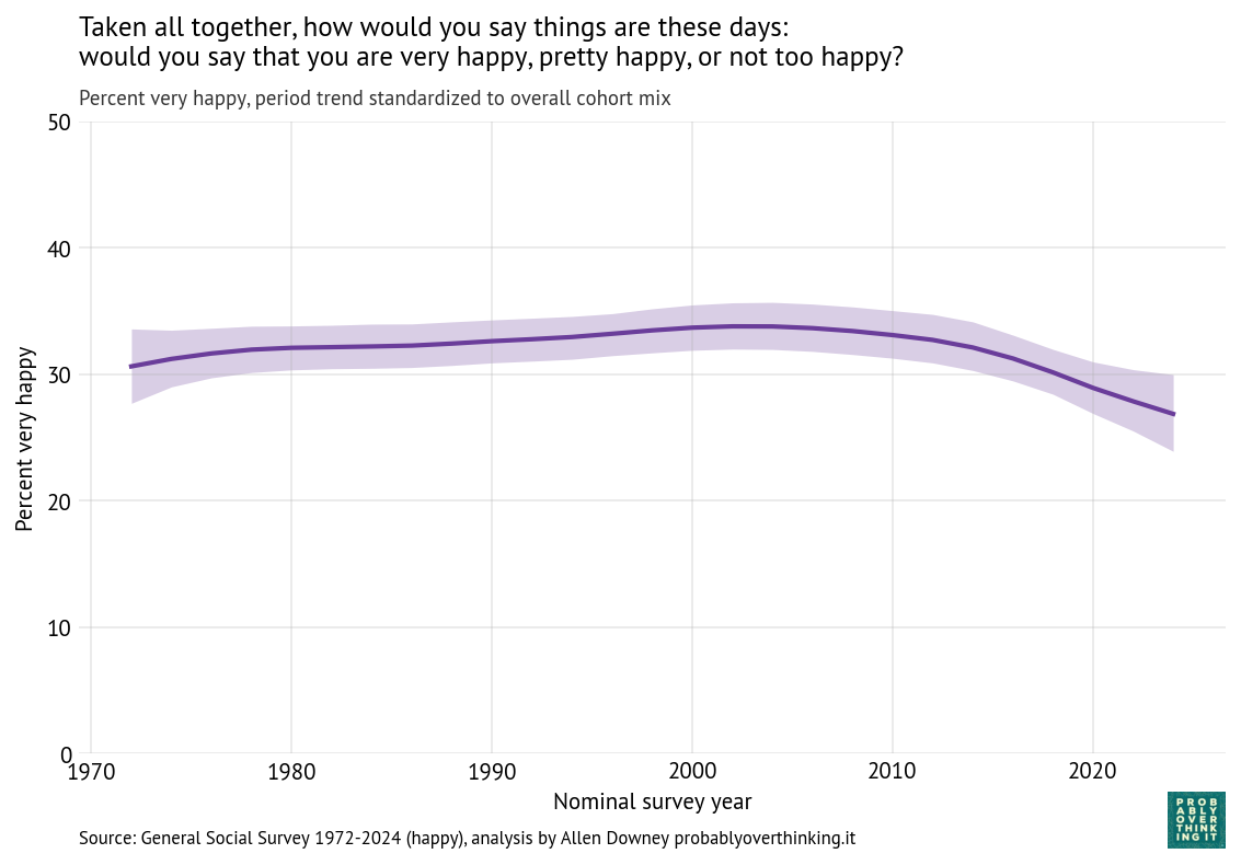
To characterize the contribution of time, we have to hold the cohort effect constant, which we can do by computing the distribution of birth years across the entire dataset and simulating a population where this distribution does not change over time. The following figure shows the result.
The overall level of happiness increased between 1972 and 2000, leveled off, and then declined after 2010.
Of course it is speculation to say why that happened, but we can think about large-scale economic and social patterns and how they line up with these trends.
Economically, 1980 to 2000 was a period of growth and relative stability. That changed after the end of the Dot-com bubble in 2001 and, more importantly, the Global Financial Crisis in 2008, which had broad and persistent effects on employment, wealth, and economic security.
Geopolitically, the 1970s through the 1990s were relatively quiet compared to what followed. The September 11 attacks in 2001, and the wars in Iraq (2003–2011) and Afghanistan (2001–2021) marked a shift toward a more uncertain and conflict-oriented global environment.
Participation in civic organizations and religious institutions declined over the past several decades. These institutions traditionally provided social support, shared identity, and regular face-to-face interaction. Social isolation is strongly associated with lower well-being.
At the same time, the media environment was transformed. The rise of 24-hour news increased exposure to negative and emotionally salient events, and after 2010 the spread of smartphones and social media made that exposure continuous and personalized.
Finally, measures of trust in institutions and other people have generally declined over this period, while political polarization has increased. These trends may reduce people’s sense of stability and shared purpose.
The COVID-19 pandemic likely contributed to the most recent decline, but the downward trend was already underway before 2020.
The Cohort Effect
Just as we isolated the time trend by simulating a survey with a fixed distribution of cohorts, we can isolate the cohort effect by simulating a survey with a fixed distribution of times. The following figure shows the result.
The cohort effect is larger and more consistent than the time trend: the difference between the happiest and least happy cohorts is more than 20 percentage points.
The decline was relatively slow for cohorts born between 1900 and 1950 and nearly zero for cohorts born in the 1950s, 1960s and 1970s (late Baby Boomers and Gen X). The steep decline begins with the Millennials and continues into Gen Z.
Possible explanations for the recent decline include:
Transformation of childhood: Jonathan Haidt has described childhood in recent cohorts as “overprotected in the real world and underprotected in the online world.” Increased parental monitoring, reduced independent play, and greater time spent online may affect the development of autonomy, risk tolerance, and social skills. If these early-life experiences shape long-term outlook, they could contribute to lower self-reported happiness.
Greater and earlier exposure to media: Younger cohorts were exposed to a media landscape characterized by continuous, personalized, and often negative content. Social media platforms amplify social comparison and negative content, while displacing in-person interaction. Increased awareness of global risks—including climate change—may contribute to a more pessimistic worldview.
Differential impact of economic conditions: Recent cohorts entered the labor market during periods of economic disruption, including the aftermath of the Global Financial Crisis and more recent pandemic-related shocks. These cohorts also face higher housing costs and greater student debt. Economic insecurity during the transition to adulthood may have lasting effects on well-being.
Extension of “liminal” adulthood: Young adults are taking longer to complete education, establish careers, form long-term partnerships, and have children. This extended unsettled period may be associated with lower life satisfaction.
Norms around self-reported well-being. Younger cohorts may also be less likely to say they are “very happy,” either because of changing norms around self-presentation or greater awareness of mental health.
It’s hard to say how much of the recent decline we can attribute to these causes. But the decline is steep, and seems to be ongoing.
How the Model Works
One of the challenges with this kind of survey data is that the sample size is small for each birth year in each iteration of the survey. If we plot raw percentages over time, the result is noisy.
In Probably Overthinking It, I addressed this problem by grouping respondents into decade-of-birth cohorts and smoothing the resulting time series. That approach works, but it has drawbacks: aggregation removes detail, introduces edge effects for the earliest and latest cohorts, and requires an arbitrary choice about the level of smoothing.
The new model takes a more principled approach. Instead of smoothing the observed data, it models an unobserved (latent) propensity to report being “very happy” for each cohort in each year.
We assume that the number of “very happy” responses in each group follows a binomial distribution, where the probability of a “very happy” response depends on this latent propensity. The observed responses provide noisy information about the latent factor; the model combines information across cohorts and years to estimate it.
The latent propensity is modeled as the sum of an intercept, representing the overall level of happiness, a smooth effect of birth cohort, a smooth effect of survey year, and a year-specific random effect that captures short-term fluctuations (overdispersion).
The cohort and period effects are modeled as second-order Gaussian random walks (RW2), which means the model assumes these effects evolve smoothly over time, with a preference for gradual changes in slope rather than abrupt jumps, unless the data provide strong evidence otherwise. The amount of smoothing is not fixed in advance; it is estimated from the data.
The random year effect captures variation from one survey to the next that is not explained by long-term trends, like current events and topics of discussion.
Where we have a lot of data, the estimates track the observed proportions closely. Where data are sparse, the model borrows strength from neighboring cohorts and years, providing principled smoothing and interpolation without arbitrary grouping.
This article is an excerpt from the manuscript of Probably Overthinking It, available from the University of Chicago Press and from Amazon and, if you want to support independent bookstores, from Bookshop.org.
[This excerpt is from a chapter on moral progress. Previous examples explored responses to survey questions related to race and gender.]
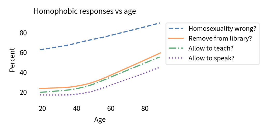
The General Social Survey includes four questions related to sexual orientation.
What about sexual relations between two adults of the same sex – do you think it is always wrong, almost always wrong, wrong only sometimes, or not wrong at all?
And what about a man who admits that he is a homosexual? Should such a person be allowed to teach in a college or university, or not?
If some people in your community suggested that a book he wrote in favor of homosexuality should be taken out of your public library, would you favor removing this book, or not?
Suppose this admitted homosexual wanted to make a speech in your community. Should he be allowed to speak, or not?
If the wording of these questions seems dated, remember that they were written around 1970, when one might “admit” to homosexuality, and a large majority thought it was wrong, wrong, or wrong. In general, the GSS avoids changing the wording of questions, because subtle word choices can influence the results. But the price of this consistency is that a phrasing that might have been neutral in 1970 seems loaded today.
Nevertheless, let’s look at the results. The following figure shows the percentage of people who chose a homophobic response to these questions as a function of age.
It comes as no surprise that older people are more likely to hold homophobic beliefs. But that doesn’t mean people adopt these attitudes as they age. In fact, within every birth cohort, they become less homophobic with age.
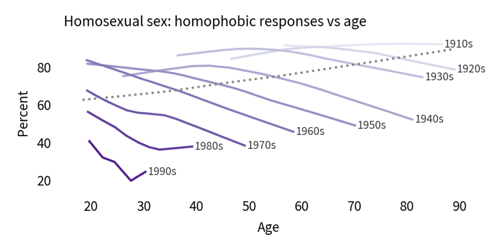
The following figure show the results from the first question, showing the percentage of respondents who said homosexuality was wrong (with or without an adverb).
There is clearly a cohort effect: each generation is substantially less homophobic than the one before. And in almost every cohort, homophobia declines with age. But that doesn’t mean there is an age effect; if there were, we would expect to see a change in all cohorts at about the same age. And there’s no sign of that.
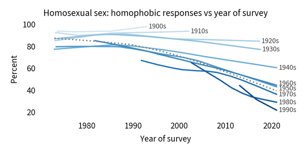
So let’s see if it might be a period effect. The following figure shows the same results plotted over time rather than age.
If there is a period effect, we expect to see an inflection point in all cohorts at the same point in time. And there is some evidence of that. Reading from top to bottom:
More than 90% of people born in the nineteen-oughts and the teens thought homosexuality was wrong, and they went to their graves without changing their minds.
People born in the 1920s and 1930s might have softened their views, slightly, starting around 1990.
Among people born in the 1940s and 1950s, there is a notable inflection point: before 1990, they were almost unchanged; after 1990, they became more tolerant over time.
In the last four cohorts, there is a clear trend over time, but we did not observe these groups sufficiently before 1990 to identify an inflection point.
On the whole, this looks like a period effect. Also, looking at the overall trend, it declined slowly before 1990 and much more quickly thereafter. So we might wonder what happened in 1990.
What happened in 1990?
In general, questions like this are hard to answer. Societal changes are the result of interactions between many causes and effects. But in this case, I think there is an explanation that is at least plausible: advocacy for acceptance of homosexuality has been successful at changing people’s minds.
In 1989, Marshall Kirk and Hunter Madsen published a book called After the Ball with the prophetic subtitle How America Will Conquer Its Fear and Hatred of Gays in the ’90s. The authors, with backgrounds in psychology and advertising, outlined a strategy for changing beliefs about homosexuality, which I will paraphrase in two parts: make homosexuality visible, and make it boring. Toward the first goal, they encouraged people to come out and acknowledge their sexual orientation publicly. Toward the second, they proposed a media campaign to depict homosexuality as ordinary.
Some conservative opponents of gay rights latched onto this book as a textbook of propaganda and the written form of the “gay agenda”. Of course reality was more complicated than that: social change is the result of many people in many places, not a centrally-organized conspiracy.
It’s not clear whether Kirk and Madsen’s book caused America to conquer its fear in the 1990s, but what they proposed turned out to be a remarkable prediction of what happened. Among many milestones, the first National Coming Out Day was celebrated in 1988; the first Gay Pride Day Parade was in 1994 (although previous similar events had used different names); and in 1999, President Bill Clinton proclaimed June as Gay and Lesbian Pride month.
During this time, the number of people who came out to their friends and family grew exponentially, along with the number of openly gay public figures and the representation of gay characters on television and in movies.
And as surveys by the Pew Research Center have shown repeatedly, “familiarity is closely linked to tolerance”. People who have a gay friend or family member – and know it – are substantially more likely to hold positive attitudes about homosexuality and to support gay rights.
All of this adds up to a large period effect that has changed hearts and minds, especially among the most recent birth cohorts.
Cohort or period effect?
Since 1990, attitudes about homosexuality have changed due to
A cohort effect: As old homophobes die, they are replaced by a more tolerant generation.
A period effect: Within most cohorts, people became more tolerant over time.
These effects are additive, so the overall trend is steeper than the trend within the cohorts – like Simpson’s paradox in reverse. But that raises a question: how much of the overall trend is due to the cohort effect, and how much to the period effect?
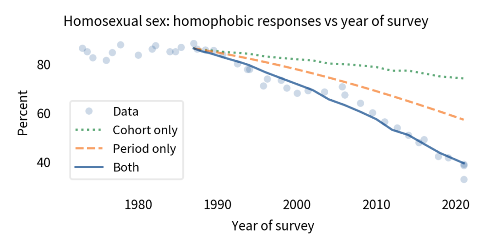
To answer that, I used a model that estimates the contributions of the two effects separately (a logistic regression model, if you want the details). Then I used the model to generate predictions for two counterfactual scenarios: what if there had been no cohort effect, and what if there had been no period effect? The following figure shows the results.
The circles show the actual data. The solid line shows the results from the model from 1987 to 2018, including both effects. The model plots a smooth course through the data, which confirms that it captures the overall trend during this interval. The total change is about 46 percentage points.
The dotted line shows what would have happened, according to the model, if there had been no period effect; the total change due to the cohort effect alone would have been about 12 percentage points.
The dashed line shows what would have happened if there had been no cohort effect; the total change due to the period effect alone would have been about 29 percentage points.
You might notice that the sum of 12 and 29 is only 41, not 46. That’s not an error; in a model like this, we don’t expect percentage points to add up (because it’s linear on a logistic scale, not a percentage scale).
Nevertheless, we can conclude that the magnitude of the period effect is about twice the magnitude of the cohort effect. In other words, most of the change we’ve seen since 1987 has been due to changed minds, with the smaller part due to generational replacement.
No one knows that better than the San Francisco Gay Men’s Chorus. In July 2021, they performed a song by Tim Rosser and Charlie Sohne with the title, “A Message From the Gay Community”. It begins:
To those of you out there who are still working against equal rights, we have a message for you […] You think that we’ll corrupt your kids, if our agenda goes unchecked. Funny, just this once, you’re correct. We’ll convert your children, happens bit by bit; Quietly and subtly, and you will barely notice it.
Of course, the reference to the “gay agenda” is tongue-in-cheek, and the threat to “convert your children” is only scary to someone who thinks (wrongly) that gay people can convert straight people to homosexuality, and believes (wrongly) that having a gay child is bad. For everyone else, it is clearly a joke.
Then the refrain delivers the punchline:
We’ll convert your children; we’ll make them tolerant and fair.
For anyone who still doesn’t get it, later verses explain:
Turning your children into accepting, caring people; We’ll convert your children; someone’s gotta teach them not to hate. Your children will care about fairness and justice for others.
And finally,
Your kids will start converting you; the gay agenda is coming home. We’ll convert your children; and make an ally of you yet.
The thesis of the song is that advocacy can change minds, especially among young people. Those changed minds create an environment where the next generation is more likely to be “tolerant and fair”, and where some older people change their minds, too.
The data show that this thesis is, “just this once, correct”.
Sources
The General Social Survey (GSS) is a project of the independent research organization NORC at the University of Chicago, with principal funding from the National Science Foundation. The data is available from the GSS website.
Is Simpson’s Paradox just a mathematical curiosity, or does it happen in real life? And if it happens, what does it mean? To answer these questions, I’ve been searching for natural examples in data from the General Social Survey (GSS).
A few weeks ago I posted this article, where I group GSS respondents by their decade of birth and plot changes in their opinions over time. Among questions related to faith in humanity, I found several instances of Simpson’s paradox; for example, in every generation, people have become more optimistic over time, but the overall average is going down over time. The reason for this apparent contradiction is generational replacement: as old optimists die, they are being replaced by young pessimists.
In this followup article, I group people by level of education and plot their opinions over time, and again I found several instances of Simpson’s paradox. For example, at every level of education, support for legal abortion has gone down over time (at least under some conditions). But the overall level of support has increased, because over the same period, more people have achieved higher levels of education.
In the most recent article, I group people by decade of birth again, and plot their opinions as a function of age rather than time. I found some of the clearest instances of Simpson’s paradox so far. For example, if we plot support for interracial marriage as a function of age, the trend is downward; older people are less likely to approve. But within every birth cohort, support for interracial marriage increases as a function of age.
With so many examples, we are starting to see a pattern:
Examples of Simpson’s paradox are confusing at first because they violate our expectation that if a trend goes in the same direction in every group, it must go in the same direction when we put the groups together.
But now we realize that this expectation is naive: mathematically, it does not have to be true, and in practice, there are several reasons it can happen, including generational replacement and period effects.
Once explained, the examples we’ve seen so far have turned out not to be very informative. Rather than revealing useful information about the world, it seems like Simpson’s paradox is most often a sign that we are not looking at the data in the most effective way,
But before I give up, I want to give it one more try.
A more systematic search
Each example of Simpson’s paradox involves three variables:
On the x-axis, I’ve put time, age, and a few other continuous variables.
On the y-axis, I’ve put the fraction of people giving the most common response to questions about opinions, attitudes, and world view.
And I have grouped respondents by decade of birth, age, sex, race, religion, and several other demographic variables.
At this point I have tried a few thousand combinations and found about ten clear-cut instances of Simpson’s paradox. So I’ve decided to make a more systematic search. From the GSS data I selected 119 opinion questions that were asked repeatedly over more than a decade, and 12 demographic questions I could sensibly use to group respondents.
With 119 possible variables on the x-axis, the same 119 possibilities on the y-axis, and 12 groupings, there are a 84,118 sensible combinations. When I tested them, 594 produced computational errors of some kind, in most cases because some variables have logical dependencies on others. Among the remaining combinations, I found 19 instances of Simpson’s paradox.
So one conclusion we can reach immediately is that Simpson’s paradox is rare in the wild, at least with data of this kind. But let’s look more closely at the 19 examples.
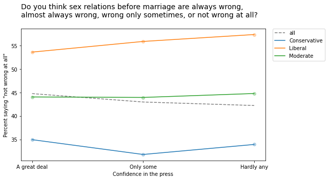
Many of them turn out to be statistical noise. For example, the following figure shows responses to a question about premarital sex on the y-axis, responses to a question about confidence in the press on the x-axis, with respondents grouped by political alignment.
As confidence in the press declines from left to right, the overall fraction of people who think premarital sex is “not wrong at all” declines slightly. But within each political group, there is a slight increase.
Although this example meets the requirements for Simpson’s paradox, it is unlikely to mean much. Most of these relationships are not statistically significant, which means that if the GSS had randomly sampled a different group of people, it is plausible that these trends might have gone the other way.
And this should not be surprising. If there is no relationship between two variables in reality, the actual trend is zero and the trend we see in a random sample is equally likely to be positive or negative. Under this assumption, we can estimate the probability of seeing a Simpson paradox by chance:
If the overall trend is positive, the trend in all three groups has to be negative, which happens one time in eight.
If the overall trend is negative, the trend in all three groups has to be positive, which also happens one time in eight.
When there are more groups, Simpson’s paradox is less likely to happen by chance. Even so, since we tried so many combinations, it is only surprising that we did find more.
A few good examples
Most of the examples I found are like the previous one. The relationships are so weak that the trends we see are mostly random, which means we don’t need a special explanation for Simpson’s paradox. But I found a few examples where the Simpsonian reversal is probably not random and, even better, it makes sense.
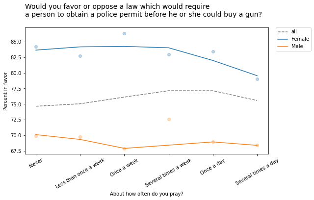
For example, the following figure shows the fraction of people who would support a gun law as a function of how often they pray, grouped by sex.
Within each group, the overall trend is downward: the more you pray, the less likely you are to favor gun control. But the overall trend goes the other way: people who pray more are more likely to support gun control. Before you proceed, see if you can figure out what’s going on.
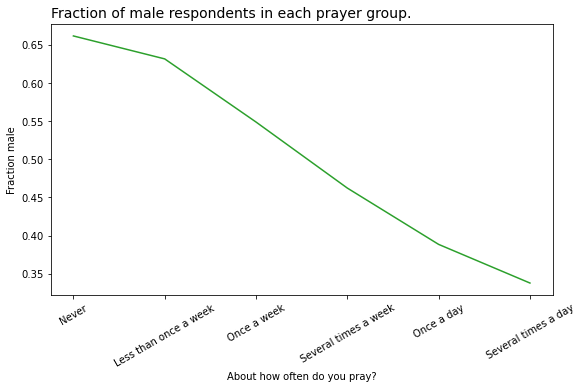
At this point you might guess that there is a correlation of some kind between the variable on the x-axis and the groups. In this example, there is a substantial difference in how much men and women pray. The following figure shows how much:
And that’s why average support for gun control increases as a function of prayer:
The low-prayer groups are mostly male, so average support for gun control is closer to the male response, which is lower.
The high-prayer groups are mostly female, so the overall average is closer to the female response, which is higher.
On one hand, this result is satisfying because we were able to explain something surprising. But having made the effort, I’m not sure we have learned much. Let’s look at one more example.
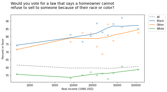
The GSS includes the following question about a hypothetical open housing law:
Suppose there is a community-wide vote on the general housing issue. There are two possible laws to vote on. One law says that a homeowner can decide for himself whom to sell his house to, even if he prefers not to sell to [someone because of their race or color]. The second law says that a homeowner cannot refuse to sell to someone because of their race or color. Which law would you vote for?
The following figure shows the fraction of people who would vote for the second law, grouped by race and plotted as a function of income (on a log scale).
In every group, support for open housing increases as a function of income, but the overall trend goes the other way: people who make more money are less likely to support open housing.
At this point, you can probably figure out why:
White respondents are less likely to support this law than Black respondents and people of other races, and
People in the higher income groups are more likely to be white.
So the overall average in the lower income groups is closer to the non-white response; the overall average in the higher income groups is closer to the white response.
Summary
Is Simpson’s paradox a mathematical curiosity, or does it happen in real life?
Based on my exploration (and a similar search in a different dataset), if you go looking for Simpson’s paradox in real data, you will find it. But it is rare: I tried almost 100,000 combinations, and found only about 100 examples. And a large majority of the examples I found were just statistical noise.
What does Simpson’s paradox tell us about the data, and about the world?
In the examples I found, Simpson’s paradox doesn’t reveal anything about the world that is useful to know. Mostly it creates confusion, especially for people who have not encountered it before. Sometimes it is satisfying to figure out what’s going on, but if you create confusion and then resolve it, I am not sure you have made net progress. If Simpson’s paradox is useful, it is as a warning that the question you are asking and the way you are looking at the data don’t quite go together.
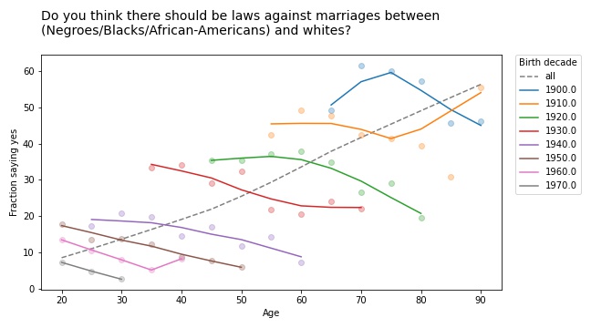
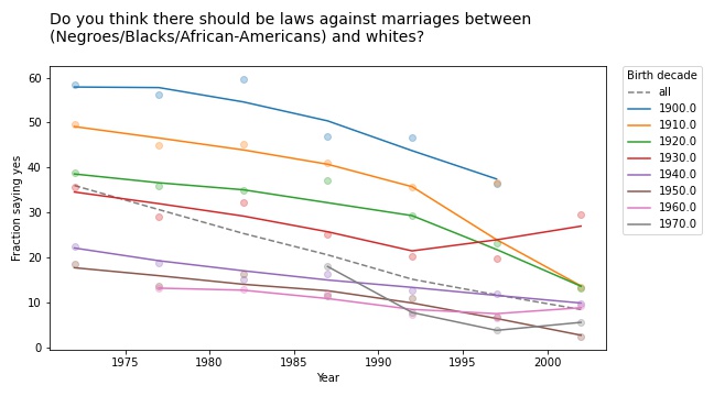
As people get older, do they become more racist, sexist, and homophobic? To find out, you could use data from the General Social Survey (GSS), which asks questions like:
Do you think there should be laws against marriages between Blacks/African-Americans and whites?
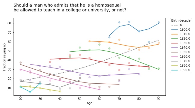
Should a man who admits[mfn]If you find the wording of this question problematic, remember that it was written in 1970 and reflects mainstream views at the time. It persists because, in order to support time series analysis, the GSS generally avoids changing the wording of questions.[/mfn] that he is a homosexual be allowed to teach in a college or university, or not?
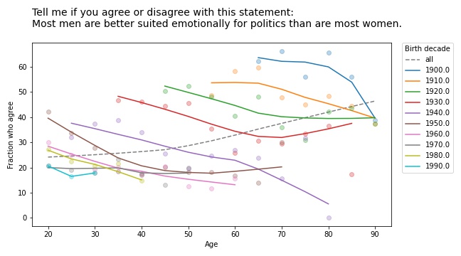
Tell me if you agree or disagree with this statement: Most men are better suited emotionally for politics than are most women.
If you plot the answers to these questions as a function of age, you find that older people are, in fact, more racist, sexist, and homophobic than younger people. But that’s not because they are old; it’s because they were born, raised, and educated during a time when large fractions of the population were racist, sexist homophobes.
In other words, it’s primarily a cohort effect, not an age effect. We can see that if we group respondents by birth cohort and plot their responses by age. Here are the results for the first question:
The circle markers show the proportion of respondents who got this question wrong (no other way to put it); the lines show local regressions through the markers.
The dashed gray line shows the overall trend, if we don’t group by cohort. Sure enough, when this question was asked between 1972 and 2002, older respondents were substantially more likely to support laws against marriage between people of difference races.
But when we group by decade of birth, we see:
A cohort effect: people born later are less racist.
A period effect: within every cohort, people get less racist over time.
The results are similar for the second question:
If you thought the racism was bad, get a load of the homophobia!
But again, all birth cohorts became more tolerant over time (even the people born in the 19-aughts, though it doesn’t look it). And again, there is no age effect; people do not become homophobic as they age.
They don’t get more sexist, either:
Simpson’s Paradox
These are all examples of Simpson’s paradox, where the trend in every group goes in one direction, and the overall trend goes in the other direction. It’s called a paradox because many people find it counterintuitive at first. But once you have seen a few examples, like the ones I wrote about this, this, and this previous article, it gets to be less of a surprise.
And if you pay attention, it can be a hint that there is something wrong with your model. In this case, it is a symptom that we are looking at the data the wrong way. If we suspect that the changes we see are due to cohort and period, rather than age, we can check by plotting over time, rather than age, like this:
Every cohort is less racist than its predecessor, every cohort gets less racist over time, and the overall trend goes in the same direction, so Simpson’s paradox is resolved.
Or maybe it persists in a weaker form: the overall trend is steeper than the trend in any of the cohorts, because in addition to the cohort effect and the period effect, we also see the effect of generational replacement.
This article is part of a series where I search the GSS for examples of Simpson’s paradox. More coming soon!
Is Simpson’s paradox a mathematical curiosity or something that matters in practice? To answer this question, I’m searching the General Social Survey (GSS) for examples. Last week I published the first batch, examples where we group people by decade of birth and plot their opinions over time. In this article I present the next batch, grouping by education and plotting over time.
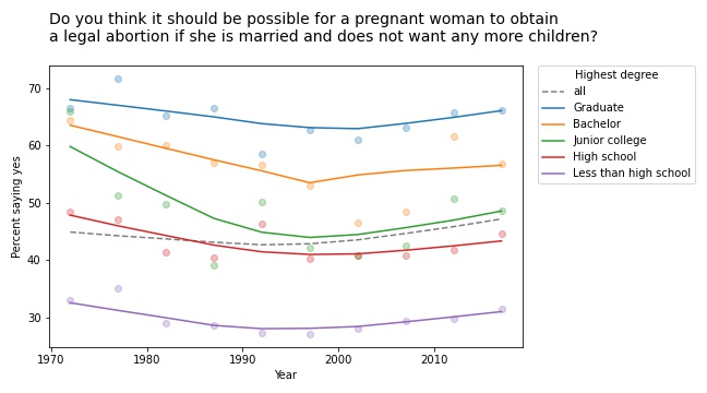
The first example I found is in the responses to this question: “Please tell me whether or not you think it should be possible for a pregnant woman to obtain a legal abortion if she is married and does not want any more children?”
If we group respondents by the highest degree they have earned and compute the fraction who answer “yes” over time, the results meet the criteria for Simpson’s paradox: in every group, the trend over time is downward, but if we put the groups together, the overall trend is upward.
However, if we plot the data, we see that this example is not entirely satisfying.
The markers show the fraction of respondents in each group who answered “yes”; the lines show local regressions through the markers.
In all groups, support for legal abortion (under the specified condition) was decreasing until the 1990s, then started to increase. If we fit a straight line to these curves, the estimated slope is negative. And if we fit a straight line to the overall curve, the estimated slope is positive.
But in both cases, the result doesn’t mean very much because we’re fitting a line to a curve. This is one of many examples I have seen where Simpson’s paradox doesn’t happen because anything interesting is happening in the world; it is just an artifact of a bad model.
This example would have been more interesting in 2002. If we run the same analysis using data from 2002 or earlier, we see a substantial decrease in all groups, and almost no change overall. In that case, the paradox is explained by changes in educational level. Between 1972 and 2002, the fraction of people with a college degree increased substantially. Support for abortion was decreasing in all groups, but more and more people were in the high-support groups.
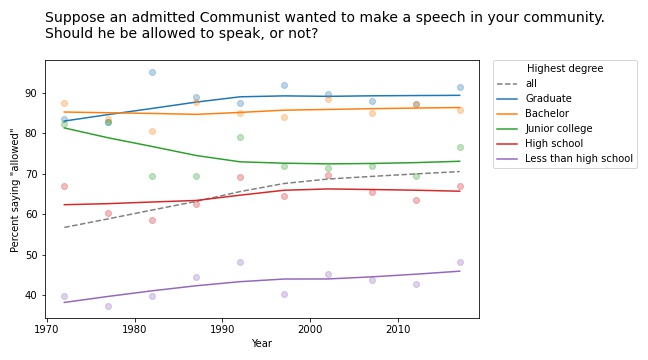
Free speech
We see a similar pattern in many of the questions related to free speech. For example, the GSS asks, “Suppose an admitted Communist wanted to make a speech in your community. Should he be allowed to speak, or not?” The following figure shows the fraction of respondents at each education level who say “allowed to speak”, plotted over time.
The differences between the groups are big: among people with a bachelor’s or advanced degree, almost 90% would allow an “admitted” Communist to speak; among people without a high school diploma it’s less than 50%. (If you are curious about the wording of questions like this, remember that many GSS questions were written in the 1970s and, for purposes of comparison over time, they avoid changing the text.)
The responses have changed only slightly since 1973: in most groups, support has increased a little; among people with a junior college degree, it has decreased a little.
But overall support has increased substantially, for the same reason as in the previous example: the number of people at higher levels of education increased during this interval.
Whether this is an example of Simpson’s paradox depends on the definition. But it is certainly an example where we see one story if we look at the overall trend and another story if we look at the subgroups.
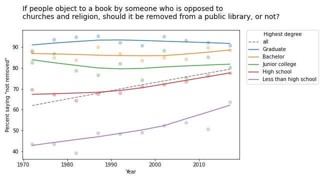
Other questions related to free speech show similar trends. For example, the GSS asks: “There are always some people whose ideas are considered bad or dangerous by other people. For instance, somebody who is against all churches and religion. If some people in your community suggested that a book he wrote against churches and religion should be taken out of your public library, would you favor removing this book, or not?”
The following figure shows the fraction of respondents who say the book should not be removed:
Again, respondents with more education are more likely to support free speech (and probably less hostile to the non-religious, as well). But in this case support is increasing among people with less education. So the overall trend we see is really the sum of two trends: increases within some groups in addition to shifts between groups.
In this example, the overall slope is steeper than the estimated slope in any group. That would be surprising if you expected the overall slope to be like a weighted average of the group slopes. But as all of these examples show, it’s not.
This article presents examples of Simpson’s paradox, and related patterns, when we group people by education level and plot their responses over time. In the next article we’ll see what happens when we groups people by age.
Years ago I told one of my colleagues about my Data Science class and he asked if I taught Simpson’s paradox. I said I didn’t spend much time on it because, I opined, it is a mathematical curiosity unlikely to come up in practice. My colleague was shocked and dismayed because, he said, it comes up all the time in his field (psychology).
And that got me thinking about my old friend, the General Social Survey (GSS). So I’ve started searching the GSS for instances of Simpson’s paradox. I’ll report what I find, and maybe we can get a sense of (1) how often it happens, (2) whether it matters, and (3) what to do about it.
I’ll start with examples where the x-variable is time. For y-variables, I use about 120 questions from the GSS. And for subgroups, I use race, sex, political alignment (liberal-conservative), political party (Democrat-Republican), religion, age, birth cohort, social class, and education level. That’s about 1000 combinations.
Of these, about 10 meet the strict criteria for Simpson’s paradox, where the trend in all subgroups goes in the same direction and the overall trend goes in the other direction. On examination, most of them are not very interesting. In most cases, the actual trend is nonlinear, so the parameters of the linear model don’t mean very much.
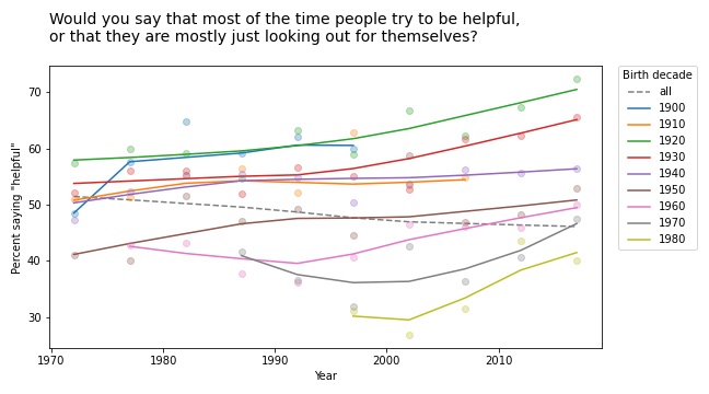
But a few of them turn out to be interesting, at least to me. For example, the following figure shows the fraction of respondents who think “most of the time people try to be helpful”, plotted over time, grouped by decade of birth. The markers show the percentage in each group during each interval; the lines show local regressions.
Within each group, the trend is positive: apparently, people get more optimistic about human nature as they age. But overall the trend is negative. Why? Because of generational replacement. People born before 1940 are substantially more optimistic than people born later; as old optimists die, they are being replaced by young pessimists.
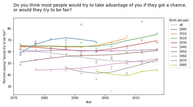
Based on this example, we can go looking for similar patterns in other variables. For example, here are the results from a related question about fairness.
Again, old optimists are being replaced by young pessimists.
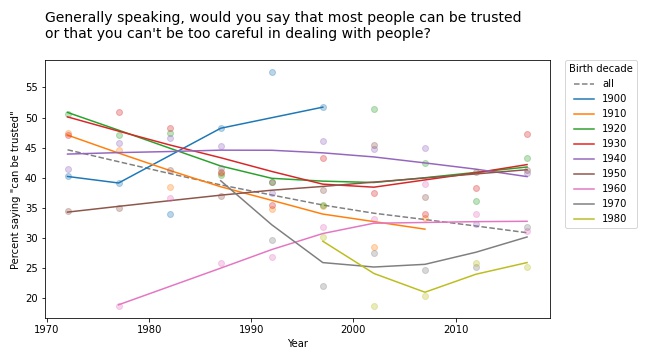
For a similar question about trust, the results are a little more chaotic:
Some groups are going up and others down, so this example doesn’t meet the criteria for Simpson’s paradox. But it shows the same pattern of generational replacement.
Old conservatives, young liberals
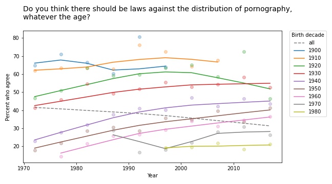
Questions related to prohibition show similar patterns. For example, here are the responses to a question about whether pornography should be illegal.
In almost every group, support for banning pornography has increased over time. But recent generations are substantially more tolerant on this point, so overall support for prohibition is decreasing.
The results for legalizing marijuana are similar.
In most groups, support for legalization has gone down over time; nevertheless, through the power of generational replacement, overall support is increasing.
So far, I think this is more interesting than Derek Jeter’s batting average. More examples coming soon!
Generational changes in public spending priorities
In the third article, I found that generational differences on most questions related to abortion are small and probably not practically or statistically significant.
GSS respondents were asked, “We are faced with many problems in this country, none of which can be solved easily or inexpensively. I’m going to name some of these problems, and for each one I’d like you to tell me whether you think we’re spending too much money on it, too little money, or about the right amount.”
Since they asked about 18 areas of public spending, I’ve put them in three categories:
Areas where young people are more inclined to increase spending,
Areas where young people are less inclined to increase spending, and
Areas where generational differences are inconsistent or small.
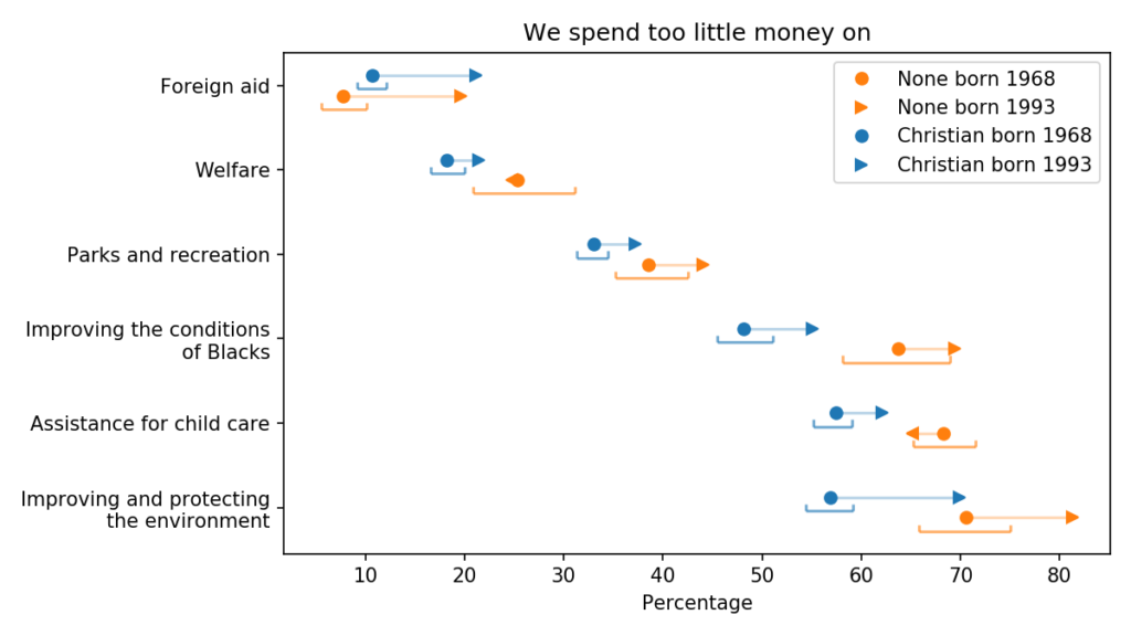
The following figure shows the first group, areas where young people are more likely to say we spend too little:
Generational changes in views on public spending
The blue markers are for people whose religious preference is Catholic, Protestant, or Christian; the orange markers are for people with no religious affiliation.
For each group, the circles show estimated percentages for people born in 1968; the arrowheads show percentages for people born in 1993.
For both groups, the estimates are for 2018, when the younger group was 25 and the older group was 50. The brackets show 90% confidence intervals.
The way these questions were posed, I suspect that most respondents can’t answer them literally. Few people know how much we spend in each area, what we spend it on, or what effect it would have if we spent more.
So their answers reflect some combination of how important they consider each issue, how much they think we are spending, and how effective they imagine more government spending would be.
With those caveats, we can draw a few conclusions:
On these issues, the priorities of Christians and Nones are generally aligned. The biggest difference between the groups is on spending to protect the environment, but a majority of both groups think we are spending too little.
The biggest generational changes are in foreign aid and protecting the environment; on both issues, young people are substantially more inclined to increase spending. But with respect to foreign aid, it is still a small minority.
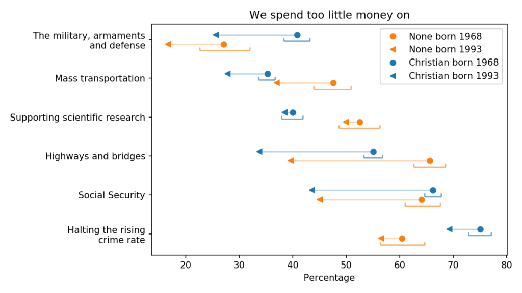
The following figure shows areas of public spending where the generational change is generally negative:
Generational changes in views on public spending
Compared to their parents’ generation, young people are substantially less likely to increase spending on the military, transportation infrastructure and Social Security. To me, the direction of those changes is not surprising, but the magnitude is.
The other change I find surprising is in support for mass transportation, which decreased in both groups. I double-checked the data and this result seems to be correct, but it might warrant more investigation.
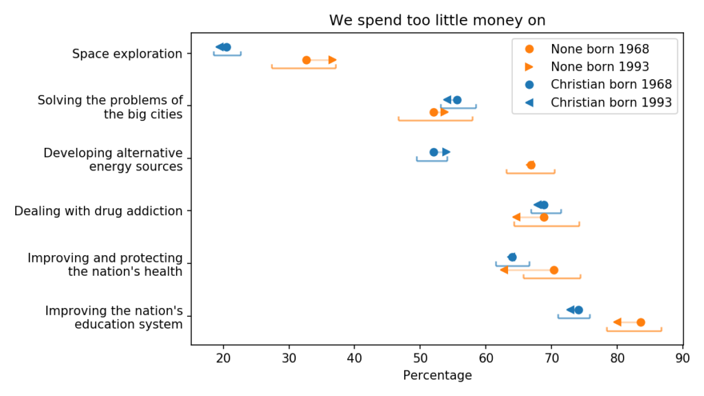
Finally, the following figure shows areas of public spending where generational changes are small and unlikely to be practically or statistically significant.
Generational changes in views on public spending
On these issues, the spending priorities of Christians and Nones are generally aligned, although Nones are more inclined to increase spending on space exploration, alternative energy, and education.
In the next article, I’ll look at generational changes related to confidence in various government and private institutions.
Generational changes in religious belief and public policy
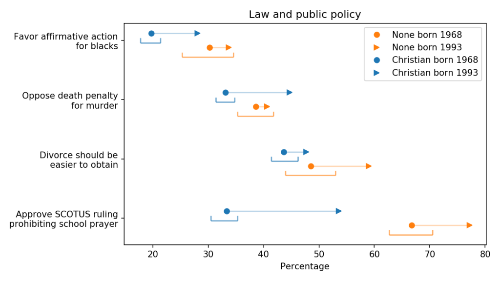
Here are results for five propositions with relatively high support:
Generational changes in support for issues related to law and public policy
The blue markers are for people whose religious preference is Catholic, Protestant, or Christian; the orange markers are for people with no religious affiliation.
For each group, the circles show estimated percentages for people born in 1968; the arrowheads show percentages for people born in 1993.
For both groups, the estimates are for 2018, when the younger group was 25 and the older group was 50. The brackets show 90% confidence intervals.
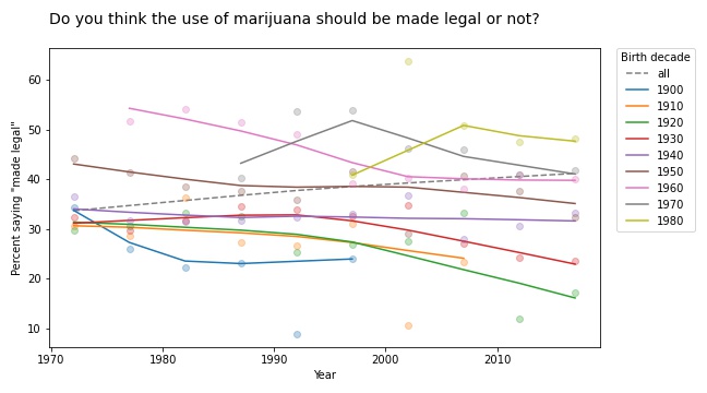
The first row shows the percentage of respondents who answered “Yes” to the question “Do you think the use of marijuana should be made legal or not?”
Young Christians are substantially more likely to support legalization than their parents’ generation. Among the Nones, support might also be increasing, but the change is within the statistical margin of error.
Young Christians also support legal pornography. When asked, “Which of these statements comes closest to your feelings about pornography laws?”, more than 75% of them indicated that it should be legal, or legal for adults, rather than illegal. That’s more than 10 percentage points higher than in the previous generation.
Support for legal pornography has also increase among the unaffiliated, from 85% to almost 90%.
Young Christians are more likely to support legal euthanasia; when asked “When a person has a disease that cannot be cured, do you think Doctors should be allowed by law to end the patient’s life by some painless means if the patient and his family request it?”, more than 75% say “Yes”.
On these three questions, Christians are moving toward the position of their secular peers. On the other two questions, there are no clear patterns:
Support for fair housing policy is high in both groups and might be increasing.
Here are results for four propositions with somewhat lower support:
Generational changes in support for issues related to law and public policy
These results shows that younger Christians are more likely than the previous generation to:
Support affirmative action,
Oppose legal obstactles to divorce,
Oppose the death penalty, and
Approve the prohibition of prayer in public schools.
In each case, Christians are moving toward the position held by the nonreligious, and in one case they have overtaken them: Christians are now more likely to oppose the death penalty than Nones of the current or previous generation.
Regarding school prayer, they were asked “The United States Supreme Court has ruled that no state or local government may require the reading of the Lord’s Prayer or Bible verses in public schools. What are your views on this–do you approve or disapprove of the court ruling?” More than 50% of young Christians answered that they approve, 20 percentage points higher than the previous generation.
Summary
These results suggest that people who identify as Christians are more politically progressive than previous generations. On most issues of law and public policy, a 25-year old Christian is more aligned with a 50-year old None than a 50-year old Christian.
In the next article, I’ll explore generational changes in other opinions and attitudes.
Related reading: In this article about an evangelical Christian activist, The Washington Post Magazine asks “Can Shane Claiborne’s progressive version of evangelical Christianity catch on with a new generation?” The article emphasizes Claiborne’s progressive views on reducing gun violence. My analysis of data from the GSS suggests that young Christians are more progressive than previous generations on many issues, but gun control is not one of them.
Political alignment and beliefs about homosexuality
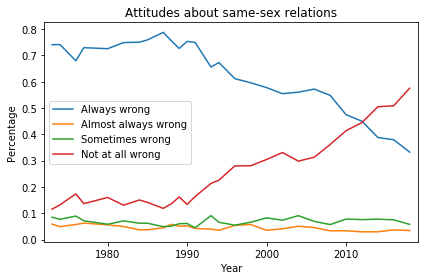
In the United States, beliefs and attitudes about homosexuality have changed drastically over the last 50 years. In 1972, 74% of U.S. residents thought sexual relations between two adults of the same sex were “always wrong”, according to results from the General Social Survey (GSS). In 2018, that fraction was down to 33%, and another 58% thought same-sex relations were “not wrong at all”.
Here’s what the distribution of responses looks like over the duration of the survey:
Distribution of responses to the question “What about sexual relations between two adults of the same sex—do you think it is always wrong, almost always wrong, wrong only sometimes, or not wrong at all?”
In the late 1980s, the fraction of “always wrong” responses started dropping, being replaced almost entirely with “not at all wrong”. Respondents who chose “almost always wrong” or “sometimes wrong” have always been a small minority.
Political alignment
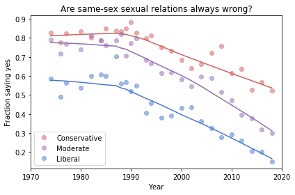
As you might expect, these responses are related to political alignment, that is, to whether respondents describe themselves as liberal, conservative, or moderate.
The following figure shows the fraction of “always wrong” responses over time, grouped by political alignment:
Fraction of respondents who think sexual relations between two adults of the same sex are “always wrong”, grouped by self-described political affiliation.
The circles in this figure show the observed percentages in each group during each year. The lines show a smooth curve computed by local regression.
Unsurprisingly, people who consider themselves conservative are consistently more likely than liberals to believe homosexuality is wrong. And moderates fall somewhere between liberals and conservatives.
What might be more surprising is how conservative self-described liberals were in 1972: almost 60% of them thought homosexuality was always wrong.
You might also be surprised at how liberal self-described conservatives are now: the fraction who think homosexuality is wrong is down to 60%. In other words, conservatives now are as liberal as liberals were in 1972.
The more things change…
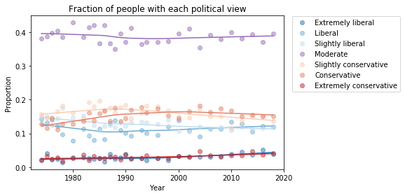
As we saw in a previous article, the fractions of liberals and conservatives do not change much over time. The following figure shows the proportions for GSS respondents:
Self-described political alignment over time.
I conjecture that people describe themselves relative to a perceived center of mass of public opinion. If they are more conservative than what they think is the mean, they are more likely to say they are “conservative”.
But what that means, in terms of beliefs and attitudes, changes over time. And with some issues, it changes quite fast.