You Would Choose Now
In 2016, Barack Obama gave a commencement address at Howard University, where he said
If you had to choose one moment in history in which you could be born, and you didn’t know ahead of time who you were going to be — what nationality, what gender, what race, whether you’d be rich or poor, gay or straight, what faith you’d be born into — you wouldn’t choose 100 years ago. You wouldn’t choose the fifties, or the sixties, or the seventies. You’d choose right now. If you had to choose a time to be, in the words of Lorraine Hansberry, “young, gifted, and black” in America, you would choose right now. [Emphasis added]
Was he right? It’s a broad claim — about racism, sexism, homophobia, and more — so I’ll focus on the last sentence: If you are young, gifted, and Black, would you choose right now?
And I’ll focus on just one part of the answer: public opinions about race relations and civil rights. On these topics, the General Social Survey includes several questions that have been asked repeatedly — although some of them were dropped from the survey before Obama’s assertion in 2016.
As an example, we’ll start with a question about open housing, which has been asked since 1973, and shows one of the clearest trends over time.
Open housing
The GSS asks this question about open housing:
Suppose there is a community-wide vote on the general housing issue. There are two possible laws to vote on. (A) One law says that a homeowner can decide for himself whom to sell his house to, even if he prefers not to sell to someone because of their race or color. (B) The second law says that a homeowner cannot refuse to sell to someone because of their race or color. Which law would you vote for?
The following figure shows the percentage of respondents who chose the first law, which allows someone selling their house to discriminate.
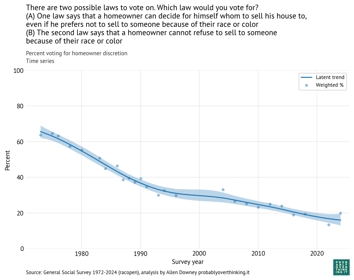
In 1973, about 65% favored the first law; in 2024, it had dropped below 20%. When public opinion changes as fast as that, it is usually the result of two effects:
- Generational replacement: as older people with receding viewpoints age out of the survey, they are replaced by young adults with rising viewpoints.
- Changing minds: people adopt different views over the course of their lives, possibly in response to events.
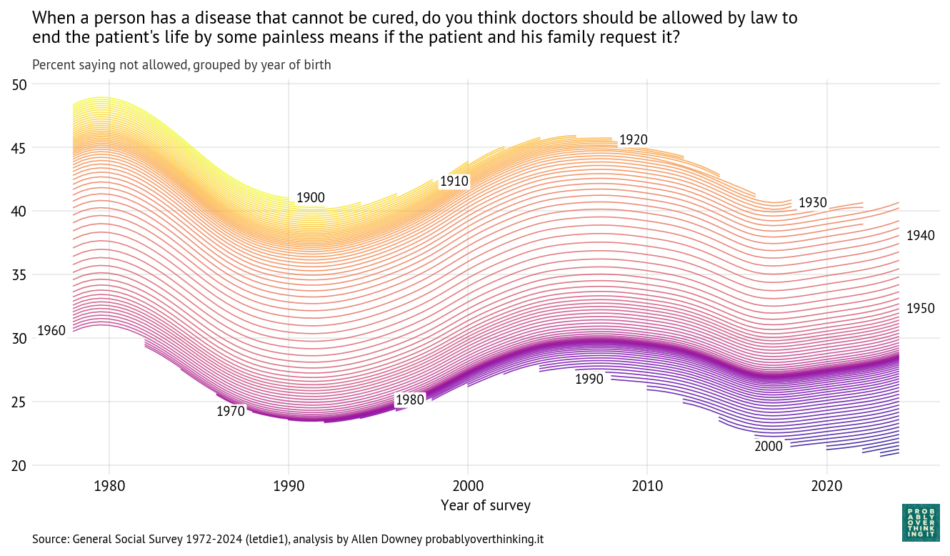
With a repeated survey like the GSS, we can follow each generation to see how it changes over time. The following figure shows one line for each year of birth, estimating support for homeowner discretion over time.
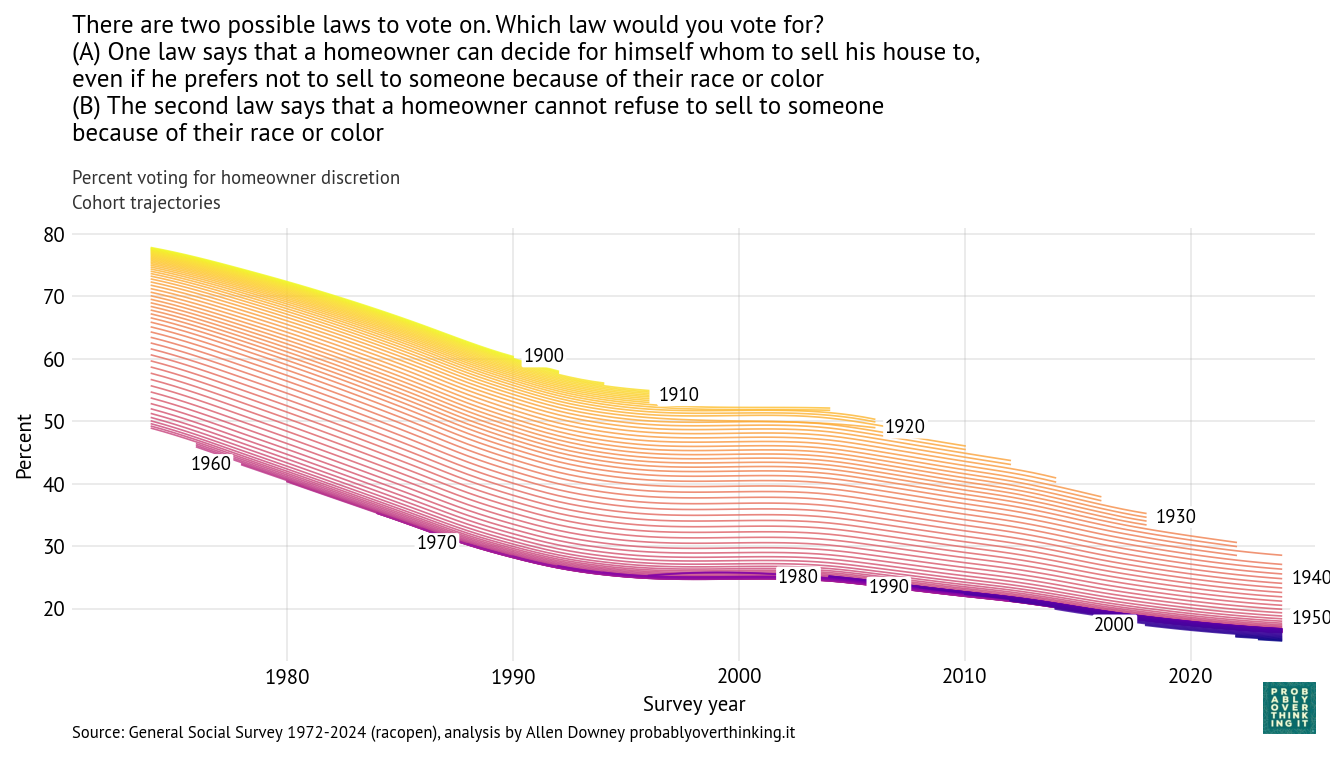
In the top left we can see that when people born in the 1900s and 1910s were interviewed in 1973, almost 80% of them said homeowners should be allowed to discriminate based on race. In the bottom right we can see that when people born in the 2000s were interviewed in 2024, fewer than 20% of them held that view. So there are big differences between generations. And, following the cohorts over time, we can see that the trend is downward — that is, toward support for open housing laws.
From this analysis we can decompose the period effect (holding the mixture of cohorts constant) and the cohort effect (holding the mixture of survey years constant). Here’s the estimated cohort effect:
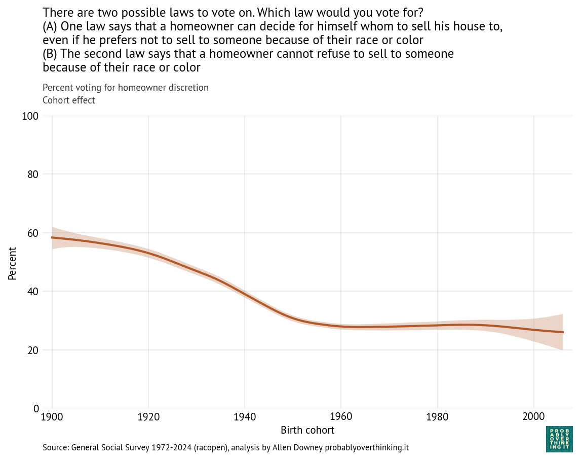
Looking at differences between cohorts, the biggest changes happened between people born in 1900 and 1960. Since then, the cohort effect is essentially flat.
And here’s the period effect after factoring out the cohort effect.
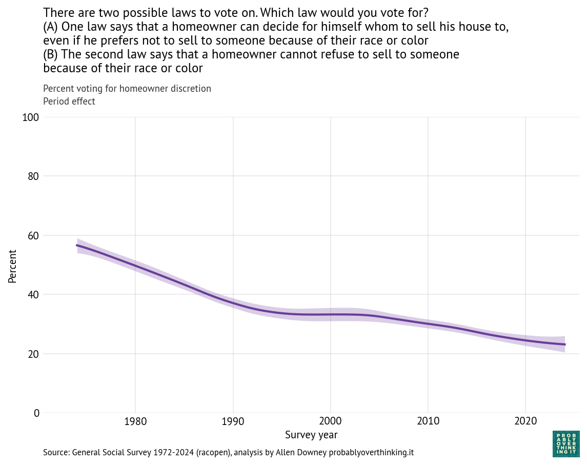
The trend is consistently downward, with a possible plateau between 1995 and 2005. If you are young, Black, and looking for a house, these trends are good news. Let’s see if the other questions show the same patterns.
Race relations and civil rights
Here are other questions related to race relations and civil rights — I selected the ones that were asked repeatedly over the widest intervals.
Affirmative action:
Some people say that because of past discrimination, Black people should be given preference in hiring and promotion. Others say that such preference in hiring and promotion of Black people is wrong because it discriminates against whites. What about your opinion — are you for or against preferential hiring and promotion of Black people?
Segregation:
Do you agree or disagree with the following statement: African-Americans shouldn’t push themselves where they’re not wanted.
Do you agree or disagree with the following statement: White people have a right to keep African-Americans out of their neighborhoods if they want to, and African-Americans should respect that right.
Interracial marriage:
Do you think there should be laws against marriages between African-Americans and whites?
Black presidential candidate:
If your party nominated an African-American for President, would you vote for him if he were qualified for the job?
If some of these questions seem dated, remember that they were written in the 1970s. The wording of the questions is mostly unchanged, except that the original use of “Negroes” was updated to “African-American” and then updated again to “Black”.
Now let’s see how the responses have changed. To make the results easier to compare, for each question we’ll look at responses associated with a more racist viewpoint. So we’ll track:
- Support for segregation
- Opposition to interracial marriage
- Unwillingness to vote for a Black candidate
- Opposition to affirmative action (with the acknowledgement that this view is not necessarily racist)
The following figure shows the percentage of respondents with these views, plotted over time.
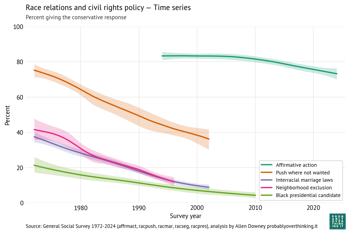
All of these views have declined over time, although opposition to affirmative action is still high.
For three of the questions, support for the more racist responses had fallen below 15% when they were dropped from the survey. For example, in 1973 more than 40% agreed that “White people have a right to keep Negroes out of their neighborhoods if they want to, and Negroes should respect that right.” By 2002, it was below 10% — and in 2026 I think a lot of people wouldn’t read that sentence out loud, much less believe it.
One reason the GSS drops questions like these is that statistical estimates are less precise when an observed proportion is far from 50% in either direction. For example, in 2010, fewer than 4% of respondents said they were unwilling to vote for a Black presidential candidate. At that level, even a low error rate becomes a problem; for example, if 1% of respondents misunderstand the question or record the wrong response, they would account for 1 out of 4 of the negative responses.
Another reason is that a question that was relevant when it was added to the survey might seem dated a few decades later, might introduce a framing or mindset that influences responses, and might even antagonize respondents. For example, if you agreed to take a survey and they were still asking about interracial marriage in 2026, it might make you wonder about the worldview of the survey writers.
Now we’ll decompose these trends into cohort and period effects. The following figure shows the cohort effects.
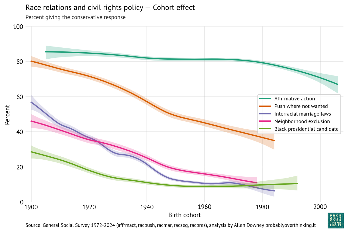
On support for segregation and opposition to interracial marriage, the cohort effect is consistently downward — that is, each generation is less likely to support these views.
Opposition to affirmative action was almost unchanged between cohorts born in the 1940s, 1950s, 1960s, and 1970s, but since then it has declined steeply.
Unwillingness to vote for a Black candidate declined earlier and reached a minimum with the Baby Boomers (born 1946 to 1964). It might have increased after that, but the increase is within the range of statistical uncertainty.
Now here’s the period effect after controlling for changes in the cohort mix.
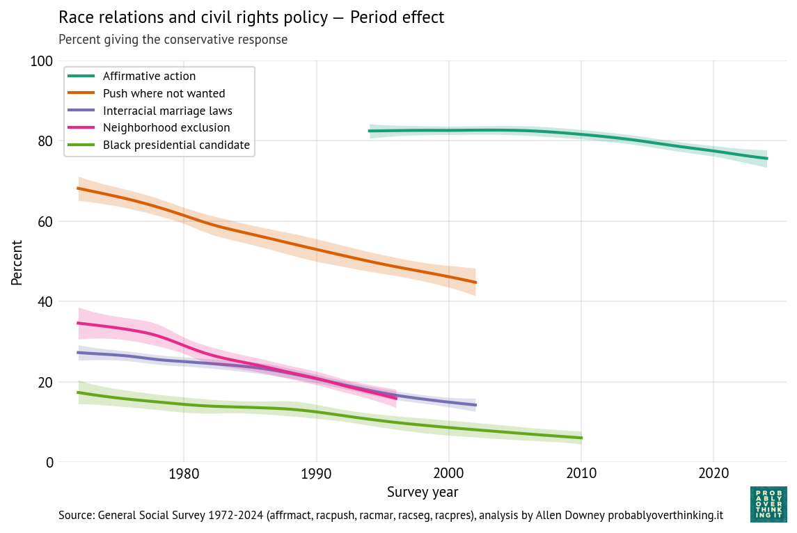
The trends are all consistently downward, which means that the changes we see in the time series are not just generational replacement — they are also changing minds.
Unequal Outcomes
In 1977, the GSS added four questions starting with this preamble:
On the average, African-Americans have worse jobs, income, and housing than white people. Do you think these differences are …
Then they ask:
- … mainly due to discrimination?
- … because most African-Americans have less in-born ability to learn?
- … because most African-Americans don’t have the chance for education that it takes to rise out of poverty?
- … because most African-Americans just don’t have the motivation or will power to pull themselves up out of poverty?
Respondents can answer yes or no to each question, so they could affirm all four, or none, or any combination. The following figure shows the percentage affirming each explanation.
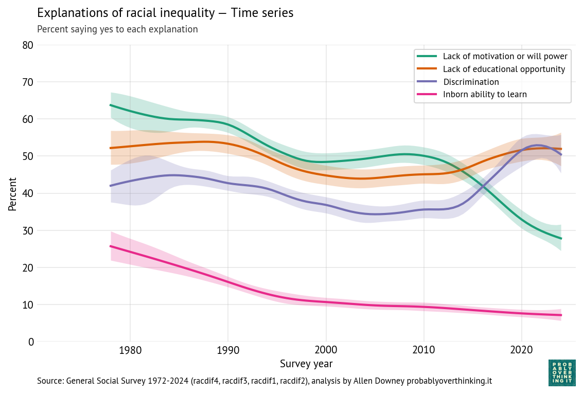
Over time, respondents are
- Less likely to accept lack of motivation or in-born ability as explanations, and
- More likely to accept discrimination.
Belief in educational opportunity as an explanation was high in the 1980s, declined in the 1990s, and has increased since.
The following figure shows how the responses differ between generations.
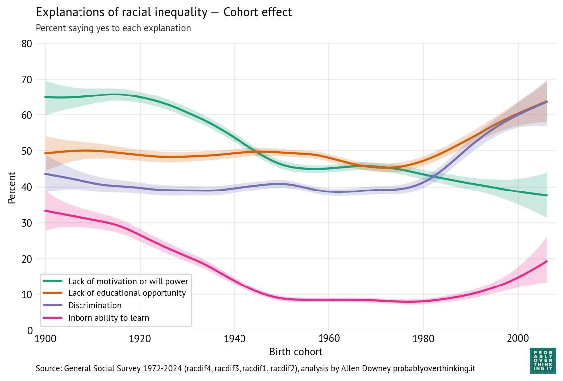
The picture here is a little more complicated, but in general, more recent cohorts are more likely to endorse discrimination and educational opportunity, and less likely to endorse motivation and innate ability — although it looks like cohorts born after 1990 are increasingly likely to believe in innate differences.
The following figure shows the period effects.
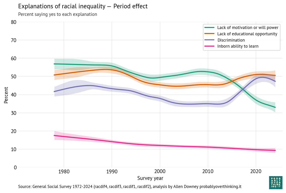
The period effects have the same shapes as the original time series, but the magnitudes of the changes are a little smaller after we factor out the cohort effects. So again, the changes we see over time are a combination of generational replacement and changed minds.
What about now?
So when Obama said, “You wouldn’t choose the fifties, or the sixties, or the seventies. You’d choose right now,” was he right?
If the prevalence of racist views is one of the factors you would consider, the choice is clear: public opinion was less racist in 2016 than it was in the 1970s. We don’t have GSS data from the fifties and sixties, but we have data from people born in the 1900s and 1910s, and it is equally clear: younger cohorts are less racist than older cohorts.
Of course, these are survey results, and people don’t always say what they believe. But I think it’s likely that the changes we see in the responses reflect true changes in beliefs. For example, as opposition to interracial marriage has declined, rates of interracial marriage have in fact increased. And given that presidential elections tend to be tightly contested, if many people were unwilling to vote for a Black candidate, Obama would not have been elected (and might not have spoken at Howard University).
But even if we conclude that Obama was right in 2016, would he still be right in 2024? In the most recent data, it looks like fewer people believe that unequal outcomes are “mainly due to discrimination”. And it looks like the youngest respondents are more likely to believe in innate racial differences, compared to previous generations.
Because some of the questions where we see the biggest changes were dropped from the survey, we can’t rule out the possibility that those trends have reversed. But other surveys can fill in the blanks. For example, Gallup reported that opposition to interracial marriage dropped to 4% in 2021, less than the 12% seen in the GSS in 2002. And when they asked if people would vote for a Black presidential candidate in 2019, about 3% said no, slightly less than the proportion in the GSS in 2010. So I don’t think these trends reversed when the GSS stopped looking.
Even if racism is in decline, concern about racism is not. Since 1948, Gallup has asked “What do you think is the most important problem facing this country today?” The following figure shows the percentage who said racism or a related term:
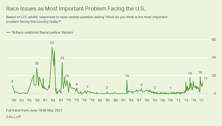
Several of the peaks align with notable historical events, including:
| Year | Peak | Possible events |
|---|---|---|
| 1958 | 29% | Aftermath of the Little Rock Crisis in 1957 (federal troops escorting Black students into a desegregated school in Arkansas). |
| 1967 | 52% | Urban riots and racial unrest, especially in Detroit and Newark. |
| 1968 | 35% | Assassination of Martin Luther King Jr. followed by nationwide riots in more than 100 cities. |
| 1992 | 15% | 1992 Los Angeles Riots after the acquittal of officers filmed beating Rodney King. |
| 2015–2017 | 10–18% | Multiple events, possibly including the Charleston church shooting in 2015, the killing of Philando Castile in 2016, and a white supremacist rally in Charlottesville in 2017. |
| 2020–2021 | 19% | Killing of George Floyd in May 2020, nationwide protests, and intense discussion of systemic racism. |
The salience of racism as a national issue seems be driven by events, and media coverage, more than by the prevalence of racist attitudes. That’s not ideal — the limited resource of attention should go where it is most needed — but it might not be all bad. Even if racist beliefs are rarer than they used to be, they are not gone. I’m glad if only 3% of Americans refuse to vote for a Black candidate, but that’s not zero, and in a close election, it could be a deciding factor.
So we should be aware of what’s going on — and we should keep an eye on the trends that have stalled or reversed. But we should not ignore the consistent decline of racist attitudes in the last fifty years. Based on the data, if I had to choose when to be born, not knowing who I was going to be, I would choose right now.
Note: The scenario Obama posed is a nod to the veil of ignorance, a hypothetical used by moral philosopher John Rawls to support basic principles of justice.