I am excited to announce that I have started work on a third edition of Think Stats, to be published by O’Reilly Media in 2025. At this point the content is mostly settled, and I am revising chapters to get them ready for technical review.
For the third edition, I started by moving the book into Jupyter notebooks. This change has one immediate benefit – you can read the text, run the code, and work on the exercises all in one place. And the notebooks are designed to work on Google Colab, so you can get started without installing anything.
The move to notebooks has another benefit – the code is more visible. In the first two editions, some of the code was in the book and some was in supporting files available online. In retrospect, it’s clear that splitting the material in this way was not ideal, and it made the code more complicated than it needed to be. In the third edition, I was able to simplify the code and make it more readable.
Since the last edition was published, I’ve developed a library called empiricaldist that provides objects that represent statistical distributions. This library is more mature now, so the updated code makes better use of it.
When I started this project, NumPy and SciPy were not as widely used, and Pandas even less, so the original code used Python data structures like lists and dictionaries. This edition uses arrays and Pandas structures extensively, and makes more use of functions these libraries provide. I assume readers have some familiarity with these tools, but I explain each feature when it first appears.
The third edition covers the same topics as the original, in almost the same order, but the text is substantially revised. Some of the examples are new; others are updated with new data. I’ve developed new exercises, revised some of the old ones, and removed a few. I think the updated exercises are better connected to the examples, and more interesting.
Since the first edition, this book has been based on the thesis that many ideas that are hard to explain with math are easier to explain with code. In this edition, I have doubled down on this idea, to the point where there is almost no mathematical notation, only code.
Overall, I think these changes make Think Stats a better book. To give you a taste, here’s an excerpt from Chapter 12: Time Series Analysis.
Multiplicative Model
The additive model we used in the previous section is based on the assumption that the time series is well modeled as the sum of a long-term trend, a seasonal component, and a residual component – which implies that the magnitude of the seasonal component and the residuals does not vary over time.
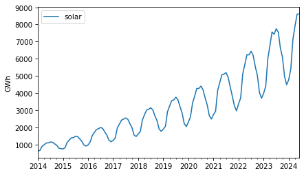
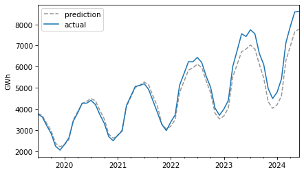
As an example that violates this assumption, let’s look at small-scale solar electricity production since 2014.
solar = elec["United States : small-scale solar photovoltaic"].dropna()
solar.plot(label="solar")
decorate(ylabel="GWh")
Over this interval, total production has increased several times over. And it’s clear that the magnitude of seasonal variation has increased as well.
If suppose that the magnitudes of seasonal and random variation are proportional to the magnitude of the trend, that suggests an alternative to the additive model in which the time series is the product of a trend, a seasonal component, and a residual component.
To try out this multiplicative model, we’ll split this series into training and test sets.
training, test = split_series(solar)
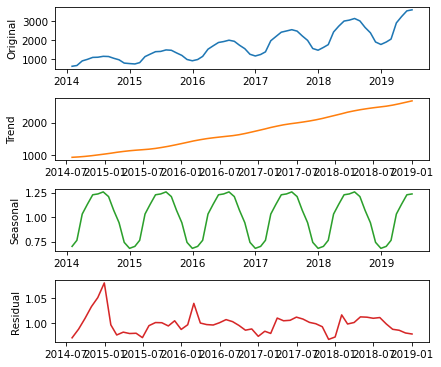
And call seasonal_decompose with the model=multiplicative argument.
Now the seasonal and residual components are multiplicative factors. So, it looks like the seasonal component varies from about 25% below the trend to 25% above. And the residual component is usually less than 5% either way, with the exception of some larger factors in the first period.
The production of a solar panel is almost entirely a function of the sunlight it’s exposed to, so it makes sense that it follows an annual cycle so closely.
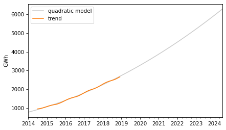
To predict the long term trend, we’ll use a quadratic model.
In the Patsy formula, the term "I(months**2)" adds a quadratic term to the model, so we don’t have to compute it explicitly. Here are the results.
display_summary(results)
coef
std err
t
P>|t|
[0.025
0.975]
Intercept
766.1962
13.494
56.782
0.000
739.106
793.286
months
22.2153
0.938
23.673
0.000
20.331
24.099
I(months ** 2)
0.1762
0.014
12.480
0.000
0.148
0.205
R-squared:
0.9983
The p-values of the linear and quadratic terms are very low, which suggests that the quadratic model captures more information about the trend than a linear model would – and the R² value is very high.
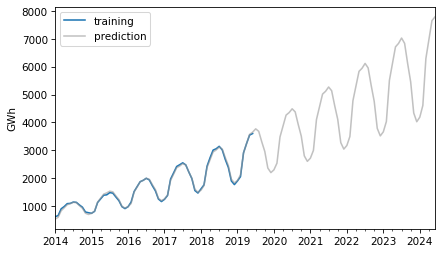
Now we can use the model to compute the expected value of the trend for the past and future.
The retrodictions fit the training data well and the predictions seem plausible – now let’s see if they turned out to be accurate. Here are the predictions along with the test data.
For the first three years, the predictions are very good. After that, it looks like actual growth exceeded expectations.
In this example, seasonal decomposition worked well for modeling and predicting solar production, but in the previous example, it was not very effective for nuclear production. In the next section, we’ll try a different approach, autoregression.
How do I use bootstrapping to generate confidence intervals for a proportion/ratio? The situation is this:
I obtain samples of text with differing numbers of lines. From several tens to over a million. I have no control over how many lines there are in any given sample. Each line of each sample may or may not contain a string S. Counting lines according to S presence or S absence generates a ratio of S to S’ for that sample. I want to use bootstrapping to calculate confidence intervals for the found ratio (which of course will vary with sample size).
To do this I could either:
A. Literally resample (10,000 times) of size (say) 1,000 from the original sample (with replacement) then categorise S (and S’), and then calculate the ratio for each resample, and finally identify highest and lowest 2.5% (for 95% CI), or
B. Generate 10,000 samples of 1,000 random numbers between 0 and 1, scoring each stochastically as above or below original sample ratio (equivalent to S or S’). Then calculate CI as in A.
Programmatically A is slow and B is very fast. Is there anything wrong with doing B? The confidence intervals generated by each are almost identical.
The answer to the immediate question is that A and B are equivalent, so there’s nothing wrong with B. But in follow-up responses, a few related questions were raised:
Is resampling a good choice for this problem?
What size should the resamplings be?
How many resamplings do we need?
I don’t think resampling is really necessary here, and I’ll show some alternatives. And I’ll answer the other questions along the way.
I’ll download a utilities module with some of my frequently-used functions, and then import the usual libraries.
Pallor and Probability
As an example, let’s use one of the exercises from Think Python:
The Count of Monte Cristo is a novel by Alexandre Dumas that is considered a classic. Nevertheless, in the introduction of an English translation of the book, the writer Umberto Eco confesses that he found the book to be “one of the most badly written novels of all time”.
In particular, he says it is “shameless in its repetition of the same adjective,” and mentions in particular the number of times “its characters either shudder or turn pale.”
To see whether his objection is valid, let’s count the number number of lines that contain the word pale in any form, including pale, pales, paled, and paleness, as well as the related word pallor. Use a single regular expression that matches all of these words and no others.
The following cell downloads the text of the book from Project Gutenberg.
def clean_file(input_file, output_file):
    reader = open(input_file)
    writer = open(output_file, 'w')

    for line in reader:
        if is_special_line(line):
            break

    for line in reader:
        if is_special_line(line):
            break
        writer.write(line)

    reader.close()
    writer.close()

clean_file('pg1184.txt', 'pg1184_cleaned.txt')
And we’ll use the following function to count the number of lines that contain a particular pattern of characters.
import re

def count_matches(lines, pattern):
    count = 0
    for line in lines:
        result = re.search(pattern, line)
        if result:
            count += 1
    return count
readlines reads the file and creates a list of strings, one for each line.
lines = open('pg1184_cleaned.txt').readlines()
n = len(lines)
n
61310
There are about 61,000 lines in the file.
The following pattern matches “pale” and several related words.
pattern = r'\b(pale|pales|paled|paleness|pallor)\b'
k = count_matches(lines, pattern)
k
223
These words appear in 223 lines of the file.
p_est = k / n
p_est
0.0036372533028869677
So the estimated proportion is about 0.0036. To quantify the precision of that estimate, we’ll compute a confidence interval.
Resampling
First we’ll use the method OP called A – literally resampling the lines of the file. The following function takes a list of lines and selects a sample, with replacement, that has the same size.
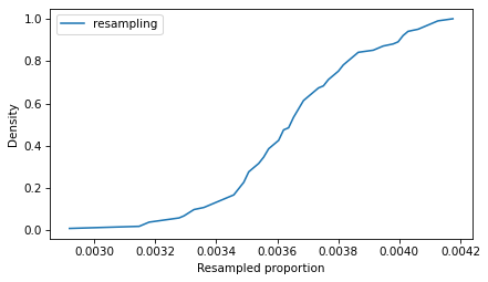
In a resampled list, the same line can appear more than once, and some lines might not appear at all. So in any resampling, the forbidden words might appear more times than in the original text, or fewer. Here’s an example.
In this resampling, the words appear in 201 lines, fewer than in the original (223).
If we repeat this process many times, we can compute a sample of possible values of k. Because this method is slow, we’ll only repeat it 101 times.
ks_resampling = [count_matches(resample(lines), pattern) for i in range(101)]
With these different values of k, we can divide by n to get the corresponding values of p.
ps_resampling = np.array(ks_resampling) / n
To see what the distribution of those values looks like, we’ll plot the CDF.
from empiricaldist import Cdf

Cdf.from_seq(ps_resampling).plot(label='resampling')
decorate(xlabel='Resampled proportion', ylabel='Density')
So that’s the slow way to compute the sampling distribution of the proportion. The method OP calls B is to simulate a Bernoulli trial with size n and probability of success p_est. One way to do that is to draw random numbers from 0 to 1 and count how many are less than p_est.
(np.random.random(n) < p_est).sum()
229
Equivalently, we can draw a sample from a Bernoulli distribution and add it up.
from scipy.stats import bernoulli

bernoulli(p_est).rvs(n).sum()
232
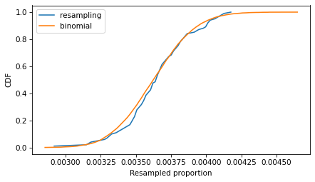
These values follow a binomial distribution with parameters n and p_est. So we can simulate a large number of trials quickly by drawing values from a binomial distribution.
from scipy.stats import binom

ks_binom = binom(n, p_est).rvs(10001)
Dividing by n, we can compute the corresponding sample of proportions.
ps_binom = np.array(ks_binom) / n
Because this method is so much faster, we can generate a large number of values, which means we get a more precise picture of the sampling distribution.
The following figure compares the CDFs of the values we got by resampling and the values we got from the binomial distribution.
If we run the resampling method longer, these CDFs converge, so the two methods are equivalent.
To compute a 90% confidence interval, we can use the values we sampled from the binomial distribution.
np.percentile(ps_binom, [5, 95])
array([0.0032458 , 0.00404502])
Or we can use the inverse CDF of the binomial distribution, which is even faster than drawing a sample. And it’s deterministic – that is, we get the same result every time, with no randomness.
binom(n, p_est).ppf([0.05, 0.95]) / n
array([0.0032458 , 0.00404502])
Using the inverse CDF of the binomial distribution is a good way to compute confidence intervals. But before we get to that, let’s see how resampling behaves as we increase the sample size and the number of iterations.
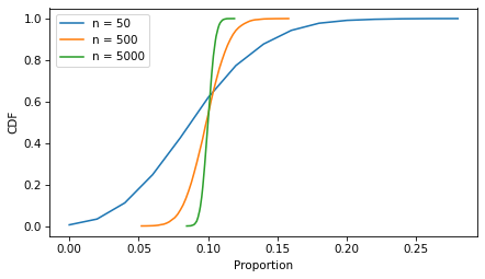
Sample Size
In the example, the sample size is more than 60,000, so the CI is very small. The following figure shows what it looks like for more moderate sample sizes, using p=0.1 as an example.
p = 0.1
ns = [50, 500, 5000]
ci_df = pd.DataFrame(index=ns, columns=['low', 'high'])

for n in ns:
    ks = binom(n, p).rvs(10001)
    ps = ks / n
    Cdf.from_seq(ps).plot(label=f"n = {n}")
    ci_df.loc[n] = np.percentile(ps, [5, 95])

decorate(xlabel='Proportion', ylabel='CDF')
As the sample size increases, the spread of the sampling distribution gets smaller, and so does the width of the confidence interval.
With resampling methods, it is important to draw samples with the same size as the original dataset – otherwise the result is wrong.
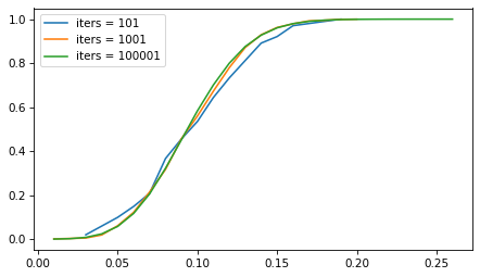
But the number of iterations doesn’t matter as much. The following figure shows the sampling distribution if we run the sampling process 101, 1001, and 10,001 times.
p = 0.1
n = 100
iter_seq = [101, 1001, 100001]

for iters in iter_seq:
    ks = binom(n, p).rvs(iters)
    ps = ks / n
    Cdf.from_seq(ps).plot(label=f"iters = {iters}")

decorate()
The sampling distribution is the same, regardless of how many iterations we run. But with more iterations, we get a better picture of the distribution and a more precise estimate of the confidence interval. For most problems, 1001 iterations is enough, but if you can generate larger samples fast enough, more is better.
However, for this problem, resampling isn’t really necessary. As we’ve seen, we can use the binomial distribution to compute a CI without drawing a random sample at all. And for this problem, there are approximations that are even easier to compute – although they come with some caveats.
Approximations
If n is large and p is not too close to 0 or 1, the sampling distribution of a proportion is well modeled by a normal distribution, and we can approximate a confidence interval with just a few calculations.
For a given confidence level, we can use the inverse CDF of the normal distribution to compute a
score, which is the number of standard deviations the CI should span – above and below the observed value of p – in order to include the given confidence.
from scipy.stats import norm

confidence = 0.9
z = norm.ppf(1 - (1 - confidence) / 2)
z
1.6448536269514722
A 90% confidence interval spans about 1.64 standard deviations.
Now we can use the following function, which uses p, n, and this z score to compute the confidence interval.
def confidence_interval_normal_approx(k, n, z):
    p = k / n
    margin_of_error = z * np.sqrt(p * (1 - p) / n)

    lower_bound = p - margin_of_error
    upper_bound = p + margin_of_error
    return lower_bound, upper_bound
To test it, we’ll compute n and k for the example again.
n = len(lines)
k = count_matches(lines, pattern)
n, k
(61310, 223)
Here’s the confidence interval based on the normal approximation.
ci_normal = confidence_interval_normal_approx(k, n, z)
ci_normal
(0.003237348046298746, 0.00403715855947519)
In the example, n is large, which is good for the normal approximation, but p is small, which is bad. So it’s not obvious whether we can trust the approximation.
An alternative that’s more robust is the Wilson score interval, which is reliable for values of p close to 0 and 1, and sample sizes bigger than about 5.
def confidence_interval_wilson_score(k, n, z):
    p = k / n
    factor = z**2 / n
    denominator = 1 + factor
    center = p + factor / 2
    half_width = z * np.sqrt((p * (1 - p) + factor / 4) / n)

    lower_bound = (center - half_width) / denominator
    upper_bound = (center + half_width) / denominator

    return lower_bound, upper_bound
Here’s the 90% CI based on Wilson scores.
ci_wilson = confidence_interval_wilson_score(k, n, z)
ci_wilson
(0.003258660468175958, 0.00405965209814987)
Another option is the Clopper-Pearson interval, which is what we computed earlier with the inverse CDF of the binomial distribution. Here’s a function that computes it.
from scipy.stats import binom

def confidence_interval_exact_binomial(k, n, confidence=0.9):
    alpha = 1 - confidence
    p = k / n

    lower_bound = binom.ppf(alpha / 2, n, p) / n if k > 0 else 0
    upper_bound = binom.ppf(1 - alpha / 2, n, p) / n if k < n else 1

    return lower_bound, upper_bound
A final alternative is the Jeffreys interval, which is derived from Bayes’s Theorem. If we start with a Jeffreys prior and observe k successes out of n attempts, the posterior distribution of p is a beta distribution with parameters a = k + 1/2 and b = n - k + 1/2. So we can use the inverse CDF of the beta distribution to compute a CI.
from scipy.stats import beta

def bayesian_confidence_interval_beta(k, n, confidence=0.9):
    alpha = 1 - confidence
    a, b = k + 1/2, n - k + 1/2

    lower_bound = beta.ppf(alpha / 2, a, b)
    upper_bound = beta.ppf(1 - alpha / 2, a, b)

    return lower_bound, upper_bound
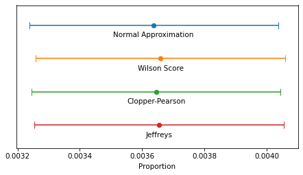
In this example, because n is so large, the intervals are all similar – the differences are too small to matter in practice. For smaller values of n, the normal approximation becomes unreliable, and for very small values, none of them are reliable.
The normal approximation and Wilson score interval are easy and fast to compute. On my old laptop, they take 1-2 microseconds.
%timeit confidence_interval_normal_approx(k, n, z)
1.04 µs ± 4.04 ns per loop (mean ± std. dev. of 7 runs, 1,000,000 loops each)
%timeit confidence_interval_wilson_score(k, n, z)
1.64 µs ± 28.6 ns per loop (mean ± std. dev. of 7 runs, 1,000,000 loops each)
Evaluating the inverse CDF of the binomial and beta distributions are more complex computations – they take about 100 times longer.
%timeit confidence_interval_exact_binomial(k, n)
195 µs ± 7.53 µs per loop (mean ± std. dev. of 7 runs, 1,000 loops each)
%timeit bayesian_confidence_interval_beta(k, n)
269 µs ± 4.6 µs per loop (mean ± std. dev. of 7 runs, 1,000 loops each)
But they still take less than 300 microseconds, so unless you need to compute millions of confidence intervals per second, the difference in computation time doesn’t matter.
Discussion
If you took a statistics class and learned one of these methods, you probably learned the normal approximation. That’s because it is easy to explain and, because it is based on a form of the Central Limit Theorem, it helps to justify time spent learning about the CLT. But in my opinion it should never be used in practice because it is dominated by the Wilson score interval – that is, it is worse than Wilson in at least one way and better in none.
I think the Clopper-Pearson interval is equally easy to explain, but when n is small, there are few possible values of k, and therefore few possible values of p – and the interval can be wider than it needs to be.
The Jeffreys interval is based on Bayesian statistics, so it takes a little more explaining, but it behaves well for all values of n and p. And when n is small, it can be extended to take advantage of background information about likely values of p.
For these reasons, the Jeffreys interval is my usual choice, but in a computational environment that doesn’t provide the inverse CDF of the beta distribution, I would use a Wilson score interval.
OP is working in LiveCode, which doesn’t provide a lot of math and statistics libraries, so Wilson might be a good choice. Here’s a LiveCode implementation generated by ChatGPT.
-- Function to calculate the z-score for a 95% confidence level (z ≈ 1.96)
function zScore
    return 1.96
end zScore

-- Function to calculate the Wilson Score Interval with distinct bounds
function wilsonScoreInterval k n
    -- Calculate proportion of successes
    put k / n into p
    put zScore() into z

    -- Common term for the interval calculation
    put (z^2 / n) into factor
    put (p + factor / 2) / (1 + factor) into adjustedCenter

    -- Asymmetric bounds
    put sqrt(p * (1 - p) / n + factor / 4) into sqrtTerm

    -- Lower bound calculation
    put adjustedCenter - (z * sqrtTerm / (1 + factor)) into lowerBound

    -- Upper bound calculation
    put adjustedCenter + (z * sqrtTerm / (1 + factor)) into upperBound

    return lowerBound & comma & upperBound
end wilsonScoreInterval
In a previous article, I looked at 93 measurements from the ANSUR-II dataset and found that ear protrusion is not correlated with any other measurement. In a followup article, I used principle component analysis to explore the correlation structure of the measurements, and found that once you have exhausted the information encoded in the most obvious measurements, the ear-related measurements are left standing alone.
I have a conjecture about why ears are weird: ear growth might depend on idiosyncratic details of the developmental environment — so they might be like fingerprints. Recently I discovered a hint that supports my conjecture.
This Veritasium video explains how we locate the source of a sound.
In general, we use small differences between what we hear in each ear — specifically, differences in amplitude, quality, time delay, and phase. That works well if the source of the sound is to the left or right, but not if it’s directly in front, above, or behind — anywhere on vertical plane through the centerline of your head — because in those cases, the paths from the source to the two ears are symmetric.
Fortunately we have another trick that helps in this case. The shape of the outer ear changes the quality of the sound, depending on the direction of the source. The resulting spectral cues makes it possible to locate sources even when they are on the central plane.
The video mentions that owls have asymmetric ears that make this trick particularly effective. Human ears are not as distinctly asymmetric as owl ears, but they are not identical.
And now, based on the Veritasium video, I suspect that might be a feature — the shape of the outer ear might be unpredictably variable because it’s advantageous for our ears to be asymmetric. Almost everything about the way our bodies grow is programmed to be as symmetric as possible, but ears might be programmed to be different.
An article in a recent issue of The Economist suggests, right in the title, “Investors should avoid a new generation of rip-off ETFs”. An ETF is an exchange-traded fund, which holds a collection of assets and trades on an exchange like a single stock. For example, the SPDR S&P 500 ETF Trust (SPY) tracks the S&P 500 index, but unlike traditional index funds, you can buy or sell shares in minutes.
There’s nothing obviously wrong with that – but as an example of a “rip-off ETF”, the article describes “defined-outcome funds” or buffer ETFs, which “offer investors an enviable-sounding opportunity: hold stocks, with protection against falling prices. All they must do is forgo annual returns above a certain level, often 10% or so.”
That might sound good, but the article explains, “Over the long term, they are a terrible deal for investors. Much of the compounding effect of stock ownership comes from rallies.”
To demonstrate, they use the value of the S&P index since 1980: “An investor with returns capped at 10% and protected from losses would have made a real return of 403% over the period, a fraction of the 3,155% return offered by just buying and holding the S&P 500.”
So that sounds bad, but returns from 1980 to the present have been historically unusual. To get a sense of whether buffer ETFs are more generally a bad deal, let’s get a bigger picture.
The MeasuringWorth Foundation has compiled the value of the Dow Jones Industrial Average at the end of each day from February 16, 1885 to the present, with adjustments at several points to make the values comparable. The series I collected starts on February 16, 1885 and ends on August 30, 2024. The following cells download and read the data.
To compute annual returns, we’ll start by selecting the closing price on the last trading day of each year (dropping 2024 because we don’t have a complete year).
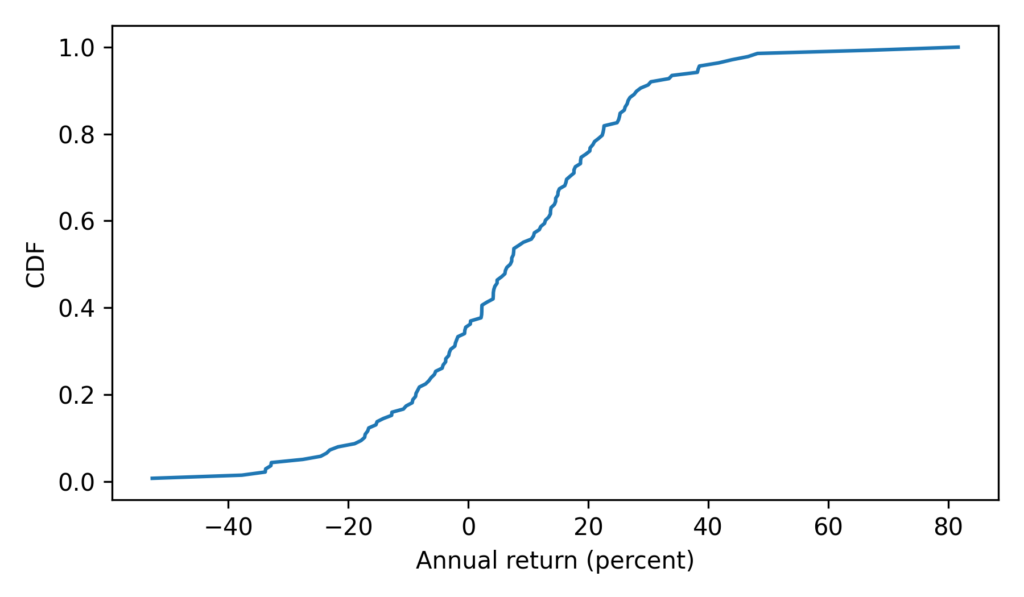
Looking at the years with the biggest losses and gains, we can see that most of the extremes were before the 1960s – with the exception of the 2008 financial crisis.
annual.dropna().sort_values(by='Return')
DJIA
Ratio
Return
Date
1931
77.9000
0.473326
-52.667396
1907
43.0382
0.622683
-37.731743
2008
8776.3900
0.661629
-33.837097
1930
164.5800
0.662347
-33.765293
1920
71.9500
0.670988
-32.901240
…
…
…
…
1954
404.3900
1.439623
43.962264
1908
63.1104
1.466381
46.638103
1928
300.0000
1.482213
48.221344
1933
99.9000
1.666945
66.694477
1915
99.1500
1.816599
81.659949
138 rows × 3 columns
Here’s what the distribution of annual returns looks like.
With this function, we can replicate the analysis The Economist did with the S&P 500. Here are the results for the DJIA from the beginning of 1980 to the end of 2023.
A buffer ETF over this period would have grown by a factor of more than 15 in nominal dollars, with no risk of loss. But an index fund would have grown by a factor of almost 45. So yeah, the ETF would have been a bad deal.
However, if we go back to the bad old days, an investor in 1900 would have been substantially better off with a buffer ETF held for 43 years – a factor of 7.2 compared to a factor of 2.8.
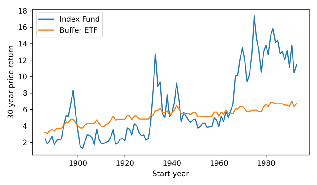
It seems we can cherry-pick the data to make the comparison go either way – so let’s see how things look more generally. Starting in 1886, we’ll compute price returns for all 30-year intervals, ending with the interval from 1993 to 2023.
The buffer ETF performs as advertised, substantially reducing volatility. But it has only occasionally been a good deal, and not in my lifetime.
According to ChatGPT, the primary reasons for strong growth in stock prices since the 1960s are “technological advancements, globalization, financial market innovation, and favorable monetary policies”. If you think these elements will generally persist over the next 30 years, you might want to avoid buffer ETFs.
For people at the conference who don’t know me, this might be a good time to introduce you to this blog, where I write about data science and Bayesian statistics, and to Probably Overthinking It, the book based on the blog, which was published by University of Chicago Press last December. Here’s an outline of the book with links to excerpts I’ve published in the blog and talks I’ve presented based on some of the chapters.
For your very own copy, you can order from Bookshop.org if you want to support independent bookstores, or Amazon if you don’t.
Chapter 2 is about the inspection paradox, which affects our perception of many real-world scenarios, including fun examples like class sizes and relay races, and more serious examples like our understanding of criminal justice and ability to track infectious disease. I published a prototype of this chapter as an article called “The Inspection Paradox is Everywhere“, and gave a talk about it at PyData NYC:
Chapter 3 presents three consequences of the inspection paradox in demography, especially changes in fertility in the United States over the last 50 years. It explains Preston’s paradox, named after the demographer who discovered it: if each woman has the same number of children as her mother, family sizes — and population — grow quickly; in order to maintain constant family sizes, women must have fewer children than their mothers, on average. I published an excerpt from this chapter, and it was discussed on Hacker News.
Chapter 4 is about extremes, outliers, and GOATs (greatest of all time), and two reasons the distribution of many abilities tends toward a lognormal distribution: proportional gain and weakest link effects. I gave a talk about this chapter for PyData Global 2023:
Chapter 5 is about the surprising conditions where something used is better than something new. Most things wear out over time, but sometimes longevity implies information, which implies even greater longevity. This property has implications for life expectancy and the possibility of much longer life spans. I gave a talk about this chapter at ODSC East 2024 — there’s no recording, but the slides are here.
Chapter 6 introduces Berkson’s paradox — a form of collision bias — with some simple examples like the correlation of test scores and some more important examples like COVID and depression. Chapter 7 uses collision bias to explain the low birthweight paradox and other confusing results from epidemiology. I gave a “Talk at Google” about these chapters:
Chapter 8 shows that the magnitudes of natural and human-caused disasters follow long-tailed distributions that violate our intuition, defy prediction, and leave us unprepared. Examples include earthquakes, solar flares, asteroid impacts, and stock market crashes. I gave a talk about this chapter at SciPy 2023:
The talk includes this animation showing how plotting a tail distribution on a log-y scale provides a clearer picture of the extreme tail behavior.
Chapter 9 is about the base rate fallacy, which is the cause of many statistical errors, including misinterpretations of medical tests, field sobriety tests, and COVID statistics. It includes a discussion of the COMPAS system for predicting criminal behavior.
Chapter 10 is about Simpson’s paradox, with examples from ecology, sociology, and economics. It is the key to understanding one of the most notorious examples of misinterpretation of COVID data. This is the first of three chapters that use data from the General Social Survey (GSS).
Chapter 12 is about the Overton Paradox, a name I’ve given to a pattern observed in GSS data: as people get older, their beliefs become more liberal, on average, but they are more likely to say they are conservative. This chapter is the basis of this interactive lesson at Brilliant.org. And I gave a talk about it at PyData NYC 2022:
There are still a few chapters I haven’t given a talk about, so watch this space!
Again, you can order the book from Bookshop.org if you want to support independent bookstores, or Amazon if you don’t.
Supporting code for the book is in this GitHub repository. All of the chapters are available as Jupyter notebooks that run in Colab, so you can replicate my analysis. If you are teaching a data science or statistic class, they make good teaching examples.
In a recent video, Hank Green nerd-sniped me by asking a question I couldn’t not answer.
At one point in the video, he shows “a graph of the last 20 years of Olympic games showing the gold, silver, and bronze medals from continental Europe. And it “shows continental Europe having significantly more bronze medals than gold medals.”
Hank wonders why and offers a few possible explanations, finally settling on the one I think is correct:
… the increased numbers of athletes who come from European countries weight them more toward bronze, which might actually be a more randomized medal. Placing gold might just be a better judge of who is first, because gold medal winners are more likely to be truer outliers, while bronze medal recipients are closer to the middle of the pack. And so randomness might play a bigger role, which would mean that having a larger number of athletes gives you more bronze medal winners and more athletes is what you get when you lump a bunch of countries together.
In the following notebook, I use a simple simulation to show that this explanation is plausible. Click here to run the notebook on Colab. Or read the details below.
In a recent video, Hank Green nerd-sniped me by asking a question I couldn’t not answer.
At one point in the video, he shows “a graph of the last 20 years of Olympic games showing the gold, silver, and bronze medals from continental Europe. And it “shows continental Europe having significantly more bronze medals than gold medals.”
Hank wonders why and offers a few possible explanations, finally settling on the one I think is correct:
… the increased numbers of athletes who come from European countries weight them more toward bronze, which might actually be a more randomized medal. Placing gold might just be a better judge of who is first, because gold medal winners are more likely to be truer outliers, while bronze medal recipients are closer to the middle of the pack. And so randomness might play a bigger role, which would mean that having a larger number of athletes gives you more bronze medal winners and more athletes is what you get when you lump a bunch of countries together.
In the following simulations, I show that this explanation is plausible.
If you like this kind of analysis, you might like my book, Probably Overthinking It.
The following function takes a random distribution, generates a population of athletes with random abilities, and returns the top three.
In [4]:
defgenerate(dist,n,label):"""Generate the top 3 athletes from a country with population n. dist: distribution of ability n: population label: name of country """# generate a sample with the given sizesample=dist.rvs(n)# select the top 3top3=top_k=np.sort(sample)[-3:]# put the results in a DataFrame with country labelsdf=pd.DataFrame(dict(ability=top3))df['label']=labelreturndf
Here’s an example based on a normal distribution with mean 500 and standard deviation 100.
A single large country called “UnaGrandia”, with population of 30,000 athletes,
And a group of ten smaller countries called “MultiParvia” with 3,000 athletes each
In [6]:
defrun_trials(dist):"""Simulate the trials. dist: distribution of ability """# generate athletes from 10 countries with population 30dfs=[generate(dist,3000,'MultiParvia')foriinrange(10)]# add in athletes from one country with population 300dfs.append(generate(dist,30000,'UnaGrandia'))# combine into a single DataFrameathletes=pd.concat(dfs)returnathletes
The result is 33 athletes, 3 from UnaGrandia and 30 from the various countries of MultiParvia.
Here’s what the distribution of ability looks like.
In [8]:
fromempiricaldistimportSurvfromutilsimportdecoratesurv_ability=Surv.from_seq(athletes['ability'],normalize=False)surv_ability.plot(style='o',alpha=0.6,label='')decorate(xlabel='Ability',ylabel='Rank',title='Distribution of ability')
Because we’ve selected the largest values from the distribution of ability, the result is skewed to the right — that is, there are a few extreme outliers who have the best chances of winning, and a middle of the pack that have fewer chances (with a reminder that it’s a pretty elite pack to be in the middle of).
Now let’s simulate the competition.
The following function takes the distribution of ability and an additional parameter, std, that controls the randomness of the results.
When std is 0, the outcome of the competition depends only on the abilities of the athletes — the athlete with the highest ability wins every time.
As std increases, the outcome is more random, so an athlete with a lower ability has a better chance of beating an athlete with higher ability.
In [9]:
medals=['Gold','Silver','Bronze']defcompete(dist,std=0):"""Simulate a competition. dist: distribution of ability std: standard deviation of randomness """# run the trialsathletes=run_trials(dist)# add a random factor to ability to get scoresrandomness=norm(0,std).rvs(len(athletes))athletes['score']=athletes['ability']+randomness# select and return athlete with top 3 scorespodium=athletes.nlargest(3,columns='score')podium['medal']=medalsreturnpodium
The result shows the abilities of each winner, which region they are from, their score in the competition, and the medal they won.
In [10]:
compete(dist,std=10)
Out[10]:
ability
label
score
medal
2
920.202590
UnaGrandia
926.182143
Gold
0
876.618008
UnaGrandia
884.973475
Silver
1
876.623360
UnaGrandia
877.887775
Bronze
Now let’s simulate multiple events.
The following function takes the distribution of ability again, along with the number of events and the amount of randomness in the outcomes.
In [11]:
defgames(dist,num_events,std=0):"""Simulate multiple games. dist: distribution of abilities num_events: how many events are contested """dfs=[compete(dist,std)foriinrange(num_events)]results=pd.concat(dfs)xtab=pd.crosstab(results['label'],results['medal'])returnxtab[medals]
The result is a table that shows the number of each kind of medal won by each region.
The results here are more consistent that what we see in the real data because we simulated 1000 events.
If we increase the amount of randomness, the advantage of sending more athletes to the games is even stronger — and it looks like it has an effect on the number of gold medals as well.
I was curious to know how the distribution of ability affects the result, so I tried the simulations with a lognormal distribution, too.
This choice might be more realistic because the distribution of ability in many fields follows a lognormal distribution — see Chapter 4 of Probably Overthinking It or this article).
Here’s a lognormal distribution that’s a good match for the distribution of Elo scores in chess.
They are similar to the results with a normal distribution of abilities, so it seems like the shape of the distribution is not an essential reason for the excess of bronze medals.
I think Hank is right. If you have two regions with the same population, and one is allowed to send more athletes to the games, it is not much more likely to win gold medals, but notably more likely to win silver and bronze medals — and the size of the excess depends on how much randomness there is in the outcome of the events.
fromempiricaldistimportCdfresults['diff']=results['score']-results['ability']forname,groupinresults.groupby('medal'):cdf=Cdf.from_seq(group['diff'])*100cdf.plot(label=name)decorate(xlabel='Under / over performance',ylabel='Percentile rank')
Copyright 2024 Allen Downey
The code in this notebook and utils.py is under the MIT license.
Yesterday I presented a webinar for PyMC Labs where I solved one of the exercises from Think Bayes, called “The Red Line Problem”. Here’s the scenario:
The Red Line is a subway that connects Cambridge and Boston, Massachusetts. When I was working in Cambridge I took the Red Line from Kendall Square to South Station and caught the commuter rail to Needham. During rush hour Red Line trains run every 7-8 minutes, on average.
When I arrived at the subway stop, I could estimate the time until the next train based on the number of passengers on the platform. If there were only a few people, I inferred that I just missed a train and expected to wait about 7 minutes. If there were more passengers, I expected the train to arrive sooner. But if there were a large number of passengers, I suspected that trains were not running on schedule, so I expected to wait a long time.
While I was waiting, I thought about how Bayesian inference could help predict my wait time and decide when I should give up and take a taxi.
I used this exercise to demonstrate a process for developing and testing Bayesian models in PyMC. The solution uses some common PyMC features, like the Normal, Gamma, and Poisson distributions, and some less common features, like the Interpolated and StudentT distributions.
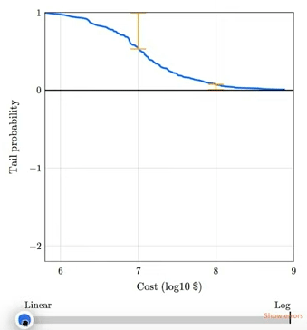
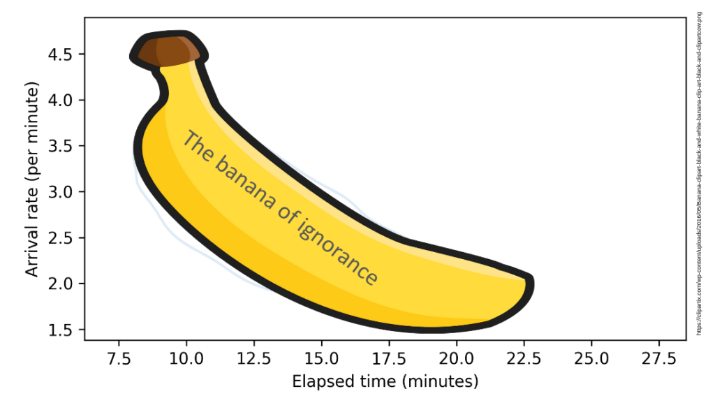
This talk will be remembered for the first public appearance of the soon-to-be-famous “Banana of Ignorance”. In general, when the data we have are unable to distinguish between competing explanations, that uncertainty is reflected in the joint distribution of the parameters. In this example, if we see more people waiting than expected, there are two explanation: a higher-than-average arrival rate or a longer-than-average elapsed time since the last train. If we make a contour plot of the joint posterior distribution of these parameters, it looks like this:
The elongated shape of the contour indicates that either explanation is sufficient: if the arrival rate is high, elapsed time can be normal, and if the elapsed time is high, the arrival rate can be normal. Because this shape indicates that we don’t know which explanation is correct, I have dubbed it “The Banana of Ignorance”:
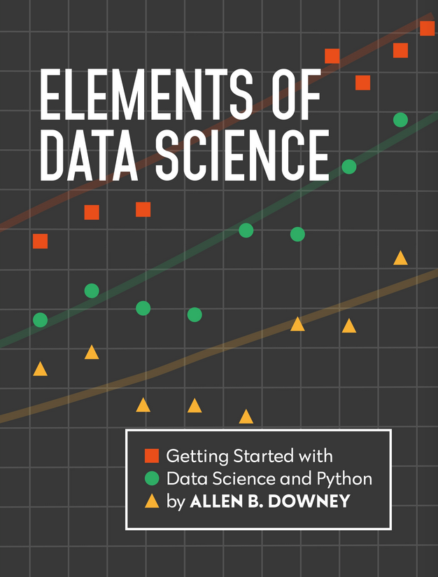
I’m excited to announce the launch of my newest book, Elements of Data Science. As the subtitle suggests, it is about “Getting started with Data Science and Python”.
I am publishing this book myself, which has one big advantage: I can print it with a full color interior without increasing the cover price. In my opinion, the code is more readable with syntax highlighting, and the data visualizations look great!
In addition to the printed edition, all chapters are available to read online, and they are in Jupyter notebooks, where you can read the text, run the code, and work on the exercises.
Description
Elements of Data Science is an introduction to data science for people with no programming experience. My goal is to present a small, powerful subset of Python that allows you to do real work with data as quickly as possible.
Part 1 includes six chapters that introduce basic Python with a focus on working with data.
Part 2 presents exploratory data analysis using Pandas and empiricaldist — it includes a revised and updated version of the material from my popular DataCamp course, “Exploratory Data Analysis in Python.”
Part 3 takes a computational approach to statistical inference, introducing resampling method, bootstrapping, and randomization tests.
Part 4 is the first of two case studies. It uses data from the General Social Survey to explore changes in political beliefs and attitudes in the U.S. in the last 50 years. The data points on the cover are from one of the graphs in this section.
Part 5 is the second case study, which introduces classification algorithms and the metrics used to evaluate them — and discusses the challenges of algorithmic decision-making in the context of criminal justice.
This project started in 2019, when I collaborated with a group at Harvard to create a data science class for people with no programming experience. We discussed some of the design decisions that went into the course and the book in this article.
I’m a math graduate and am partially self taught. I am really frustrated with likelihood and probability density, two concepts that I personally think are explained so disastrously that I’ve been struggling with them for an embarrassingly long time. Here’s my current understanding and what I want to understand:
probability density is the ‘concentration of probability’ or probability per unit and the value of the density in any particular interval depends on the density function used. When you integrate the density curve over all outcomes x in X where X is a random variable and x are its realizations then the result should be all the probability or 1.
likelihood is the joint probability, in the discrete case, of observing fixed and known data depending on what parameter(s) value we choose. In the continuous case we do not have a nonzero probability of any single value but we do have nonzero probability within some infinitely small interval (containing infinite values?) [x, x+h] and maximizing the likelihood of observing this data is equivalent to maximizing the probability of observing it, which we can do by maximizing the density at x.
My questions are:
Is what I wrote above correct? Probability density and likelihood are not the same thing. But what the precise distinction is in the continuous case is not completely cut and dry to me. […]
I agree with OP — these topics are confusing and not always explained well. So let’s see what we can do.
I’ll start with a discrete distribution, so we can leave density out of it for now and focus on the difference between a probability mass function (PMF) and a likelihood function.
As an example, suppose we know that a hockey team scores goals at a rate of 3 goals per game on average.
If we model goal scoring as a Poisson process — which is not a bad model — the number of goals per game follows a Poisson distribution with parameter mu=3.
The PMF of the Poisson distribution tells us the probability of scoring k goals in a game, for non-negative values of k.
Now suppose we don’t know the goal scoring rate, but we observe 4 goals in one game.
There are several ways we can use this data to estimate mu.
One is to find the maximum likelihood estimator (MLE), which is the value of mu that makes the observed data most likely.
To find the MLE, we need to maximize the likelihood function, which is a function of mu with a fixed number of observed goals, k.
To evaluate the likelihood function, we can use the PMF of the Poisson distribution again, this time with a single value of k and a range of values for mu.
To find the value of mu that maximizes the likelihood of the data, we can use argmax to find the index of the highest value in ls, and then look up the corresponding element of mus.
In [10]:
i=np.argmax(ls)mus[i]
Out[10]:
4.0
In this case, the maximum likelihood estimator is equal to the number of goals we observed.
That’s the answer to the estimation problem, but now let’s look more closely at those likelihoods.
Here’s the likelihood at the maximum of the likelihood function.
In [11]:
np.max(ls)
Out[11]:
0.19536681481316454
This likelihood is a probability mass — specifically, it is the probability of scoring 4 goals, given that the goal-scoring rate is exactly 4.0.
In [12]:
poisson.pmf(4,mu=4)
Out[12]:
0.19536681481316454
So, some likelihoods are probability masses — but not all.
Now suppose, again, that we know the goal scoring rate is exactly 3,
but now we want to know how long it will be until the next goal.
If we model goal scoring as a Poisson process, the time until the next goal follows an exponential distribution with a rate parameter, lam=3.
Because the exponential distribution is continuous, it has a probability density function (PDF) rather than a probability mass function (PMF).
We can approximate the distribution by evaluating the exponential PDF at a set of equally-spaced times, ts.
SciPy’s implementation of the exponential distribution does not take lam as a parameter, so we have to set scale=1/lam.
The PDF is a function of t with lam as a fixed parameter.
Here’s what it looks like.
In [14]:
plt.plot(ts,ps)decorate(xlabel='Games until next goal',ylabel='Density')
Notice that the values on the y-axis extend above 1. That would not be possible if they were probability masses, but it is possible because they are probability densities.
By themselves, probability densities are hard to interpret.
As an example, we can pick an arbitrary element from ts and the corresponding element from ps.
In [15]:
ts[40],ps[40]
Out[15]:
(0.5, 0.6693904804452895)
So the probability density at t=0.5 is about 0.67. What does that mean? Not much.
To get something meaningful, we have to compute an area under the PDF.
For example, if we want to know the probability that the first goal is scored during the first half of a game, we can compute the area under the curve from t=0 to t=0.5.
We can use a slice index to select the elements of ps and ts in this interval, and NumPy’s trapz function, which uses the trapezoid method to compute the area under the curve.
In [16]:
np.trapz(ps[:41],ts[:41])
Out[16]:
0.7769608771522626
The probability of a goal in the first half of the game is about 78%.
To check that we got the right answer, we can compute the same probability using the exponential CDF.
In [17]:
expon.cdf(0.5,scale=1/lam)
Out[17]:
0.7768698398515702
Considering that we used a discrete approximation of the PDF, our estimate is pretty close.
This example provides an operational definition of a probability density: it’s something you can add up over an interval — or integrate — to get a probability mass.
Now let’s suppose that we don’t know the parameter lam and we want to use data to estimate it.
And suppose we observe a game where the first goal is scored at t=0.5.
As we did when we estimated the parameter mu of the Poisson distribution, we can find the value of lam that maximizes the likelihood of this data.
First we’ll define a range of possible values of lam.
In [18]:
lams=np.linspace(0,20,201)
Then for each value of lam, we can evaluate the exponential PDF at the observed time t=0.5 — using errstate to ignore the “division by zero” warning when lam is 0.
In the first example, we evaluated a Poisson PMF at discrete values of k with a fixed parameter, mu. The results were probability masses.
In the second example, we evaluated the same PMF for possible values of a parameter, mu, with a fixed value of k. The result was a likelihood function where each point is a probability mass.
In the third example, we evaluated an exponential PDF at possible values of t with a fixed parameter, lam. The results were probability densities, which we integrated over an interval to get a probability mass.
In the fourth example, we evaluated the same PDF at possible values of a parameter, lam, with a fixed value of t. The result was a likelihood function where each point is a probability density.
A PDF is a function of an outcome — like the number of goals scored or the time under the first goal — given a fixed parameter.
If you evaluate a PDF, you get a probability density.
If you integrate density over an interval, you get a probability mass.
A likelihood function is a function of a parameter, given a fixed outcome.
If you evaluate a likelihood function, you might get a probability mass or a density, depending on whether the outcome is discrete or continuous.
Either way, evaluating a likelihood function at a single point doesn’t mean much by itself.
A common use of a likelihood function is finding a maximum likelihood estimator.
As OP says, “Probability density and likelihood are not the same thing”, but the distinction is not clear because they are not completely distinct things, either.
A probability density can be a likelihood, but not all densities are likelihoods.
A likelihood can be a probability density, but not all likelihoods are densities.
I met a basic problem in pdf and pmf. I perform a grid approximation on bayesian problem. After normalizing the vector, I got a discretized pmf. Then I want to draw pmf and pdf on a plot to check if they are similar distribution. However, the pmf doesn’t resemble the pdf at all. The instruction told me that I need to sample from my pmf then draw a histogram with density for comparison. It really works, but why can’t I directly compare them?
In Think Bayes I used this kind of discrete approximation in almost every chapter, so this issue came up a lot! There are at least two good solutions:
Normalize the PDF and PMF so they are on the same scale, or
As an example, I’ll solve an exercise from Chapter 4 of Think Bayes:
In Major League Baseball, most players have a batting average between .230 and .300, which means that their probability of getting a hit is between 0.23 and 0.30.
Suppose a player appearing in their first game gets 3 hits out of 3 attempts. What is the posterior distribution for their probability of getting a hit?
To represent the prior distribution, I’ll use a beta distribution with parameters I chose to be consistent with the expected range of batting averages.
Unlike probability masses, probability densities can exceed 1.
But the area under the curve should be 1, which we can check using trapz, which is a NumPy function that computes numerical integrals using the trapezoid rule.
In [6]:
area=np.trapz(ps,qs)area
Out[6]:
1.0
Within floating-point error, the area under the PDF is 1.
To do the Bayesian update, I’ll put these values in a Pmf object and normalize it so the sum of the probability masses is 1.
The result is a discrete approximation of the actual posterior distribution — so let’s see how close it is.
Because the beta distribution is the conjugate prior of the binomial likelihood function, the posterior is also a beta distribution, with parameters updated to reflect the data: 3 successes and 0 failures.
In [10]:
beta_posterior=beta(a+3,b)
Here’s what this theoretical posterior distribution looks like compared to our numerical approximation.
Oops! Something has gone wrong. I assume this is what OP meant by “the pmf doesn’t resemble the pdf at all”.
The problem is that the PMF is normalized so the total of the probability masses is 1, and the PDF is normalized so the area under the curve is 1.
They are not on the same scale, so the y-axis in this figure is different for the two curves.
To fix the problem, we can find the area under the PMF.
The curves are visually indistinguishable, and the numerical differences are small.
In [15]:
diff=ps-pdf_posterior.psnp.max(np.abs(diff))
Out[15]:
4.973799150320701e-14
As an aside, note that the posterior and prior distributions are not very different.
The prior mean is 0.267 and the posterior mean is 0.281.
If a rookie goes 3 for 3 in their first game, that’s a good start, but it doesn’t mean they are the next Ted Williams.
In [16]:
pmf_prior.mean(),pmf_posterior.mean()
Out[16]:
(0.2666666666666667, 0.28104575163398693)
As an alternative to comparing PDFs, we could convert the PMF to a CDF, which contains the cumulative sum of the probability masses.
In [17]:
cdf_posterior=pmf_posterior.make_cdf()
And compare to the mathematical CDF of the beta distribution.
In this example, I plotted the discrete approximation of the CDF as a step function — which is technically what it is — to highlight how it overlaps with the beta distribution.
Probability density is hard to define — the best I can do is usually, “It’s something that you can integrate to get a probability mass”.
And when you work with probability densities computationally, you often have to discretize them, which can add another layer of confusion.
One way to distinguish PMFs and PDFs is to remember that PMFs are normalized so sum of the probability masses is 1, and PDFs are normalized so the area under the curve is 1.
In general, you can’t plot PMFs and PDFs on the same axes because they are not in the same units.